Time/Clock2020s Contemporary
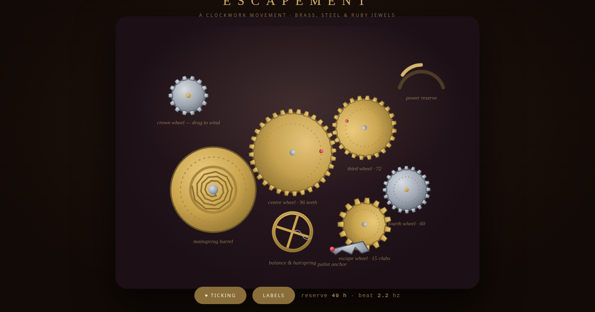
ESCAPEMENT — clockwork mechanism
Time/Clock style inspired by "ESCAPEMENT — clockwork mechanism". Flexbox, Transitions, Transforms. With animations.
clockworkescapementtimeclockanimatedgradient
Use case: Time/Clock apps, Creative landing pages, Experimental projects
Historical Context
Contemporary style (2020s Contemporary) combining Flexbox and Transitions with Gradients and Hover Effects.
When to Use
Use for time/clock projects that need Gradients and Hover Effects effects.
Design Principles
- Leverage Flexbox for layout structure
- Apply Gradients consistently across components
- Maintain visual consistency
DESIGN.md
---
version: "alpha"
name: "ESCAPEMENT — clockwork mechanism"
description: "Time/Clock style with Flexbox and Transitions."
colors:
  primary: "#241610"
  secondary: "#120a06"
  tertiary: "#d8c9a8"
typography:
  h1:
    fontFamily: Georgia
    fontSize: 2.5rem
    fontWeight: 700
  body-md:
    fontFamily: Georgia
    fontSize: 1rem
    fontWeight: 400
rounded:
  sm: 4px
  md: 8px
  lg: 16px
spacing:
  sm: 1rem
  md: 2rem
  lg: 4rem
---

## Overview

ESCAPEMENT — clockwork mechanism - Time/Clock style from the 2020s Contemporary era.

- Density: 5/10
- Variance: 6/10
- Motion: 8/10 — Animated

- **Style:** Time/Clock
- **Keywords:** clockwork, escapement
- **Era:** 2020s Contemporary
- **Light/Dark:** ✓ Light / ○ Dark

## Colors

- **#241610**
- **#120a06**
- **#d8c9a8**
- **#d4b46a**
- **#8a7454**

## Typography

- **Georgia**
- **system-ui**
- **Courier New**

## Layout

- **Features:** Flexbox, Transitions, Transforms, Gradients, Box Shadows, Border Radius, Aspect Ratio

## Effects

- Gradients
- Hover Effects

## Use Case

Time/Clock apps, Landing pages, Experimental projects.
Technical Specs
CSS
Flexbox, Transitions, Transforms, Gradients, Box Shadows, Border Radius, Aspect Ratio
Variables
--primary: #000
Checklist
☐ Flexbox ☐ Transitions ☐ Transforms ☐ Responsive ☐ Acessibilidade
Colors
Primary
#241610
#120a06
#d8c9a8
Secondary
#d4b46a
#8a7454
#2e1a22
Effects
Gradients, Hover Effects
Light/Dark
✓ Light / ○ Dark
AI Prompt
Act as a Senior Frontend Engineer and Expert UI Designer.
Your task is to code a complete Landing Page on the first attempt.
- Landing Page Theme: <INSERT THEME>
- Sections to add: <INSERT SECTIONS>

Generate the final code immediately following these definitions:

## Style

- **Name:** ESCAPEMENT — clockwork mechanism
- **Type:** Time/Clock
- **Keywords:** clockwork, escapement, time, clock, animated, gradient
- **Era:** 2020s Contemporary
- **Light/Dark:** ✓ Light / ○ Dark

## Color Palette

- **Primary:** #241610, #120a06, #d8c9a8
- **Secondary:** #d4b46a, #8a7454, #2e1a22

## Visual Effects

Gradients, Hover Effects

## AI Visual Direction

Design a time/clock landing page inspired by "ESCAPEMENT — clockwork mechanism". Use: Flexbox, Transitions, Transforms, Gradients. Colors: #241610, #120a06, #d8c9a8. Effects: Gradients, Hover Effects.

## CSS Technical

```css
Flexbox, Transitions, Transforms, Gradients, Box Shadows, Border Radius, Aspect Ratio
```

## Design System Variables

```css
--primary: #000
```

## Implementation Checklist

- ☐ Flexbox ☐ Transitions ☐ Transforms ☐ Responsive ☐ Acessibilidade

## Execution Rules

1. Strictly follow the defined visual style.
2. Use high-quality inline SVG icons (Heroicons or Lucide style) — NEVER use emojis as icons.
3. Add `cursor-pointer` and smooth `hover` states (transition-all) on all interactive elements.
4. Required Page Structure:
   - Navbar (Logo + Links + CTA)
   - Hero Section (Impactful Headline + Subtitle + 2 buttons + 3D/Abstract visual element via CSS)
   - Features (3 cards with icons)
   - Testimonials (3 cards)
   - Pricing (3 tiers, highlight the middle one)
   - Final CTA
   - Full Footer with social links, privacy policy, terms of use, contact and SEO links.
5. All text content must be in English.
6. The visual must be CLEARLY distinct — do not create a "default Bootstrap" design. Force the use of the provided design system variables.
7. Use `<style>` tags in the head for custom classes (especially for complex backdrop-filter effects and animations) that Tailwind CDN doesn't cover.
8. Full Responsiveness: Layout must adapt perfectly to Mobile, Tablet and Desktop (vertical stack on mobile).
9. Include basic SEO, Viewport and Open Graph meta tags in `<head>`.
10. Footer must contain: Copyright 2026, Secondary navigation links and Social media icons.
11. Make the creative decisions needed to deliver the complete, functional result now.
Last synced: 8/15/2026