Chalkboard Sketch-Note
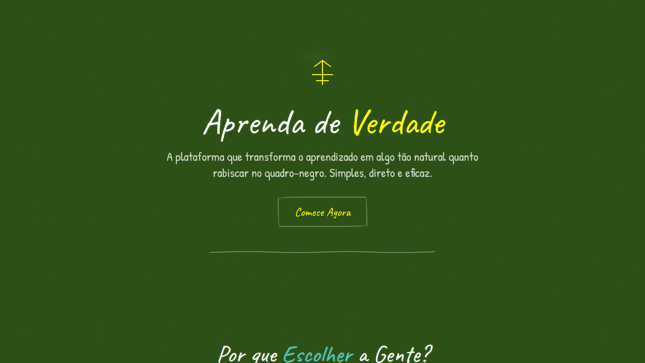
Chalkboard landing page, blackboard background, hand drawn chalk style, white sketch on dark, educational aesthetic, doodle icons. Ideal for landing pages, modern websites. AI-ready template.
Use case: Landing pages, Modern websites
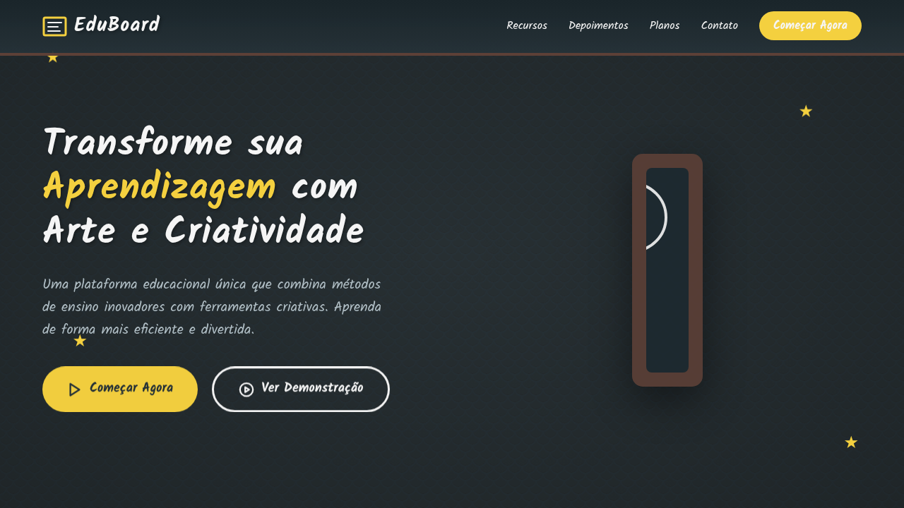
Historical Context
The chalkboard never really left us. It retreated from classrooms into nostalgia, then resurfaced in digital interfaces as something more deliberate — a conscious rejection of sterile perfection. When educators and designers started placing hand-drawn letterforms and wobbly diagrams against dark, textured backgrounds, they weren't being retro. They were solving a problem: how do you make a screen feel like a conversation instead of a broadcast? There's a reason the best lecturers always preferred chalk to slides. The act of drawing in real-time — imperfect, sequential, human — creates cognitive intimacy. Digital chalkboard aesthetics inherit this. The dark ground reduces eye strain during long sessions while the sketch-note elements signal "this is being built with you, not presented at you." It's participatory by implication. What makes this aesthetic endure where others fade is its honesty. A hand-drawn arrow can't lie about hierarchy the way a gradient can. Sketch-notes on dark backgrounds carry the weight of someone thinking out loud — and that vulnerability is exactly what learning environments need.
When to Use
Reach for chalkboard sketch-note when your interface needs to feel like a workshop table, not a conference room. It thrives in education platforms where reducing formality increases retention, in brainstorming tools where polish would signal "finished" too early, and in presentation contexts where you want audiences leaning in rather than leaning back. Avoid it for data-heavy dashboards or anywhere precision matters more than approachability. This aesthetic earns trust through imperfection — deploy it where that trade-off serves your users.
Design Principles
- Embrace line weight variation — uniform strokes kill the hand-drawn illusion faster than anything else
- Dark backgrounds should feel chalky and textured, never pure #000000; add subtle grain or fiber to the ground
- Limit your palette to what actual chalk offers: whites, muted pastels, dusty yellows — saturated color breaks the metaphor
- Let elements breathe asymmetrically; rigid grid alignment contradicts the entire premise of sketch-note thinking
- Animation should mimic drawing speed — progressive reveal beats instant appearance every time
DESIGN.md
---
version: "alpha"
name: "Chalkboard Sketch-Note"
description: "Chalkboard landing page, blackboard background, hand drawn chalk style, white sketch on dark, educational aesthetic, doodle icons. Ideal for landing pages, modern websites. AI-ready template."
colors:
  primary: "#263238"
  secondary: "#F5F5F5"
  tertiary: "#F4D03F"
  neutral: "#FFFFFF"
  surface: "#546E7A"
  accent: "#FFCC80"
typography:
  h1:
    fontFamily: Kalam
    fontSize: 2.5rem
    fontWeight: 700
  body-md:
    fontFamily: Kalam
    fontSize: 1rem
    fontWeight: 400
components:
  button-primary:
    backgroundColor: "{colors.primary}"
    textColor: "{colors.neutral}"
    padding: 12px
---

## Overview

Chalkboard landing page, blackboard background, hand drawn chalk style, white sketch on dark, educational aesthetic, doodle icons. Ideal for landing pages, modern websites. AI-ready template. The chalkboard never really left us. It retreated from classrooms into nostalgia, then resurfaced in digital interfaces as something more deliberate — a conscious rejection of sterile perfection. When educators and designers started placing hand-drawn letterforms and wobbly diagrams against dark, textured backgrounds, they weren't being retro. They were solving a problem: how do you make a screen feel like a conversation instead of a broadcast?

There's a reason the best lecturers always preferred chalk to slides. The act of drawing in real-time — imperfect, sequential, human — creates cognitive intimacy. Digital chalkboard aesthetics inherit this. The dark ground reduces eye strain during long sessions while the sketch-note elements signal "this is being built with you, not presented at you." It's participatory by implication.

What makes this aesthetic endure where others fade is its honesty. A hand-drawn arrow can't lie about hierarchy the way a gradient can. Sketch-notes on dark backgrounds carry the weight of someone thinking out loud — and that vulnerability is exactly what learning environments need.

- Density: 5/10 — Balanced
- Variance: 8/10 — Expressive
- Motion: 4/10 — Subtle

- **Style:** Educational, Approachable, Structured
- **Keywords:** chalkboard, sketch, education, school, hand-drawn, dust, dark, teaching
- **Era:** Classic Classroom
- **Light/Dark:** ✗ No / ✓ Full

## Colors

- **Background** (#263238) — Primary background surface
- **Text** (#F5F5F5) — Primary text color
- **Accent** (#F4D03F) — Primary accent, CTAs and interactive elements
- **Chalk White** (#FFFFFF) — Secondary surface
- **Eraser Grey** (#546E7A) — Secondary text, borders, muted elements
- **Pastel Colors** (#FFCC80) — Extended palette, decorative use


## Typography

- **Display / Hero:** Kalam — Weight 700, tight tracking, used for headline impact
- **Body:** Kalam — Weight 400, 16px/1.6 line-height, max 72ch per line
- **UI Labels / Captions:** Kalam — 0.875rem, weight 500, slight letter-spacing
- **Monospace:** JetBrains Mono — Used for code, metadata, and technical values

Scale:
- Hero: clamp(2.5rem, 5vw, 4rem)
- H1: 2.25rem
- H2: 1.5rem
- Body: 1rem / 1.6
- Small: 0.875rem


## Layout

- **Grid:** CSS Grid primary. Max-width containment: 1280px centered with 1.5rem side padding.
- **Spacing rhythm:** Balanced. Base unit: 0.5rem (8px).
- **Section vertical gaps:** clamp(4rem, 8vw, 8rem).
- **Hero layout:** Asymmetric composition.
- **Feature sections:** Asymmetric grid with varied card sizes. No 3-equal-columns.
- **Mobile collapse:** All multi-column layouts collapse below 768px. No horizontal overflow.
- **z-index contract:** base (0) / sticky-nav (100) / overlay (200) / modal (300) / toast (500).


## Elevation & Depth

Hand-drawn chalk illustrations, ribbon banners, doodle ornaments, schematic arrows, matte slate surface, grainy chalk dust.

- **Physics:** Ease-out curves, 200-300ms duration. Smooth and predictable.
- **Entry animations:** Fade + translate-Y (16px → 0) over 420ms ease-out. Staggered cascades for lists: 80ms between items.
- **Hover states:** Subtle color shift + shadow adjustment over 200ms.
- **Page transitions:** Fade only (200ms).
- **Performance:** Only transform and opacity animated. No layout-triggering properties.


## Shapes

Base corner radius: 8px. See rounded tokens in front matter for the full scale.


## Components

- **Primary Button:** Subtly rounded (0.5rem) shape. Accent color fill. Hover: 8% darken + subtle lift shadow. Active: -1px translate tactile press. Font weight 600. No outer glows.
- **Secondary / Ghost Button:** Outline variant. 1.5px border in muted color. Text in primary color. Hover: subtle background fill.
- **Cards:** Subtly rounded (0.5rem) corners. Surface background. Subtle shadow (0 2px 12px rgba(0,0,0,0.06)). 1px border stroke.
- **Inputs:** Label above input. 1px border stroke. Focus ring: 2px accent color offset 2px. Error text below in semantic red. No floating labels.
- **Navigation:** Primary surface background. Active item: accent color indicator. Font weight 500 when active.
- **Skeletons:** Shimmer animation matching component dimensions. No circular spinners.
- **Empty States:** Icon-based composition with descriptive text and action button.


## Do's and Don'ts

- No emojis in UI — use icon system only (Lucide, Heroicons)
- No pure white (#FFFFFF) backgrounds — use off-white or dark surfaces
- No oversaturated accent colors (saturation cap: 80%)
- No 3-column equal-width feature layouts — use zig-zag or asymmetric grid
- No `h-screen` — use `min-h-[100dvh]`
- No AI copywriting clichés: "Elevate", "Seamless", "Unleash", "Next-Gen"
- No broken external image links — use picsum.photos or inline SVG
- No generic lorem ipsum in demos

- Do Dark green/grey blackboard texture
- Do White 'chalk' text and lines
- Do Hand-drawn diagrams/arrows
- Do Wood border/frame elements
- Do Dusty texture overlay


## Use Case

Landing pages, Modern websites
Technical Specs
CSS
background-color: #263238; color: #F5F5F5; font-family: 'Kalam', cursive; border: 10px solid #5D4037; background-image: url('https://www.transparenttextures.com/patterns/black-scales.png');Variables
--bg-chalkboard: #263238, --chalk-white: #F5F5F5, --chalk-yellow: #F4D03F, --wood-border: #5D4037, --font-chalk: 'Kalam', cursive
Checklist
☐ Dark green/grey blackboard texture, ☐ White 'chalk' text and lines, ☐ Hand-drawn diagrams/arrows, ☐ Wood border/frame elements, ☐ Dusty texture overlay
Colors
Primary
Secondary
Effects
Hand-drawn chalk illustrations, ribbon banners, doodle ornaments, schematic arrows, matte slate surface, grainy chalk dust.
Light/Dark
✗ No / ✓ Full
AI Prompt
Act as a Senior Frontend Engineer and Expert UI Designer.
Your task is to code a complete Landing Page on the first attempt.
- Landing Page Theme: <INSERT THEME>
- Sections to add: <INSERT SECTIONS>

Generate the final code immediately following these definitions:

## Style

- **Name:** Chalkboard Sketch-Note
- **Type:** Educational, Approachable, Structured
- **Keywords:** chalkboard, sketch, education, school, hand-drawn, dust, dark, teaching
- **Era:** Classic Classroom
- **Light/Dark:** ✗ No / ✓ Full

## Color Palette

- **Primary:** Background #263238, Text #F5F5F5, Accent #F4D03F
- **Secondary:** Chalk White #FFFFFF, Eraser Grey #546E7A, Pastel Colors #FFCC80

## Visual Effects

Hand-drawn chalk illustrations, ribbon banners, doodle ornaments, schematic arrows, matte slate surface, grainy chalk dust.

## AI Visual Direction

chalkboard landing page, blackboard background, hand drawn chalk style, white sketch on dark, educational aesthetic, doodle icons.

## CSS Technical

```css
background-color: #263238; color: #F5F5F5; font-family: 'Kalam', cursive; border: 10px solid #5D4037; background-image: url('https://www.transparenttextures.com/patterns/black-scales.png');
```

## Design System Variables

```css
--bg-chalkboard: #263238, --chalk-white: #F5F5F5, --chalk-yellow: #F4D03F, --wood-border: #5D4037, --font-chalk: 'Kalam', cursive
```

## Implementation Checklist

- ☐ Dark green/grey blackboard texture
- ☐ White 'chalk' text and lines
- ☐ Hand-drawn diagrams/arrows
- ☐ Wood border/frame elements
- ☐ Dusty texture overlay

## Execution Rules

1. Strictly follow the defined visual style.
2. Use high-quality inline SVG icons (Heroicons or Lucide style) — NEVER use emojis as icons.
3. Add `cursor-pointer` and smooth `hover` states (transition-all) on all interactive elements.
4. Required Page Structure:
   - Navbar (Logo + Links + CTA)
   - Hero Section (Impactful Headline + Subtitle + 2 buttons + 3D/Abstract visual element via CSS)
   - Features (3 cards with icons)
   - Testimonials (3 cards)
   - Pricing (3 tiers, highlight the middle one)
   - Final CTA
   - Full Footer with social links, privacy policy, terms of use, contact and SEO links.
5. All text content must be in English.
6. The visual must be CLEARLY distinct — do not create a "default Bootstrap" design. Force the use of the provided design system variables.
7. Use `<style>` tags in the head for custom classes (especially for complex backdrop-filter effects and animations) that Tailwind CDN doesn't cover.
8. Full Responsiveness: Layout must adapt perfectly to Mobile, Tablet and Desktop (vertical stack on mobile).
9. Include basic SEO, Viewport and Open Graph meta tags in `<head>`.
10. Footer must contain: Copyright 2026, Secondary navigation links and Social media icons.
11. Make the creative decisions needed to deliver the complete, functional result now.Related
Last synced: 4/1/2026