Brutalismo Sonoro Glitch
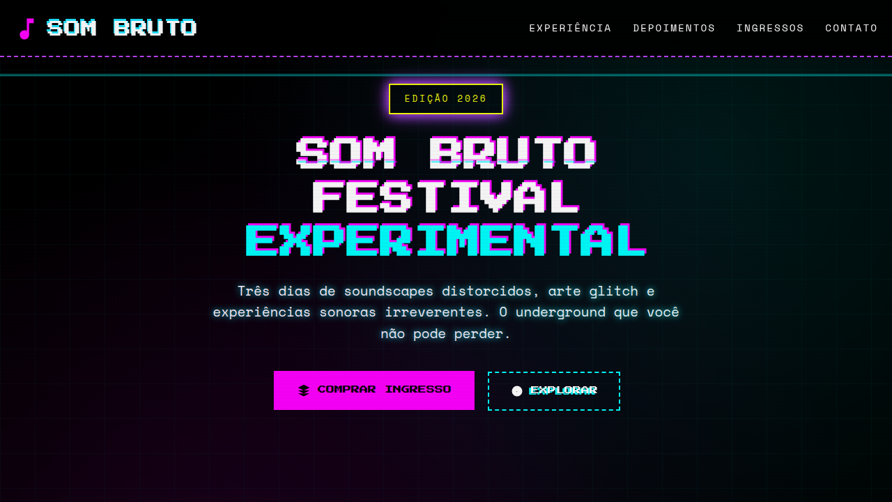
Design an edgy and raw brutalist landing page for an experimental electronic music festival. Ideal for landing pages, modern websites. AI-ready template.
Use case: Landing pages, Modern websites
Historical Context
Glitch brutalism in visual design didn't emerge from design schools. It crawled out of basement raves and pirate radio stations. The lineage is direct: Designers for Underground Resistance, Warp Records, and Mille Plateaux weren't decorating—they were translating. Clipping audio becomes clipping type. A bitcrushed kick drum becomes a shattered grid. The rave flyer tradition of the early 90s—photocopied, degraded, illegible on purpose—established that destruction carries information. Legibility was never the point. Energy was. When Autechre's artwork fractured into pure data noise, when Oval built entire albums from skipping CDs, the visual language followed. Designers like The Designers Republic and Non-Format understood: if the music breaks the signal, the poster breaks the page. Every torn pixel is a deliberate frequency. Every misregistered layer is a tempo shift. The aesthetic isn't chaos—it's controlled feedback, same as Merzbow pushing a mixer into the red and finding structure in the scream. This isn't retro fetishism. The tradition lives because electronic music keeps pushing past comfortable thresholds, and design must match that voltage.
When to Use
When the brief demands physical impact over polite communication. Music festivals selling transgression, not comfort. Electronic acts whose sound design already lives in distortion territory. Experimental art exhibitions that need the poster to feel like a warning, not an invitation. Sound design studios positioning themselves as dangerous rather than safe. Any context where the audience self-selects through visual hostility—where confusion filters for the curious and repels the passive.
Design Principles
- Signal degradation as compositional tool — treat visual artifacts (scan lines, compression, misregistration) as deliberate rhythm, not decoration. Every glitch must feel inevitable, like tape saturation at volume.
- Typographic clipping — push letterforms past their readable threshold the way a limiter pushes audio. Partial occlusion, extreme cropping, overlapping layers. The viewer reconstructs meaning like a listener parsing distortion.
- Temporal layering over static composition — design as if the piece exists across multiple corrupted frames. Offset duplicates, phase-shifted color channels, motion blur on static media. The page should feel like a frozen moment of failure.
- Raw material honesty — expose the grid, the pixel, the process. No smoothing, no anti-aliasing apologies. If brutalist architecture shows concrete pours, glitch brutalism shows render errors. The substrate is the surface.
- Dynamic density contrast — alternate between total visual overload and aggressive negative space. Mimic the dynamics of harsh noise: the silence between blasts carries as much weight as the blast itself.
DESIGN.md
---
version: "alpha"
name: "Brutalismo Sonoro Glitch"
description: "Design an edgy and raw brutalist landing page for an experimental electronic music festival. Ideal for landing pages, modern websites. AI-ready template."
colors:
  primary: "#000000"
  secondary: "#FF00FF"
  tertiary: "#00FFFF"
  neutral: "#FFFFFF"
  surface: "#32CD32"
  accent: "#FFFF00"
typography:
  h1:
    fontFamily: Press Start 2P
    fontSize: 2.5rem
    fontWeight: 700
  body-md:
    fontFamily: Press Start 2P
    fontSize: 1rem
    fontWeight: 400
components:
  button-primary:
    backgroundColor: "{colors.primary}"
    textColor: "{colors.neutral}"
    padding: 12px
---

## Overview

Design an edgy and raw brutalist landing page for an experimental electronic music festival. Ideal for landing pages, modern websites. AI-ready template. Glitch brutalism in visual design didn't emerge from design schools. It crawled out of basement raves and pirate radio stations. The lineage is direct: Designers for Underground Resistance, Warp Records, and Mille Plateaux weren't decorating—they were translating. Clipping audio becomes clipping type. A bitcrushed kick drum becomes a shattered grid. The rave flyer tradition of the early 90s—photocopied, degraded, illegible on purpose—established that destruction carries information. Legibility was never the point. Energy was.

When Autechre's artwork fractured into pure data noise, when Oval built entire albums from skipping CDs, the visual language followed. Designers like The Designers Republic and Non-Format understood: if the music breaks the signal, the poster breaks the page. Every torn pixel is a deliberate frequency. Every misregistered layer is a tempo shift. The aesthetic isn't chaos—it's controlled feedback, same as Merzbow pushing a mixer into the red and finding structure in the scream.

This isn't retro fetishism. The tradition lives because electronic music keeps pushing past comfortable thresholds, and design must match that voltage.

- Density: 5/10 — Balanced
- Variance: 8/10 — Expressive
- Motion: 4/10 — Subtle

- **Style:** Edgy, Raw, Experimental
- **Keywords:** music festival, electronic, experimental, edgy, raw, glitch, underground, disruptive, vibrant, intense
- **Era:** 2026+ Cultura Underground
- **Light/Dark:** ✗ No / ✓ Full

## Colors

- **Preto** (#000000) — Dark surface, primary background
- **Magenta** (#FF00FF) — Decorative accent, highlight elements
- **Ciano** (#00FFFF) — Supporting palette color
- **Branco** (#FFFFFF) — Light surface, card backgrounds
- **Verde Limão** (#32CD32) — Success states, positive indicators
- **Amarelo Neon** (#FFFF00) — Warning states, attention indicators
- **Roxo Elétrico** (#BF00FF) — Accent color, emphasis elements
- **Cinza Escuro** (#1A1A1A) — Deep contrast surface


## Typography

- **Display / Hero:** Press Start 2P — Weight 700, tight tracking, used for headline impact
- **Body:** Press Start 2P — Weight 400, 16px/1.6 line-height, max 72ch per line
- **UI Labels / Captions:** Press Start 2P — 0.875rem, weight 500, slight letter-spacing
- **Monospace:** JetBrains Mono — Used for code, metadata, and technical values

Scale:
- Hero: clamp(2.5rem, 5vw, 4rem)
- H1: 2.25rem
- H2: 1.5rem
- Body: 1rem / 1.6
- Small: 0.875rem


## Layout

- **Grid:** CSS Grid primary. Max-width containment: 1280px centered with 1.5rem side padding.
- **Spacing rhythm:** Balanced. Base unit: 0.5rem (8px).
- **Section vertical gaps:** clamp(4rem, 8vw, 8rem).
- **Hero layout:** Asymmetric composition.
- **Feature sections:** Asymmetric grid with varied card sizes. No 3-equal-columns.
- **Mobile collapse:** All multi-column layouts collapse below 768px. No horizontal overflow.
- **z-index contract:** base (0) / sticky-nav (100) / overlay (200) / modal (300) / toast (500).


## Elevation & Depth

Efeitos de glitch e distorção, tipografia condensada e pixelizada, imagens de baixa resolução intencionais, sobreposições de texto, animações de loop curtas e repetitivas, micro-interações de hover com feedback visual forte.

- **Physics:** Ease-out curves, 200-300ms duration. Smooth and predictable.
- **Entry animations:** Fade + translate-Y (16px → 0) over 420ms ease-out. Staggered cascades for lists: 80ms between items.
- **Hover states:** Subtle color shift + shadow adjustment over 200ms.
- **Page transitions:** Fade only (200ms).
- **Performance:** Only transform and opacity animated. No layout-triggering properties.


## Shapes

Base corner radius: 8px. See rounded tokens in front matter for the full scale.


## Components

- **Primary Button:** Subtly rounded (0.5rem) shape. Accent color fill. Hover: 8% darken + subtle lift shadow. Active: -1px translate tactile press. Font weight 600. No outer glows.
- **Secondary / Ghost Button:** Outline variant. 1.5px border in muted color. Text in primary color. Hover: subtle background fill.
- **Cards:** Subtly rounded (0.5rem) corners. Surface background. Subtle shadow (0 2px 12px rgba(0,0,0,0.06)). 1px border stroke.
- **Inputs:** Label above input. 1px border stroke. Focus ring: 2px accent color offset 2px. Error text below in semantic red. No floating labels.
- **Navigation:** Primary surface background. Active item: accent color indicator. Font weight 500 when active.
- **Skeletons:** Shimmer animation matching component dimensions. No circular spinners.
- **Empty States:** Icon-based composition with descriptive text and action button.


## Do's and Don'ts

- No emojis in UI — use icon system only (Lucide, Heroicons)
- No pure black (#000000) — use off-black or charcoal variants
- No oversaturated accent colors (saturation cap: 80%)
- No 3-column equal-width feature layouts — use zig-zag or asymmetric grid
- No `h-screen` — use `min-h-[100dvh]`
- No AI copywriting clichés: "Elevate", "Seamless", "Unleash", "Next-Gen"
- No broken external image links — use picsum.photos or inline SVG
- No generic lorem ipsum in demos

- Do Efeitos de glitch
- Do Tipografia pixelizada
- Do Imagens de baixa resolução
- Do Sobreposições de texto
- Do Animações de loop
- Do Feedback visual forte.


## Use Case

Landing pages, Modern websites
Technical Specs
CSS
background: #000000, color: #FFFFFF, text-shadow: 2px 2px #FF00FF, border: 2px dashed #00FFFF, font-family: "Press Start 2P, cursive", animation: glitch-effect 0.5s infinite alternate, .glitch-image, .pixel-font, .text-overlay.
Variables
--black-bg: #000000, --white-text: #FFFFFF, --magenta-accent: #FF00FF, --cyan-accent: #00FFFF, --border-dashed: 2px dashed #00FFFF, --font-pixel: "Press Start 2P, cursive", --glitch-shadow: 2px 2px #FF00FF.
Checklist
☐ Efeitos de glitch, ☐ Tipografia pixelizada, ☐ Imagens de baixa resolução, ☐ Sobreposições de texto, ☐ Animações de loop, ☐ Feedback visual forte.
Colors
Primary
Secondary
Effects
Efeitos de glitch e distorção, tipografia condensada e pixelizada, imagens de baixa resolução intencionais, sobreposições de texto, animações de loop curtas e repetitivas, micro-interações de hover com feedback visual forte.
Light/Dark
✗ No / ✓ Full
AI Prompt
Act as a Senior Frontend Engineer and Expert UI Designer.
Your task is to code a complete Landing Page on the first attempt.
- Landing Page Theme: <INSERT THEME>
- Sections to add: <INSERT SECTIONS>

Generate the final code immediately following these definitions:

## Style

- **Name:** Brutalismo Sonoro Glitch
- **Type:** Edgy, Raw, Experimental
- **Keywords:** music festival, electronic, experimental, edgy, raw, glitch, underground, disruptive, vibrant, intense
- **Era:** 2026+ Cultura Underground
- **Light/Dark:** ✗ No / ✓ Full

## Color Palette

- **Primary:** Preto #000000, Magenta #FF00FF, Ciano #00FFFF, Branco #FFFFFF
- **Secondary:** Verde Limão #32CD32, Amarelo Neon #FFFF00, Roxo Elétrico #BF00FF, Cinza Escuro #1A1A1A

## Visual Effects

Efeitos de glitch e distorção, tipografia condensada e pixelizada, imagens de baixa resolução intencionais, sobreposições de texto, animações de loop curtas e repetitivas, micro-interações de hover com feedback visual forte.

## AI Visual Direction

Design an edgy and raw brutalist landing page for an experimental electronic music festival. Use: glitch and distortion effects, condensed pixelated typography, intentional low-res images, text overlays, short looping animations, strong visual hover feedback, magenta and cyan accents, intense and underground feel.

## CSS Technical

```css
background: #000000, color: #FFFFFF, text-shadow: 2px 2px #FF00FF, border: 2px dashed #00FFFF, font-family: "Press Start 2P, cursive", animation: glitch-effect 0.5s infinite alternate, .glitch-image, .pixel-font, .text-overlay.
```

## Design System Variables

```css
--black-bg: #000000, --white-text: #FFFFFF, --magenta-accent: #FF00FF, --cyan-accent: #00FFFF, --border-dashed: 2px dashed #00FFFF, --font-pixel: "Press Start 2P, cursive", --glitch-shadow: 2px 2px #FF00FF.
```

## Implementation Checklist

- ☐ Efeitos de glitch
- ☐ Tipografia pixelizada
- ☐ Imagens de baixa resolução
- ☐ Sobreposições de texto
- ☐ Animações de loop
- ☐ Feedback visual forte.

## Execution Rules

1. Strictly follow the defined visual style.
2. Use high-quality inline SVG icons (Heroicons or Lucide style) — NEVER use emojis as icons.
3. Add `cursor-pointer` and smooth `hover` states (transition-all) on all interactive elements.
4. Required Page Structure:
   - Navbar (Logo + Links + CTA)
   - Hero Section (Impactful Headline + Subtitle + 2 buttons + 3D/Abstract visual element via CSS)
   - Features (3 cards with icons)
   - Testimonials (3 cards)
   - Pricing (3 tiers, highlight the middle one)
   - Final CTA
   - Full Footer with social links, privacy policy, terms of use, contact and SEO links.
5. All text content must be in English.
6. The visual must be CLEARLY distinct — do not create a "default Bootstrap" design. Force the use of the provided design system variables.
7. Use `<style>` tags in the head for custom classes (especially for complex backdrop-filter effects and animations) that Tailwind CDN doesn't cover.
8. Full Responsiveness: Layout must adapt perfectly to Mobile, Tablet and Desktop (vertical stack on mobile).
9. Include basic SEO, Viewport and Open Graph meta tags in `<head>`.
10. Footer must contain: Copyright 2026, Secondary navigation links and Social media icons.
11. Make the creative decisions needed to deliver the complete, functional result now.
Related
Last synced: 4/1/2026