Brutalismo Artístico Abstrato
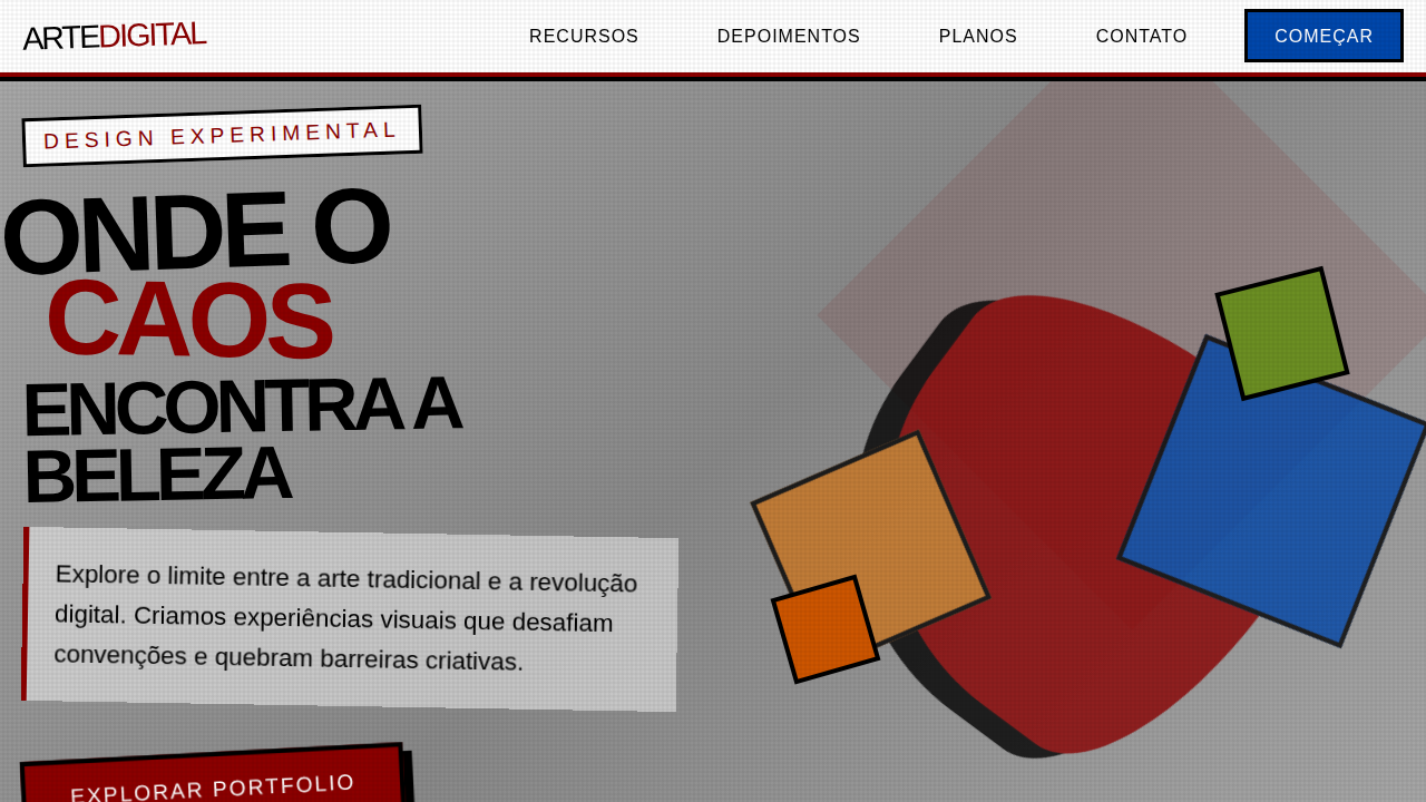
Design an artistic and experimental brutalist landing page for a digital artist portfolio. Ideal for landing pages, modern websites. AI-ready template.
Use case: Landing pages, Modern websites
Historical Context
Abstract brutalism on the web didn't emerge from design systems or agency trend reports. It came from artists who looked at the browser and saw a canvas that everyone else was trying to tame. Around 2014–2016, a loose network of digital artists—many adjacent to net art collectives and experimental type foundries—started treating the webpage itself as the artwork. No separation between container and content. The gallery became the interface became the piece. What makes this strain distinct from functional brutalism is intent. These weren't developers rejecting CSS frameworks out of pragmatism. These were artists deliberately exploiting the raw materiality of HTML and CSS—overflow as composition, z-index as depth, system fonts as texture. The browser's default rendering wasn't a limitation to overcome but a palette to manipulate. Olia Lialina's work, Rafaël Rozendaal's single-serving sites, the entire arena.are.na ecosystem—all ancestors of this thinking. The gallery-as-interface concept flipped the portfolio convention entirely. Instead of neutral white walls showcasing work, the portfolio structure itself communicates artistic position. Navigation becomes gesture. Layout becomes statement. The website doesn't house the art—it is the art.
When to Use
When the project IS the aesthetic statement. Artist portfolios where the site itself functions as a piece. Experimental galleries that reject the white-cube digital template. Art collectives who need their online presence to feel as uncompromising as their work. Degree shows. Net art archives. Any context where "usability" takes a deliberate backseat to artistic intent—and the audience expects exactly that. Not for client work pretending to be edgy.
Design Principles
- The interface is the artwork — no separation between container and content, every structural decision is an aesthetic one
- Exploit browser materiality — use default rendering, overflow, z-index collisions, and system behaviors as compositional tools rather than bugs to fix
- Reject neutral presentation — navigation, layout, and interaction patterns should communicate artistic position, never disappear into convention
- Embrace deliberate friction — loading sequences, unexpected scroll behaviors, and disorienting spatial relationships are valid artistic choices when intentional
- Raw over refined — visible structure, exposed grid logic, unhidden markup thinking; polish is a choice, not a default
DESIGN.md
---
version: "alpha"
name: "Brutalismo Artístico Abstrato"
description: "Design an artistic and experimental brutalist landing page for a digital artist portfolio. Ideal for landing pages, modern websites. AI-ready template."
colors:
  primary: "#A9A9A9"
  secondary: "#000000"
  tertiary: "#8B0000"
  neutral: "#FFFFFF"
  surface: "#0047AB"
  accent: "#CC7722"
typography:
  h1:
    fontFamily: Arial Black
    fontSize: 2.5rem
    fontWeight: 700
  body-md:
    fontFamily: Arial Black
    fontSize: 1rem
    fontWeight: 400
components:
  button-primary:
    backgroundColor: "{colors.primary}"
    textColor: "{colors.neutral}"
    padding: 12px
---

## Overview

Design an artistic and experimental brutalist landing page for a digital artist portfolio. Ideal for landing pages, modern websites. AI-ready template. Abstract brutalism on the web didn't emerge from design systems or agency trend reports. It came from artists who looked at the browser and saw a canvas that everyone else was trying to tame. Around 2014–2016, a loose network of digital artists—many adjacent to net art collectives and experimental type foundries—started treating the webpage itself as the artwork. No separation between container and content. The gallery became the interface became the piece.

What makes this strain distinct from functional brutalism is intent. These weren't developers rejecting CSS frameworks out of pragmatism. These were artists deliberately exploiting the raw materiality of HTML and CSS—overflow as composition, z-index as depth, system fonts as texture. The browser's default rendering wasn't a limitation to overcome but a palette to manipulate. Olia Lialina's work, Rafaël Rozendaal's single-serving sites, the entire arena.are.na ecosystem—all ancestors of this thinking.

The gallery-as-interface concept flipped the portfolio convention entirely. Instead of neutral white walls showcasing work, the portfolio structure itself communicates artistic position. Navigation becomes gesture. Layout becomes statement. The website doesn't house the art—it is the art.

- Density: 5/10 — Balanced
- Variance: 8/10 — Expressive
- Motion: 4/10 — Subtle

- **Style:** Artistic, Experimental, Unconventional
- **Keywords:** digital art, experimental, portfolio, abstract, unconventional, raw, bold, artistic, disruptive, unique
- **Era:** 2026+ Arte Digital Pós-Moderna
- **Light/Dark:** ✓ Full / ✗ No

## Colors

- **Cinza Concreto** (#A9A9A9) — Secondary text, borders, muted elements
- **Preto** (#000000) — Dark surface, primary background
- **Vermelho Sangue** (#8B0000) — Error states, destructive actions
- **Branco** (#FFFFFF) — Light surface, card backgrounds
- **Azul Cobalto** (#0047AB) — Secondary accent
- **Amarelo Ocre** (#CC7722) — Warning states, attention indicators
- **Verde Musgo** (#6B8E23) — Success states, positive indicators
- **Laranja Queimado** (#CC5500) — Warm accent, call-to-action secondary


## Typography

- **Display / Hero:** Arial Black — Weight 700, tight tracking, used for headline impact
- **Body:** Arial Black — Weight 400, 16px/1.6 line-height, max 72ch per line
- **UI Labels / Captions:** Arial Black — 0.875rem, weight 500, slight letter-spacing
- **Monospace:** JetBrains Mono — Used for code, metadata, and technical values

Scale:
- Hero: clamp(2.5rem, 5vw, 4rem)
- H1: 2.25rem
- H2: 1.5rem
- Body: 1rem / 1.6
- Small: 0.875rem


## Layout

- **Grid:** CSS Grid primary. Max-width containment: 1280px centered with 1.5rem side padding.
- **Spacing rhythm:** Balanced. Base unit: 0.5rem (8px).
- **Section vertical gaps:** clamp(4rem, 8vw, 8rem).
- **Hero layout:** Asymmetric composition.
- **Feature sections:** Asymmetric grid with varied card sizes. No 3-equal-columns.
- **Mobile collapse:** All multi-column layouts collapse below 768px. No horizontal overflow.
- **z-index contract:** base (0) / sticky-nav (100) / overlay (200) / modal (300) / toast (500).


## Elevation & Depth

Texturas de concreto e metal, tipografia áspera e desalinhada, imagens cortadas e sobrepostas de forma agressiva, layouts de grid quebrados, micro-interações de hover com distorção, animações de transição bruscas.

- **Physics:** Ease-out curves, 200-300ms duration. Smooth and predictable.
- **Entry animations:** Fade + translate-Y (16px → 0) over 420ms ease-out. Staggered cascades for lists: 80ms between items.
- **Hover states:** Subtle color shift + shadow adjustment over 200ms.
- **Page transitions:** Fade only (200ms).
- **Performance:** Only transform and opacity animated. No layout-triggering properties.


## Shapes

Base corner radius: 8px. See rounded tokens in front matter for the full scale.


## Components

- **Primary Button:** Subtly rounded (0.5rem) shape. Accent color fill. Hover: 8% darken + subtle lift shadow. Active: -1px translate tactile press. Font weight 600. No outer glows.
- **Secondary / Ghost Button:** Outline variant. 1.5px border in muted color. Text in primary color. Hover: subtle background fill.
- **Cards:** Subtly rounded (0.5rem) corners. Surface background. Subtle shadow (0 2px 12px rgba(0,0,0,0.06)). 1px border stroke.
- **Inputs:** Label above input. 1px border stroke. Focus ring: 2px accent color offset 2px. Error text below in semantic red. No floating labels.
- **Navigation:** Primary surface background. Active item: accent color indicator. Font weight 500 when active.
- **Skeletons:** Shimmer animation matching component dimensions. No circular spinners.
- **Empty States:** Icon-based composition with descriptive text and action button.


## Do's and Don'ts

- No emojis in UI — use icon system only (Lucide, Heroicons)
- No pure black (#000000) — use off-black or charcoal variants
- No oversaturated accent colors (saturation cap: 80%)
- No 3-column equal-width feature layouts — use zig-zag or asymmetric grid
- No `h-screen` — use `min-h-[100dvh]`
- No AI copywriting clichés: "Elevate", "Seamless", "Unleash", "Next-Gen"
- No broken external image links — use picsum.photos or inline SVG
- No generic lorem ipsum in demos

- Do Texturas de concreto/metal
- Do Tipografia áspera
- Do Imagens cortadas/sobrepostas
- Do Grids quebrados
- Do Micro-interações de distorção
- Do Transições bruscas.


## Use Case

Landing pages, Modern websites
Technical Specs
CSS
background: #A9A9A9, color: #000000, border: 4px solid #8B0000, box-shadow: 8px 8px 0px #000000, font-family: "Arial Black, sans-serif", transform: rotate(-2deg), .broken-grid-item, .cropped-image, .distort-hover.
Variables
--concrete-grey: #A9A9A9, --black-text: #000000, --blood-red: #8B0000, --white-bg: #FFFFFF, --border-heavy: 4px solid #8B0000, --shadow-art: 8px 8px 0px #000000, --font-rough: "Arial Black, sans-serif".
Checklist
☐ Texturas de concreto/metal, ☐ Tipografia áspera, ☐ Imagens cortadas/sobrepostas, ☐ Grids quebrados, ☐ Micro-interações de distorção, ☐ Transições bruscas.
Colors
Primary
Secondary
Effects
Texturas de concreto e metal, tipografia áspera e desalinhada, imagens cortadas e sobrepostas de forma agressiva, layouts de grid quebrados, micro-interações de hover com distorção, animações de transição bruscas.
Light/Dark
✓ Full / ✗ No
AI Prompt
Act as a Senior Frontend Engineer and Expert UI Designer.
Your task is to code a complete Landing Page on the first attempt.
- Landing Page Theme: <INSERT THEME>
- Sections to add: <INSERT SECTIONS>

Generate the final code immediately following these definitions:

## Style

- **Name:** Brutalismo Artístico Abstrato
- **Type:** Artistic, Experimental, Unconventional
- **Keywords:** digital art, experimental, portfolio, abstract, unconventional, raw, bold, artistic, disruptive, unique
- **Era:** 2026+ Arte Digital Pós-Moderna
- **Light/Dark:** ✓ Full / ✗ No

## Color Palette

- **Primary:** Cinza Concreto #A9A9A9, Preto #000000, Vermelho Sangue #8B0000, Branco #FFFFFF
- **Secondary:** Azul Cobalto #0047AB, Amarelo Ocre #CC7722, Verde Musgo #6B8E23, Laranja Queimado #CC5500

## Visual Effects

Texturas de concreto e metal, tipografia áspera e desalinhada, imagens cortadas e sobrepostas de forma agressiva, layouts de grid quebrados, micro-interações de hover com distorção, animações de transição bruscas.

## AI Visual Direction

Design an artistic and experimental brutalist landing page for a digital artist portfolio. Use: concrete and metal textures, rough misaligned typography, aggressively cropped and overlapping images, broken grid layouts, distortion hover micro-interactions, abrupt transition animations, blood red and cobalt blue accents, raw and unconventional feel.

## CSS Technical

```css
background: #A9A9A9, color: #000000, border: 4px solid #8B0000, box-shadow: 8px 8px 0px #000000, font-family: "Arial Black, sans-serif", transform: rotate(-2deg), .broken-grid-item, .cropped-image, .distort-hover.
```

## Design System Variables

```css
--concrete-grey: #A9A9A9, --black-text: #000000, --blood-red: #8B0000, --white-bg: #FFFFFF, --border-heavy: 4px solid #8B0000, --shadow-art: 8px 8px 0px #000000, --font-rough: "Arial Black, sans-serif".
```

## Implementation Checklist

- ☐ Texturas de concreto/metal
- ☐ Tipografia áspera
- ☐ Imagens cortadas/sobrepostas
- ☐ Grids quebrados
- ☐ Micro-interações de distorção
- ☐ Transições bruscas.

## Execution Rules

1. Strictly follow the defined visual style.
2. Use high-quality inline SVG icons (Heroicons or Lucide style) — NEVER use emojis as icons.
3. Add `cursor-pointer` and smooth `hover` states (transition-all) on all interactive elements.
4. Required Page Structure:
   - Navbar (Logo + Links + CTA)
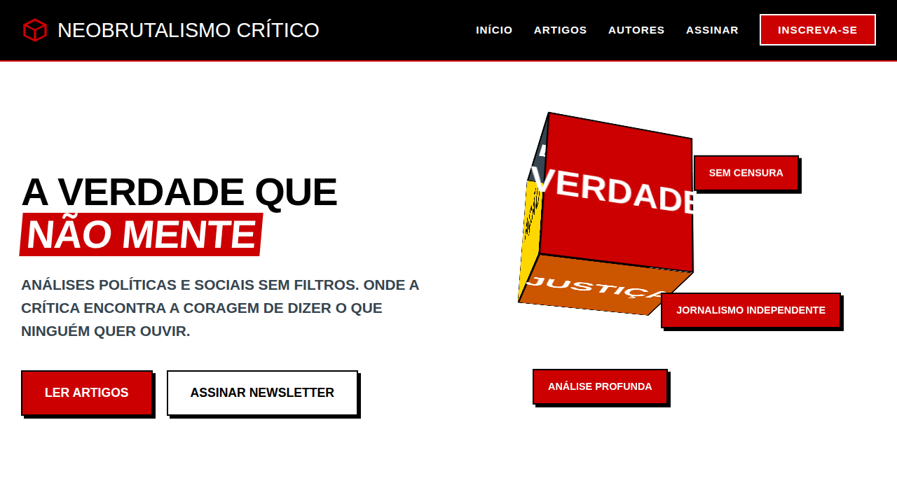
   - Hero Section (Impactful Headline + Subtitle + 2 buttons + 3D/Abstract visual element via CSS)
   - Features (3 cards with icons)
   - Testimonials (3 cards)
   - Pricing (3 tiers, highlight the middle one)
   - Final CTA
   - Full Footer with social links, privacy policy, terms of use, contact and SEO links.
5. All text content must be in English.
6. The visual must be CLEARLY distinct — do not create a "default Bootstrap" design. Force the use of the provided design system variables.
7. Use `<style>` tags in the head for custom classes (especially for complex backdrop-filter effects and animations) that Tailwind CDN doesn't cover.
8. Full Responsiveness: Layout must adapt perfectly to Mobile, Tablet and Desktop (vertical stack on mobile).
9. Include basic SEO, Viewport and Open Graph meta tags in `<head>`.
10. Footer must contain: Copyright 2026, Secondary navigation links and Social media icons.
11. Make the creative decisions needed to deliver the complete, functional result now.
Related
Last synced: 4/1/2026