Broadside
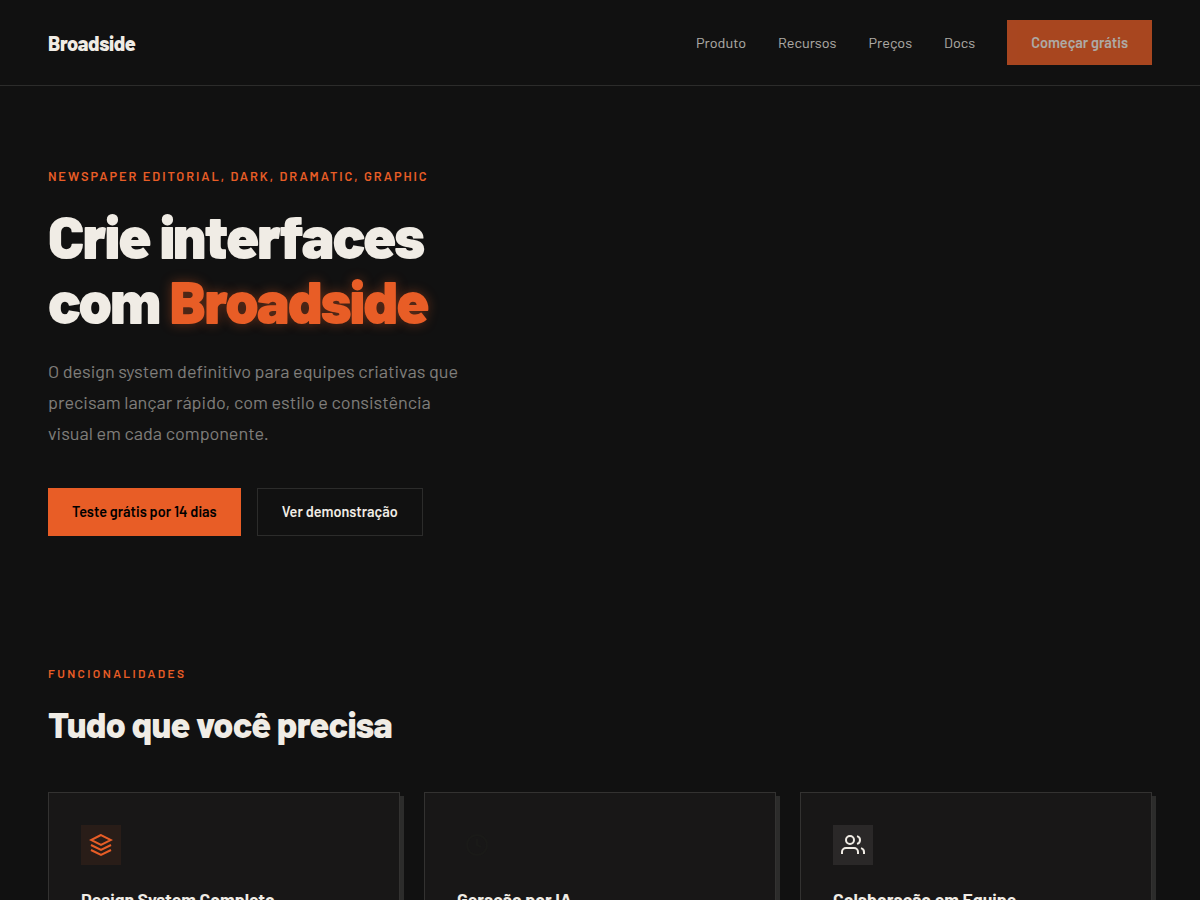
Broadside — Dark editorial canvas with a single fire orange accent and bilingual Latin/Chinese type stack. Barlow typography. near-black newspaper canvas with warm cream text and a single fire-orange headli. Best for brand manifesto, founder vision deck, magazine / cultural pitch. AI-ready design system.
Use case: brand manifesto, founder vision deck, magazine / cultural pitch, design talk, bilingual EN/CN deck, campaign launch
Historical Context
The broadside is the oldest form of mass communication design. Before newspapers existed as we know them, single-sheet broadsides were plastered across city walls — urgent, loud, impossible to ignore. They announced executions, political upheaval, and market prices with equal typographic fury. Everything was hierarchy: massive wood-type headlines dominating the sheet, body text crammed below in tight columns. What made broadsides work wasn't subtlety. It was the raw collision of scale. A 72-point headline next to 8-point body copy creates tension that still feels electric. The near-black ink on cheap paper, occasionally punctuated by a single spot color for emphasis — that's where the fire orange enters. Not decorative. Functional. A visual alarm bell. Modern editorial design owes everything to this lineage. The broadside taught us that typography IS the interface. No imagery needed. No illustration required. Just letterforms doing violent, beautiful work at extreme scales.
When to Use
Deploy Broadside when content demands authority and urgency simultaneously. News platforms that need to signal credibility without feeling sterile. Long-form journalism sites where the writing is the product and the typography must carry that weight alone. Opinion sections, investigative pieces, editorial magazines — anywhere the words themselves are the spectacle. Not for soft brands. Not for friendly SaaS. This is confrontational design for confrontational content.
Design Principles
- Near-black (#0A0A0A) as your foundation — true black is lazy, near-black has depth and ink-like warmth that references physical printing
- Fire orange exists only as intervention — pull quotes, bylines, breaking labels. The moment it becomes decorative, you've lost the plot
- Extreme typographic scale contrast: your headline-to-body ratio should feel almost uncomfortable. If it looks 'balanced,' you're being timid
- Tight vertical rhythm with generous horizontal gutters — columns should breathe but lines should stack with mechanical precision, like a press bed
- No rounded corners, no soft shadows, no gradients. Every element is cut sharp. The grid is visible and unapologetic — structure as aesthetic
Technical Specs
Colors
Primary
Secondary
Effects
display font Barlow for hero headlines, smooth hover transitions (200-250ms), subtle lift shadows, dark canvas with glow/shadow accents, fire-orange accent headlines, high-contrast newspaper grid
Light/Dark
✗ None / ✓ Full
Related

Last synced: 5/6/2026