Bold Poster
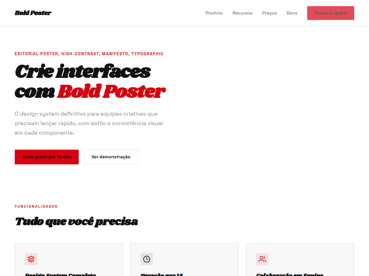
Bold Poster — Editorial poster aesthetic with massive Shrikhand display and a single fire-engine red accent. Shrikhand typography. white and warm-cream paper with deep almost-black ink, lifted by a single satura. Best for brand manifesto, creative-led pitch, magazine / editorial. AI-ready design system.
Use case: brand manifesto, creative-led pitch, magazine / editorial, founder vision deck, art / culture
Historical Context
The oversized poster tradition owes everything to the reckless confidence of 1960s Swiss Punk and the Italian manifesti that plastered cinema walls with type so large you could read it from a moving Vespa. Shrikhand — a typeface born from Gujarati calligraphic traditions — carries that same unapologetic weight. Its thick strokes and high contrast weren't designed for body copy; they were designed to stop traffic. Fire-engine red as a background choice isn't decorative. It's confrontational. The combination references Constructivist propaganda posters, punk zine covers, and the raw energy of letterpress broadsides where ink pooled heavy in the counters. When you pair that red with display type scaled beyond reason, you're not designing a layout — you're engineering a physical reaction. The viewer doesn't read it. They feel it hit them. This template exists in the lineage of designers who understood that restraint is a choice, not a default. Sometimes the brief demands volume.
When to Use
Deploy this when subtlety would be a disservice. Event announcements that need to cut through urban visual noise. Album drops. Protest graphics. Brand campaigns where the entire strategy is "be impossible to ignore." It works for magazine covers competing on newsstands, festival posters fighting for attention on wheat-pasted walls, and any moment where your client says "make it louder" and actually means it. Not for the faint-hearted or the committee-driven.
Design Principles
- Scale is the message — if the type doesn't feel uncomfortably large in your design tool, it's not large enough for the street
- Red demands commitment: use it as a flood, never as an accent — half-measures read as indecision
- Let Shrikhand's weight do the work; never add strokes, shadows, or effects to a typeface that already commands the room
- Negative space is structural, not decorative — it exists to give the eye exactly one place to land
- Hierarchy through scale alone: two sizes maximum, because three choices means you made no choice at all
Technical Specs
Colors
Primary
Secondary
Effects
display font Shrikhand for hero headlines, bold hover color shift (150ms), high-contrast active states, massive Shrikhand display text, fire-engine red single accent, poster-scale type, generous whitespace, clamp(4rem,8vw,8rem) section gaps
Light/Dark
✓ Full / ✗ None
Related

Last synced: 5/6/2026