Bento Eventos Dinâmicos
Dynamic and organized Bento Style landing page for an event and ticketing platform. Ideal for landing pages, modern websites. AI-ready template.
Use case: Landing pages, Modern websites
Historical Context
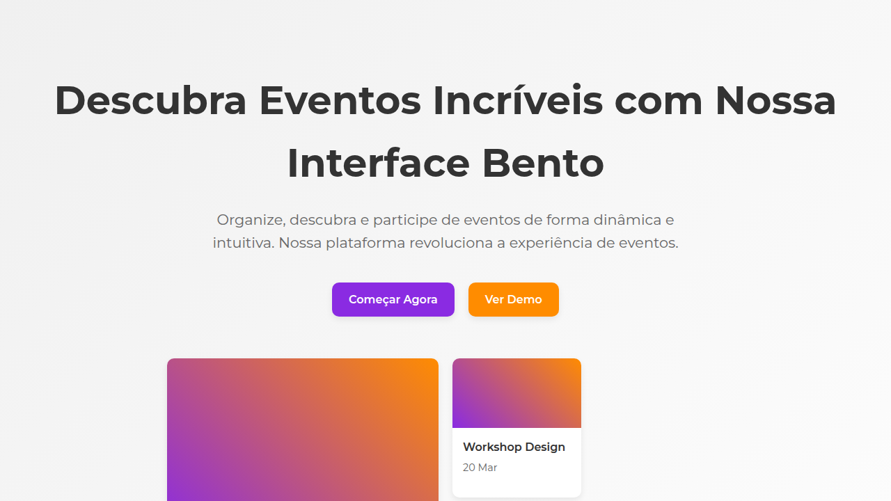
Event discovery has always been a spatial problem. You're scanning a city's worth of possibilities — dates, venues, vibes — and your brain needs to pattern-match fast. Eventbrite figured this out early with their card grid: thumbnail, title, date, location. Four data points per unit. Enough to decide in under a second whether something deserves a click. The layout was utilitarian, almost brutalist in its repetition. Luma changed the conversation. Their cards breathe. Cover images bleed to edges, typography sits confident and large, and the grid itself feels curated rather than generated. They proved that event cards don't need to look like database rows — they can carry the energy of the event itself. A techno night looks different from a founder breakfast, and the card should telegraph that before you read a single word. Bento grids push this further. Instead of uniform rectangles, you get hierarchy through size. A featured festival takes four cells. A weekly meetup takes one. The grid becomes editorial — it has opinion about what matters tonight.
When to Use
When your event platform needs to surface dozens of options without flattening them into sameness. Bento works when events have unequal weight — a headliner festival alongside three intimate workshops. Use it for discovery pages, homepage feeds, and curated collections where editorial hierarchy matters more than chronological fairness. Skip it for simple list views or calendar interfaces where temporal order is the primary navigation model.
Design Principles
- Let cover imagery dictate card energy — a dark venue photo and a sunlit park demand different typographic treatments within the same grid
- Date and time earn prime real estate. Always. An event card without instantly scannable timing is a broken component, no matter how beautiful the layout
- Size equals editorial weight. The 2×2 card is a recommendation. The 1×1 is an option. Never assign grid spans randomly — every size decision is a curatorial statement
- Typographic contrast between event title and metadata should be aggressive. Display weight for the name, tabular figures for the date, muted small caps for the venue. Three distinct voices in one card
- Leave the grid slightly irregular. Perfect symmetry reads as algorithmic. One odd-sized gap or an asymmetric row tells users a human (or human-like intelligence) arranged this
DESIGN.md
---
version: "alpha"
name: "Bento Eventos Dinâmicos"
description: "Dynamic and organized Bento Style landing page for an event and ticketing platform. Ideal for landing pages, modern websites. AI-ready template."
colors:
  primary: "#8A2BE2"
  secondary: "#FF8C00"
  tertiary: "#FFFFFF"
  neutral: "#333333"
  surface: "#32CD32"
  accent: "#00BFFF"
typography:
  h1:
    fontFamily: Montserrat
    fontSize: 2.5rem
    fontWeight: 700
  body-md:
    fontFamily: Montserrat
    fontSize: 1rem
    fontWeight: 400
rounded:
  sm: 10px
  md: 20px
  lg: 30px
components:
  button-primary:
    backgroundColor: "{colors.primary}"
    textColor: "{colors.neutral}"
    rounded: "{rounded.sm}"
    padding: 12px
---

## Overview

Dynamic and organized Bento Style landing page for an event and ticketing platform. Ideal for landing pages, modern websites. AI-ready template. Event discovery has always been a spatial problem. You're scanning a city's worth of possibilities — dates, venues, vibes — and your brain needs to pattern-match fast. Eventbrite figured this out early with their card grid: thumbnail, title, date, location. Four data points per unit. Enough to decide in under a second whether something deserves a click. The layout was utilitarian, almost brutalist in its repetition.

Luma changed the conversation. Their cards breathe. Cover images bleed to edges, typography sits confident and large, and the grid itself feels curated rather than generated. They proved that event cards don't need to look like database rows — they can carry the energy of the event itself. A techno night looks different from a founder breakfast, and the card should telegraph that before you read a single word.

Bento grids push this further. Instead of uniform rectangles, you get hierarchy through size. A featured festival takes four cells. A weekly meetup takes one. The grid becomes editorial — it has opinion about what matters tonight.

- Density: 5/10 — Balanced
- Variance: 2/10 — Structured
- Motion: 4/10 — Subtle

- **Style:** Dynamic, Organized, Engaging
- **Keywords:** events, tickets, discovery, bento grid, organized, engaging, modern, intuitive, vibrant, social
- **Era:** 2026+ Experiências ao Vivo
- **Light/Dark:** ✓ Full / ✗ No

## Colors

- **Roxo Vibrante** (#8A2BE2) — Accent color, emphasis elements
- **Laranja Vibrante** (#FF8C00) — Warm accent, call-to-action secondary
- **Branco** (#FFFFFF) — Light surface, card backgrounds
- **Cinza Escuro** (#333333) — Dark surface, primary background
- **Verde Limão** (#32CD32) — Success states, positive indicators
- **Azul Elétrico** (#00BFFF) — Secondary accent
- **Rosa Choque** (#FF00CC) — Decorative accent, highlight elements
- **Cinza Claro** (#F0F0F0) — Secondary text, borders, muted elements


## Typography

- **Display / Hero:** Bento — Weight 700, tight tracking, used for headline impact
- **Accent:** Montserrat — Used for decorative or emphasis text
- **Body:** Bento — Weight 400, 16px/1.6 line-height, max 72ch per line
- **UI Labels / Captions:** Bento — 0.875rem, weight 500, slight letter-spacing
- **Monospace:** JetBrains Mono — Used for code, metadata, and technical values

Scale:
- Hero: clamp(2.5rem, 5vw, 4rem)
- H1: 2.25rem
- H2: 1.5rem
- Body: 1rem / 1.6
- Small: 0.875rem


## Layout

- **Grid:** CSS Grid primary. Max-width containment: 1280px centered with 1.5rem side padding.
- **Spacing rhythm:** Balanced. Base unit: 0.5rem (8px).
- **Section vertical gaps:** clamp(4rem, 8vw, 8rem).
- **Hero layout:** Split-screen (text left, visual right).
- **Feature sections:** Zig-zag alternating text+image rows. No 3-equal-columns.
- **Mobile collapse:** All multi-column layouts collapse below 768px. No horizontal overflow.
- **z-index contract:** base (0) / sticky-nav (100) / overlay (200) / modal (300) / toast (500).


## Elevation & Depth

Layouts de grid "Bento" para eventos, cards com imagens de eventos e informações concisas, tipografia sans-serif limpa, ícones de categoria de evento minimalistas, micro-interações de hover com detalhes do evento, transições de elementos suaves e dinâmicas, foco na descoberta e engajamento.

- **Physics:** Ease-out curves, 200-300ms duration. Smooth and predictable.
- **Entry animations:** Fade + translate-Y (16px → 0) over 420ms ease-out. Staggered cascades for lists: 80ms between items.
- **Hover states:** Subtle color shift + shadow adjustment over 200ms.
- **Page transitions:** Fade only (200ms).
- **Performance:** Only transform and opacity animated. No layout-triggering properties.


## Shapes

Base corner radius: 10px. See rounded tokens in front matter for the full scale.


## Components

- **Primary Button:** Rounded (10px) shape. Accent color fill. Hover: 8% darken + subtle lift shadow. Active: -1px translate tactile press. Font weight 600. No outer glows.
- **Secondary / Ghost Button:** Outline variant. 1.5px border in muted color. Text in primary color. Hover: subtle background fill.
- **Cards:** Rounded (10px) corners. Surface background. Subtle shadow (0 2px 12px rgba(0,0,0,0.06)). 1px border stroke.
- **Inputs:** Label above input. 1px border stroke. Focus ring: 2px accent color offset 2px. Error text below in semantic red. No floating labels.
- **Navigation:** Primary surface background. Active item: accent color indicator. Font weight 500 when active.
- **Skeletons:** Shimmer animation matching component dimensions. No circular spinners.
- **Empty States:** Icon-based composition with descriptive text and action button.


## Do's and Don'ts

- No emojis in UI — use icon system only (Lucide, Heroicons)
- No pure black (#000000) — use off-black or charcoal variants
- No oversaturated accent colors (saturation cap: 80%)
- No 3-column equal-width feature layouts — use zig-zag or asymmetric grid
- No `h-screen` — use `min-h-[100dvh]`
- No AI copywriting clichés: "Elevate", "Seamless", "Unleash", "Next-Gen"
- No broken external image links — use picsum.photos or inline SVG
- No generic lorem ipsum in demos

- Do Layouts de grid "Bento" para eventos
- Do Cards com imagens/informações
- Do Tipografia sans-serif limpa
- Do Ícones de categoria de evento
- Do Micro-interações de detalhes do evento
- Do Transições suaves e dinâmicas.


## Use Case

Landing pages, Modern websites
Technical Specs
CSS
background: #FFFFFF, color: #333333, border-radius: 10px, box-shadow: 0 4px 10px rgba(0,0,0,0.08), font-family: "Montserrat, sans-serif", transition: all 0.4s ease-in-out, .bento-event-card, .event-image, .event-detail-hover.
Variables
--vibrant-purple: #8A2BE2, --vibrant-orange: #FF8C00, --white-bg: #FFFFFF, --dark-text: #333333, --border-radius-lg: 10px, --shadow-event: 0 4px 10px rgba(0,0,0,0.08), --font-main: "Montserrat, sans-serif".
Checklist
☐ Layouts de grid "Bento" para eventos, ☐ Cards com imagens/informações, ☐ Tipografia sans-serif limpa, ☐ Ícones de categoria de evento, ☐ Micro-interações de detalhes do evento, ☐ Transições suaves e dinâmicas.
Colors
Primary
Secondary
Effects
Layouts de grid "Bento" para eventos, cards com imagens de eventos e informações concisas, tipografia sans-serif limpa, ícones de categoria de evento minimalistas, micro-interações de hover com detalhes do evento, transições de elementos suaves e dinâmicas, foco na descoberta e engajamento.
Light/Dark
✓ Full / ✗ No
AI Prompt
Act as a Senior Frontend Engineer and Expert UI Designer.
Your task is to code a complete Landing Page on the first attempt.
- Landing Page Theme: <INSERT THEME>
- Sections to add: <INSERT SECTIONS>

Generate the final code immediately following these definitions:

## Style

- **Name:** Bento Eventos Dinâmicos
- **Type:** Dynamic, Organized, Engaging
- **Keywords:** events, tickets, discovery, bento grid, organized, engaging, modern, intuitive, vibrant, social
- **Era:** 2026+ Experiências ao Vivo
- **Light/Dark:** ✓ Full / ✗ No

## Color Palette

- **Primary:** Roxo Vibrante #8A2BE2, Laranja Vibrante #FF8C00, Branco #FFFFFF, Cinza Escuro #333333
- **Secondary:** Verde Limão #32CD32, Azul Elétrico #00BFFF, Rosa Choque #FF00CC, Cinza Claro #F0F0F0

## Visual Effects

Layouts de grid "Bento" para eventos, cards com imagens de eventos e informações concisas, tipografia sans-serif limpa, ícones de categoria de evento minimalistas, micro-interações de hover com detalhes do evento, transições de elementos suaves e dinâmicas, foco na descoberta e engajamento.

## AI Visual Direction

Design a dynamic and organized Bento Style landing page for an event and ticketing platform. Use: Bento grid layouts for events, cards with event images and concise info, clean sans-serif typography, minimalist event category icons, event detail hover micro-interactions, smooth dynamic element transitions, vibrant purple and orange accents, engaging and social feel.

## CSS Technical

```css
background: #FFFFFF, color: #333333, border-radius: 10px, box-shadow: 0 4px 10px rgba(0,0,0,0.08), font-family: "Montserrat, sans-serif", transition: all 0.4s ease-in-out, .bento-event-card, .event-image, .event-detail-hover.
```

## Design System Variables

```css
--vibrant-purple: #8A2BE2, --vibrant-orange: #FF8C00, --white-bg: #FFFFFF, --dark-text: #333333, --border-radius-lg: 10px, --shadow-event: 0 4px 10px rgba(0,0,0,0.08), --font-main: "Montserrat, sans-serif".
```

## Implementation Checklist

- ☐ Layouts de grid "Bento" para eventos
- ☐ Cards com imagens/informações
- ☐ Tipografia sans-serif limpa
- ☐ Ícones de categoria de evento
- ☐ Micro-interações de detalhes do evento
- ☐ Transições suaves e dinâmicas.

## Execution Rules

1. Strictly follow the defined visual style.
2. Use high-quality inline SVG icons (Heroicons or Lucide style) — NEVER use emojis as icons.
3. Add `cursor-pointer` and smooth `hover` states (transition-all) on all interactive elements.
4. Required Page Structure:
   - Navbar (Logo + Links + CTA)
   - Hero Section (Impactful Headline + Subtitle + 2 buttons + 3D/Abstract visual element via CSS)
   - Features (3 cards with icons)
   - Testimonials (3 cards)
   - Pricing (3 tiers, highlight the middle one)
   - Final CTA
   - Full Footer with social links, privacy policy, terms of use, contact and SEO links.
5. All text content must be in English.
6. The visual must be CLEARLY distinct — do not create a "default Bootstrap" design. Force the use of the provided design system variables.
7. Use `<style>` tags in the head for custom classes (especially for complex backdrop-filter effects and animations) that Tailwind CDN doesn't cover.
8. Full Responsiveness: Layout must adapt perfectly to Mobile, Tablet and Desktop (vertical stack on mobile).
9. Include basic SEO, Viewport and Open Graph meta tags in `<head>`.
10. Footer must contain: Copyright 2026, Secondary navigation links and Social media icons.
11. Make the creative decisions needed to deliver the complete, functional result now.
Related
Last synced: 4/1/2026