Apple Premium Cinematic
Premium Apple-style landing page with binary light/dark section rhythm. Ideal for produtos premium, technology, eletrônicos, marcas de luxo. AI-ready template.
Use case: Products premium, Technology, Eletrônicos, Luxury brands
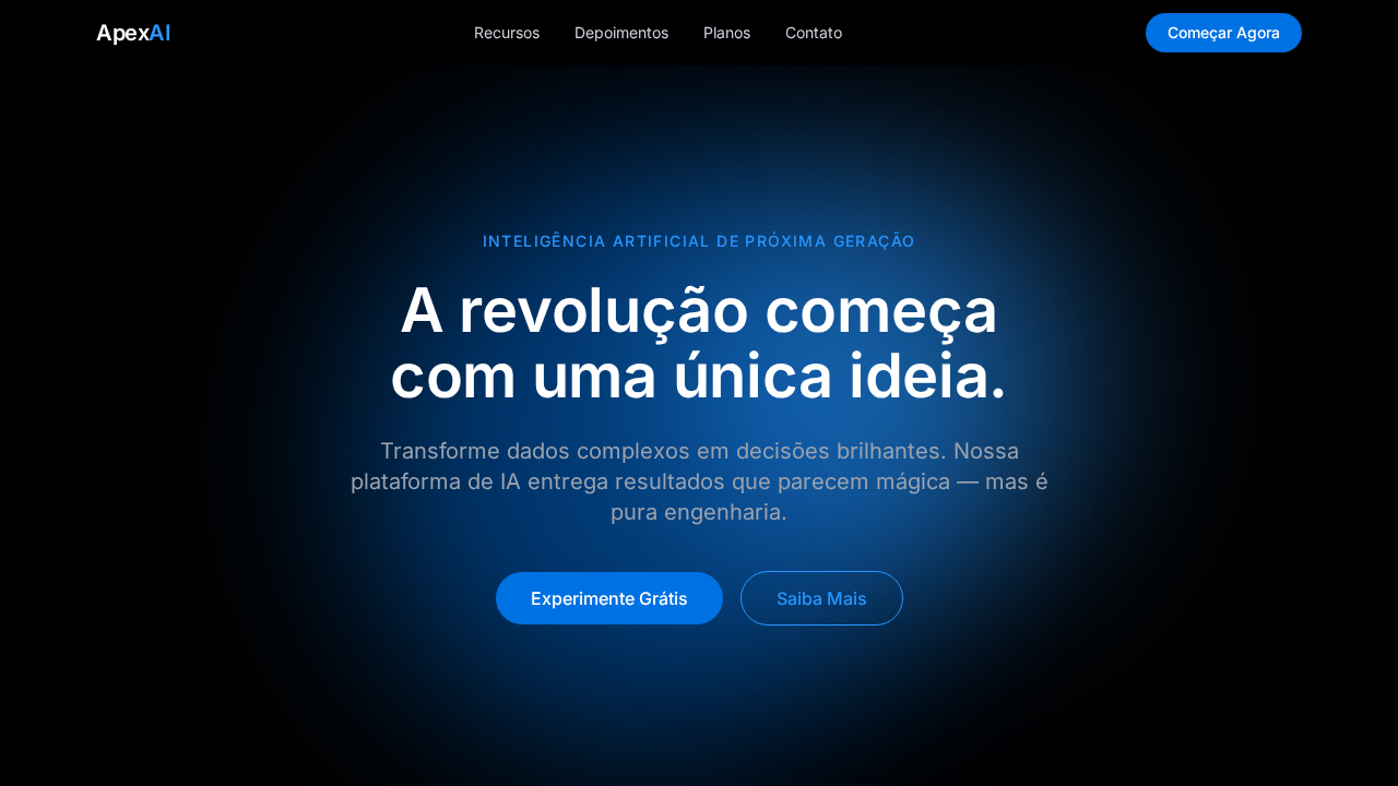
Historical Context
Apple didn't invent dark backgrounds or minimal typography — but they made everyone else look like amateurs trying it. The shift started around 2016 with the iPhone 7 product pages: black canvas, SF Pro in massive weights, and scroll-triggered animations that made a phone feel like a spacecraft. Before this, tech marketing was cluttered — spec sheets, comparison tables, lifestyle photography fighting for attention. Apple stripped it all away and let the product float in void. The cinematic scroll — that parallax-driven reveal where hardware rotates, text fades in at precise moments, and the page itself becomes a choreographed experience — redefined what a product page could be. It wasn't just marketing; it was interaction design applied to storytelling. SF Pro gave them typographic control no other brand had: a typeface designed for screens, optimized at every weight, readable at 200px headlines and 14px body alike. Every premium SaaS landing page you've seen since 2018 owes something to this language. The dark hero, the oversized type, the scroll-driven reveals — it's Apple's aesthetic democratized. Some pull it off. Most don't, because they copy the surface without understanding the restraint underneath.
When to Use
When your product deserves to be presented as an object of desire, not explained with bullet points. Premium hardware, high-end SaaS with visual products, developer tools that want to signal craft, Apple-ecosystem apps that need to feel native to the brand's world. Works when you have strong product visuals — 3D renders, hardware photography, UI screenshots worth showcasing. Falls apart instantly if your product isn't visually compelling or if you lack the engineering budget for smooth scroll animations. This is a high-commitment aesthetic: half-assed execution looks worse than not trying.
Design Principles
- Negative space is the product's stage — every pixel of black background is intentional, giving hardware and UI room to command attention without competing elements
- Typography carries the entire narrative weight — SF Pro or equivalent optical-size fonts at extreme scale contrasts (80px+ headlines against 16px body), no decorative type, no gradients on text
- Scroll is choreography, not decoration — every animation serves revelation timing, hardware rotates to show craftsmanship, text appears when the eye needs context, nothing moves without narrative purpose
- Color is surgical — monochrome dominates, with product color as the only accent; if you add a blue gradient or a purple glow, it better be the actual product finish, not decoration
- Restraint over feature-dumping — one idea per viewport, one product angle per scroll section, trust that less information presented beautifully converts better than comprehensive information presented generically
DESIGN.md
---
version: "alpha"
name: "Apple Premium Cinematic"
description: "Premium Apple-style landing page with binary light/dark section rhythm. Ideal for produtos premium, technology, eletrônicos, marcas de luxo. AI-ready template."
colors:
  primary: "#000000"
  secondary: "#f5f5f7"
  tertiary: "#1d1d1f"
  neutral: "#0071e3"
  surface: "#0066cc"
  accent: "#2997ff"
typography:
  h1:
    fontFamily: SF Pro Display
    fontSize: 2.25rem
    fontWeight: 700
  body-md:
    fontFamily: SF Pro Display
    fontSize: 1rem
    fontWeight: 400
  label-caps:
    fontFamily: SF Pro Display
    fontSize: 0.75rem
    fontWeight: 500
rounded:
  sm: 980px
  md: 1960px
  lg: 2940px
components:
  button-primary:
    backgroundColor: "{colors.primary}"
    textColor: "{colors.neutral}"
    rounded: "{rounded.sm}"
    padding: 12px
---

## Overview

Premium Apple-style landing page with binary light/dark section rhythm. Ideal for produtos premium, technology, eletrônicos, marcas de luxo. AI-ready template. Apple didn't invent dark backgrounds or minimal typography — but they made everyone else look like amateurs trying it. The shift started around 2016 with the iPhone 7 product pages: black canvas, SF Pro in massive weights, and scroll-triggered animations that made a phone feel like a spacecraft. Before this, tech marketing was cluttered — spec sheets, comparison tables, lifestyle photography fighting for attention. Apple stripped it all away and let the product float in void.

The cinematic scroll — that parallax-driven reveal where hardware rotates, text fades in at precise moments, and the page itself becomes a choreographed experience — redefined what a product page could be. It wasn't just marketing; it was interaction design applied to storytelling. SF Pro gave them typographic control no other brand had: a typeface designed for screens, optimized at every weight, readable at 200px headlines and 14px body alike.

Every premium SaaS landing page you've seen since 2018 owes something to this language. The dark hero, the oversized type, the scroll-driven reveals — it's Apple's aesthetic democratized. Some pull it off. Most don't, because they copy the surface without understanding the restraint underneath.

- Density: 3/10 — Airy
- Variance: 2/10 — Structured
- Motion: 8/10 — Cinematic

- **Style:** Minimalismo Premium, Cinematic, Product-Hero, Binary Light/Dark
- **Keywords:** apple, SF Pro, minimalismo premium, cinematic, product-hero, binary light/dark, pill CTA, translucent nav, whitespace, billboard headlines
- **Era:** 2024-2026 Apple Premium
- **Light/Dark:** ✓ Full / ✓ Full

## Colors

- **Preto Puro** (#000000) — Dark surface, primary background
- **Cinza Claro** (#f5f5f7) — Secondary text, borders, muted elements
- **Quase Preto** (#1d1d1f) — Dark surface, primary background
- **Azul Apple** (#0071e3) — Accent highlight, links and focus states
- **Azul Link** (#0066cc) — Primary text color
- **Azul Brilhante** (#2997ff) — Secondary accent
- **Branco** (#FFFFFF) — Secondary surface
- **** (rgba(0,0,0,0.8)) — Extended palette, decorative use


## Typography

- **Display / Hero:** SF Pro Display — Weight 700, tight tracking, used for headline impact
- **Accent:** SF Pro Text — Used for decorative or emphasis text
- **Body:** SF Pro Display — Weight 400, 16px/1.6 line-height, max 72ch per line
- **UI Labels / Captions:** SF Pro Display — 0.875rem, weight 500, slight letter-spacing
- **Monospace:** JetBrains Mono — Used for code, metadata, and technical values

Scale:
- Hero: clamp(2.5rem, 5vw, 4rem)
- H1: 2.25rem
- H2: 1.5rem
- Body: 1rem / 1.6
- Small: 0.875rem


## Layout

- **Grid:** CSS Grid primary. Max-width containment: 1280px centered with 1.5rem side padding.
- **Spacing rhythm:** Balanced. Base unit: 0.5rem (8px).
- **Section vertical gaps:** clamp(4rem, 8vw, 8rem).
- **Hero layout:** Split-screen (text left, visual right).
- **Feature sections:** Zig-zag alternating text+image rows. No 3-equal-columns.
- **Mobile collapse:** All multi-column layouts collapse below 768px. No horizontal overflow.
- **z-index contract:** base (0) / sticky-nav (100) / overlay (200) / modal (300) / toast (500).


## Elevation & Depth

Seções alternando entre fundo preto puro e cinza claro (#f5f5f7) criando ritmo cinematográfico. Navbar translúcida com backdrop-filter: saturate(180%) blur(20px) sobre rgba(0,0,0,0.8). CTAs pill-shaped com border-radius 980px. Headlines com line-height 1.07 ultra-comprimidas. Produto como herói em campos de cor sólida sem distrações.

- **Physics:** Spring — stiffness 120, damping 20. Confident, weighted transitions.
- **Entry animations:** Fade + translate-Y (16px → 0) over 540ms ease-out. Staggered cascades for lists: 120ms between items.
- **Hover states:** Scale(1.03) + shadow lift over 200ms.
- **Page transitions:** Fade + slide (300ms).
- **Performance:** Only transform and opacity animated. No layout-triggering properties.


## Shapes

Base corner radius: 980px. See rounded tokens in front matter for the full scale.


## Components

- **Primary Button:** Pill-shaped (9999px) shape. Accent color fill. Hover: 8% darken + subtle lift shadow. Active: -1px translate tactile press. Font weight 600. No outer glows.
- **Secondary / Ghost Button:** Outline variant. 1.5px border in muted color. Text in primary color. Hover: subtle background fill.
- **Cards:** Pill-shaped (9999px) corners. Surface background. Subtle shadow (0 2px 12px rgba(0,0,0,0.06)). 1px border stroke.
- **Inputs:** Label above input. 1px border stroke. Focus ring: 2px accent color offset 2px. Error text below in semantic red. No floating labels.
- **Navigation:** Primary surface background. Active item: accent color indicator. Font weight 500 when active.
- **Skeletons:** Shimmer animation matching component dimensions. No circular spinners.
- **Empty States:** Icon-based composition with descriptive text and action button.


## Do's and Don'ts

- No emojis in UI — use icon system only (Lucide, Heroicons)
- No decorative gradients — flat color only
- No shadows heavier than 0 2px 8px rgba(0,0,0,0.08)
- No pure white (#FFFFFF) backgrounds — use off-white or dark surfaces
- No oversaturated accent colors (saturation cap: 80%)
- No 3-column equal-width feature layouts — use zig-zag or asymmetric grid
- No `h-screen` — use `min-h-[100dvh]`
- No AI copywriting clichés: "Elevate", "Seamless", "Unleash", "Next-Gen"
- No broken external image links — use picsum.photos or inline SVG
- No generic lorem ipsum in demos

- Do Seções alternando preto/cinza claro
- Do Navbar translúcida com blur
- Do Headlines SF Pro 56px weight 600 line-height 1.07
- Do Único acento azul #0071e3
- Do CTAs pill 980px radius
- Do Produto como herói em fundo sólido
- Do Whitespace cinematográfico entre seções
- Do Responsivo


## Use Case

Products premium, Technology, Eletrônicos, Luxury brands
Technical Specs
CSS
font-family: 'SF Pro Display', 'SF Pro Text', 'Helvetica Neue', sans-serif; background alternating #000000 and #f5f5f7; color: #1d1d1f on light, #ffffff on dark; accent: #0071e3; border-radius: 980px for pills, 8px for buttons; backdrop-filter: saturate(180%) blur(20px); line-height: 1.07 for headlines; letter-spacing: -0.28px
Variables
--bg-dark: #000000; --bg-light: #f5f5f7; --text-dark: #1d1d1f; --text-light: #ffffff; --accent: #0071e3; --link: #0066cc; --link-dark: #2997ff; --nav-bg: rgba(0,0,0,0.8); --radius-pill: 980px; --radius-btn: 8px
Checklist
☐ Seções alternando preto/cinza claro, ☐ Navbar translúcida com blur, ☐ Headlines SF Pro 56px weight 600 line-height 1.07, ☐ Único acento azul #0071e3, ☐ CTAs pill 980px radius, ☐ Produto como herói em fundo sólido, ☐ Whitespace cinematográfico entre seções, ☐ Responsivo
Colors
Primary
Secondary
Effects
Seções alternando entre fundo preto puro e cinza claro (#f5f5f7) criando ritmo cinematográfico. Navbar translúcida com backdrop-filter: saturate(180%) blur(20px) sobre rgba(0,0,0,0.8). CTAs pill-shaped com border-radius 980px. Headlines com line-height 1.07 ultra-comprimidas. Produto como herói em campos de cor sólida sem distrações.
Light/Dark
✓ Full / ✓ Full
AI Prompt
Act as a Senior Frontend Engineer and Expert UI Designer.
Your task is to code a complete Landing Page on the first attempt.
- Landing Page Theme: <INSERT THEME>
- Sections to add: <INSERT SECTIONS>

Generate the final code immediately following these definitions:

## Style

- **Name:** Apple Premium Cinematic
- **Type:** Minimalismo Premium, Cinematic, Product-Hero, Binary Light/Dark
- **Keywords:** apple, SF Pro, minimalismo premium, cinematic, product-hero, binary light/dark, pill CTA, translucent nav, whitespace, billboard headlines
- **Era:** 2024-2026 Apple Premium
- **Light/Dark:** ✓ Full / ✓ Full

## Color Palette

- **Primary:** Preto Puro #000000, Cinza Claro #f5f5f7, Quase Preto #1d1d1f, Azul Apple #0071e3
- **Secondary:** Azul Link #0066cc, Azul Brilhante #2997ff, Branco #FFFFFF, Preto 80% rgba(0,0,0,0.8)

## Visual Effects

Seções alternando entre fundo preto puro e cinza claro (#f5f5f7) criando ritmo cinematográfico. Navbar translúcida com backdrop-filter: saturate(180%) blur(20px) sobre rgba(0,0,0,0.8). CTAs pill-shaped com border-radius 980px. Headlines com line-height 1.07 ultra-comprimidas. Produto como herói em campos de cor sólida sem distrações.

## AI Visual Direction

Design a premium Apple-style landing page with binary light/dark section rhythm. Pure black (#000000) hero alternating with light gray (#f5f5f7) sections. SF Pro Display headlines at 56px weight 600, line-height 1.07, letter-spacing -0.28px. Single accent color Apple Blue (#0071e3) for CTAs only. Pill-shaped CTAs with 980px radius. Translucent dark glass navbar with backdrop-filter saturate(180%) blur(20px). Product-as-hero photography on solid color fields. Extreme whitespace between sections.

## CSS Technical

```css
font-family: 'SF Pro Display', 'SF Pro Text', 'Helvetica Neue', sans-serif; background alternating #000000 and #f5f5f7; color: #1d1d1f on light, #ffffff on dark; accent: #0071e3; border-radius: 980px for pills, 8px for buttons; backdrop-filter: saturate(180%) blur(20px); line-height: 1.07 for headlines; letter-spacing: -0.28px
```

## Design System Variables

```css
--bg-dark: #000000; --bg-light: #f5f5f7; --text-dark: #1d1d1f; --text-light: #ffffff; --accent: #0071e3; --link: #0066cc; --link-dark: #2997ff; --nav-bg: rgba(0,0,0,0.8); --radius-pill: 980px; --radius-btn: 8px
```

## Implementation Checklist

- ☐ Seções alternando preto/cinza claro
- ☐ Navbar translúcida com blur
- ☐ Headlines SF Pro 56px weight 600 line-height 1.07
- ☐ Único acento azul #0071e3
- ☐ CTAs pill 980px radius
- ☐ Produto como herói em fundo sólido
- ☐ Whitespace cinematográfico entre seções
- ☐ Responsivo

## Execution Rules

1. Strictly follow the defined visual style.
2. Use high-quality inline SVG icons (Heroicons or Lucide style) — NEVER use emojis as icons.
3. Add `cursor-pointer` and smooth `hover` states (transition-all) on all interactive elements.
4. Required Page Structure:
   - Navbar (Logo + Links + CTA)
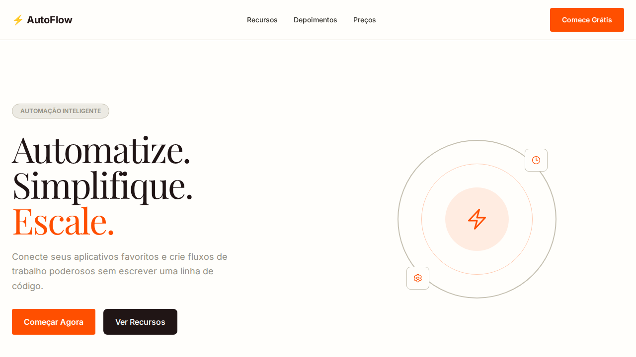
   - Hero Section (Impactful Headline + Subtitle + 2 buttons + 3D/Abstract visual element via CSS)
   - Features (3 cards with icons)
   - Testimonials (3 cards)
   - Pricing (3 tiers, highlight the middle one)
   - Final CTA
   - Full Footer with social links, privacy policy, terms of use, contact and SEO links.
5. All text content must be in English.
6. The visual must be CLEARLY distinct — do not create a "default Bootstrap" design. Force the use of the provided design system variables.
7. Use `<style>` tags in the head for custom classes (especially for complex backdrop-filter effects and animations) that Tailwind CDN doesn't cover.
8. Full Responsiveness: Layout must adapt perfectly to Mobile, Tablet and Desktop (vertical stack on mobile).
9. Include basic SEO, Viewport and Open Graph meta tags in `<head>`.
10. Footer must contain: Copyright 2026, Secondary navigation links and Social media icons.
11. Make the creative decisions needed to deliver the complete, functional result now.
Related

Last synced: 4/1/2026