Anime Battle
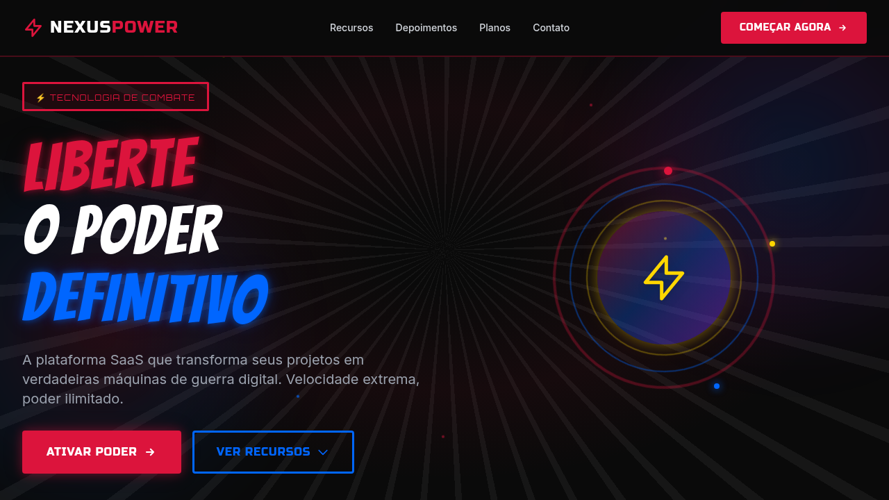
Design an anime battle-style landing page with intense, dynamic energy. Ideal for games, esports, entertainment, fan sites, streaming de anime. AI-ready template.
Use case: Games, Esports, Entertainment, Fan sites, Streaming de anime
Historical Context
The anime battle aesthetic didn't emerge from nowhere — it's the direct descendant of 1970s manga panel composition, where artists like Go Nagai and Kazuo Koike figured out how to make static ink feel violent. Speed lines, exaggerated foreshortening, and impossible anatomy weren't mistakes. They were solutions to a print medium that couldn't move. When anime hit television, those conventions translated into limited animation shortcuts that became style signatures. Toei's cost-saving techniques — held frames with radiating backgrounds, impact flashes, dramatic zoom-ins — accidentally created an entire visual grammar. By the time Dragon Ball Z and Saint Seiya dominated the late '80s, the "battle pose against an energy burst" was as codified as Swiss grid typography. The retro-pop revival we're seeing now strips these conventions back to their graphic roots. It's less about faithful recreation and more about extracting the raw kinetic energy — the diagonal compositions, the contrast explosions, the sense that something is about to break the frame. Designers working in gaming and esports recognized that this visual language communicates intensity faster than any Western equivalent.
When to Use
Deploy this when your interface needs to feel like a punch. Fighting game character selects, esports tournament brackets, anime streaming hero sections, gacha pull animations — anywhere the user expects adrenaline before they even interact. It works because the visual language is pre-loaded in your audience's brain. They already know what speed lines mean. Don't use it for anything requiring calm or trust. This aesthetic screams action, and it will overwhelm content that needs breathing room.
Design Principles
- Diagonal dominance — tilt your composition axis 15-45° off vertical. Straight grids kill the energy immediately. Every major element should feel like it's falling forward.
- Contrast as violence — push your value range to extremes. Deep blacks against blown-out highlights. No gentle gradients. The transition between light and dark should feel like a cut, not a fade.
- Speed lines are structural, not decorative — they define the direction of force in your layout. Use them to guide the eye along your intended reading path, not as background filler.
- Contained chaos — the energy works because it has borders. Manga panels, character frames, UI cards — give the dynamism hard edges to push against. Unbounded chaos is just noise.
- Scale breaks communicate power — one element should be disproportionately large. The hierarchy isn't subtle. If everything is the same size, nothing feels powerful.
DESIGN.md
---
version: "alpha"
name: "Anime Battle"
description: "Design an anime battle-style landing page with intense, dynamic energy. Ideal for games, esports, entertainment, fan sites, streaming de anime. AI-ready template."
colors:
  primary: "#DC143C"
  secondary: "#0066FF"
  tertiary: "#0A0A0A"
  neutral: "#FFD700"
  surface: "#9B30FF"
  accent: "#FFFFFF"
typography:
  h1:
    fontFamily: System UI stack
    fontSize: 2.25rem
    fontWeight: 700
  body-md:
    fontFamily: System UI stack
    fontSize: 1rem
    fontWeight: 400
  label-caps:
    fontFamily: System UI stack
    fontSize: 0.75rem
    fontWeight: 500
components:
  button-primary:
    backgroundColor: "{colors.primary}"
    textColor: "{colors.neutral}"
    padding: 12px
---

## Overview

Design an anime battle-style landing page with intense, dynamic energy. Ideal for games, esports, entertainment, fan sites, streaming de anime. AI-ready template. The anime battle aesthetic didn't emerge from nowhere — it's the direct descendant of 1970s manga panel composition, where artists like Go Nagai and Kazuo Koike figured out how to make static ink feel violent. Speed lines, exaggerated foreshortening, and impossible anatomy weren't mistakes. They were solutions to a print medium that couldn't move.

When anime hit television, those conventions translated into limited animation shortcuts that became style signatures. Toei's cost-saving techniques — held frames with radiating backgrounds, impact flashes, dramatic zoom-ins — accidentally created an entire visual grammar. By the time Dragon Ball Z and Saint Seiya dominated the late '80s, the "battle pose against an energy burst" was as codified as Swiss grid typography.

The retro-pop revival we're seeing now strips these conventions back to their graphic roots. It's less about faithful recreation and more about extracting the raw kinetic energy — the diagonal compositions, the contrast explosions, the sense that something is about to break the frame. Designers working in gaming and esports recognized that this visual language communicates intensity faster than any Western equivalent.

- Density: 7/10 — Compact
- Variance: 7/10 — Dynamic
- Motion: 6/10 — Expressive

- **Style:** Dynamic, Intense, Action-Packed, Manga-Inspired
- **Keywords:** anime, manga, battle, action, speed lines, dynamic poses, intense colors, shonen, energy burst, dramatic
- **Era:** Japanese Manga/Anime (1990s-present)
- **Light/Dark:** ✗ No / ✓ Only

## Colors

- **Crimson Red** (#DC143C) — Error states, destructive actions
- **Electric Blue** (#0066FF) — Accent highlight, links and focus states
- **Deep Black** (#0A0A0A) — Dark surface, primary background
- **Energy Gold** (#FFD700) — Premium accent, decorative highlights
- **Plasma Purple** (#9B30FF) — Accent color, emphasis elements
- **Lightning White** (#FFFFFF) — Secondary surface
- **Impact Orange** (#FF6600) — Warm accent, call-to-action secondary


## Typography

- **Display / Hero:** System UI stack (-apple-system, sans-serif) — Weight 700, tight tracking, used for headline impact
- **Body:** System UI stack (-apple-system, sans-serif) — Weight 400, 16px/1.6 line-height, max 72ch per line
- **UI Labels / Captions:** System UI stack (-apple-system, sans-serif) — 0.875rem, weight 500, slight letter-spacing
- **Monospace:** JetBrains Mono — Used for code, metadata, and technical values

Scale:
- Hero: clamp(2.5rem, 5vw, 4rem)
- H1: 2.25rem
- H2: 1.5rem
- Body: 1rem / 1.6
- Small: 0.875rem


## Layout

- **Grid:** CSS Grid primary. Max-width containment: 1280px centered with 1.5rem side padding.
- **Spacing rhythm:** Balanced. Base unit: 0.5rem (8px).
- **Section vertical gaps:** clamp(4rem, 8vw, 8rem).
- **Hero layout:** Asymmetric composition.
- **Feature sections:** Asymmetric grid with varied card sizes. No 3-equal-columns.
- **Mobile collapse:** All multi-column layouts collapse below 768px. No horizontal overflow.
- **z-index contract:** base (0) / sticky-nav (100) / overlay (200) / modal (300) / toast (500).


## Elevation & Depth

Speed lines radiating from center (CSS radial gradients), energy burst glow effects, dramatic diagonal layouts, screen-shake animation on hover, bold manga-style borders (3-4px), intense text-shadow for impact typography

- **Physics:** Spring — stiffness 120, damping 20. Confident, weighted transitions.
- **Entry animations:** Fade + translate-Y (16px → 0) over 480ms ease-out. Staggered cascades for lists: 100ms between items.
- **Hover states:** Scale(1.03) + shadow lift over 200ms.
- **Page transitions:** Fade + slide (300ms).
- **Performance:** Only transform and opacity animated. No layout-triggering properties.


## Shapes

Base corner radius: 0px. See rounded tokens in front matter for the full scale.


## Components

- **Primary Button:** Sharp edges (0px) shape. Accent color fill. Hover: 8% darken + subtle lift shadow. Active: -1px translate tactile press. Font weight 600. No outer glows.
- **Secondary / Ghost Button:** Outline variant. 1.5px border in muted color. Text in primary color. Hover: subtle background fill.
- **Cards:** Sharp edges (0px) corners. Surface background. Subtle shadow (0 2px 12px rgba(0,0,0,0.06)). 1px border stroke.
- **Inputs:** Label above input. 1px border stroke. Focus ring: 2px accent color offset 2px. Error text below in semantic red. No floating labels.
- **Navigation:** Primary surface background. Active item: accent color indicator. Font weight 500 when active.
- **Skeletons:** Shimmer animation matching component dimensions. No circular spinners.
- **Empty States:** Icon-based composition with descriptive text and action button.


## Do's and Don'ts

- No emojis in UI — use icon system only (Lucide, Heroicons)
- No pure black (#000000) — use off-black or charcoal variants
- No oversaturated accent colors (saturation cap: 80%)
- No 3-column equal-width feature layouts — use zig-zag or asymmetric grid
- No `h-screen` — use `min-h-[100dvh]`
- No AI copywriting clichés: "Elevate", "Seamless", "Unleash", "Next-Gen"
- No broken external image links — use picsum.photos or inline SVG
- No generic lorem ipsum in demos

- Do Speed lines visible
- Do Manga-style thick borders
- Do Dynamic diagonal layouts
- Do Energy glow effects
- Do Bold impactful typography
- Do Dark background with neon accents


## Use Case

Games, Esports, Entertainment, Fan sites, Streaming de anime
Technical Specs
CSS
background: radial-gradient for speed lines, border: 3-4px solid for manga panels, transform: skewY(-3deg) for dynamic angles, text-shadow: 0 0 20px for energy glow, animation: shake 0.3s for impact, clip-path: polygon() for angular sections, box-shadow: 0 0 30px neon-color for energy bursts
Variables
--speed-line-color: rgba(255,255,255,0.1), --border-manga: 3px solid #000, --skew-angle: -3deg, --glow-intensity: 20px, --impact-shake: 3px, --energy-color: #FFD700
Checklist
☐ Speed lines visible, ☐ Manga-style thick borders, ☐ Dynamic diagonal layouts, ☐ Energy glow effects, ☐ Bold impactful typography, ☐ Dark background with neon accents
Colors
Primary
Secondary
Effects
Speed lines radiating from center (CSS radial gradients), energy burst glow effects, dramatic diagonal layouts, screen-shake animation on hover, bold manga-style borders (3-4px), intense text-shadow for impact typography
Light/Dark
✗ No / ✓ Only
AI Prompt
Act as a Senior Frontend Engineer and Expert UI Designer.
Your task is to code a complete Landing Page on the first attempt.
- Landing Page Theme: <INSERT THEME>
- Sections to add: <INSERT SECTIONS>

Generate the final code immediately following these definitions:

## Style

- **Name:** Anime Battle
- **Type:** Dynamic, Intense, Action-Packed, Manga-Inspired
- **Keywords:** anime, manga, battle, action, speed lines, dynamic poses, intense colors, shonen, energy burst, dramatic
- **Era:** Japanese Manga/Anime (1990s-present)
- **Light/Dark:** ✗ No / ✓ Only

## Color Palette

- **Primary:** Crimson Red #DC143C, Electric Blue #0066FF, Deep Black #0A0A0A
- **Secondary:** Energy Gold #FFD700, Plasma Purple #9B30FF, Lightning White #FFFFFF, Impact Orange #FF6600

## Visual Effects

Speed lines radiating from center (CSS radial gradients), energy burst glow effects, dramatic diagonal layouts, screen-shake animation on hover, bold manga-style borders (3-4px), intense text-shadow for impact typography

## AI Visual Direction

Design an anime battle-style landing page with intense, dynamic energy. Use speed lines radiating from focal points, bold diagonal layouts, manga-style thick borders, energy burst effects with glowing gradients. Typography should be bold, impactful, and slightly tilted. Dark background with vibrant neon accents. Include action-pose inspired section dividers and dramatic lighting effects.

## CSS Technical

```css
background: radial-gradient for speed lines, border: 3-4px solid for manga panels, transform: skewY(-3deg) for dynamic angles, text-shadow: 0 0 20px for energy glow, animation: shake 0.3s for impact, clip-path: polygon() for angular sections, box-shadow: 0 0 30px neon-color for energy bursts
```

## Design System Variables

```css
--speed-line-color: rgba(255,255,255,0.1), --border-manga: 3px solid #000, --skew-angle: -3deg, --glow-intensity: 20px, --impact-shake: 3px, --energy-color: #FFD700
```

## Implementation Checklist

- ☐ Speed lines visible
- ☐ Manga-style thick borders
- ☐ Dynamic diagonal layouts
- ☐ Energy glow effects
- ☐ Bold impactful typography
- ☐ Dark background with neon accents

## Execution Rules

1. Strictly follow the defined visual style.
2. Use high-quality inline SVG icons (Heroicons or Lucide style) — NEVER use emojis as icons.
3. Add `cursor-pointer` and smooth `hover` states (transition-all) on all interactive elements.
4. Required Page Structure:
   - Navbar (Logo + Links + CTA)
   - Hero Section (Impactful Headline + Subtitle + 2 buttons + 3D/Abstract visual element via CSS)
   - Features (3 cards with icons)
   - Testimonials (3 cards)
   - Pricing (3 tiers, highlight the middle one)
   - Final CTA
   - Full Footer with social links, privacy policy, terms of use, contact and SEO links.
5. All text content must be in English.
6. The visual must be CLEARLY distinct — do not create a "default Bootstrap" design. Force the use of the provided design system variables.
7. Use `<style>` tags in the head for custom classes (especially for complex backdrop-filter effects and animations) that Tailwind CDN doesn't cover.
8. Full Responsiveness: Layout must adapt perfectly to Mobile, Tablet and Desktop (vertical stack on mobile).
9. Include basic SEO, Viewport and Open Graph meta tags in `<head>`.
10. Footer must contain: Copyright 2026, Secondary navigation links and Social media icons.
11. Make the creative decisions needed to deliver the complete, functional result now.
Related
Last synced: 4/1/2026