8-Bit Retro Terminal
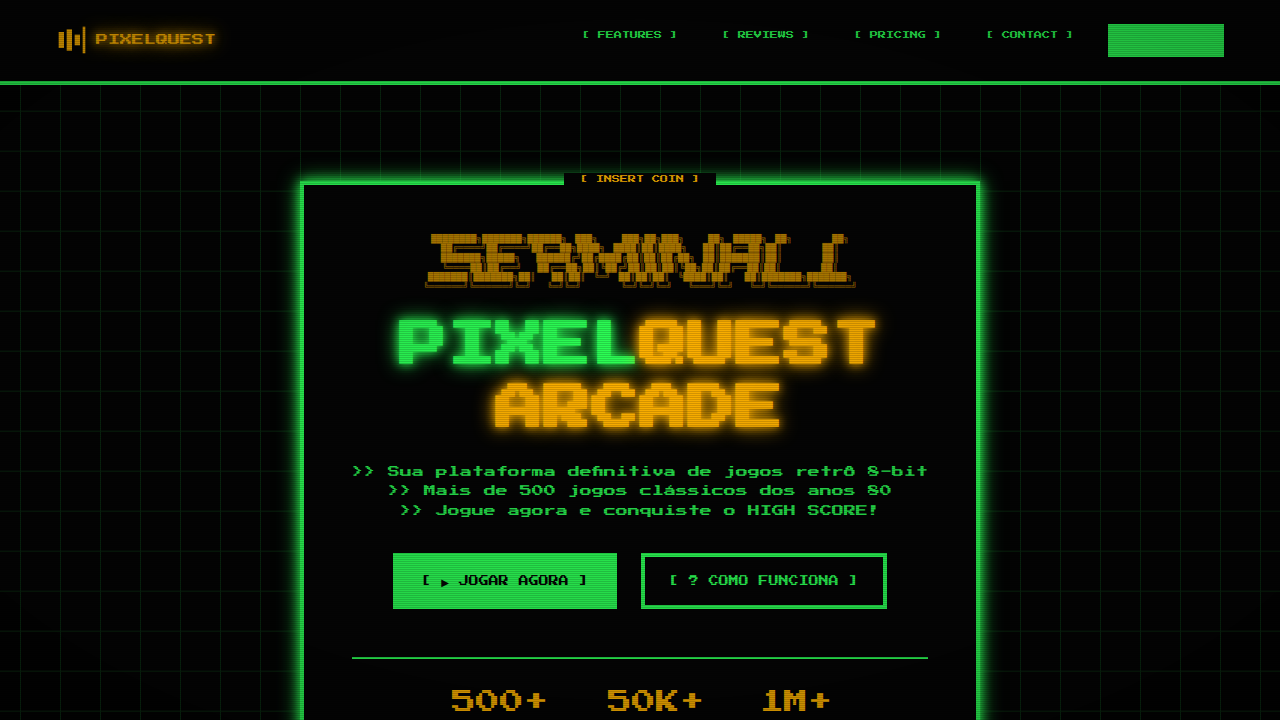
8-bit landing page, retro terminal style, pixel art, green phosphor text, scanlines, arcade game aesthetic. Ideal for landing pages, modern websites. AI-ready template.
Use case: Landing pages, Modern websites
Historical Context
Before screens could render curves, before anti-aliasing existed as a concept, every character lived on a grid. The Commodore 64 gave you 40 columns and 25 rows. DOS handed you green phosphor on black. The early Macintosh — despite its GUI ambitions — still rendered Chicago in bitmaps, every letter a tiny sculpture of on/off pixels. These weren't aesthetic choices. They were physics. CRT electron guns, limited VRAM, 8-bit address buses that could only think in powers of two. Designers worked within brutal constraints: monospaced type because proportional spacing cost too many cycles, blocky cursors because sub-pixel rendering was decades away, scan lines because that's literally how the beam drew. Then something happened. The constraints disappeared but the look didn't. Somewhere in the late 2000s, indie developers and digital artists started reaching back — not out of laziness, but recognition. Those limitations had produced something genuinely beautiful. The grid wasn't a cage. It was a composition tool. The low resolution forced clarity. Every pixel earned its place.
When to Use
When you want immediate nostalgia without explanation. Retro game interfaces, developer tools that wear their nerdiness proudly, indie titles that signal craft over budget. Works brilliantly for CLI-inspired SaaS dashboards, hacker-themed products, or anything targeting people who remember — or romanticize — the days when computers felt like magic boxes rather than appliances. Avoid if your audience skews toward luxury or corporate polish.
Design Principles
- Honor the grid absolutely — every element snaps to pixel boundaries, no sub-pixel rendering, no fractional positioning
- Monospace is non-negotiable — proportional fonts break the illusion instantly, choose faces like IBM Plex Mono, Berkeley Mono, or press-start-2p for display
- Color palettes stay small and saturated — pull from real hardware (C64's 16 colors, CGA's cyan-magenta-white, Game Boy's four greens) rather than inventing arbitrary retro-ish schemes
- Animation happens in discrete steps — no easing curves, no smooth transitions, movement jumps frame-to-frame like sprite animation on hardware that couldn't interpolate
- Embrace the cursor as interaction metaphor — blinking block cursors, text-based feedback, command-line patterns for navigation signal authenticity over decoration
DESIGN.md
---
version: "alpha"
name: "8-Bit Retro Terminal"
description: "8-bit landing page, retro terminal style, pixel art, green phosphor text, scanlines, arcade game aesthetic. Ideal for landing pages, modern websites. AI-ready template."
colors:
  primary: "#050505"
  secondary: "#2CFF56"
  tertiary: "#FFB200"
  neutral: "#FFFFFF"
  surface: "#FFD700"
  accent: "#FF0000"
typography:
  h1:
    fontFamily: Press Start 2P
    fontSize: 2.5rem
    fontWeight: 700
  body-md:
    fontFamily: Press Start 2P
    fontSize: 1rem
    fontWeight: 400
components:
  button-primary:
    backgroundColor: "{colors.primary}"
    textColor: "{colors.neutral}"
    padding: 12px
---

## Overview

8-bit landing page, retro terminal style, pixel art, green phosphor text, scanlines, arcade game aesthetic. Ideal for landing pages, modern websites. AI-ready template. Before screens could render curves, before anti-aliasing existed as a concept, every character lived on a grid. The Commodore 64 gave you 40 columns and 25 rows. DOS handed you green phosphor on black. The early Macintosh — despite its GUI ambitions — still rendered Chicago in bitmaps, every letter a tiny sculpture of on/off pixels.

These weren't aesthetic choices. They were physics. CRT electron guns, limited VRAM, 8-bit address buses that could only think in powers of two. Designers worked within brutal constraints: monospaced type because proportional spacing cost too many cycles, blocky cursors because sub-pixel rendering was decades away, scan lines because that's literally how the beam drew.

Then something happened. The constraints disappeared but the look didn't. Somewhere in the late 2000s, indie developers and digital artists started reaching back — not out of laziness, but recognition. Those limitations had produced something genuinely beautiful. The grid wasn't a cage. It was a composition tool. The low resolution forced clarity. Every pixel earned its place.

- Density: 8/10 — Dense
- Variance: 7/10 — Dynamic
- Motion: 4/10 — Subtle

- **Style:** Technical, Nostalgic, Cryptic
- **Keywords:** 8-bit, retro, pixel, terminal, green, arcade, game, console
- **Era:** 80s Computing
- **Light/Dark:** ✗ No / ✓ Full

## Colors

- **Background** (#050505) — Primary background surface
- **Text** (#2CFF56) — Primary text color
- **Accent** (#FFB200) — Primary accent, CTAs and interactive elements
- **Pixel White** (#FFFFFF) — Secondary surface
- **Coin Yellow** (#FFD700) — Warning states, attention indicators
- **Heart Red** (#FF0000) — Error states, destructive actions


## Typography

- **Display / Hero:** Press Start 2P — Weight 700, tight tracking, used for headline impact
- **Body:** Press Start 2P — Weight 400, 16px/1.6 line-height, max 72ch per line
- **UI Labels / Captions:** Press Start 2P — 0.875rem, weight 500, slight letter-spacing
- **Monospace:** JetBrains Mono — Used for code, metadata, and technical values

Scale:
- Hero: clamp(2.5rem, 5vw, 4rem)
- H1: 2.25rem
- H2: 1.5rem
- Body: 1rem / 1.6
- Small: 0.875rem


## Layout

- **Grid:** CSS Grid primary. Max-width containment: 1280px centered with 1.5rem side padding.
- **Spacing rhythm:** Balanced. Base unit: 0.5rem (8px).
- **Section vertical gaps:** clamp(4rem, 8vw, 8rem).
- **Hero layout:** Asymmetric composition.
- **Feature sections:** Asymmetric grid with varied card sizes. No 3-equal-columns.
- **Mobile collapse:** All multi-column layouts collapse below 768px. No horizontal overflow.
- **z-index contract:** base (0) / sticky-nav (100) / overlay (200) / modal (300) / toast (500).


## Elevation & Depth

ASCII art, pixel-art iconography, binary strings, bracket-style terminal frames, CRT monitor phosphor glow, scanlines.

- **Physics:** Ease-out curves, 200-300ms duration. Smooth and predictable.
- **Entry animations:** Fade + translate-Y (16px → 0) over 420ms ease-out. Staggered cascades for lists: 80ms between items.
- **Hover states:** Subtle color shift + shadow adjustment over 200ms.
- **Page transitions:** Fade only (200ms).
- **Performance:** Only transform and opacity animated. No layout-triggering properties.


## Shapes

Base corner radius: 8px. See rounded tokens in front matter for the full scale.


## Components

- **Primary Button:** Subtly rounded (0.5rem) shape. Accent color fill. Hover: 8% darken + subtle lift shadow. Active: -1px translate tactile press. Font weight 600. No outer glows.
- **Secondary / Ghost Button:** Outline variant. 1.5px border in muted color. Text in primary color. Hover: subtle background fill.
- **Cards:** Subtly rounded (0.5rem) corners. Surface background. Subtle shadow (0 2px 12px rgba(0,0,0,0.06)). 1px border stroke.
- **Inputs:** Label above input. 1px border stroke. Focus ring: 2px accent color offset 2px. Error text below in semantic red. No floating labels.
- **Navigation:** Primary surface background. Active item: accent color indicator. Font weight 500 when active.
- **Skeletons:** Shimmer animation matching component dimensions. No circular spinners.
- **Empty States:** Icon-based composition with descriptive text and action button.


## Do's and Don'ts

- No emojis in UI — use icon system only (Lucide, Heroicons)
- No pure black (#000000) — use off-black or charcoal variants
- No oversaturated accent colors (saturation cap: 80%)
- No 3-column equal-width feature layouts — use zig-zag or asymmetric grid
- No `h-screen` — use `min-h-[100dvh]`
- No AI copywriting clichés: "Elevate", "Seamless", "Unleash", "Next-Gen"
- No broken external image links — use picsum.photos or inline SVG
- No generic lorem ipsum in demos

- Do Pixel art fonts/icons
- Do High contrast black/green/yellow
- Do Blocky layout elements
- Do CRT scanline overlay (optional)
- Do Arcade game references


## Use Case

Landing pages, Modern websites
Technical Specs
CSS
background-color: #050505; color: #2CFF56; font-family: 'Press Start 2P', cursive; image-rendering: pixelated; border: 4px solid #2CFF56;
Variables
--bg-pixel: #050505, --pixel-green: #2CFF56, --pixel-yellow: #FFB200, --font-pixel: 'Press Start 2P', cursive, --border-thick: 4px solid
Checklist
☐ Pixel art fonts/icons, ☐ High contrast black/green/yellow, ☐ Blocky layout elements, ☐ CRT scanline overlay (optional), ☐ Arcade game references
Colors
Primary
Secondary
Effects
ASCII art, pixel-art iconography, binary strings, bracket-style terminal frames, CRT monitor phosphor glow, scanlines.
Light/Dark
✗ No / ✓ Full
AI Prompt
Act as a Senior Frontend Engineer and Expert UI Designer.
Your task is to code a complete Landing Page on the first attempt.
- Landing Page Theme: <INSERT THEME>
- Sections to add: <INSERT SECTIONS>

Generate the final code immediately following these definitions:

## Style

- **Name:** 8-Bit Retro Terminal
- **Type:** Technical, Nostalgic, Cryptic
- **Keywords:** 8-bit, retro, pixel, terminal, green, arcade, game, console
- **Era:** 80s Computing
- **Light/Dark:** ✗ No / ✓ Full

## Color Palette

- **Primary:** Background #050505, Text #2CFF56, Accent #FFB200
- **Secondary:** Pixel White #FFFFFF, Coin Yellow #FFD700, Heart Red #FF0000

## Visual Effects

ASCII art, pixel-art iconography, binary strings, bracket-style terminal frames, CRT monitor phosphor glow, scanlines.

## AI Visual Direction

8-bit landing page, retro terminal style, pixel art, green phosphor text, scanlines, arcade game aesthetic.

## CSS Technical

```css
background-color: #050505; color: #2CFF56; font-family: 'Press Start 2P', cursive; image-rendering: pixelated; border: 4px solid #2CFF56;
```

## Design System Variables

```css
--bg-pixel: #050505, --pixel-green: #2CFF56, --pixel-yellow: #FFB200, --font-pixel: 'Press Start 2P', cursive, --border-thick: 4px solid
```

## Implementation Checklist

- ☐ Pixel art fonts/icons
- ☐ High contrast black/green/yellow
- ☐ Blocky layout elements
- ☐ CRT scanline overlay (optional)
- ☐ Arcade game references

## Execution Rules

1. Strictly follow the defined visual style.
2. Use high-quality inline SVG icons (Heroicons or Lucide style) — NEVER use emojis as icons.
3. Add `cursor-pointer` and smooth `hover` states (transition-all) on all interactive elements.
4. Required Page Structure:
   - Navbar (Logo + Links + CTA)
   - Hero Section (Impactful Headline + Subtitle + 2 buttons + 3D/Abstract visual element via CSS)
   - Features (3 cards with icons)
   - Testimonials (3 cards)
   - Pricing (3 tiers, highlight the middle one)
   - Final CTA
   - Full Footer with social links, privacy policy, terms of use, contact and SEO links.
5. All text content must be in English.
6. The visual must be CLEARLY distinct — do not create a "default Bootstrap" design. Force the use of the provided design system variables.
7. Use `<style>` tags in the head for custom classes (especially for complex backdrop-filter effects and animations) that Tailwind CDN doesn't cover.
8. Full Responsiveness: Layout must adapt perfectly to Mobile, Tablet and Desktop (vertical stack on mobile).
9. Include basic SEO, Viewport and Open Graph meta tags in `<head>`.
10. Footer must contain: Copyright 2026, Secondary navigation links and Social media icons.
11. Make the creative decisions needed to deliver the complete, functional result now.
Related
Last synced: 4/1/2026