xAI Brutalist Monospace
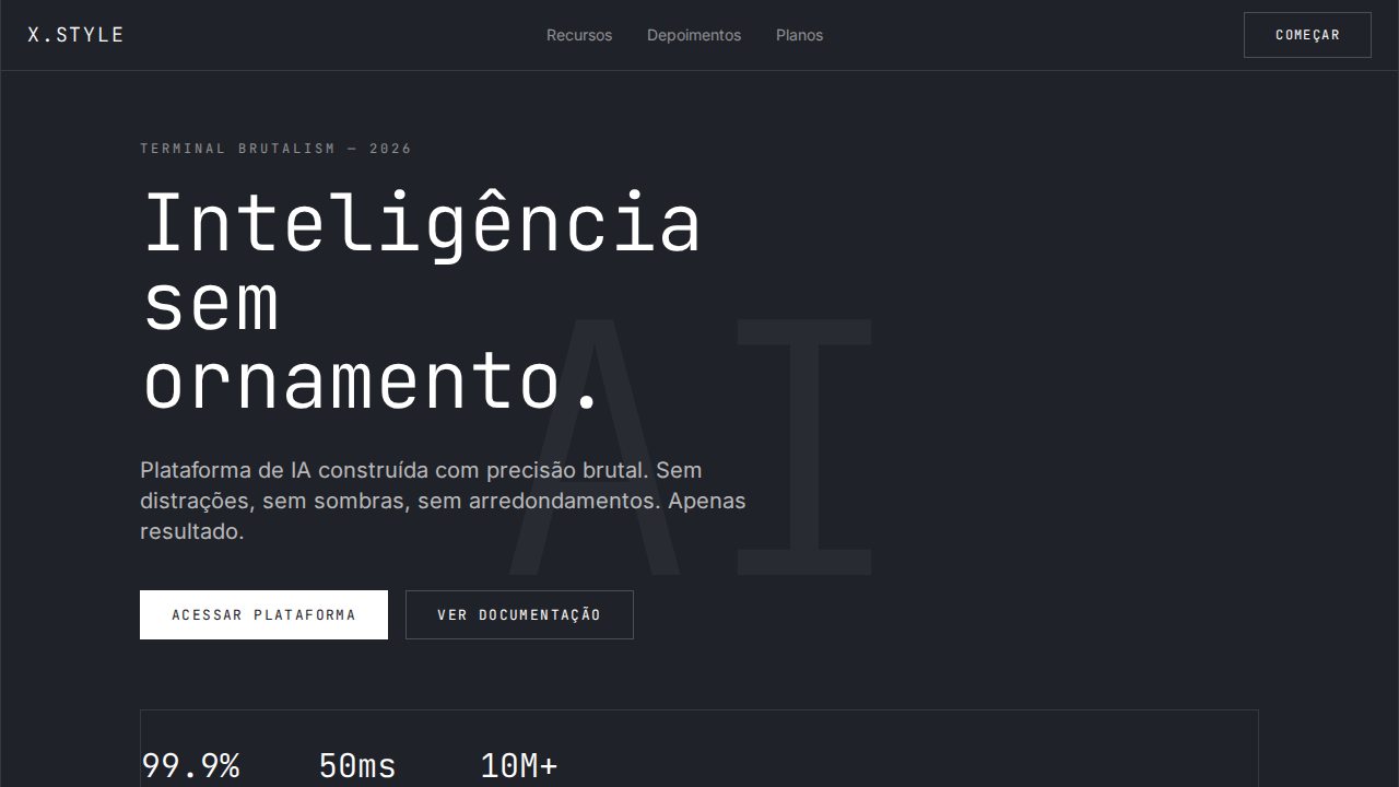
Design an xAI-inspired dark brutalist landing page. Ideal for labs de ia, pesquisa, plataformas técnicas, infraestrutura de modelos. AI-ready template.
Use case: Labs de IA, Pesquisa, Platforms técnicas, Infraestrutura de modelos
Historical Context
Brutalism in digital design owes nothing to concrete housing blocks and everything to the programmer's terminal. The monospaced grid — every character occupying identical width — was never an aesthetic choice. It was a hardware constraint. Teletype machines, CRT displays, punch cards: fixed-width was the only option. When proportional fonts arrived, monospace became a deliberate rejection of polish. It said: I don't need to seduce you. xAI's visual identity lands squarely in this lineage. Musk's AI venture adopted a stripped-back, monospaced brutalism that signals raw computation over corporate warmth. No rounded corners, no gradient softness, no brand-safe blue. The typography does the heavy lifting — dense, unapologetic, grid-locked. It's a direct descendant of early MIT AI Lab printouts and Bell Labs technical papers, filtered through the sensibility of someone who thinks interfaces should look like they're doing real work. This isn't nostalgia. It's a power move. When every AI company wraps itself in friendly sans-serifs and pastel palettes, choosing brutalist monospace communicates: we're building infrastructure, not consumer toys. The aesthetic carries implicit authority — the visual equivalent of showing your work.
When to Use
Deploy this system when your product needs to communicate technical credibility without explanation. AI research platforms, developer documentation, data-heavy dashboards, CLI-adjacent interfaces, and any tool where users expect density over comfort. It works when your audience already knows what they're looking at — engineers, researchers, technical founders. Avoid it for consumer onboarding or anything requiring emotional warmth. This aesthetic punishes casual users and rewards literate ones. That's the point.
Design Principles
- Fixed-width typography as structural grid — every element aligns to the character matrix, not arbitrary spacing tokens
- Information density over whitespace comfort — respect the reader's expertise by refusing to dumb down the layout
- Monochrome with surgical accent color — one highlight hue maximum, used only for state changes and interactive affordances
- Raw data visibility — expose the system's internals (timestamps, model versions, token counts) as first-class UI elements, not hidden metadata
- Zero decorative elements — if a component doesn't convey information or enable interaction, it doesn't exist
DESIGN.md
---
version: "alpha"
name: "xAI Brutalist Monospace"
description: "Design an xAI-inspired dark brutalist landing page. Ideal for labs de ia, pesquisa, plataformas técnicas, infraestrutura de modelos. AI-ready template."
colors:
  primary: "#1f2228"
  secondary: "#ffffff"
typography:
  h1:
    fontFamily: monospace for display/buttons
    fontSize: 2.25rem
    fontWeight: 700
  body-md:
    fontFamily: monospace for display/buttons
    fontSize: 1rem
    fontWeight: 400
  label-caps:
    fontFamily: monospace for display/buttons
    fontSize: 0.75rem
    fontWeight: 500
rounded:
  sm: 2px
  md: 4px
  lg: 8px
components:
  button-primary:
    backgroundColor: "{colors.primary}"
    rounded: "{rounded.sm}"
    padding: 12px
---

## Overview

Design an xAI-inspired dark brutalist landing page. Ideal for labs de ia, pesquisa, plataformas técnicas, infraestrutura de modelos. AI-ready template. Brutalism in digital design owes nothing to concrete housing blocks and everything to the programmer's terminal. The monospaced grid — every character occupying identical width — was never an aesthetic choice. It was a hardware constraint. Teletype machines, CRT displays, punch cards: fixed-width was the only option. When proportional fonts arrived, monospace became a deliberate rejection of polish. It said: I don't need to seduce you.

xAI's visual identity lands squarely in this lineage. Musk's AI venture adopted a stripped-back, monospaced brutalism that signals raw computation over corporate warmth. No rounded corners, no gradient softness, no brand-safe blue. The typography does the heavy lifting — dense, unapologetic, grid-locked. It's a direct descendant of early MIT AI Lab printouts and Bell Labs technical papers, filtered through the sensibility of someone who thinks interfaces should look like they're doing real work.

This isn't nostalgia. It's a power move. When every AI company wraps itself in friendly sans-serifs and pastel palettes, choosing brutalist monospace communicates: we're building infrastructure, not consumer toys. The aesthetic carries implicit authority — the visual equivalent of showing your work.

- Density: 8/10 — Dense
- Variance: 4/10 — Moderate
- Motion: 4/10 — Subtle

- **Style:** Dark Brutalist, Monospace Display, Zero Shadows, Dim-on-Hover, Sharp Corners
- **Keywords:** xAI, brutalist, monospace, dark, zero shadows, dim-on-hover, sharp corners, GeistMono, universalSans, terminal luxury
- **Era:** 2024-2026 Terminal Brutalism
- **Light/Dark:** ✗ Not Recommended / ✓ Full

## Colors

- **Escuro** (#1f2228) — Dark surface, primary background
- **Branco** (#ffffff) — Light surface, card backgrounds
- **** (rgba(255,255,255,0.5)) — Supporting palette color
- **** (rgba(255,255,255,0.1)) — Supporting palette color
- **** (rgba(255,255,255,0.2)) — Extended palette, decorative use
- **** (rgba(255,255,255,0.05)) — Extended palette, decorative use
- **** (rgba(255,255,255,0.03)) — Extended palette, decorative use
- **Ring Blue** (rgb(59,130,246)) — Secondary accent


## Typography

- **Display / Hero:** monospace for display/buttons — Weight 700, tight tracking, used for headline impact
- **Body:** monospace for display/buttons — Weight 400, 16px/1.6 line-height, max 72ch per line
- **UI Labels / Captions:** monospace for display/buttons — 0.875rem, weight 500, slight letter-spacing
- **Monospace:** monospace for display/buttons — Used for code, metadata, and technical values

Scale:
- Hero: clamp(2.5rem, 5vw, 4rem)
- H1: 2.25rem
- H2: 1.5rem
- Body: 1rem / 1.6
- Small: 0.875rem


## Layout

- **Grid:** CSS Grid primary. Max-width containment: 1280px centered with 1.5rem side padding.
- **Spacing rhythm:** Balanced. Base unit: 0.5rem (8px).
- **Section vertical gaps:** clamp(4rem, 8vw, 8rem).
- **Hero layout:** Split-screen (text left, visual right).
- **Feature sections:** Zig-zag alternating text+image rows. No 3-equal-columns.
- **Mobile collapse:** All multi-column layouts collapse below 768px. No horizontal overflow.
- **z-index contract:** base (0) / sticky-nav (100) / overlay (200) / modal (300) / toast (500).


## Elevation & Depth

Canvas dark near-black (#1f2228) com subtom azul quente. Monospace para display headlines em escala extrema (até 320px) weight 300. Botões uppercase monospace com letter-spacing 1.4px. Zero sombras em qualquer lugar. Cantos afiados (0px radius). Hover que DIMINUI opacidade para 0.5 (inverso da convenção). Profundidade via bordas de opacidade (rgba branco 0.1 padrão, 0.2 ativo). Hierarquia de texto via opacidade de branco (100%, 70%, 50%, 30%).

- **Physics:** Ease-out curves, 200-300ms duration. Smooth and predictable.
- **Entry animations:** Fade + translate-Y (16px → 0) over 420ms ease-out. Staggered cascades for lists: 80ms between items.
- **Hover states:** Subtle color shift + shadow adjustment over 200ms.
- **Page transitions:** Fade only (200ms).
- **Performance:** Only transform and opacity animated. No layout-triggering properties.


## Shapes

Base corner radius: 0px. See rounded tokens in front matter for the full scale.


## Components

- **Primary Button:** Sharp edges (0px) shape. Accent color fill. Hover: 8% darken + subtle lift shadow. Active: -1px translate tactile press. Font weight 600. No outer glows.
- **Secondary / Ghost Button:** Outline variant. 1.5px border in muted color. Text in primary color. Hover: subtle background fill.
- **Cards:** Sharp edges (0px) corners. Surface background. Subtle shadow (0 2px 12px rgba(0,0,0,0.06)). 1px border stroke.
- **Inputs:** Label above input. 1px border stroke. Focus ring: 2px accent color offset 2px. Error text below in semantic red. No floating labels.
- **Navigation:** Primary surface background. Active item: accent color indicator. Font weight 500 when active.
- **Skeletons:** Shimmer animation matching component dimensions. No circular spinners.
- **Empty States:** Icon-based composition with descriptive text and action button.


## Do's and Don'ts

- No emojis in UI — use icon system only (Lucide, Heroicons)
- No rounded corners — sharp edges only
- No subtle shadows — use hard borders instead
- No pure white (#FFFFFF) backgrounds — use off-white or dark surfaces
- No oversaturated accent colors (saturation cap: 80%)
- No 3-column equal-width feature layouts — use zig-zag or asymmetric grid
- No `h-screen` — use `min-h-[100dvh]`
- No AI copywriting clichés: "Elevate", "Seamless", "Unleash", "Next-Gen"
- No broken external image links — use picsum.photos or inline SVG
- No generic lorem ipsum in demos

- Do Fundo dark #1f2228
- Do Monospace display weight 300
- Do Botões uppercase monospace
- Do Zero sombras
- Do Radius 0px
- Do Hover diminui opacidade
- Do Bordas por opacidade
- Do Responsivo


## Use Case

Labs de IA, Pesquisa, Platforms técnicas, Infraestrutura de modelos
Technical Specs
CSS
background: #1f2228; color: #ffffff; border: 1px solid rgba(255,255,255,0.1); border-radius: 0px; box-shadow: none; font-family: monospace for display/buttons, sans-serif for body; font-weight: 300 display, 400 body; text-transform: uppercase buttons; letter-spacing: 1.4px buttons
Variables
--bg: #1f2228; --text: #ffffff; --text-secondary: rgba(255,255,255,0.7); --text-muted: rgba(255,255,255,0.5); --text-disabled: rgba(255,255,255,0.3); --border: rgba(255,255,255,0.1); --border-strong: rgba(255,255,255,0.2); --surface: rgba(255,255,255,0.03); --radius: 0px
Checklist
☐ Fundo dark #1f2228, ☐ Monospace display weight 300, ☐ Botões uppercase monospace, ☐ Zero sombras, ☐ Radius 0px, ☐ Hover diminui opacidade, ☐ Bordas por opacidade, ☐ Responsivo
Colors
Primary
Effects
Canvas dark near-black (#1f2228) com subtom azul quente. Monospace para display headlines em escala extrema (até 320px) weight 300. Botões uppercase monospace com letter-spacing 1.4px. Zero sombras em qualquer lugar. Cantos afiados (0px radius). Hover que DIMINUI opacidade para 0.5 (inverso da convenção). Profundidade via bordas de opacidade (rgba branco 0.1 padrão, 0.2 ativo). Hierarquia de texto via opacidade de branco (100%, 70%, 50%, 30%).
Light/Dark
✗ Not Recommended / ✓ Full
AI Prompt
Act as a Senior Frontend Engineer and Expert UI Designer.
Your task is to code a complete Landing Page on the first attempt.
- Landing Page Theme: <INSERT THEME>
- Sections to add: <INSERT SECTIONS>

Generate the final code immediately following these definitions:

## Style

- **Name:** xAI Brutalist Monospace
- **Type:** Dark Brutalist, Monospace Display, Zero Shadows, Dim-on-Hover, Sharp Corners
- **Keywords:** xAI, brutalist, monospace, dark, zero shadows, dim-on-hover, sharp corners, GeistMono, universalSans, terminal luxury
- **Era:** 2024-2026 Terminal Brutalism
- **Light/Dark:** ✗ Not Recommended / ✓ Full

## Color Palette

- **Primary:** Escuro #1f2228, Branco #ffffff, Branco 50% rgba(255,255,255,0.5), Branco 10% rgba(255,255,255,0.1)
- **Secondary:** Branco 20% rgba(255,255,255,0.2), Branco 5% rgba(255,255,255,0.05), Branco 3% rgba(255,255,255,0.03), Ring Blue rgb(59,130,246)

## Visual Effects

Canvas dark near-black (#1f2228) com subtom azul quente. Monospace para display headlines em escala extrema (até 320px) weight 300. Botões uppercase monospace com letter-spacing 1.4px. Zero sombras em qualquer lugar. Cantos afiados (0px radius). Hover que DIMINUI opacidade para 0.5 (inverso da convenção). Profundidade via bordas de opacidade (rgba branco 0.1 padrão, 0.2 ativo). Hierarquia de texto via opacidade de branco (100%, 70%, 50%, 30%).

## AI Visual Direction

Design an xAI-inspired dark brutalist landing page. Near-black background (#1f2228) with warm blue undertone. Monospace font for display headlines at extreme scale (72px+) weight 300. Uppercase monospace buttons with 1.4px letter-spacing. Zero shadows anywhere. Sharp corners (0px radius). Hover DIMS to rgba(255,255,255,0.5) instead of brightening. Depth through opacity-based borders (white at 0.1 default, 0.2 active). Text hierarchy via white opacity (100%, 70%, 50%, 30%). Sans-serif for body at 16px/1.5.

## CSS Technical

```css
background: #1f2228; color: #ffffff; border: 1px solid rgba(255,255,255,0.1); border-radius: 0px; box-shadow: none; font-family: monospace for display/buttons, sans-serif for body; font-weight: 300 display, 400 body; text-transform: uppercase buttons; letter-spacing: 1.4px buttons
```

## Design System Variables

```css
--bg: #1f2228; --text: #ffffff; --text-secondary: rgba(255,255,255,0.7); --text-muted: rgba(255,255,255,0.5); --text-disabled: rgba(255,255,255,0.3); --border: rgba(255,255,255,0.1); --border-strong: rgba(255,255,255,0.2); --surface: rgba(255,255,255,0.03); --radius: 0px
```

## Implementation Checklist

- ☐ Fundo dark #1f2228
- ☐ Monospace display weight 300
- ☐ Botões uppercase monospace
- ☐ Zero sombras
- ☐ Radius 0px
- ☐ Hover diminui opacidade
- ☐ Bordas por opacidade
- ☐ Responsivo

## Execution Rules

1. Strictly follow the defined visual style.
2. Use high-quality inline SVG icons (Heroicons or Lucide style) — NEVER use emojis as icons.
3. Add `cursor-pointer` and smooth `hover` states (transition-all) on all interactive elements.
4. Required Page Structure:
   - Navbar (Logo + Links + CTA)
   - Hero Section (Impactful Headline + Subtitle + 2 buttons + 3D/Abstract visual element via CSS)
   - Features (3 cards with icons)
   - Testimonials (3 cards)
   - Pricing (3 tiers, highlight the middle one)
   - Final CTA
   - Full Footer with social links, privacy policy, terms of use, contact and SEO links.
5. All text content must be in English.
6. The visual must be CLEARLY distinct — do not create a "default Bootstrap" design. Force the use of the provided design system variables.
7. Use `<style>` tags in the head for custom classes (especially for complex backdrop-filter effects and animations) that Tailwind CDN doesn't cover.
8. Full Responsiveness: Layout must adapt perfectly to Mobile, Tablet and Desktop (vertical stack on mobile).
9. Include basic SEO, Viewport and Open Graph meta tags in `<head>`.
10. Footer must contain: Copyright 2026, Secondary navigation links and Social media icons.
11. Make the creative decisions needed to deliver the complete, functional result now.
Related
Last synced: 4/1/2026