Lo-fi Wireframe
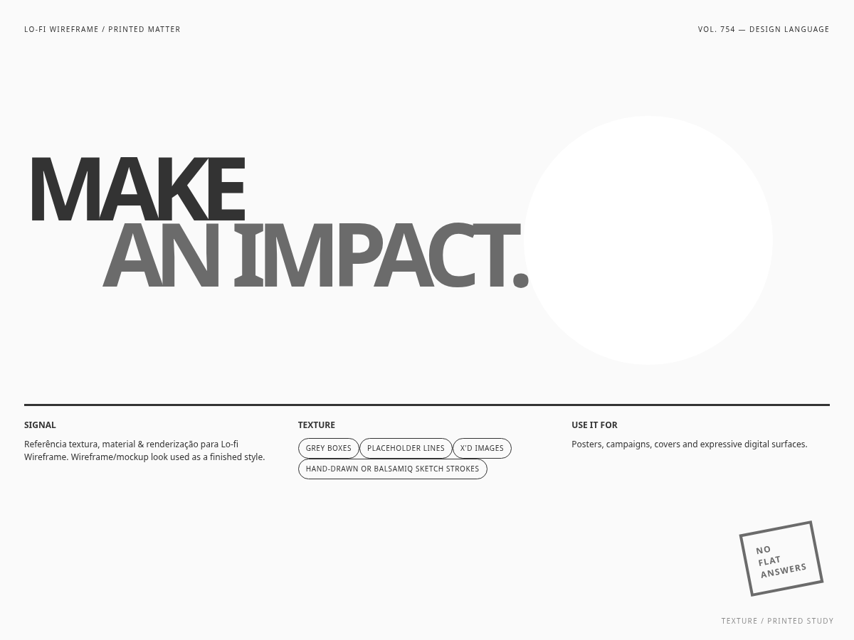
Reference for textura, material & renderização Lo-fi Wireframe. Wireframe/mockup look used as a finished style.
Use case: hero, superfície, conteúdo e grade responsiva; Grey boxes, placeholder lines, X'd images; Hand-drawn or Balsamiq sketch strokes
Historical Context
Wireframe/mockup look used as a finished style. Example: Balsamiq mockups; 'in progress' brand sites..
Source & Provenance
Imported from ara-mkr/claude-artisan · MIT · commit ae6d3ad · 2026-08-30
DESIGN.md
---
version: "alpha"
name: "Lo-fi Wireframe"
description: "Lo-fi Wireframe visual system, translated from the Claude Artisan catalog for use in digital products. Grey boxes, placeholder lines, X'd images; Hand-drawn or Balsamiq sketch strokes"
colors:
  primary: "#6b6b6b"
  background: "#fafafa"
  surface: "#ffffff"
  text: "#333333"
  accent: "#ff5a36"
  on-primary: "#FFFFFF"
  on-surface: "#000000"
  on-accent: "#000000"
typography:
  h1:
    fontFamily: "'Helvetica Neue', Arial, sans-serif"
    fontSize: "4rem"
    fontWeight: "700"
    lineHeight: "1.05"
  body-md:
    fontFamily: "'Helvetica Neue', Arial, sans-serif"
    fontSize: "1rem"
    fontWeight: "400"
    lineHeight: "1.6"
  label-caps:
    fontFamily: "'Helvetica Neue', Arial, sans-serif"
    fontSize: "0.75rem"
    fontWeight: "600"
    letterSpacing: "0.06em"
rounded:
  sm: "2px"
  md: "3px"
  lg: "4px"
spacing:
  sm: "8px"
  md: "16px"
  lg: "32px"
components:
  button-primary:
    backgroundColor: "{colors.primary}"
    textColor: "{colors.on-primary}"
    rounded: "{rounded.md}"
    padding: "16px"
  button-secondary:
    backgroundColor: "{colors.accent}"
    textColor: "{colors.on-accent}"
    rounded: "{rounded.md}"
    padding: "16px"
  card:
    backgroundColor: "{colors.surface}"
    textColor: "{colors.on-surface}"
    rounded: "{rounded.lg}"
    padding: "24px"
  page:
    backgroundColor: "{colors.background}"
    textColor: "{colors.text}"
    padding: "16px"
---
## Overview

Lo-fi Wireframe visual system, translated from the Claude Artisan catalog for use in digital products. Grey boxes, placeholder lines, X'd images; Hand-drawn or Balsamiq sketch strokes

- **Category:** texture
- **Era:** 2015–present
- **Origin:** Wireframe/mockup look used as a finished style.
- **Reference:** Balsamiq mockups; 'in progress' brand sites.
- **Structural base:** hero, superfície, conteúdo e grade responsiva

**Defining traits:**
- Grey boxes, placeholder lines, X'd images
- Hand-drawn or Balsamiq sketch strokes
- Deliberately unfinished honesty
- Neutral, structural, playful

## Colors

- **bg** — #fafafa
- **surface** — #ffffff
- **surface-strong** — #f0f0f0
- **border** — #9a9a9a
- **text** — #333333
- **text-muted** — #7a7a7a
- **primary** — #6b6b6b
- **accent** — #ff5a36
- **placeholder** — #cfcfcf

## Typography

- Display: 'Helvetica Neue', Arial, sans-serif
- Body: 'Helvetica Neue', Arial, sans-serif
- Mono: 'Courier New', ui-monospace, monospace

## Layout

- hero, superfície, conteúdo e grade responsiva
- Use a responsive grid and preserve content hierarchy.
- Collapse columns below 768px without horizontal overflow.

## Elevation & Depth

- Grey boxes, placeholder lines, X'd images; Hand-drawn or Balsamiq sketch strokes; Deliberately unfinished honesty; Neutral, structural, playful; sombras e elevação

## Shapes

- Radius scale: 2px, 3px, 4px.

## Components

- Buttons keep visible focus and predictable hover/pressed states.
- Cards use the surface and radius scale from the tokens.
- Forms expose persistent labels, textual errors, and keyboard focus.

## Do's and Don'ts

- Do: follow the tokens and the structural composition.
- Do: maintain WCAG AA contrast and `prefers-reduced-motion`.
- Avoid: using the style as decoration without functional hierarchy.
Technical Specs
CSS
/* Lo-fi Wireframe — design tokens */
/* 2015–present | Wireframe/mockup look used as a finished style, condensed */
:root {
  /* color */
  --color-bg: #fafafa;
  --color-surface: #ffffff;
  --color-surface-strong: #f0f0f0;
  --color-border: #9a9a9a;
  --color-text: #333333;
  --color-text-muted: #7a7a7a;
  --color-primary: #6b6b6b;
  --color-accent: #ff5a36;
  --color-placeholder: #cfcfcf;
  /* radius */
  --radius-sm: 2px;
  --radius-md: 3px;
  --radius-lg: 4px;
  --radius-pill: 999px;
  /* shadow */
  --shadow-sm: none;
  --shadow-md: none;
  --shadow-lg: none;
  /* font */
  --font-sans: 'Helvetica Neue', Arial, sans-serif;
  --font-display: 'Helvetica Neue', Arial, sans-serif;
  --font-mono: 'Courier New', ui-monospace, monospace;
  /* text */
  --text-xs: 0.75rem;
  --text-sm: 0.875rem;
  --text-base: 1rem;
  --text-lg: 1.125rem;
  --text-xl: 1.375rem;
  --text-2xl: 1.75rem;
  --text-3xl: 2.25rem;
  --text-4xl: 3rem;
  --text-5xl: 4rem;
  /* space */
  --space-1: 4px;
  --space-2: 8px;
  --space-3: 12px;
  --space-4: 16px;
  --space-6: 24px;
  --space-8: 32px;
  --space-12: 48px;
  --space-16: 64px;
  --space-24: 96px;
  /* ease */
  --ease-standard: ease;
  /* extra (signature gradients, composite borders, filters) */
  --dashed-outline: 1.5px dashed var(--color-border);
  --x-image-pattern: repeating-linear-gradient(45deg, var(--color-placeholder) 0 1px, transparent 1px 12px),
    repeating-linear-gradient(-45deg, var(--color-placeholder) 0 1px, transparent 1px 12px);
  --sketch-jitter: rotate(-0.2deg);
}

/* ============================================================
   Base component classes — Lo-fi Wireframe
   Signature move: a dashed sketch-line border (--dashed-outline) instead
   of a solid one, plus an X'd-out placeholder pattern for imagery.
   Repeats on nav, card, and input.
   ============================================================ */
body { margin: 0; color: var(--color-text); font-family: var(--font-sans); background: var(--color-bg); }
.nav { display: flex; gap: var(--space-4); align-items: center; padding: var(--space-3) var(--space-6);
  background: var(--color-surface); border: var(--dashed-outline); border-radius: var(--radius-md); }
.btn { font: 600 var(--text-base)/1 var(--font-sans); color: var(--color-text);
  padding: var(--space-3) var(--space-6); border-radius: var(--radius-sm);
  background: var(--color-surface-strong); border: var(--dashed-outline); cursor: pointer;
  transition: background .15s var(--ease-standard); }
.btn:hover { background: #e6e6e6; }
.btn:active { background: #dedede; }
.btn:focus-visible { outline: 2px solid var(--color-accent); outline-offset: 2px; }
.btn[disabled] { opacity: .5; cursor: not-allowed; }
.btn--primary { background: var(--color-text); color: #ffffff; border: 1.5px solid var(--color-text); }
.card { background: var(--color-surface); color: var(--color-text); padding: var(--space-6);
  border: var(--dashed-outline); border-radius: var(--radius-md); position: relative; }
.card::before { content: "IMG"; display: block; width: 100%; height: 80px; margin-bottom: var(--space-3);
  background: var(--x-image-pattern); background-color: var(--color-surface-strong);
  border: 1px solid var(--color-border); color: var(--color-text-muted); font-size: var(--text-xs);
  display: flex; align-items: center; justify-content: center; }
.input { width: 100%; box-sizing: border-box; color: var(--color-text); font: var(--text-base) var(--font-sans);
  padding: var(--space-3) var(--space-4); border-radius: var(--radius-sm);
  background: var(--color-surface); border: var(--dashed-outline); }
.input::placeholder { color: var(--color-text-muted); }
.input:focus { outline: none; border-style: solid; border-color: var(--color-accent); }
.badge { display: inline-flex; align-items: center; gap: .4em; font-size: var(--text-xs);
  padding: .3em .8em; border-radius: var(--radius-pill); background: var(--color-surface-strong); color: var(--color-text);
  border: 1px dashed var(--color-border); }
@media (prefers-reduced-motion: reduce) { .btn { transition: none; } }


/* Especificação de referência: references/00-flagship-implementation-specs/wireframe-lofi.md */
Variables
--bg: #fafafa, --fg: #333333, --accent: #6b6b6b, --surface: #ffffff, --radius: 3px, --spacing: 16px, --font-display: 'Helvetica Neue', Arial, sans-serif, --font-body: 'Helvetica Neue', Arial, sans-serif
Checklist
Contraste WCAG AA; foco visível; navegação por teclado; estados hover/pressed; responsividade; prefers-reduced-motion; Tailwind v4 via @theme.
Colors
Primary
Secondary
Effects
Grey boxes, placeholder lines, X'd images, Hand-drawn or Balsamiq sketch strokes, Deliberately unfinished honesty, Neutral, structural, playful, shadow
Light/Dark
Fonte não declara modos; validar em light e dark antes de publicar
AI Prompt
Act as a Senior Frontend Engineer and Expert UI Designer.
Your task is to code a complete Landing Page on the first attempt.
- Landing Page Theme: <INSERT THEME>
- Sections to add: <INSERT SECTIONS>

Generate the final code immediately following these definitions:

## Style

- **Name:** Lo-fi Wireframe
- **Type:** claude-artisan/texture
- **Keywords:** Lo-fi Wireframe, wireframe aesthetic, sketch UI, lo-fi mockup, Grey boxes, placeholder lines, X'd images, Hand-drawn or Balsamiq sketch strokes, Deliberately unfinished honesty, Neutral, structural, playful, texture
- **Era:** 2015–present
- **Light/Dark:** Fonte não declara modos; validar em light e dark antes de publicar

## Color Palette

- **Primary:** bg: #fafafa, surface: #ffffff, surface-strong: #f0f0f0, border: #9a9a9a
- **Secondary:** text: #333333, text-muted: #7a7a7a, primary: #6b6b6b, accent: #ff5a36, placeholder: #cfcfcf

## Visual Effects

Grey boxes, placeholder lines, X'd images, Hand-drawn or Balsamiq sketch strokes, Deliberately unfinished honesty, Neutral, structural, playful, shadow

## AI Visual Direction

Lo-fi Wireframe, Grey boxes, placeholder lines, X'd images, Hand-drawn or Balsamiq sketch strokes, Deliberately unfinished honesty, Neutral, structural, playful, Balsamiq mockups; 'in progress' brand sites.

## CSS Technical

```css
/* Lo-fi Wireframe — design tokens */
/* 2015–present | Wireframe/mockup look used as a finished style, condensed */
:root {
  /* color */
  --color-bg: #fafafa;
  --color-surface: #ffffff;
  --color-surface-strong: #f0f0f0;
  --color-border: #9a9a9a;
  --color-text: #333333;
  --color-text-muted: #7a7a7a;
  --color-primary: #6b6b6b;
  --color-accent: #ff5a36;
  --color-placeholder: #cfcfcf;
  /* radius */
  --radius-sm: 2px;
  --radius-md: 3px;
  --radius-lg: 4px;
  --radius-pill: 999px;
  /* shadow */
  --shadow-sm: none;
  --shadow-md: none;
  --shadow-lg: none;
  /* font */
  --font-sans: 'Helvetica Neue', Arial, sans-serif;
  --font-display: 'Helvetica Neue', Arial, sans-serif;
  --font-mono: 'Courier New', ui-monospace, monospace;
  /* text */
  --text-xs: 0.75rem;
  --text-sm: 0.875rem;
  --text-base: 1rem;
  --text-lg: 1.125rem;
  --text-xl: 1.375rem;
  --text-2xl: 1.75rem;
  --text-3xl: 2.25rem;
  --text-4xl: 3rem;
  --text-5xl: 4rem;
  /* space */
  --space-1: 4px;
  --space-2: 8px;
  --space-3: 12px;
  --space-4: 16px;
  --space-6: 24px;
  --space-8: 32px;
  --space-12: 48px;
  --space-16: 64px;
  --space-24: 96px;
  /* ease */
  --ease-standard: ease;
  /* extra (signature gradients, composite borders, filters) */
  --dashed-outline: 1.5px dashed var(--color-border);
  --x-image-pattern: repeating-linear-gradient(45deg, var(--color-placeholder) 0 1px, transparent 1px 12px),
    repeating-linear-gradient(-45deg, var(--color-placeholder) 0 1px, transparent 1px 12px);
  --sketch-jitter: rotate(-0.2deg);
}

/* ============================================================
   Base component classes — Lo-fi Wireframe
   Signature move: a dashed sketch-line border (--dashed-outline) instead
   of a solid one, plus an X'd-out placeholder pattern for imagery.
   Repeats on nav, card, and input.
   ============================================================ */
body { margin: 0; color: var(--color-text); font-family: var(--font-sans); background: var(--color-bg); }
.nav { display: flex; gap: var(--space-4); align-items: center; padding: var(--space-3) var(--space-6);
  background: var(--color-surface); border: var(--dashed-outline); border-radius: var(--radius-md); }
.btn { font: 600 var(--text-base)/1 var(--font-sans); color: var(--color-text);
  padding: var(--space-3) var(--space-6); border-radius: var(--radius-sm);
  background: var(--color-surface-strong); border: var(--dashed-outline); cursor: pointer;
  transition: background .15s var(--ease-standard); }
.btn:hover { background: #e6e6e6; }
.btn:active { background: #dedede; }
.btn:focus-visible { outline: 2px solid var(--color-accent); outline-offset: 2px; }
.btn[disabled] { opacity: .5; cursor: not-allowed; }
.btn--primary { background: var(--color-text); color: #ffffff; border: 1.5px solid var(--color-text); }
.card { background: var(--color-surface); color: var(--color-text); padding: var(--space-6);
  border: var(--dashed-outline); border-radius: var(--radius-md); position: relative; }
.card::before { content: "IMG"; display: block; width: 100%; height: 80px; margin-bottom: var(--space-3);
  background: var(--x-image-pattern); background-color: var(--color-surface-strong);
  border: 1px solid var(--color-border); color: var(--color-text-muted); font-size: var(--text-xs);
  display: flex; align-items: center; justify-content: center; }
.input { width: 100%; box-sizing: border-box; color: var(--color-text); font: var(--text-base) var(--font-sans);
  padding: var(--space-3) var(--space-4); border-radius: var(--radius-sm);
  background: var(--color-surface); border: var(--dashed-outline); }
.input::placeholder { color: var(--color-text-muted); }
.input:focus { outline: none; border-style: solid; border-color: var(--color-accent); }
.badge { display: inline-flex; align-items: center; gap: .4em; font-size: var(--text-xs);
  padding: .3em .8em; border-radius: var(--radius-pill); background: var(--color-surface-strong); color: var(--color-text);
  border: 1px dashed var(--color-border); }
@media (prefers-reduced-motion: reduce) { .btn { transition: none; } }


/* Especificação de referência: references/00-flagship-implementation-specs/wireframe-lofi.md */
```

## Design System Variables

```css
--bg: #fafafa, --fg: #333333, --accent: #6b6b6b, --surface: #ffffff, --radius: 3px, --spacing: 16px, --font-display: 'Helvetica Neue', Arial, sans-serif, --font-body: 'Helvetica Neue', Arial, sans-serif
```

## Implementation Checklist

- Contraste WCAG AA; foco visível; navegação por teclado; estados hover/pressed; responsividade; prefers-reduced-motion; Tailwind v4 via @theme.

## Execution Rules

1. Strictly follow the defined visual style.
2. Use high-quality inline SVG icons (Heroicons or Lucide style) — NEVER use emojis as icons.
3. Add `cursor-pointer` and smooth `hover` states (transition-all) on all interactive elements.
4. Required Page Structure:
   - Navbar (Logo + Links + CTA)
   - Hero Section (Impactful Headline + Subtitle + 2 buttons + 3D/Abstract visual element via CSS)
   - Features (3 cards with icons)
   - Testimonials (3 cards)
   - Pricing (3 tiers, highlight the middle one)
   - Final CTA
   - Full Footer with social links, privacy policy, terms of use, contact and SEO links.
5. All text content must be in English.
6. The visual must be CLEARLY distinct — do not create a "default Bootstrap" design. Force the use of the provided design system variables.
7. Use `<style>` tags in the head for custom classes (especially for complex backdrop-filter effects and animations) that Tailwind CDN doesn't cover.
8. Full Responsiveness: Layout must adapt perfectly to Mobile, Tablet and Desktop (vertical stack on mobile).
9. Include basic SEO, Viewport and Open Graph meta tags in `<head>`.
10. Footer must contain: Copyright 2026, Secondary navigation links and Social media icons.
11. Make the creative decisions needed to deliver the complete, functional result now.Related
Last synced: 8/30/2026