Web3 EOS Hero
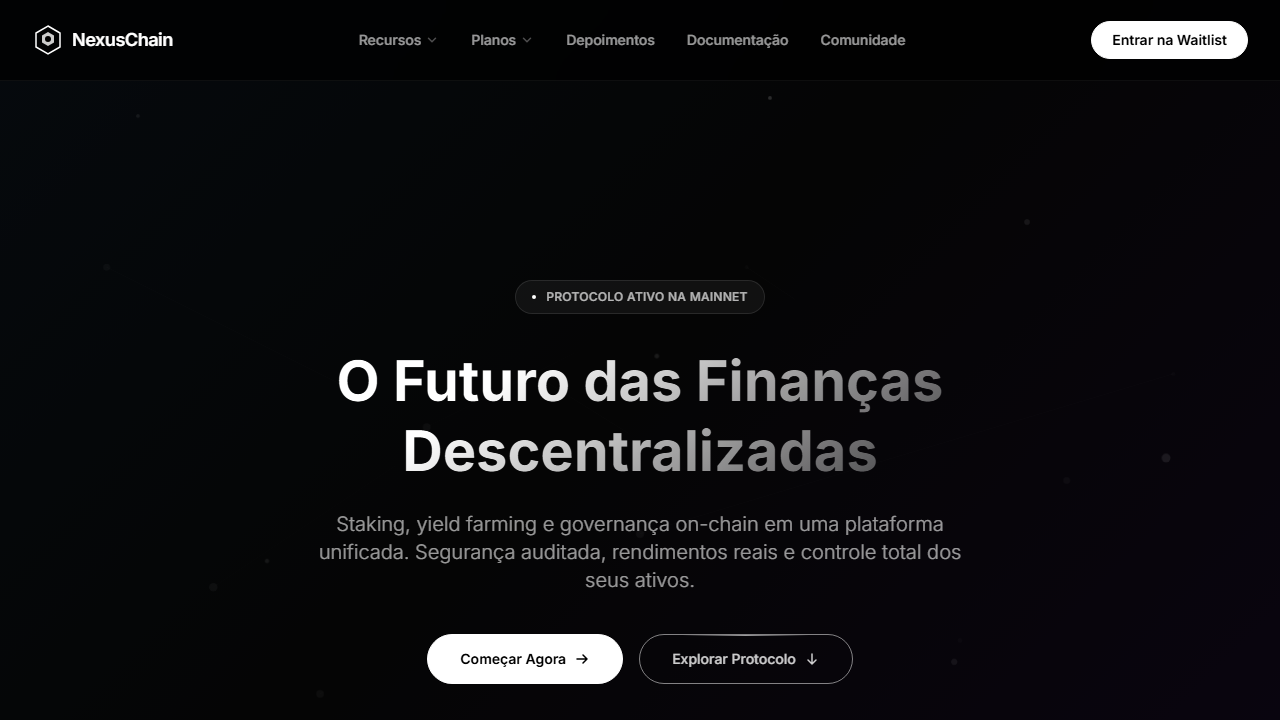
Web3 hero with full-screen video and 50% black overlay. Ideal for projetos blockchain, plataformas web3, daos, landing pages de waitlist cripto. AI-ready template.
Use case: Projects blockchain, Platforms Web3, DAOs, Landing pages de waitlist cripto
Historical Context
The Web3 hero section emerged from a very specific cultural moment — when crypto projects needed to signal legitimacy while still feeling rebellious. Early blockchain sites borrowed heavily from fintech aesthetics: clean whites, trust badges, stock photography of handshakes. It was boring and dishonest. The breakthrough came when projects like Solana and Ethereum's ecosystem sites started embracing what the technology actually felt like — decentralized, electric, boundary-dissolving. Gradient text became the defining visual shorthand. Not decorative gradients — structural ones. Text that appears to shift between states, suggesting transformation and fluidity. The EOS-era hero pushed this further by pairing those chromatic type treatments with deep, near-black backgrounds and minimal geometric accents. It said: we're building infrastructure, not selling you a lifestyle. What makes this pattern endure beyond the 2021 hype cycle is its restraint. The best Web3 heroes never went full cyberpunk. They stayed closer to developer documentation than to gaming interfaces — technical confidence over spectacle.
When to Use
Deploy this when your project needs to communicate technical sophistication without alienating non-technical users. It works for DeFi dashboards, blockchain explorers, protocol landing pages, and developer tooling sites. The pattern fails when you're targeting mainstream consumers who associate dark interfaces with complexity. It also fails when you layer too many effects — particle backgrounds, animated meshes, floating 3D objects. Pick the gradient text OR the geometric accents. Never both at full intensity.
Design Principles
- Gradient text carries the entire visual weight — treat it as your hero image, not decoration
- Background darkness should be functional (reducing eye strain for technical readers), not theatrical
- Typography hierarchy must survive without color — if you remove the gradients and the layout collapses, your information architecture is broken
- Geometric accents exist to create spatial depth, not to fill empty space — if you can remove one without losing meaning, remove it
- Motion should suggest state transitions (loading, confirming, processing) rather than ambient atmosphere — every animation implies a system doing work
DESIGN.md
---
version: "alpha"
name: "Web3 EOS Hero"
description: "Web3 hero with full-screen video and 50% black overlay. Ideal for projetos blockchain, plataformas web3, daos, landing pages de waitlist cripto. AI-ready template."
colors:
  primary: "#000000"
  secondary: "#FFFFFF"
typography:
  h1:
    fontFamily: General Sans
    fontSize: 2.5rem
    fontWeight: 700
  body-md:
    fontFamily: General Sans
    fontSize: 1rem
    fontWeight: 400
rounded:
  sm: 9999px
  md: 19998px
  lg: 29997px
components:
  button-primary:
    backgroundColor: "{colors.primary}"
    rounded: "{rounded.sm}"
    padding: 12px
---

## Overview

Web3 hero with full-screen video and 50% black overlay. Ideal for projetos blockchain, plataformas web3, daos, landing pages de waitlist cripto. AI-ready template. The Web3 hero section emerged from a very specific cultural moment — when crypto projects needed to signal legitimacy while still feeling rebellious. Early blockchain sites borrowed heavily from fintech aesthetics: clean whites, trust badges, stock photography of handshakes. It was boring and dishonest. The breakthrough came when projects like Solana and Ethereum's ecosystem sites started embracing what the technology actually felt like — decentralized, electric, boundary-dissolving.

Gradient text became the defining visual shorthand. Not decorative gradients — structural ones. Text that appears to shift between states, suggesting transformation and fluidity. The EOS-era hero pushed this further by pairing those chromatic type treatments with deep, near-black backgrounds and minimal geometric accents. It said: we're building infrastructure, not selling you a lifestyle.

What makes this pattern endure beyond the 2021 hype cycle is its restraint. The best Web3 heroes never went full cyberpunk. They stayed closer to developer documentation than to gaming interfaces — technical confidence over spectacle.

- Density: 3/10 — Airy
- Variance: 3/10 — Restrained
- Motion: 8/10 — Cinematic

- **Style:** Web3, Gradient Text, Video Overlay, Layered Pill Buttons, Minimal Dark
- **Keywords:** Web3, blockchain, gradient text, vídeo overlay, pill buttons layered, General Sans, preto puro, dot badge, chevron nav, waitlist
- **Era:** 2024-2026 Web3 Premium
- **Light/Dark:** ✗ Not Recommended / ✓ Full

## Colors

- **Preto Puro** (#000000) — Dark surface, primary background
- **Branco** (#FFFFFF) — Light surface, card backgrounds
- **** (rgba(255,255,255,0.6)) — Supporting palette color
- **** (rgba(255,255,255,0.7)) — Supporting palette color
- **Overlay Preto** (rgba(0,0,0,0.5)) — Deep contrast surface
- **Borda Pill** (rgba(255,255,255,0.2)) — Extended palette, decorative use
- **** (rgba(255,255,255,0.2)) — Extended palette, decorative use
- **** (rgba(255,255,255,0.1)) — Extended palette, decorative use


## Typography

- **Display / Hero:** General Sans — Weight 700, tight tracking, used for headline impact
- **Body:** General Sans — Weight 400, 16px/1.6 line-height, max 72ch per line
- **UI Labels / Captions:** General Sans — 0.875rem, weight 500, slight letter-spacing
- **Monospace:** JetBrains Mono — Used for code, metadata, and technical values

Scale:
- Hero: clamp(2.5rem, 5vw, 4rem)
- H1: 2.25rem
- H2: 1.5rem
- Body: 1rem / 1.6
- Small: 0.875rem


## Layout

- **Grid:** CSS Grid primary. Max-width containment: 1280px centered with 1.5rem side padding.
- **Spacing rhythm:** Balanced. Base unit: 0.5rem (8px).
- **Section vertical gaps:** clamp(4rem, 8vw, 8rem).
- **Hero layout:** Split-screen (text left, visual right).
- **Feature sections:** Zig-zag alternating text+image rows. No 3-equal-columns.
- **Mobile collapse:** All multi-column layouts collapse below 768px. No horizontal overflow.
- **z-index contract:** base (0) / sticky-nav (100) / overlay (200) / modal (300) / toast (500).


## Elevation & Depth

VÍDEO: Vídeo abstrato com visual futurista e tecnológico em tons escuros. Partículas digitais, redes neurais ou formas geométricas em movimento evocando blockchain e Web3. Fundo predominantemente preto com destaques luminosos sutis. Coberto por overlay preto 50% (bg-black/50) para legibilidade do texto com gradient fill. | EFEITOS CSS: Vídeo de fundo tela cheia com overlay preto 50%, headline com gradient text fill (linear-gradient ~144.5deg de branco sólido a preto transparente via background-clip text), badge pill com dot branco 4px e texto em opacidades diferentes, botões pill com construção em camadas (borda externa 0.6px branca, pill interno, glow/streak branco no topo), nav links com chevron-down 14px, padding generoso (280px top desktop)

- **Physics:** Spring — stiffness 120, damping 20. Confident, weighted transitions.
- **Entry animations:** Fade + translate-Y (16px → 0) over 540ms ease-out. Staggered cascades for lists: 120ms between items.
- **Hover states:** Scale(1.03) + shadow lift over 200ms.
- **Page transitions:** Fade + slide (300ms).
- **Performance:** Only transform and opacity animated. No layout-triggering properties.


## Shapes

Base corner radius: 9999px. See rounded tokens in front matter for the full scale.


## Components

- **Primary Button:** Pill-shaped (9999px) shape. Accent color fill. Hover: 8% darken + subtle lift shadow. Active: -1px translate tactile press. Font weight 600. No outer glows.
- **Secondary / Ghost Button:** Outline variant. 1.5px border in muted color. Text in primary color. Hover: subtle background fill.
- **Cards:** Pill-shaped (9999px) corners. Surface background. Subtle shadow (0 2px 12px rgba(0,0,0,0.06)). 1px border stroke.
- **Inputs:** Label above input. 1px border stroke. Focus ring: 2px accent color offset 2px. Error text below in semantic red. No floating labels.
- **Navigation:** Primary surface background. Active item: accent color indicator. Font weight 500 when active.
- **Skeletons:** Shimmer animation matching component dimensions. No circular spinners.
- **Empty States:** Icon-based composition with descriptive text and action button.


## Do's and Don'ts

- No emojis in UI — use icon system only (Lucide, Heroicons)
- No pure black (#000000) — use off-black or charcoal variants
- No oversaturated accent colors (saturation cap: 80%)
- No 3-column equal-width feature layouts — use zig-zag or asymmetric grid
- No `h-screen` — use `min-h-[100dvh]`
- No AI copywriting clichés: "Elevate", "Seamless", "Unleash", "Next-Gen"
- No broken external image links — use picsum.photos or inline SVG
- No generic lorem ipsum in demos

- Do Vídeo tela cheia com overlay preto 50%
- Do General Sans font
- Do Headline gradient text fill diagonal
- Do Badge pill com dot branco
- Do Botões pill em camadas com glow
- Do Nav com chevron-down
- Do Padding top 280px
- Do Responsivo headline 36px mobile


## Use Case

Projects blockchain, Platforms Web3, DAOs, Landing pages de waitlist cripto
Technical Specs
CSS
font-family: 'General Sans', background: #000000, video: with bg-black/50 overlay, background: linear-gradient(144.5deg, white 28%, transparent 115%), -webkit-background-clip: text, border: 0.6px solid white, border-radius: 9999px, padding-top: 280px, font-size: 56px desktop / 36px mobile
Variables
--bg-primary: #000000, --text-primary: #FFFFFF, --text-muted: rgba(255,255,255,0.7), --overlay: rgba(0,0,0,0.5), --pill-border: 0.6px solid white, --gradient-text: linear-gradient(144.5deg, white 28%, transparent 115%), --font-primary: 'General Sans', --headline-size: 56px
Checklist
☐ Vídeo tela cheia com overlay preto 50%, ☐ General Sans font, ☐ Headline gradient text fill diagonal, ☐ Badge pill com dot branco, ☐ Botões pill em camadas com glow, ☐ Nav com chevron-down, ☐ Padding top 280px, ☐ Responsivo headline 36px mobile
Colors
Primary
Effects
VÍDEO: Vídeo abstrato com visual futurista e tecnológico em tons escuros. Partículas digitais, redes neurais ou formas geométricas em movimento evocando blockchain e Web3. Fundo predominantemente preto com destaques luminosos sutis. Coberto por overlay preto 50% (bg-black/50) para legibilidade do texto com gradient fill. | EFEITOS CSS: Vídeo de fundo tela cheia com overlay preto 50%, headline com gradient text fill (linear-gradient ~144.5deg de branco sólido a preto transparente via background-clip text), badge pill com dot branco 4px e texto em opacidades diferentes, botões pill com construção em camadas (borda externa 0.6px branca, pill interno, glow/streak branco no topo), nav links com chevron-down 14px, padding generoso (280px top desktop)
Light/Dark
✗ Not Recommended / ✓ Full
AI Prompt
Act as a Senior Frontend Engineer and Expert UI Designer.
Your task is to code a complete Landing Page on the first attempt.
- Landing Page Theme: <INSERT THEME>
- Sections to add: <INSERT SECTIONS>

Generate the final code immediately following these definitions:

## Style

- **Name:** Web3 EOS Hero
- **Type:** Web3, Gradient Text, Video Overlay, Layered Pill Buttons, Minimal Dark
- **Keywords:** Web3, blockchain, gradient text, vídeo overlay, pill buttons layered, General Sans, preto puro, dot badge, chevron nav, waitlist
- **Era:** 2024-2026 Web3 Premium
- **Light/Dark:** ✗ Not Recommended / ✓ Full

## Color Palette

- **Primary:** Preto Puro #000000, Branco #FFFFFF, Branco 60% rgba(255,255,255,0.6), Branco 70% rgba(255,255,255,0.7)
- **Secondary:** Overlay Preto rgba(0,0,0,0.5), Borda Pill rgba(255,255,255,0.2), Branco 20% rgba(255,255,255,0.2), Branco 10% rgba(255,255,255,0.1)

## Visual Effects

VÍDEO: Vídeo abstrato com visual futurista e tecnológico em tons escuros. Partículas digitais, redes neurais ou formas geométricas em movimento evocando blockchain e Web3. Fundo predominantemente preto com destaques luminosos sutis. Coberto por overlay preto 50% (bg-black/50) para legibilidade do texto com gradient fill. | EFEITOS CSS: Vídeo de fundo tela cheia com overlay preto 50%, headline com gradient text fill (linear-gradient ~144.5deg de branco sólido a preto transparente via background-clip text), badge pill com dot branco 4px e texto em opacidades diferentes, botões pill com construção em camadas (borda externa 0.6px branca, pill interno, glow/streak branco no topo), nav links com chevron-down 14px, padding generoso (280px top desktop)

## AI Visual Direction

Design a Web3 hero with full-screen video and 50% black overlay. General Sans font. Headline with gradient text fill (linear-gradient ~144.5deg from white to transparent via background-clip text). Pill badge with 4px white dot. Layered pill buttons: 0.6px white outer border, inner pill, white glow streak on top. Nav links with chevron-down. Generous top padding 280px desktop.

## CSS Technical

```css
font-family: 'General Sans', background: #000000, video: with bg-black/50 overlay, background: linear-gradient(144.5deg, white 28%, transparent 115%), -webkit-background-clip: text, border: 0.6px solid white, border-radius: 9999px, padding-top: 280px, font-size: 56px desktop / 36px mobile
```

## Design System Variables

```css
--bg-primary: #000000, --text-primary: #FFFFFF, --text-muted: rgba(255,255,255,0.7), --overlay: rgba(0,0,0,0.5), --pill-border: 0.6px solid white, --gradient-text: linear-gradient(144.5deg, white 28%, transparent 115%), --font-primary: 'General Sans', --headline-size: 56px
```

## Implementation Checklist

- ☐ Vídeo tela cheia com overlay preto 50%
- ☐ General Sans font
- ☐ Headline gradient text fill diagonal
- ☐ Badge pill com dot branco
- ☐ Botões pill em camadas com glow
- ☐ Nav com chevron-down
- ☐ Padding top 280px
- ☐ Responsivo headline 36px mobile

## Execution Rules

1. Strictly follow the defined visual style.
2. Use high-quality inline SVG icons (Heroicons or Lucide style) — NEVER use emojis as icons.
3. Add `cursor-pointer` and smooth `hover` states (transition-all) on all interactive elements.
4. Required Page Structure:
   - Navbar (Logo + Links + CTA)
   - Hero Section (Impactful Headline + Subtitle + 2 buttons + 3D/Abstract visual element via CSS)
   - Features (3 cards with icons)
   - Testimonials (3 cards)
   - Pricing (3 tiers, highlight the middle one)
   - Final CTA
   - Full Footer with social links, privacy policy, terms of use, contact and SEO links.
5. All text content must be in English.
6. The visual must be CLEARLY distinct — do not create a "default Bootstrap" design. Force the use of the provided design system variables.
7. Use `<style>` tags in the head for custom classes (especially for complex backdrop-filter effects and animations) that Tailwind CDN doesn't cover.
8. Full Responsiveness: Layout must adapt perfectly to Mobile, Tablet and Desktop (vertical stack on mobile).
9. Include basic SEO, Viewport and Open Graph meta tags in `<head>`.
10. Footer must contain: Copyright 2026, Secondary navigation links and Social media icons.
11. Make the creative decisions needed to deliver the complete, functional result now.
Related
Last synced: 4/1/2026