Victorian
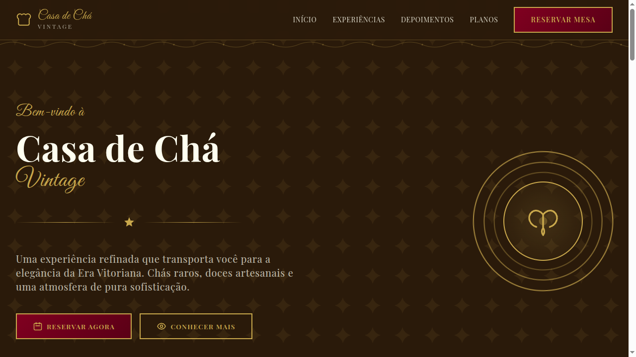
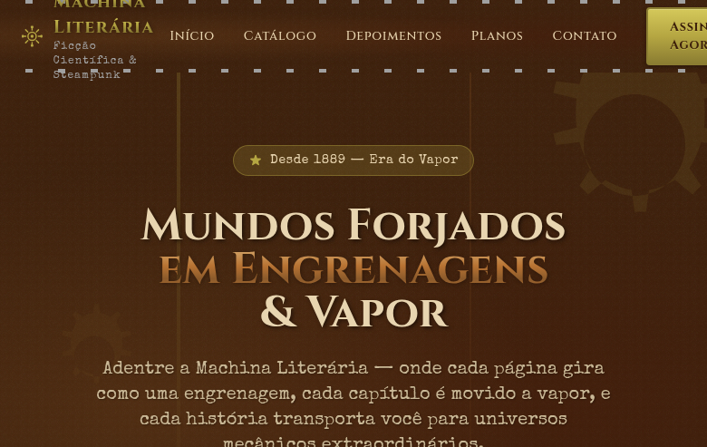
Victorian-era landing page with extremely ornate details. Ideal for caligrafia moderna, convites temáticos, branding vintage, designs steampunk. AI-ready template.
Use case: Modern calligraphy, Themed invitations, Vintage branding, Steampunk designs
Historical Context
Victorian typography wasn't designed — it was engineered to overwhelm. Born from the industrial printing boom of the 1830s through 1900, every square inch of a broadsheet had to scream louder than the one next to it. Wood type foundries competed on sheer decorative excess: fat serifs, inline shadows, ornamental borders stacked three deep. The aesthetic wasn't restrained — it was maximalist by necessity, because letterpress posters were the advertising medium of an era drowning in commerce. What survives today is the curated version. We cherry-pick the elegance — the Didone-influenced high-contrast serifs, the symmetrical cartouches, the engraved illustration style — and leave behind the chaos of competing typefaces on a single handbill. That's fine. The filtered Victorian is genuinely beautiful: it communicates craft, permanence, and a kind of seriousness that sans-serif minimalism simply cannot. The danger is pastiche. Victorian done poorly becomes costume design. Done well, it borrows the structural logic — the hierarchy through weight and ornament, the framing devices, the vertical rhythm of stacked type — without cosplaying as a 19th-century apothecary label.
When to Use
When your brand needs to signal heritage, craftsmanship, or institutional weight without feeling corporate. Victorian works for luxury stationery, antique dealers, heritage food brands, whiskey labels, period-themed events, and any product where age equals value. It's the right call when your audience associates ornamentation with quality rather than clutter. Avoid it for anything that needs to feel fast, digital-native, or accessible to younger demographics who read density as pretension.
Design Principles
- Hierarchy through ornament, not whitespace — use borders, rules, and decorative frames to create structure instead of relying on empty space
- Contrast lives in stroke weight — pair hairline serifs against heavy slab forms; the tension between thick and thin is the entire engine of Victorian type
- Symmetry is non-negotiable — centered layouts with mirrored decorative elements; asymmetry reads as broken, not modern, in this idiom
- Layer density deliberately — multiple border weights, inline type, background textures; each layer must serve hierarchy or it becomes noise
- Restrain your palette — Victorian color was limited by printing technology; honor that with deep jewel tones, black, cream, and metallic accents rather than full-spectrum color
DESIGN.md
---
version: "alpha"
name: "Victorian"
description: "Victorian-era landing page with extremely ornate details. Ideal for caligrafia moderna, convites temáticos, branding vintage, designs steampunk. AI-ready template."
colors:
  primary: "#800020"
  secondary: "#C9A84C"
  tertiary: "#004953"
  neutral: "#FFFFF0"
  surface: "#8E4585"
  accent: "#B87333"
typography:
  h1:
    fontFamily: Playfair Display
    fontSize: 2.25rem
    fontWeight: 700
  body-md:
    fontFamily: Playfair Display
    fontSize: 1rem
    fontWeight: 400
  label-caps:
    fontFamily: Playfair Display
    fontSize: 0.75rem
    fontWeight: 500
spacing:
  sm: 2.0rem
  md: 4.0rem
  lg: 8.0rem
components:
  button-primary:
    backgroundColor: "{colors.primary}"
    textColor: "{colors.neutral}"
    padding: 12px
---

## Overview

Victorian-era landing page with extremely ornate details. Ideal for caligrafia moderna, convites temáticos, branding vintage, designs steampunk. AI-ready template. Victorian typography wasn't designed — it was engineered to overwhelm. Born from the industrial printing boom of the 1830s through 1900, every square inch of a broadsheet had to scream louder than the one next to it. Wood type foundries competed on sheer decorative excess: fat serifs, inline shadows, ornamental borders stacked three deep. The aesthetic wasn't restrained — it was maximalist by necessity, because letterpress posters were the advertising medium of an era drowning in commerce.

What survives today is the curated version. We cherry-pick the elegance — the Didone-influenced high-contrast serifs, the symmetrical cartouches, the engraved illustration style — and leave behind the chaos of competing typefaces on a single handbill. That's fine. The filtered Victorian is genuinely beautiful: it communicates craft, permanence, and a kind of seriousness that sans-serif minimalism simply cannot.

The danger is pastiche. Victorian done poorly becomes costume design. Done well, it borrows the structural logic — the hierarchy through weight and ornament, the framing devices, the vertical rhythm of stacked type — without cosplaying as a 19th-century apothecary label.

- Density: 5/10 — Balanced
- Variance: 8/10 — Expressive
- Motion: 6/10 — Expressive

- **Style:** Ornate, Elegant, Intricate, Floral
- **Keywords:** Victorian, ornate, elegant, intricate florals, 1837-1901, calligraphy, vintage, steampunk, decorative, rich colors
- **Era:** 1837-1901 Victorian Era
- **Light/Dark:** ✓ Full / ✓ Full

## Colors

- **Deep Burgundy** (#800020) — Primary surface or dominant color
- **Antique Gold** (#C9A84C) — Premium accent, decorative highlights
- **Midnight Green** (#004953) — Dark surface, primary background
- **Ivory** (#FFFFF0) — Light surface, card backgrounds
- **Plum** (#8E4585) — Extended palette, decorative use
- **Copper** (#B87333) — Metallic accent, decorative detail
- **Sage** (#8A9A5B) — Extended palette, decorative use
- **Warm Taupe** (#8B7D6B) — Extended palette, decorative use


## Typography

- **Display / Hero:** Playfair Display — Weight 700, tight tracking, used for headline impact
- **Accent:** Great Vibes — Used for decorative or emphasis text
- **Body:** Playfair Display — Weight 400, 16px/1.6 line-height, max 72ch per line
- **UI Labels / Captions:** Playfair Display — 0.875rem, weight 500, slight letter-spacing
- **Monospace:** JetBrains Mono — Used for code, metadata, and technical values

Scale:
- Hero: clamp(2.5rem, 5vw, 4rem)
- H1: 2.25rem
- H2: 1.5rem
- Body: 1rem / 1.6
- Small: 0.875rem


## Layout

- **Grid:** CSS Grid primary. Max-width containment: 1280px centered with 1.5rem side padding.
- **Spacing rhythm:** Balanced. Base unit: 0.5rem (8px).
- **Section vertical gaps:** clamp(4rem, 8vw, 8rem).
- **Hero layout:** Asymmetric composition.
- **Feature sections:** Asymmetric grid with varied card sizes. No 3-equal-columns.
- **Mobile collapse:** All multi-column layouts collapse below 768px. No horizontal overflow.
- **z-index contract:** base (0) / sticky-nav (100) / overlay (200) / modal (300) / toast (500).


## Elevation & Depth

Intricate SVG floral border ornaments, Victorian frame corners, rich layered backgrounds with damask patterns, ornate divider lines, elegant hover effects with gold glow, scroll-triggered reveal animations (500ms)

- **Physics:** Spring — stiffness 120, damping 20. Confident, weighted transitions.
- **Entry animations:** Fade + translate-Y (16px → 0) over 480ms ease-out. Staggered cascades for lists: 100ms between items.
- **Hover states:** Scale(1.03) + shadow lift over 200ms.
- **Page transitions:** Fade + slide (300ms).
- **Performance:** Only transform and opacity animated. No layout-triggering properties.


## Shapes

Base corner radius: 8px. See rounded tokens in front matter for the full scale.


## Components

- **Primary Button:** Subtly rounded (0.5rem) shape. Accent color fill. Hover: 8% darken + subtle lift shadow. Active: -1px translate tactile press. Font weight 600. No outer glows.
- **Secondary / Ghost Button:** Outline variant. 1.5px border in muted color. Text in primary color. Hover: subtle background fill.
- **Cards:** Subtly rounded (0.5rem) corners. Surface background. Subtle shadow (0 2px 12px rgba(0,0,0,0.06)). 1px border stroke.
- **Inputs:** Label above input. 1px border stroke. Focus ring: 2px accent color offset 2px. Error text below in semantic red. No floating labels.
- **Navigation:** Primary surface background. Active item: accent color indicator. Font weight 500 when active.
- **Skeletons:** Shimmer animation matching component dimensions. No circular spinners.
- **Empty States:** Icon-based composition with descriptive text and action button.


## Do's and Don'ts

- No emojis in UI — use icon system only (Lucide, Heroicons)
- No pure black (#000000) — use off-black or charcoal variants
- No oversaturated accent colors (saturation cap: 80%)
- No 3-column equal-width feature layouts — use zig-zag or asymmetric grid
- No `h-screen` — use `min-h-[100dvh]`
- No AI copywriting clichés: "Elevate", "Seamless", "Unleash", "Next-Gen"
- No broken external image links — use picsum.photos or inline SVG
- No generic lorem ipsum in demos

- Do Intricate floral SVG borders
- Do Victorian frame corners on sections
- Do Damask pattern backgrounds
- Do Rich deep color palette
- Do Decorative serif + calligraphic typography
- Do Ornate divider lines
- Do Responsive with simplified ornaments on mobile


## Use Case

Modern calligraphy, Themed invitations, Vintage branding, Steampunk designs
Technical Specs
CSS
font-family: 'Playfair Display', serif mixed with 'Great Vibes', cursive, background: #FFFFF0 with CSS damask pattern, color: #2A1A0A, border: 2px solid #C9A84C, border-image with ornate SVG, box-shadow: 0 4px 20px rgba(201,168,76,0.2), letter-spacing: 0.05em
Variables
--color-burgundy: #800020, --color-gold: #C9A84C, --color-green: #004953, --color-ivory: #FFFFF0, --font-display: 'Playfair Display', --font-script: 'Great Vibes', --border-ornate: 2px solid #C9A84C, --spacing: 2rem
Checklist
☐ Intricate floral SVG borders, ☐ Victorian frame corners on sections, ☐ Damask pattern backgrounds, ☐ Rich deep color palette, ☐ Decorative serif + calligraphic typography, ☐ Ornate divider lines, ☐ Responsive with simplified ornaments on mobile
Colors
Primary
Secondary
Effects
Intricate SVG floral border ornaments, Victorian frame corners, rich layered backgrounds with damask patterns, ornate divider lines, elegant hover effects with gold glow, scroll-triggered reveal animations (500ms)
Light/Dark
✓ Full / ✓ Full
AI Prompt
Act as a Senior Frontend Engineer and Expert UI Designer.
Your task is to code a complete Landing Page on the first attempt.
- Landing Page Theme: <INSERT THEME>
- Sections to add: <INSERT SECTIONS>

Generate the final code immediately following these definitions:

## Style

- **Name:** Victorian
- **Type:** Ornate, Elegant, Intricate, Floral
- **Keywords:** Victorian, ornate, elegant, intricate florals, 1837-1901, calligraphy, vintage, steampunk, decorative, rich colors
- **Era:** 1837-1901 Victorian Era
- **Light/Dark:** ✓ Full / ✓ Full

## Color Palette

- **Primary:** Deep Burgundy #800020, Antique Gold #C9A84C, Midnight Green #004953, Ivory #FFFFF0
- **Secondary:** Plum #8E4585, Copper #B87333, Sage #8A9A5B, Warm Taupe #8B7D6B

## Visual Effects

Intricate SVG floral border ornaments, Victorian frame corners, rich layered backgrounds with damask patterns, ornate divider lines, elegant hover effects with gold glow, scroll-triggered reveal animations (500ms)

## AI Visual Direction

Design a Victorian-era landing page with extremely ornate details. Use deep burgundy, antique gold, midnight green, ivory. Apply intricate SVG floral borders, Victorian frame corners, damask pattern backgrounds, ornate divider lines. Typography should be decorative serif with calligraphic accents. Rich, elegant, and historically detailed atmosphere.

## CSS Technical

```css
font-family: 'Playfair Display', serif mixed with 'Great Vibes', cursive, background: #FFFFF0 with CSS damask pattern, color: #2A1A0A, border: 2px solid #C9A84C, border-image with ornate SVG, box-shadow: 0 4px 20px rgba(201,168,76,0.2), letter-spacing: 0.05em
```

## Design System Variables

```css
--color-burgundy: #800020, --color-gold: #C9A84C, --color-green: #004953, --color-ivory: #FFFFF0, --font-display: 'Playfair Display', --font-script: 'Great Vibes', --border-ornate: 2px solid #C9A84C, --spacing: 2rem
```

## Implementation Checklist

- ☐ Intricate floral SVG borders
- ☐ Victorian frame corners on sections
- ☐ Damask pattern backgrounds
- ☐ Rich deep color palette
- ☐ Decorative serif + calligraphic typography
- ☐ Ornate divider lines
- ☐ Responsive with simplified ornaments on mobile

## Execution Rules

1. Strictly follow the defined visual style.
2. Use high-quality inline SVG icons (Heroicons or Lucide style) — NEVER use emojis as icons.
3. Add `cursor-pointer` and smooth `hover` states (transition-all) on all interactive elements.
4. Required Page Structure:
   - Navbar (Logo + Links + CTA)
   - Hero Section (Impactful Headline + Subtitle + 2 buttons + 3D/Abstract visual element via CSS)
   - Features (3 cards with icons)
   - Testimonials (3 cards)
   - Pricing (3 tiers, highlight the middle one)
   - Final CTA
   - Full Footer with social links, privacy policy, terms of use, contact and SEO links.
5. All text content must be in English.
6. The visual must be CLEARLY distinct — do not create a "default Bootstrap" design. Force the use of the provided design system variables.
7. Use `<style>` tags in the head for custom classes (especially for complex backdrop-filter effects and animations) that Tailwind CDN doesn't cover.
8. Full Responsiveness: Layout must adapt perfectly to Mobile, Tablet and Desktop (vertical stack on mobile).
9. Include basic SEO, Viewport and Open Graph meta tags in `<head>`.
10. Footer must contain: Copyright 2026, Secondary navigation links and Social media icons.
11. Make the creative decisions needed to deliver the complete, functional result now.
Related
Last synced: 4/1/2026