Vernacular Acolhedor Brasileiro
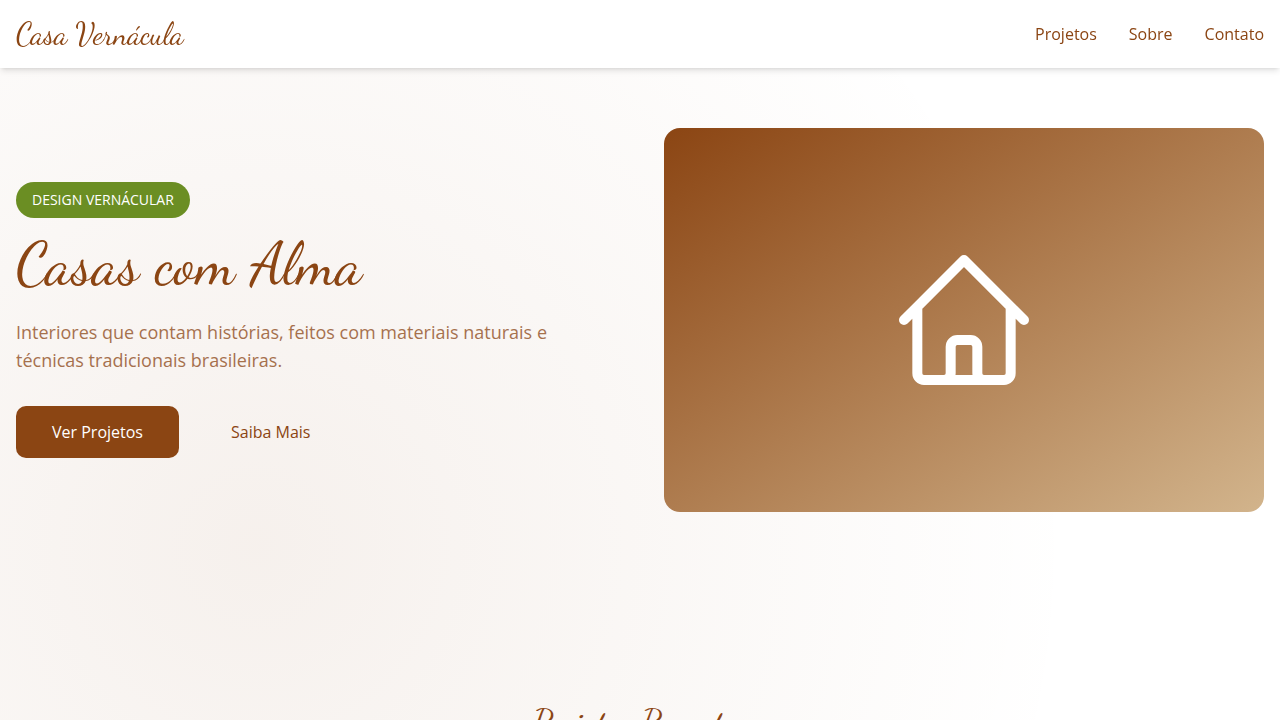
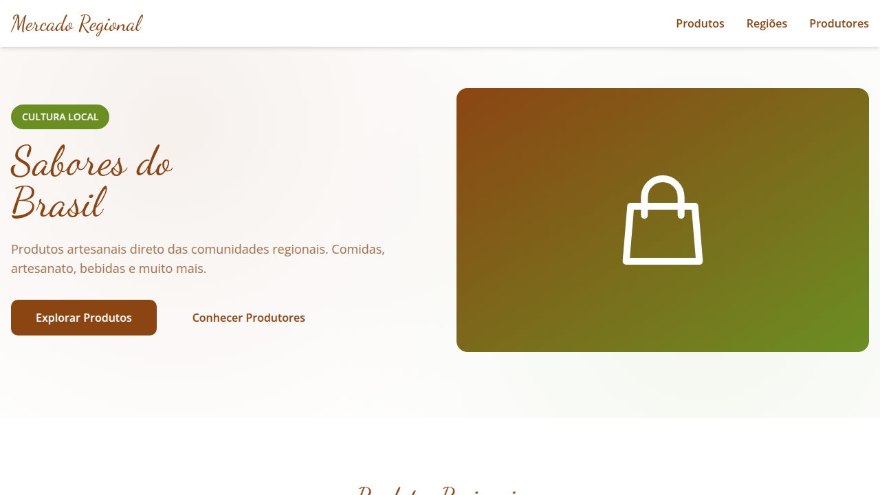
Design an authentic and rustic landing page for a vernacular interior design blog, inspired by Brazilian material culture. Ideal for landing pages, saas. AI-ready template.
Use case: Landing pages, SaaS
Historical Context
Brazilian vernacular design didn't emerge from studios or manifestos. It grew from necessity — from the hand-painted pharmacy signs in Minas Gerais, the improvised tile mosaics on favela walls, the sun-bleached color palettes of northeastern fishing villages. These weren't aesthetic choices made by designers. They were solutions made by people who needed things to work, to communicate, to feel like home. What makes this tradition remarkable is its warmth. Unlike European vernacular traditions that often lean austere or functional, Brazilian everyday design carries an inherent generosity. The corner bar with mismatched chairs and hand-lettered menus. The ceramic work passed between generations in Vale do Jequitinhonha. The woven hammocks that define domestic space across the entire north. Every object tells you: sit, stay, you belong here. The shift from unconscious tradition to intentional design language happened gradually through the 2000s and 2010s, as Brazilian designers — tired of importing Scandinavian minimalism wholesale — began documenting and elevating these patterns. Not as nostalgia. As living vocabulary.
When to Use
When your project needs to feel genuinely warm without resorting to generic 'cozy' clichés. Brazilian vernacular works for interior brands that want rootedness over trend-chasing, local businesses that need to signal community and belonging, and architectural projects where climate and culture should drive material choices. It's particularly effective when you need design that communicates accessibility and welcome across class boundaries — this tradition was never exclusive.
Design Principles
- Warmth through imperfection — embrace handmade textures, visible brushstrokes, and natural material variation over machine-perfect finishes
- Color as hospitality — use saturated, sun-informed palettes (terracotta, cobalt, ochre, verde-bandeira) that invite rather than intimidate
- Improvised functionality — let constraints drive creative solutions; the gambiarra mindset where resourcefulness becomes aesthetic
- Layered domesticity — mix patterns, materials, and eras freely the way Brazilian homes actually accumulate objects and meaning over time
- Climate-honest materiality — prioritize ceramics, natural fibers, tropical hardwoods, and ventilated forms that acknowledge heat, humidity, and outdoor living
DESIGN.md
---
version: "alpha"
name: "Vernacular Acolhedor Brasileiro"
description: "Design an authentic and rustic landing page for a vernacular interior design blog, inspired by Brazilian material culture. Ideal for landing pages, saas. AI-ready template."
colors:
  primary: "#8B4513"
  secondary: "#D2B48C"
  tertiary: "#6B8E23"
  neutral: "#FFFFFF"
  surface: "#CC5500"
  accent: "#001F3F"
typography:
  h1:
    fontFamily: Dancing Script
    fontSize: 2.5rem
    fontWeight: 700
  body-md:
    fontFamily: Dancing Script
    fontSize: 1rem
    fontWeight: 400
rounded:
  sm: 10px
  md: 20px
  lg: 30px
components:
  button-primary:
    backgroundColor: "{colors.primary}"
    textColor: "{colors.neutral}"
    rounded: "{rounded.sm}"
    padding: 12px
---

## Overview

Design an authentic and rustic landing page for a vernacular interior design blog, inspired by Brazilian material culture. Ideal for landing pages, saas. AI-ready template. Brazilian vernacular design didn't emerge from studios or manifestos. It grew from necessity — from the hand-painted pharmacy signs in Minas Gerais, the improvised tile mosaics on favela walls, the sun-bleached color palettes of northeastern fishing villages. These weren't aesthetic choices made by designers. They were solutions made by people who needed things to work, to communicate, to feel like home.

What makes this tradition remarkable is its warmth. Unlike European vernacular traditions that often lean austere or functional, Brazilian everyday design carries an inherent generosity. The corner bar with mismatched chairs and hand-lettered menus. The ceramic work passed between generations in Vale do Jequitinhonha. The woven hammocks that define domestic space across the entire north. Every object tells you: sit, stay, you belong here.

The shift from unconscious tradition to intentional design language happened gradually through the 2000s and 2010s, as Brazilian designers — tired of importing Scandinavian minimalism wholesale — began documenting and elevating these patterns. Not as nostalgia. As living vocabulary.

- Density: 5/10 — Balanced
- Variance: 4/10 — Moderate
- Motion: 4/10 — Subtle

- **Style:** Authentic, Rustic, Inspiring, Community
- **Keywords:** vernacular design, interior design, Brazilian, authentic, rustic, natural materials, cozy, inspiring, sustainable, local
- **Era:** 2026+ Raízes e Tradição
- **Light/Dark:** ✓ Full / ✗ No

## Colors

- **Marrom Terra** (#8B4513) — Primary surface or dominant color
- **Bege Argila** (#D2B48C) — Secondary surface or text color
- **Verde Musgo** (#6B8E23) — Supporting palette color
- **Branco** (#FFFFFF) — Light surface, card backgrounds
- **Laranja Queimado** (#CC5500) — Warm accent, call-to-action secondary
- **Azul Profundo** (#001F3F) — Primary background surface
- **Amarelo Ocre** (#CC7722) — Warning states, attention indicators
- **Cinza Claro** (#E0E0E0) — Secondary text, borders, muted elements


## Typography

- **Display / Hero:** Dancing Script — Weight 700, tight tracking, used for headline impact
- **Body:** Dancing Script — Weight 400, 16px/1.6 line-height, max 72ch per line
- **UI Labels / Captions:** Dancing Script — 0.875rem, weight 500, slight letter-spacing
- **Monospace:** JetBrains Mono — Used for code, metadata, and technical values

Scale:
- Hero: clamp(2.5rem, 5vw, 4rem)
- H1: 2.25rem
- H2: 1.5rem
- Body: 1rem / 1.6
- Small: 0.875rem


## Layout

- **Grid:** CSS Grid primary. Max-width containment: 1280px centered with 1.5rem side padding.
- **Spacing rhythm:** Balanced. Base unit: 0.5rem (8px).
- **Section vertical gaps:** clamp(4rem, 8vw, 8rem).
- **Hero layout:** Split-screen (text left, visual right).
- **Feature sections:** Zig-zag alternating text+image rows. No 3-equal-columns.
- **Mobile collapse:** All multi-column layouts collapse below 768px. No horizontal overflow.
- **z-index contract:** base (0) / sticky-nav (100) / overlay (200) / modal (300) / toast (500).


## Elevation & Depth

Texturas de barro, cerâmica e fibras naturais em elementos de UI, tipografia que remete a caligrafia ou escrita manual, fotografias de interiores com elementos artesanais, micro-interações de hover com efeito de "desgaste" ou "envelhecimento" sutil, transições de seção suaves e com elementos que se "desdobram" como tecidos.

- **Physics:** Ease-out curves, 200-300ms duration. Smooth and predictable.
- **Entry animations:** Fade + translate-Y (16px → 0) over 420ms ease-out. Staggered cascades for lists: 80ms between items.
- **Hover states:** Subtle color shift + shadow adjustment over 200ms.
- **Page transitions:** Fade only (200ms).
- **Performance:** Only transform and opacity animated. No layout-triggering properties.


## Shapes

Base corner radius: 10px. See rounded tokens in front matter for the full scale.


## Components

- **Primary Button:** Rounded (10px) shape. Accent color fill. Hover: 8% darken + subtle lift shadow. Active: -1px translate tactile press. Font weight 600. No outer glows.
- **Secondary / Ghost Button:** Outline variant. 1.5px border in muted color. Text in primary color. Hover: subtle background fill.
- **Cards:** Rounded (10px) corners. Surface background. Subtle shadow (0 2px 12px rgba(0,0,0,0.06)). 1px border stroke.
- **Inputs:** Label above input. 1px border stroke. Focus ring: 2px accent color offset 2px. Error text below in semantic red. No floating labels.
- **Navigation:** Primary surface background. Active item: accent color indicator. Font weight 500 when active.
- **Skeletons:** Shimmer animation matching component dimensions. No circular spinners.
- **Empty States:** Icon-based composition with descriptive text and action button.


## Do's and Don'ts

- No emojis in UI — use icon system only (Lucide, Heroicons)
- No pure black (#000000) — use off-black or charcoal variants
- No oversaturated accent colors (saturation cap: 80%)
- No 3-column equal-width feature layouts — use zig-zag or asymmetric grid
- No `h-screen` — use `min-h-[100dvh]`
- No AI copywriting clichés: "Elevate", "Seamless", "Unleash", "Next-Gen"
- No broken external image links — use picsum.photos or inline SVG
- No generic lorem ipsum in demos

- Do Paleta de cores brasileira verificada
- Do Elementos orgânicos/naturais presentes
- Do Autenticidade cultural brasileira verificada
- Do Elementos de sustentabilidade presentes
- Do Atmosfera acolhedora e calorosa verificada
- Do Texturas artesanais/rústicas aplicadas
- Do Tipografia hierárquica clara
- Do Responsividade mobile verificada
- Do Contraste WCAG AA verificado
- Do Conteúdo em PT-BR verificado


## Use Case

Landing pages, SaaS
Technical Specs
CSS
background: #FFFFFF, color: #8B4513, border: 1px solid #CC7722, border-radius: 10px, font-family: "Dancing Script, cursive", transition: all 0.7s ease-in-out, .clay-texture-bg, .handmade-element, .fabric-unfold-transition.
Variables
--earth-brown: #8B4513, --clay-beige: #D2B48C, --moss-green: #6B8E23, --white-bg: #FFFFFF, --border-radius-lg: 10px, --font-calligraphy: "Dancing Script, cursive", --ceramic-texture-bg: url("ceramic-texture.png"), --fabric-unfold-duration: 0.7s.Checklist
☐ Paleta de cores brasileira verificada, ☐ Elementos orgânicos/naturais presentes, ☐ Autenticidade cultural brasileira verificada, ☐ Elementos de sustentabilidade presentes, ☐ Atmosfera acolhedora e calorosa verificada, ☐ Texturas artesanais/rústicas aplicadas, ☐ Tipografia hierárquica clara, ☐ Responsividade mobile verificada, ☐ Contraste WCAG AA verificado, ☐ Conteúdo em PT-BR verificado
Colors
Primary
Secondary
Effects
Texturas de barro, cerâmica e fibras naturais em elementos de UI, tipografia que remete a caligrafia ou escrita manual, fotografias de interiores com elementos artesanais, micro-interações de hover com efeito de "desgaste" ou "envelhecimento" sutil, transições de seção suaves e com elementos que se "desdobram" como tecidos.
Light/Dark
✓ Full / ✗ No
AI Prompt
Act as a Senior Frontend Engineer and Expert UI Designer.
Your task is to code a complete Landing Page on the first attempt.
- Landing Page Theme: <INSERT THEME>
- Sections to add: <INSERT SECTIONS>

Generate the final code immediately following these definitions:

## Style

- **Name:** Vernacular Acolhedor Brasileiro
- **Type:** Authentic, Rustic, Inspiring, Community
- **Keywords:** vernacular design, interior design, Brazilian, authentic, rustic, natural materials, cozy, inspiring, sustainable, local
- **Era:** 2026+ Raízes e Tradição
- **Light/Dark:** ✓ Full / ✗ No

## Color Palette

- **Primary:** Marrom Terra #8B4513, Bege Argila #D2B48C, Verde Musgo #6B8E23, Branco #FFFFFF
- **Secondary:** Laranja Queimado #CC5500, Azul Profundo #001F3F, Amarelo Ocre #CC7722, Cinza Claro #E0E0E0

## Visual Effects

Texturas de barro, cerâmica e fibras naturais em elementos de UI, tipografia que remete a caligrafia ou escrita manual, fotografias de interiores com elementos artesanais, micro-interações de hover com efeito de "desgaste" ou "envelhecimento" sutil, transições de seção suaves e com elementos que se "desdobram" como tecidos.

## AI Visual Direction

Design an authentic and rustic landing page for a vernacular interior design blog, inspired by Brazilian material culture. Use: clay, ceramic, and natural fiber textures in UI elements, calligraphy/handwritten-style typography, photographs of interiors with handmade elements, subtle "worn" or "aged" hover micro-interactio, smooth section transitions with fabric-like "unfolding" effects, earthy brown and clay beige accents, cozy and inspiring feel.

## CSS Technical

```css
background: #FFFFFF, color: #8B4513, border: 1px solid #CC7722, border-radius: 10px, font-family: "Dancing Script, cursive", transition: all 0.7s ease-in-out, .clay-texture-bg, .handmade-element, .fabric-unfold-transition.
```

## Design System Variables

```css
--earth-brown: #8B4513, --clay-beige: #D2B48C, --moss-green: #6B8E23, --white-bg: #FFFFFF, --border-radius-lg: 10px, --font-calligraphy: "Dancing Script, cursive", --ceramic-texture-bg: url("ceramic-texture.png"), --fabric-unfold-duration: 0.7s.
```

## Implementation Checklist

- ☐ Paleta de cores brasileira verificada
- ☐ Elementos orgânicos/naturais presentes
- ☐ Autenticidade cultural brasileira verificada
- ☐ Elementos de sustentabilidade presentes
- ☐ Atmosfera acolhedora e calorosa verificada
- ☐ Texturas artesanais/rústicas aplicadas
- ☐ Tipografia hierárquica clara
- ☐ Responsividade mobile verificada
- ☐ Contraste WCAG AA verificado
- ☐ Conteúdo em PT-BR verificado

## Execution Rules

1. Strictly follow the defined visual style.
2. Use high-quality inline SVG icons (Heroicons or Lucide style) — NEVER use emojis as icons.
3. Add `cursor-pointer` and smooth `hover` states (transition-all) on all interactive elements.
4. Required Page Structure:
   - Navbar (Logo + Links + CTA)
   - Hero Section (Impactful Headline + Subtitle + 2 buttons + 3D/Abstract visual element via CSS)
   - Features (3 cards with icons)
   - Testimonials (3 cards)
   - Pricing (3 tiers, highlight the middle one)
   - Final CTA
   - Full Footer with social links, privacy policy, terms of use, contact and SEO links.
5. All text content must be in English.
6. The visual must be CLEARLY distinct — do not create a "default Bootstrap" design. Force the use of the provided design system variables.
7. Use `<style>` tags in the head for custom classes (especially for complex backdrop-filter effects and animations) that Tailwind CDN doesn't cover.
8. Full Responsiveness: Layout must adapt perfectly to Mobile, Tablet and Desktop (vertical stack on mobile).
9. Include basic SEO, Viewport and Open Graph meta tags in `<head>`.
10. Footer must contain: Copyright 2026, Secondary navigation links and Social media icons.
11. Make the creative decisions needed to deliver the complete, functional result now.Related
Last synced: 4/1/2026