Thermal Insight Tech
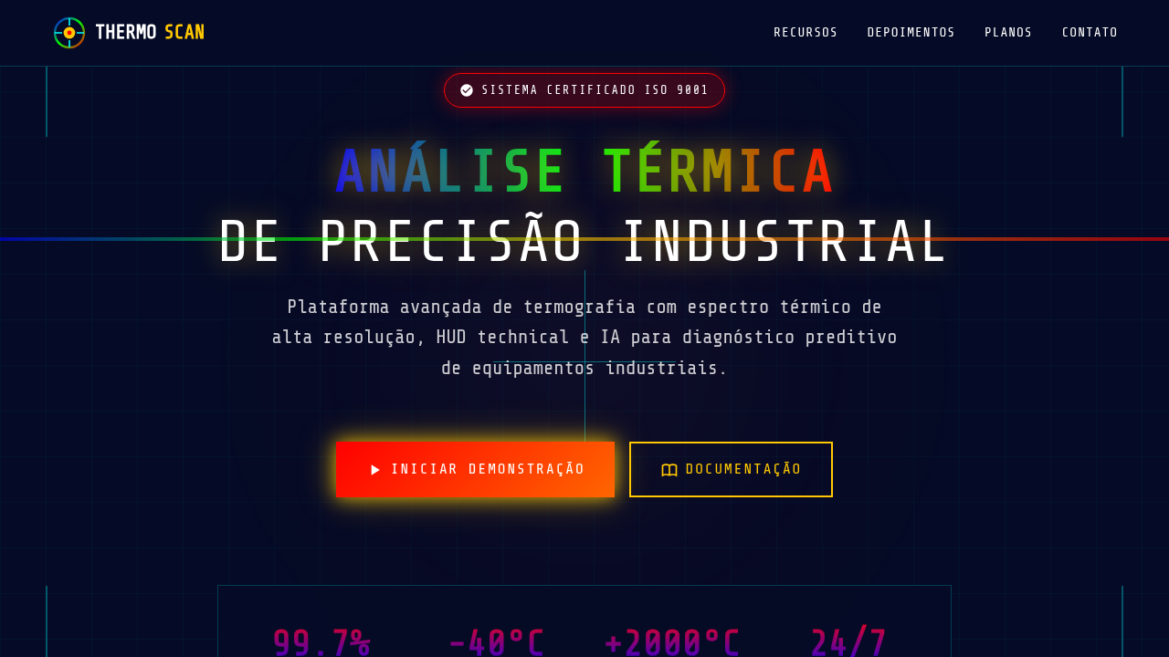
Thermal imaging landing page, heat map aesthetic, infrared colors, dark tech background, spectrum gradient, technical analysis. Ideal for landing pages, modern websites. AI-ready template.
Use case: Landing pages, Modern websites
Historical Context
Thermal imaging didn't start as a design language. It started as military surveillance — cold war paranoia rendered in phosphor green. The infrared spectrum was classified territory before it became a palette. What changed everything was accessibility. Once FLIR sensors dropped below five figures, suddenly every building inspector, firefighter, and wildlife researcher had a heat map in their pocket. The aesthetic followed the tooling. What makes thermal visualization fascinating from a design perspective is its inherent abstraction. You're mapping invisible radiation to visible color. That translation is entirely arbitrary — the classic rainbow gradient from blue-cold to red-hot is a convention, not a truth. Some of the most effective thermal interfaces abandon it completely, opting for monochrome iron palettes or high-contrast white-hot schemes that prioritize readability over spectacle. The current generation of thermal UI draws from scientific imaging but speaks the language of dashboards. Real-time overlays, threshold alerts, temporal heatmaps showing change over hours. It's data visualization at its most literal — making the invisible visible, then making that visibility actionable.
When to Use
Reach for thermal aesthetics when your interface needs to communicate intensity, density, or anomaly detection without words. Security systems monitoring perimeter breaches. Industrial floors tracking equipment stress before failure happens. Scientific instruments where temperature differential IS the data. The visual language works because humans read warm-cool intuitively — no legend required for the gut reaction. But be deliberate. Thermal palettes in the wrong context feel gimmicky fast. Use them where heat literally matters, or where the metaphor of intensity mapping serves genuine comprehension.
Design Principles
- Calibrate your palette to the data range — don't waste color bandwidth on temperatures that never occur in your use case
- Contrast beats beauty. A readable monochrome iron scale outperforms a pretty rainbow gradient every time in operational contexts
- Layer thermal data over structural context. Heat maps floating in void lose spatial meaning — anchor them to geometry, floorplans, equipment outlines
- Design for anomaly, not average. The interface should make outliers scream and let normal readings recede into quiet background texture
- Respect temporal dimension. Static thermal snapshots lie. Show accumulation, show drift, show the story of heat moving through time
DESIGN.md
---
version: "alpha"
name: "Thermal Insight Tech"
description: "Thermal imaging landing page, heat map aesthetic, infrared colors, dark tech background, spectrum gradient, technical analysis. Ideal for landing pages, modern websites. AI-ready template."
colors:
  primary: "#050B26"
  secondary: "#FFFFFF"
  tertiary: "#FFC800"
  neutral: "#FF0000"
  surface: "#0000FF"
  accent: "#00FF00"
typography:
  h1:
    fontFamily: Share Tech Mono
    fontSize: 2.5rem
    fontWeight: 700
  body-md:
    fontFamily: Share Tech Mono
    fontSize: 1rem
    fontWeight: 400
components:
  button-primary:
    backgroundColor: "{colors.primary}"
    textColor: "{colors.neutral}"
    padding: 12px
---

## Overview

Thermal imaging landing page, heat map aesthetic, infrared colors, dark tech background, spectrum gradient, technical analysis. Ideal for landing pages, modern websites. AI-ready template. Thermal imaging didn't start as a design language. It started as military surveillance — cold war paranoia rendered in phosphor green. The infrared spectrum was classified territory before it became a palette. What changed everything was accessibility. Once FLIR sensors dropped below five figures, suddenly every building inspector, firefighter, and wildlife researcher had a heat map in their pocket. The aesthetic followed the tooling.

What makes thermal visualization fascinating from a design perspective is its inherent abstraction. You're mapping invisible radiation to visible color. That translation is entirely arbitrary — the classic rainbow gradient from blue-cold to red-hot is a convention, not a truth. Some of the most effective thermal interfaces abandon it completely, opting for monochrome iron palettes or high-contrast white-hot schemes that prioritize readability over spectacle.

The current generation of thermal UI draws from scientific imaging but speaks the language of dashboards. Real-time overlays, threshold alerts, temporal heatmaps showing change over hours. It's data visualization at its most literal — making the invisible visible, then making that visibility actionable.

- Density: 5/10 — Balanced
- Variance: 4/10 — Moderate
- Motion: 4/10 — Subtle

- **Style:** Analytical, Authoritative, Industrial
- **Keywords:** thermal, heat map, infrared, tech, spectrum, gradient, dark, analysis
- **Era:** Future Industrial
- **Light/Dark:** ✗ No / ✓ Full

## Colors

- **Background** (#050B26) — Primary background surface
- **Text** (#FFFFFF) — Primary text color
- **Accent** (#FFC800) — Primary accent, CTAs and interactive elements
- **Hot Red** (#FF0000) — Error states, destructive actions
- **Cool Blue** (#0000FF) — Secondary accent
- **Mid Green** (#00FF00) — Success states, positive indicators


## Typography

- **Display / Hero:** Share Tech Mono — Weight 700, tight tracking, used for headline impact
- **Body:** Share Tech Mono — Weight 400, 16px/1.6 line-height, max 72ch per line
- **UI Labels / Captions:** Share Tech Mono — 0.875rem, weight 500, slight letter-spacing
- **Monospace:** Share Tech Mono — Used for code, metadata, and technical values

Scale:
- Hero: clamp(2.5rem, 5vw, 4rem)
- H1: 2.25rem
- H2: 1.5rem
- Body: 1rem / 1.6
- Small: 0.875rem


## Layout

- **Grid:** CSS Grid primary. Max-width containment: 1280px centered with 1.5rem side padding.
- **Spacing rhythm:** Balanced. Base unit: 0.5rem (8px).
- **Section vertical gaps:** clamp(4rem, 8vw, 8rem).
- **Hero layout:** Split-screen (text left, visual right).
- **Feature sections:** Zig-zag alternating text+image rows. No 3-equal-columns.
- **Mobile collapse:** All multi-column layouts collapse below 768px. No horizontal overflow.
- **z-index contract:** base (0) / sticky-nav (100) / overlay (200) / modal (300) / toast (500).


## Elevation & Depth

Thermal heat map spectrums (blue to red), technical HUD overlays, wireframe crosshairs, emissive bio-luminescent glow.

- **Physics:** Ease-out curves, 200-300ms duration. Smooth and predictable.
- **Entry animations:** Fade + translate-Y (16px → 0) over 420ms ease-out. Staggered cascades for lists: 80ms between items.
- **Hover states:** Subtle color shift + shadow adjustment over 200ms.
- **Page transitions:** Fade only (200ms).
- **Performance:** Only transform and opacity animated. No layout-triggering properties.


## Shapes

Base corner radius: 8px. See rounded tokens in front matter for the full scale.


## Components

- **Primary Button:** Subtly rounded (0.5rem) shape. Accent color fill. Hover: 8% darken + subtle lift shadow. Active: -1px translate tactile press. Font weight 600. No outer glows.
- **Secondary / Ghost Button:** Outline variant. 1.5px border in muted color. Text in primary color. Hover: subtle background fill.
- **Cards:** Subtly rounded (0.5rem) corners. Surface background. Subtle shadow (0 2px 12px rgba(0,0,0,0.06)). 1px border stroke.
- **Inputs:** Label above input. 1px border stroke. Focus ring: 2px accent color offset 2px. Error text below in semantic red. No floating labels.
- **Navigation:** Primary surface background. Active item: accent color indicator. Font weight 500 when active.
- **Skeletons:** Shimmer animation matching component dimensions. No circular spinners.
- **Empty States:** Icon-based composition with descriptive text and action button.


## Do's and Don'ts

- No emojis in UI — use icon system only (Lucide, Heroicons)
- No pure white (#FFFFFF) backgrounds — use off-white or dark surfaces
- No oversaturated accent colors (saturation cap: 80%)
- No 3-column equal-width feature layouts — use zig-zag or asymmetric grid
- No `h-screen` — use `min-h-[100dvh]`
- No AI copywriting clichés: "Elevate", "Seamless", "Unleash", "Next-Gen"
- No broken external image links — use picsum.photos or inline SVG
- No generic lorem ipsum in demos

- Do Dark Navy background
- Do Thermal color spectrum (Blue->Green->Red)
- Do HUD/Crosshair overlays
- Do 'Glow' effects on hotspots
- Do Monospace technical text


## Use Case

Landing pages, Modern websites
Technical Specs
CSS
background-color: #050B26; color: #FFFFFF; font-family: 'Share Tech Mono', monospace; background-image: linear-gradient(to right, #0000FF, #00FF00, #FF0000); -webkit-background-clip: text; color: transparent;
Variables
--bg-navy: #050B26, --thermal-red: #FF0000, --thermal-yellow: #FFC800, --thermal-blue: #0000FF, --font-mono: 'Share Tech Mono', monospace
Checklist
☐ Dark Navy background, ☐ Thermal color spectrum (Blue->Green->Red), ☐ HUD/Crosshair overlays, ☐ 'Glow' effects on hotspots, ☐ Monospace technical text
Colors
Primary
Secondary
Effects
Thermal heat map spectrums (blue to red), technical HUD overlays, wireframe crosshairs, emissive bio-luminescent glow.
Light/Dark
✗ No / ✓ Full
AI Prompt
Act as a Senior Frontend Engineer and Expert UI Designer.
Your task is to code a complete Landing Page on the first attempt.
- Landing Page Theme: <INSERT THEME>
- Sections to add: <INSERT SECTIONS>

Generate the final code immediately following these definitions:

## Style

- **Name:** Thermal Insight Tech
- **Type:** Analytical, Authoritative, Industrial
- **Keywords:** thermal, heat map, infrared, tech, spectrum, gradient, dark, analysis
- **Era:** Future Industrial
- **Light/Dark:** ✗ No / ✓ Full

## Color Palette

- **Primary:** Background #050B26, Text #FFFFFF, Accent #FFC800
- **Secondary:** Hot Red #FF0000, Cool Blue #0000FF, Mid Green #00FF00

## Visual Effects

Thermal heat map spectrums (blue to red), technical HUD overlays, wireframe crosshairs, emissive bio-luminescent glow.

## AI Visual Direction

thermal imaging landing page, heat map aesthetic, infrared colors, dark tech background, spectrum gradient, technical analysis.

## CSS Technical

```css
background-color: #050B26; color: #FFFFFF; font-family: 'Share Tech Mono', monospace; background-image: linear-gradient(to right, #0000FF, #00FF00, #FF0000); -webkit-background-clip: text; color: transparent;
```

## Design System Variables

```css
--bg-navy: #050B26, --thermal-red: #FF0000, --thermal-yellow: #FFC800, --thermal-blue: #0000FF, --font-mono: 'Share Tech Mono', monospace
```

## Implementation Checklist

- ☐ Dark Navy background
- ☐ Thermal color spectrum (Blue->Green->Red)
- ☐ HUD/Crosshair overlays
- ☐ 'Glow' effects on hotspots
- ☐ Monospace technical text

## Execution Rules

1. Strictly follow the defined visual style.
2. Use high-quality inline SVG icons (Heroicons or Lucide style) — NEVER use emojis as icons.
3. Add `cursor-pointer` and smooth `hover` states (transition-all) on all interactive elements.
4. Required Page Structure:
   - Navbar (Logo + Links + CTA)
   - Hero Section (Impactful Headline + Subtitle + 2 buttons + 3D/Abstract visual element via CSS)
   - Features (3 cards with icons)
   - Testimonials (3 cards)
   - Pricing (3 tiers, highlight the middle one)
   - Final CTA
   - Full Footer with social links, privacy policy, terms of use, contact and SEO links.
5. All text content must be in English.
6. The visual must be CLEARLY distinct — do not create a "default Bootstrap" design. Force the use of the provided design system variables.
7. Use `<style>` tags in the head for custom classes (especially for complex backdrop-filter effects and animations) that Tailwind CDN doesn't cover.
8. Full Responsiveness: Layout must adapt perfectly to Mobile, Tablet and Desktop (vertical stack on mobile).
9. Include basic SEO, Viewport and Open Graph meta tags in `<head>`.
10. Footer must contain: Copyright 2026, Secondary navigation links and Social media icons.
11. Make the creative decisions needed to deliver the complete, functional result now.
Related
Last synced: 4/1/2026