Tenebrism
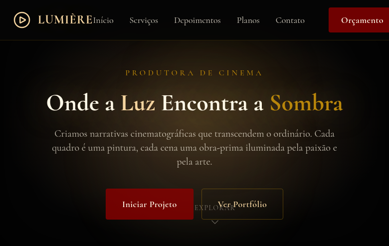
Tenebrism-inspired landing page with extreme contrast between light and deep darkness. Ideal for pôsteres atmosféricos, flyers de eventos, spreads editoriais, embalagens premium. AI-ready template.
Use case: Atmospheric posters, Event flyers, Editorial spreads, Premium packaging
Historical Context
Tenebrism isn't just chiaroscuro turned up to eleven — it's a philosophical stance disguised as a lighting technique. When Caravaggio started plunging his backgrounds into absolute blackness around 1600, he wasn't being dramatic for drama's sake. He was rejecting the idealized, evenly-lit world of Mannerism and forcing viewers to confront raw, unfiltered humanity emerging from void. The light in tenebrism doesn't illuminate a scene — it interrogates it. The technique spread like wildfire through the Caravaggisti — Artemisia Gentileschi, Georges de La Tour, Jusepe de Ribera — each understanding that darkness isn't absence, it's presence. De La Tour's candlelit scenes prove you can build entire emotional architectures with a single light source and the courage to let everything else disappear. This wasn't subtlety. This was conviction. What makes tenebrism endure in design is its brutal editorial clarity. It forces hierarchy. When 80% of your canvas is black, whatever catches light becomes undeniable. There's no hiding behind busy compositions or safe middle-gray compromises. You commit to the darkness, or you don't. Half-measures produce mud.
When to Use
Reach for tenebrism when you need to command attention without raising your voice. It's devastating for luxury brands that want gravity over gloss, photography portfolios that treat negative space as sacred, editorial layouts where one image needs to hit like a gut punch. Art galleries, theater, high-end spirits, fashion after dark. Use it when your content is strong enough to stand alone in a pool of light — because tenebrism exposes weak content mercilessly. If your subject can't carry the weight of all that surrounding darkness, pick a different approach.
Design Principles
- Commit to true black — not dark gray, not charcoal. #000000 or near-black with barely perceptible warmth. The darkness must feel absolute and intentional, never like a failed gradient.
- Single dominant light source, always motivated. Every illuminated element must feel like it earned its visibility. Scattered highlights destroy the tension tenebrism depends on.
- Hierarchy through revelation, not decoration. Let darkness do the organizational work. What's lit is important; what's hidden is context. No borders, no dividers — the void separates.
- Preserve the drama in transitions. When elements enter or exit the light, the edges should feel painterly — soft falloff, not hard masks. The boundary between visible and invisible is where the emotion lives.
- Restrain your palette to what light would actually reveal. Tenebrism palettes are warm and limited: ochre, deep red, flesh tones, gold. Cool colors read as moonlit, which is a different mood entirely.
DESIGN.md
---
version: "alpha"
name: "Tenebrism"
description: "Tenebrism-inspired landing page with extreme contrast between light and deep darkness. Ideal for pôsteres atmosféricos, flyers de eventos, spreads editoriais, embalagens premium. AI-ready template."
colors:
  primary: "#050505"
  secondary: "#F5D5A0"
  tertiary: "#3A2A1A"
  neutral: "#FFF8E7"
  surface: "#8B0000"
  accent: "#B8860B"
typography:
  h1:
    fontFamily: Cormorant
    fontSize: 2.5rem
    fontWeight: 700
  body-md:
    fontFamily: Cormorant
    fontSize: 1rem
    fontWeight: 400
spacing:
  sm: 2.5rem
  md: 5.0rem
  lg: 10.0rem
components:
  button-primary:
    backgroundColor: "{colors.primary}"
    textColor: "{colors.neutral}"
    padding: 12px
---

## Overview

Tenebrism-inspired landing page with extreme contrast between light and deep darkness. Ideal for pôsteres atmosféricos, flyers de eventos, spreads editoriais, embalagens premium. AI-ready template. Tenebrism isn't just chiaroscuro turned up to eleven — it's a philosophical stance disguised as a lighting technique. When Caravaggio started plunging his backgrounds into absolute blackness around 1600, he wasn't being dramatic for drama's sake. He was rejecting the idealized, evenly-lit world of Mannerism and forcing viewers to confront raw, unfiltered humanity emerging from void. The light in tenebrism doesn't illuminate a scene — it interrogates it.

The technique spread like wildfire through the Caravaggisti — Artemisia Gentileschi, Georges de La Tour, Jusepe de Ribera — each understanding that darkness isn't absence, it's presence. De La Tour's candlelit scenes prove you can build entire emotional architectures with a single light source and the courage to let everything else disappear. This wasn't subtlety. This was conviction.

What makes tenebrism endure in design is its brutal editorial clarity. It forces hierarchy. When 80% of your canvas is black, whatever catches light becomes undeniable. There's no hiding behind busy compositions or safe middle-gray compromises. You commit to the darkness, or you don't. Half-measures produce mud.

- Density: 5/10 — Balanced
- Variance: 4/10 — Moderate
- Motion: 6/10 — Expressive

- **Style:** Extreme Contrast, Spotlight, Moody, Dramatic
- **Keywords:** Tenebrism, extreme contrast, light vs dark, spotlight effect, moody, dramatic, Caravaggio, chiaroscuro, intense, atmospheric
- **Era:** 17th Century Baroque Painting
- **Light/Dark:** ✗ Not Recommended / ✓ Full

## Colors

- **Deep Black** (#050505) — Dark surface, primary background
- **Warm Spotlight** (#F5D5A0) — Secondary surface or text color
- **Rich Brown** (#3A2A1A) — Supporting palette color
- **Ivory Highlight** (#FFF8E7) — Light surface, card backgrounds
- **Blood Red** (#8B0000) — Error states, destructive actions
- **Deep Gold** (#B8860B) — Premium accent, decorative highlights
- **Midnight Blue** (#0D1B2A) — Deep contrast surface
- **Warm Grey** (#4A4A3A) — Secondary text, borders, muted elements


## Typography

- **Display / Hero:** Cormorant — Weight 700, tight tracking, used for headline impact
- **Body:** Cormorant — Weight 400, 16px/1.6 line-height, max 72ch per line
- **UI Labels / Captions:** Cormorant — 0.875rem, weight 500, slight letter-spacing
- **Monospace:** JetBrains Mono — Used for code, metadata, and technical values

Scale:
- Hero: clamp(2.5rem, 5vw, 4rem)
- H1: 2.25rem
- H2: 1.5rem
- Body: 1rem / 1.6
- Small: 0.875rem


## Layout

- **Grid:** CSS Grid primary. Max-width containment: 1280px centered with 1.5rem side padding.
- **Spacing rhythm:** Balanced. Base unit: 0.5rem (8px).
- **Section vertical gaps:** clamp(4rem, 8vw, 8rem).
- **Hero layout:** Split-screen (text left, visual right).
- **Feature sections:** Zig-zag alternating text+image rows. No 3-equal-columns.
- **Mobile collapse:** All multi-column layouts collapse below 768px. No horizontal overflow.
- **z-index contract:** base (0) / sticky-nav (100) / overlay (200) / modal (300) / toast (500).


## Elevation & Depth

Dramatic radial-gradient spotlight effects, deep dark backgrounds with isolated light areas, heavy vignette overlays, warm golden light accents, smooth reveal animations from darkness (800ms), text emerging from shadow with text-shadow layers

- **Physics:** Spring — stiffness 120, damping 20. Confident, weighted transitions.
- **Entry animations:** Fade + translate-Y (16px → 0) over 480ms ease-out. Staggered cascades for lists: 100ms between items.
- **Hover states:** Scale(1.03) + shadow lift over 200ms.
- **Page transitions:** Fade + slide (300ms).
- **Performance:** Only transform and opacity animated. No layout-triggering properties.


## Shapes

Base corner radius: 8px. See rounded tokens in front matter for the full scale.


## Components

- **Primary Button:** Subtly rounded (0.5rem) shape. Accent color fill. Hover: 8% darken + subtle lift shadow. Active: -1px translate tactile press. Font weight 600. No outer glows.
- **Secondary / Ghost Button:** Outline variant. 1.5px border in muted color. Text in primary color. Hover: subtle background fill.
- **Cards:** Subtly rounded (0.5rem) corners. Surface background. Subtle shadow (0 2px 12px rgba(0,0,0,0.06)). 1px border stroke.
- **Inputs:** Label above input. 1px border stroke. Focus ring: 2px accent color offset 2px. Error text below in semantic red. No floating labels.
- **Navigation:** Primary surface background. Active item: accent color indicator. Font weight 500 when active.
- **Skeletons:** Shimmer animation matching component dimensions. No circular spinners.
- **Empty States:** Icon-based composition with descriptive text and action button.


## Do's and Don'ts

- No emojis in UI — use icon system only (Lucide, Heroicons)
- No pure white (#FFFFFF) backgrounds — use off-white or dark surfaces
- No oversaturated accent colors (saturation cap: 80%)
- No 3-column equal-width feature layouts — use zig-zag or asymmetric grid
- No `h-screen` — use `min-h-[100dvh]`
- No AI copywriting clichés: "Elevate", "Seamless", "Unleash", "Next-Gen"
- No broken external image links — use picsum.photos or inline SVG
- No generic lorem ipsum in demos

- Do Extreme light/dark contrast
- Do Radial spotlight gradient backgrounds
- Do Deep dark base with isolated light
- Do Heavy vignette overlays
- Do Warm golden light accents
- Do Text emerging from shadow
- Do Moody dramatic atmosphere
- Do Responsive with maintained drama


## Use Case

Atmospheric posters, Event flyers, Editorial spreads, Premium packaging
Technical Specs
CSS
font-family: 'Cormorant', serif, background: radial-gradient(ellipse at center, #3A2A1A, #050505 70%), color: #FFF8E7, text-shadow: 0 0 40px rgba(245,213,160,0.3), box-shadow: inset 0 0 100px rgba(0,0,0,0.8) for vignette, border: 1px solid rgba(184,134,11,0.3), transition: opacity 800ms
Variables
--color-black: #050505, --color-spotlight: #F5D5A0, --color-brown: #3A2A1A, --color-ivory: #FFF8E7, --font-primary: 'Cormorant', --spotlight-gradient: radial-gradient(ellipse, #3A2A1A, #050505 70%), --vignette: inset 0 0 100px rgba(0,0,0,0.8), --spacing: 2.5rem
Checklist
☐ Extreme light/dark contrast, ☐ Radial spotlight gradient backgrounds, ☐ Deep dark base with isolated light, ☐ Heavy vignette overlays, ☐ Warm golden light accents, ☐ Text emerging from shadow, ☐ Moody dramatic atmosphere, ☐ Responsive with maintained drama
Colors
Primary
Secondary
Effects
Dramatic radial-gradient spotlight effects, deep dark backgrounds with isolated light areas, heavy vignette overlays, warm golden light accents, smooth reveal animations from darkness (800ms), text emerging from shadow with text-shadow layers
Light/Dark
✗ Not Recommended / ✓ Full
AI Prompt
Act as a Senior Frontend Engineer and Expert UI Designer.
Your task is to code a complete Landing Page on the first attempt.
- Landing Page Theme: <INSERT THEME>
- Sections to add: <INSERT SECTIONS>

Generate the final code immediately following these definitions:

## Style

- **Name:** Tenebrism
- **Type:** Extreme Contrast, Spotlight, Moody, Dramatic
- **Keywords:** Tenebrism, extreme contrast, light vs dark, spotlight effect, moody, dramatic, Caravaggio, chiaroscuro, intense, atmospheric
- **Era:** 17th Century Baroque Painting
- **Light/Dark:** ✗ Not Recommended / ✓ Full

## Color Palette

- **Primary:** Deep Black #050505, Warm Spotlight #F5D5A0, Rich Brown #3A2A1A, Ivory Highlight #FFF8E7
- **Secondary:** Blood Red #8B0000, Deep Gold #B8860B, Midnight Blue #0D1B2A, Warm Grey #4A4A3A

## Visual Effects

Dramatic radial-gradient spotlight effects, deep dark backgrounds with isolated light areas, heavy vignette overlays, warm golden light accents, smooth reveal animations from darkness (800ms), text emerging from shadow with text-shadow layers

## AI Visual Direction

Design a tenebrism-inspired landing page with extreme contrast between light and deep darkness. Use deep black backgrounds with warm spotlight radial gradients illuminating key content. Blood red and deep gold accents. Heavy vignette overlays, text emerging from shadow. Caravaggio-inspired dramatic lighting. Moody, intense, atmospheric. Content appears to be lit by a single dramatic light source.

## CSS Technical

```css
font-family: 'Cormorant', serif, background: radial-gradient(ellipse at center, #3A2A1A, #050505 70%), color: #FFF8E7, text-shadow: 0 0 40px rgba(245,213,160,0.3), box-shadow: inset 0 0 100px rgba(0,0,0,0.8) for vignette, border: 1px solid rgba(184,134,11,0.3), transition: opacity 800ms
```

## Design System Variables

```css
--color-black: #050505, --color-spotlight: #F5D5A0, --color-brown: #3A2A1A, --color-ivory: #FFF8E7, --font-primary: 'Cormorant', --spotlight-gradient: radial-gradient(ellipse, #3A2A1A, #050505 70%), --vignette: inset 0 0 100px rgba(0,0,0,0.8), --spacing: 2.5rem
```

## Implementation Checklist

- ☐ Extreme light/dark contrast
- ☐ Radial spotlight gradient backgrounds
- ☐ Deep dark base with isolated light
- ☐ Heavy vignette overlays
- ☐ Warm golden light accents
- ☐ Text emerging from shadow
- ☐ Moody dramatic atmosphere
- ☐ Responsive with maintained drama

## Execution Rules

1. Strictly follow the defined visual style.
2. Use high-quality inline SVG icons (Heroicons or Lucide style) — NEVER use emojis as icons.
3. Add `cursor-pointer` and smooth `hover` states (transition-all) on all interactive elements.
4. Required Page Structure:
   - Navbar (Logo + Links + CTA)
   - Hero Section (Impactful Headline + Subtitle + 2 buttons + 3D/Abstract visual element via CSS)
   - Features (3 cards with icons)
   - Testimonials (3 cards)
   - Pricing (3 tiers, highlight the middle one)
   - Final CTA
   - Full Footer with social links, privacy policy, terms of use, contact and SEO links.
5. All text content must be in English.
6. The visual must be CLEARLY distinct — do not create a "default Bootstrap" design. Force the use of the provided design system variables.
7. Use `<style>` tags in the head for custom classes (especially for complex backdrop-filter effects and animations) that Tailwind CDN doesn't cover.
8. Full Responsiveness: Layout must adapt perfectly to Mobile, Tablet and Desktop (vertical stack on mobile).
9. Include basic SEO, Viewport and Open Graph meta tags in `<head>`.
10. Footer must contain: Copyright 2026, Secondary navigation links and Social media icons.
11. Make the creative decisions needed to deliver the complete, functional result now.
Related
Last synced: 4/1/2026