Taskora SaaS Hero
Dark SaaS hero with background video at opacity-50 and gradient overlay fading to background color. Ideal for produtos saas, plataformas de gestão de projetos, ferramentas de produtividade, dashboards analíticos. AI-ready template.
Use case: Products SaaS, Platforms de gestão de projects, Tools de produtividade, Dashboards analíticos
Historical Context
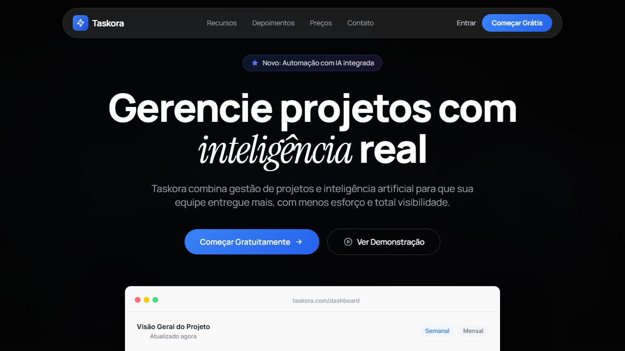
The dark-mode SaaS hero with a floating dashboard mockup didn't appear out of nowhere — it was a slow convergence of several forces. Around 2018-2019, tools like Linear, Notion, and Vercel started shipping dark interfaces as their primary brand expression, not as an accessibility toggle. The message was clear: dark means professional, focused, built for people who actually use software all day. The dashboard mockup sitting at an angle below the headline became the visual proof that replaced generic stock photography. By 2021, this pattern had calcified into the default B2B SaaS hero. Every productivity tool, every dev platform, every analytics dashboard adopted the same formula: bold sans-serif headline, one-liner value prop, CTA button with a subtle glow, and a perspective-shifted screenshot floating on a dark gradient. It works because it answers the buyer's first question — "what does this thing actually look like?" — without requiring them to sign up. The pattern persists because it's honest. Unlike lifestyle imagery or abstract illustrations, a real product screenshot signals confidence. You're showing the work. The dark background creates natural contrast hierarchy and makes the UI feel premium, even when the product itself is still rough around the edges.
When to Use
Deploy this pattern when your product has a visually compelling interface worth showing. It's ideal for B2B SaaS, productivity tools, developer platforms, and analytics products where the UI itself is the selling point. Works best when you need to establish credibility fast — the dashboard mockup acts as social proof without testimonials. Avoid it if your product is content-heavy or visually simple; a screenshot of a text editor rarely impresses. Also skip it if your brand is warm, playful, or consumer-facing — dark mode heroes signal seriousness and technical sophistication.
Design Principles
- Contrast hierarchy is everything — the mockup should be the brightest element on screen, pulling the eye down from the headline naturally
- Use real UI, not fabricated screenshots. Fake dashboards with perfect data destroy trust the moment someone recognizes the pattern
- Restrain the glow effects — one subtle radial gradient behind the mockup is atmosphere, three is a gaming peripheral ad
- Typography needs weight. Thin fonts disappear on dark backgrounds. Go bold on headlines, medium on body, and give everything generous letter-spacing
- The perspective tilt on the mockup should be subtle (8-12° max). Anything steeper feels like a PowerPoint transition from 2014
DESIGN.md
---
version: "alpha"
name: "Taskora SaaS Hero"
description: "Dark SaaS hero with background video at opacity-50 and gradient overlay fading to background color. Ideal for produtos saas, plataformas de gestão de projetos, ferramentas de produtividade, dashboards analíticos. AI-ready template."
colors:
  primary: "#050505"
  secondary: "#FFFFFF"
  tertiary: "#9CA3AF"
  neutral: "#3B82F6"
  surface: "#F9F9FA"
  accent: "#22C55E"
typography:
  h1:
    fontFamily: Manrope
    fontSize: 2.5rem
    fontWeight: 700
  body-md:
    fontFamily: Manrope
    fontSize: 1rem
    fontWeight: 400
components:
  button-primary:
    backgroundColor: "{colors.primary}"
    textColor: "{colors.neutral}"
    padding: 12px
---

## Overview

Dark SaaS hero with background video at opacity-50 and gradient overlay fading to background color. Ideal for produtos saas, plataformas de gestão de projetos, ferramentas de produtividade, dashboards analíticos. AI-ready template. The dark-mode SaaS hero with a floating dashboard mockup didn't appear out of nowhere — it was a slow convergence of several forces. Around 2018-2019, tools like Linear, Notion, and Vercel started shipping dark interfaces as their primary brand expression, not as an accessibility toggle. The message was clear: dark means professional, focused, built for people who actually use software all day. The dashboard mockup sitting at an angle below the headline became the visual proof that replaced generic stock photography.

By 2021, this pattern had calcified into the default B2B SaaS hero. Every productivity tool, every dev platform, every analytics dashboard adopted the same formula: bold sans-serif headline, one-liner value prop, CTA button with a subtle glow, and a perspective-shifted screenshot floating on a dark gradient. It works because it answers the buyer's first question — "what does this thing actually look like?" — without requiring them to sign up.

The pattern persists because it's honest. Unlike lifestyle imagery or abstract illustrations, a real product screenshot signals confidence. You're showing the work. The dark background creates natural contrast hierarchy and makes the UI feel premium, even when the product itself is still rough around the edges.

- Density: 8/10 — Dense
- Variance: 4/10 — Moderate
- Motion: 8/10 — Cinematic

- **Style:** SaaS, Dark Mode, Dashboard Preview, Staggered Animations
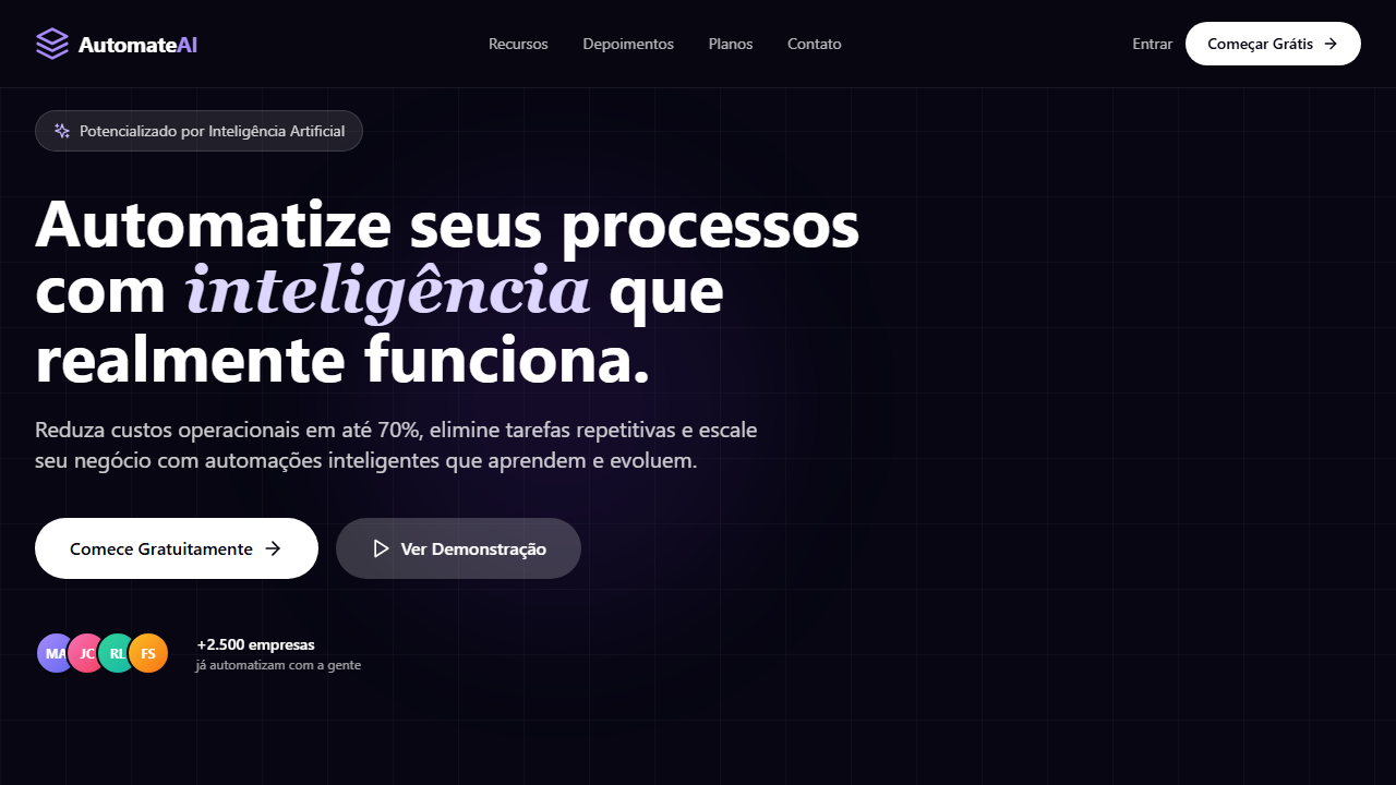
- **Keywords:** SaaS, dark mode, dashboard mockup, staggered animations, Framer Motion, glassmorphism navbar, Instrument Serif italic, product shot, badge com estrela
- **Era:** 2024-2026 SaaS Product-Led
- **Light/Dark:** ✗ Not Recommended / ✓ Full

## Colors

- **Preto Base** (#050505) — Primary background surface
- **Branco** (#FFFFFF) — Light surface, card backgrounds
- **Cinza Texto** (#9CA3AF) — Primary text color
- **Azul Gradiente** (#3B82F6) — Accent highlight, links and focus states
- **Dashboard Claro** (#F9F9FA) — Extended palette, decorative use
- **Verde Trend** (#22C55E) — Success states, positive indicators
- **Vermelho Trend** (#EF4444) — Error states, destructive actions
- **Vidro Navbar** (rgba(255,255,255,0.1)) — Extended palette, decorative use


## Typography

- **Display / Hero:** Manrope — Weight 700, tight tracking, used for headline impact
- **Accent:** Instrument Serif — Used for decorative or emphasis text
- **Body:** Manrope — Weight 400, 16px/1.6 line-height, max 72ch per line
- **UI Labels / Captions:** Manrope — 0.875rem, weight 500, slight letter-spacing
- **Monospace:** JetBrains Mono — Used for code, metadata, and technical values

Scale:
- Hero: clamp(2.5rem, 5vw, 4rem)
- H1: 2.25rem
- H2: 1.5rem
- Body: 1rem / 1.6
- Small: 0.875rem


## Layout

- **Grid:** CSS Grid primary. Max-width containment: 1280px centered with 1.5rem side padding.
- **Spacing rhythm:** Balanced. Base unit: 0.5rem (8px).
- **Section vertical gaps:** clamp(4rem, 8vw, 8rem).
- **Hero layout:** Split-screen (text left, visual right).
- **Feature sections:** Zig-zag alternating text+image rows. No 3-equal-columns.
- **Mobile collapse:** All multi-column layouts collapse below 768px. No horizontal overflow.
- **z-index contract:** base (0) / sticky-nav (100) / overlay (200) / modal (300) / toast (500).


## Elevation & Depth

VÍDEO: Vídeo abstrato escuro com partículas luminosas ou formas geométricas flutuantes em tons de azul e roxo sobre fundo preto. Movimento sutil e orgânico criando atmosfera tecnológica e sofisticada. Exibido com opacity 50% e gradient overlay (black/60 para #050505) que funde suavemente o vídeo no fundo escuro da página. | EFEITOS CSS: Vídeo de fundo com opacity-50 e gradient overlay (black/60 para #050505), navbar flutuante pill glassmorphism (bg-white/10, backdrop-blur-md), animações staggered de entrada (fade-up + slide) via Framer Motion, headline massiva com palavra em Instrument Serif italic, dashboard mockup light mode contrastando com hero dark, badge pill com ícone estrela gradiente azul

- **Physics:** Spring — stiffness 120, damping 20. Confident, weighted transitions.
- **Entry animations:** Fade + translate-Y (16px → 0) over 540ms ease-out. Staggered cascades for lists: 120ms between items.
- **Hover states:** Scale(1.03) + shadow lift over 200ms.
- **Page transitions:** Fade + slide (300ms).
- **Performance:** Only transform and opacity animated. No layout-triggering properties.


## Shapes

Base corner radius: 8px. See rounded tokens in front matter for the full scale.


## Components

- **Primary Button:** Subtly rounded (0.5rem) shape. Accent color fill. Hover: 8% darken + subtle lift shadow. Active: -1px translate tactile press. Font weight 600. No outer glows.
- **Secondary / Ghost Button:** Outline variant. 1.5px border in muted color. Text in primary color. Hover: subtle background fill.
- **Cards:** Subtly rounded (0.5rem) corners. Surface background. Subtle shadow (0 2px 12px rgba(0,0,0,0.06)). 1px border stroke.
- **Inputs:** Label above input. 1px border stroke. Focus ring: 2px accent color offset 2px. Error text below in semantic red. No floating labels.
- **Navigation:** Primary surface background. Active item: accent color indicator. Font weight 500 when active.
- **Skeletons:** Shimmer animation matching component dimensions. No circular spinners.
- **Empty States:** Icon-based composition with descriptive text and action button.


## Do's and Don'ts

- No emojis in UI — use icon system only (Lucide, Heroicons)
- No pure white (#FFFFFF) backgrounds — use off-white or dark surfaces
- No oversaturated accent colors (saturation cap: 80%)
- No 3-column equal-width feature layouts — use zig-zag or asymmetric grid
- No `h-screen` — use `min-h-[100dvh]`
- No AI copywriting clichés: "Elevate", "Seamless", "Unleash", "Next-Gen"
- No broken external image links — use picsum.photos or inline SVG
- No generic lorem ipsum in demos

- Do Vídeo de fundo opacity-50 com gradient overlay
- Do Navbar flutuante pill glassmorphism
- Do Badge pill com estrela gradiente
- Do Headline massiva com palavra em serif italic
- Do Animações staggered de entrada
- Do Dashboard mockup light mode
- Do Mobile hamburger glassmorphism
- Do Responsivo


## Use Case

Products SaaS, Platforms de gestão de projects, Tools de produtividade, Dashboards analíticos
Technical Specs
CSS
background: #050505, video: opacity-50 with gradient overlay, backdrop-filter: blur(12px), background: rgba(255,255,255,0.1), font-family: 'Manrope' body / 'Instrument Serif' italic accent / 'Inter' dashboard, font-size: clamp(3rem, 8vw, 80px), animation: staggered fade-up, dashboard: bg-[#F9F9FA]
Variables
--bg-primary: #050505, --text-primary: #FFFFFF, --text-muted: #9CA3AF, --glass-bg: rgba(255,255,255,0.1), --blur: 12px, --font-body: 'Manrope', --font-accent: 'Instrument Serif', --font-ui: 'Inter', --dashboard-bg: #F9F9FA
Checklist
☐ Vídeo de fundo opacity-50 com gradient overlay, ☐ Navbar flutuante pill glassmorphism, ☐ Badge pill com estrela gradiente, ☐ Headline massiva com palavra em serif italic, ☐ Animações staggered de entrada, ☐ Dashboard mockup light mode, ☐ Mobile hamburger glassmorphism, ☐ Responsivo
Colors
Primary
Secondary
Effects
VÍDEO: Vídeo abstrato escuro com partículas luminosas ou formas geométricas flutuantes em tons de azul e roxo sobre fundo preto. Movimento sutil e orgânico criando atmosfera tecnológica e sofisticada. Exibido com opacity 50% e gradient overlay (black/60 para #050505) que funde suavemente o vídeo no fundo escuro da página. | EFEITOS CSS: Vídeo de fundo com opacity-50 e gradient overlay (black/60 para #050505), navbar flutuante pill glassmorphism (bg-white/10, backdrop-blur-md), animações staggered de entrada (fade-up + slide) via Framer Motion, headline massiva com palavra em Instrument Serif italic, dashboard mockup light mode contrastando com hero dark, badge pill com ícone estrela gradiente azul
Light/Dark
✗ Not Recommended / ✓ Full
AI Prompt
Act as a Senior Frontend Engineer and Expert UI Designer.
Your task is to code a complete Landing Page on the first attempt.
- Landing Page Theme: <INSERT THEME>
- Sections to add: <INSERT SECTIONS>

Generate the final code immediately following these definitions:

## Style

- **Name:** Taskora SaaS Hero
- **Type:** SaaS, Dark Mode, Dashboard Preview, Staggered Animations
- **Keywords:** SaaS, dark mode, dashboard mockup, staggered animations, Framer Motion, glassmorphism navbar, Instrument Serif italic, product shot, badge com estrela
- **Era:** 2024-2026 SaaS Product-Led
- **Light/Dark:** ✗ Not Recommended / ✓ Full

## Color Palette

- **Primary:** Preto Base #050505, Branco #FFFFFF, Cinza Texto #9CA3AF, Azul Gradiente #3B82F6
- **Secondary:** Vidro Navbar rgba(255,255,255,0.1), Dashboard Claro #F9F9FA, Verde Trend #22C55E, Vermelho Trend #EF4444

## Visual Effects

VÍDEO: Vídeo abstrato escuro com partículas luminosas ou formas geométricas flutuantes em tons de azul e roxo sobre fundo preto. Movimento sutil e orgânico criando atmosfera tecnológica e sofisticada. Exibido com opacity 50% e gradient overlay (black/60 para #050505) que funde suavemente o vídeo no fundo escuro da página. | EFEITOS CSS: Vídeo de fundo com opacity-50 e gradient overlay (black/60 para #050505), navbar flutuante pill glassmorphism (bg-white/10, backdrop-blur-md), animações staggered de entrada (fade-up + slide) via Framer Motion, headline massiva com palavra em Instrument Serif italic, dashboard mockup light mode contrastando com hero dark, badge pill com ícone estrela gradiente azul

## AI Visual Direction

Design a dark SaaS hero with background video at opacity-50 and gradient overlay fading to background color. Floating pill navbar with glassmorphism (bg-white/10 backdrop-blur-md). Pill badge with star icon blue gradient fill. Massive headline up to 80px with one word in Instrument Serif italic. Staggered entrance animations via Framer Motion. Light mode dashboard preview mockup below CTA contrasting with dark hero.

## CSS Technical

```css
background: #050505, video: opacity-50 with gradient overlay, backdrop-filter: blur(12px), background: rgba(255,255,255,0.1), font-family: 'Manrope' body / 'Instrument Serif' italic accent / 'Inter' dashboard, font-size: clamp(3rem, 8vw, 80px), animation: staggered fade-up, dashboard: bg-[#F9F9FA]
```

## Design System Variables

```css
--bg-primary: #050505, --text-primary: #FFFFFF, --text-muted: #9CA3AF, --glass-bg: rgba(255,255,255,0.1), --blur: 12px, --font-body: 'Manrope', --font-accent: 'Instrument Serif', --font-ui: 'Inter', --dashboard-bg: #F9F9FA
```

## Implementation Checklist

- ☐ Vídeo de fundo opacity-50 com gradient overlay
- ☐ Navbar flutuante pill glassmorphism
- ☐ Badge pill com estrela gradiente
- ☐ Headline massiva com palavra em serif italic
- ☐ Animações staggered de entrada
- ☐ Dashboard mockup light mode
- ☐ Mobile hamburger glassmorphism
- ☐ Responsivo

## Execution Rules

1. Strictly follow the defined visual style.
2. Use high-quality inline SVG icons (Heroicons or Lucide style) — NEVER use emojis as icons.
3. Add `cursor-pointer` and smooth `hover` states (transition-all) on all interactive elements.
4. Required Page Structure:
   - Navbar (Logo + Links + CTA)
   - Hero Section (Impactful Headline + Subtitle + 2 buttons + 3D/Abstract visual element via CSS)
   - Features (3 cards with icons)
   - Testimonials (3 cards)
   - Pricing (3 tiers, highlight the middle one)
   - Final CTA
   - Full Footer with social links, privacy policy, terms of use, contact and SEO links.
5. All text content must be in English.
6. The visual must be CLEARLY distinct — do not create a "default Bootstrap" design. Force the use of the provided design system variables.
7. Use `<style>` tags in the head for custom classes (especially for complex backdrop-filter effects and animations) that Tailwind CDN doesn't cover.
8. Full Responsiveness: Layout must adapt perfectly to Mobile, Tablet and Desktop (vertical stack on mobile).
9. Include basic SEO, Viewport and Open Graph meta tags in `<head>`.
10. Footer must contain: Copyright 2026, Secondary navigation links and Social media icons.
11. Make the creative decisions needed to deliver the complete, functional result now.
Related
Last synced: 4/1/2026