Steampunk
Steampunk landing page fusing Victorian elegance with steam-powered mechanical aesthetics. Ideal for capas de livros de fantasia, merchandise temático, gráficos de videojogos, eventos cosplay. AI-ready template.
Use case: Fantasy book covers, Themed merchandise, Video game graphics, Cosplay events
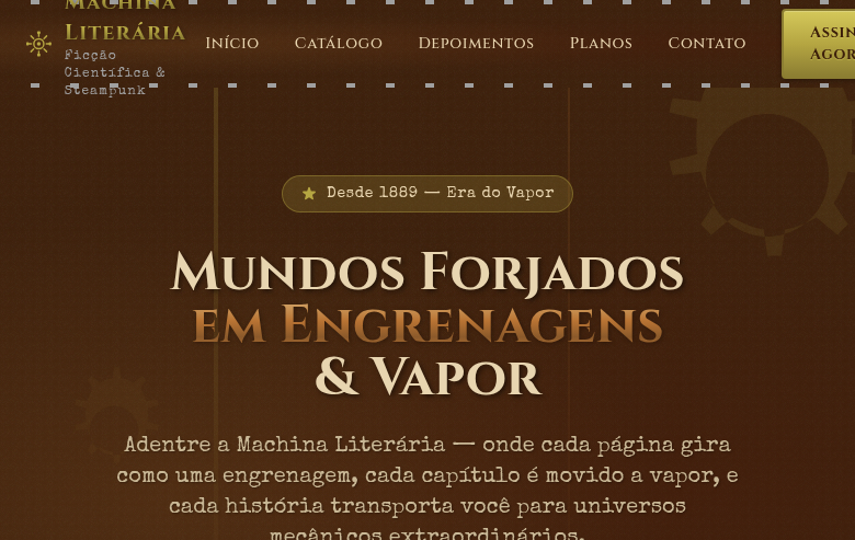
Historical Context
Steampunk didn't emerge from a design studio — it crawled out of speculative fiction in the 1980s, when writers like K.W. Jeter and William Gibson started asking what would happen if the Victorian era never ended. The aesthetic crystallized around a simple premise: what if computation ran on steam and brass instead of silicon? That question unlocked an entire visual language — exposed gears, riveted copper panels, analog gauges, leather straps, and the ornamental excess of Industrial Revolution machinery. What makes Steampunk endure as a design system isn't nostalgia — it's the tension between mechanical honesty and decorative extravagance. Victorian engineering celebrated visible function: you could see how a clock worked, trace the logic of a locomotive's pistons. Steampunk borrows that transparency and pushes it into fantasy. Every gear is both structural and ornamental. Every rivet is both fastener and decoration. The movement gained mainstream traction through gaming, cosplay, and maker culture in the 2000s. It proved that audiences crave interfaces and environments where the mechanics are legible — where the system shows its work rather than hiding behind flat minimalism.
When to Use
Reach for Steampunk when your project needs to feel handcrafted, mechanical, and deliberately analog. It works brilliantly for gaming interfaces where you want players to feel like they're operating machinery — not clicking buttons. Alternative history narratives, escape rooms, themed retail experiences, and maker-culture brands all benefit from the tactile weight this system carries. Avoid it for anything requiring speed or clinical trust. Steampunk is slow by design — it rewards exploration over efficiency.
Design Principles
- Expose the mechanism — every element should hint at how it works, gears visible behind panels, linkages connecting actions to outcomes
- Layer materials with intention — brass over wood over leather over iron, each surface communicating a different structural role
- Ornament is not optional — Victorian engineering treated decoration as integral to function, so filigree, engravings, and beveled edges earn their place
- Favor analog feedback — dials over progress bars, pressure gauges over percentages, physical metaphors over abstract indicators
- Embrace asymmetry and accumulation — real machines are built over time, modified, patched; sterile symmetry kills the illusion
DESIGN.md
---
version: "alpha"
name: "Steampunk"
description: "Steampunk landing page fusing Victorian elegance with steam-powered mechanical aesthetics. Ideal for capas de livros de fantasia, merchandise temático, gráficos de videojogos, eventos cosplay. AI-ready template."
colors:
  primary: "#B5A642"
  secondary: "#3C1F0A"
  tertiary: "#B87333"
  neutral: "#E8D5B0"
  surface: "#6B6B6B"
  accent: "#A0A0A0"
typography:
  h1:
    fontFamily: Cinzel
    fontSize: 2.5rem
    fontWeight: 700
  body-md:
    fontFamily: Cinzel
    fontSize: 1rem
    fontWeight: 400
rounded:
  sm: 4px
  md: 8px
  lg: 12px
spacing:
  sm: 2.0rem
  md: 4.0rem
  lg: 8.0rem
components:
  button-primary:
    backgroundColor: "{colors.primary}"
    textColor: "{colors.neutral}"
    rounded: "{rounded.sm}"
    padding: 12px
---

## Overview

Steampunk landing page fusing Victorian elegance with steam-powered mechanical aesthetics. Ideal for capas de livros de fantasia, merchandise temático, gráficos de videojogos, eventos cosplay. AI-ready template. Steampunk didn't emerge from a design studio — it crawled out of speculative fiction in the 1980s, when writers like K.W. Jeter and William Gibson started asking what would happen if the Victorian era never ended. The aesthetic crystallized around a simple premise: what if computation ran on steam and brass instead of silicon? That question unlocked an entire visual language — exposed gears, riveted copper panels, analog gauges, leather straps, and the ornamental excess of Industrial Revolution machinery.

What makes Steampunk endure as a design system isn't nostalgia — it's the tension between mechanical honesty and decorative extravagance. Victorian engineering celebrated visible function: you could see how a clock worked, trace the logic of a locomotive's pistons. Steampunk borrows that transparency and pushes it into fantasy. Every gear is both structural and ornamental. Every rivet is both fastener and decoration.

The movement gained mainstream traction through gaming, cosplay, and maker culture in the 2000s. It proved that audiences crave interfaces and environments where the mechanics are legible — where the system shows its work rather than hiding behind flat minimalism.

- Density: 5/10 — Balanced
- Variance: 8/10 — Expressive
- Motion: 4/10 — Subtle

- **Style:** Victorian-Mechanical, Brass, Gears, Retro-Futuristic
- **Keywords:** Steampunk, Victorian, mechanical, steam-powered, brass, gears, cogs, gadgets, retro-futuristic, industrial, copper
- **Era:** Victorian Era meets Industrial Revolution Fiction
- **Light/Dark:** ✓ Full / ✓ Full

## Colors

- **Brass Gold** (#B5A642) — Premium accent, decorative highlights
- **Dark Leather** (#3C1F0A) — Dark surface, primary background
- **Copper** (#B87333) — Metallic accent, decorative detail
- **Aged Parchment** (#E8D5B0) — Supporting palette color
- **Steam Grey** (#6B6B6B) — Secondary text, borders, muted elements
- **Rivet Silver** (#A0A0A0) — Extended palette, decorative use
- **Deep Mahogany** (#4E1A0A) — Extended palette, decorative use
- **Verdigris Green** (#43B3AE) — Success states, positive indicators


## Typography

- **Display / Hero:** Cinzel — Weight 700, tight tracking, used for headline impact
- **Accent:** Special Elite — Used for decorative or emphasis text
- **Body:** Cinzel — Weight 400, 16px/1.6 line-height, max 72ch per line
- **UI Labels / Captions:** Cinzel — 0.875rem, weight 500, slight letter-spacing
- **Monospace:** JetBrains Mono — Used for code, metadata, and technical values

Scale:
- Hero: clamp(2.5rem, 5vw, 4rem)
- H1: 2.25rem
- H2: 1.5rem
- Body: 1rem / 1.6
- Small: 0.875rem


## Layout

- **Grid:** CSS Grid primary. Max-width containment: 1280px centered with 1.5rem side padding.
- **Spacing rhythm:** Balanced. Base unit: 0.5rem (8px).
- **Section vertical gaps:** clamp(4rem, 8vw, 8rem).
- **Hero layout:** Asymmetric composition.
- **Feature sections:** Asymmetric grid with varied card sizes. No 3-equal-columns.
- **Mobile collapse:** All multi-column layouts collapse below 768px. No horizontal overflow.
- **z-index contract:** base (0) / sticky-nav (100) / overlay (200) / modal (300) / toast (500).


## Elevation & Depth

Gear/cog SVG decorative elements (rotating on hover), brass rivet border accents, leather texture backgrounds, Victorian ornamental frames, steam/fog gradient overlays, mechanical gauge-inspired progress indicators, copper metallic text effects

- **Physics:** Ease-out curves, 200-300ms duration. Smooth and predictable.
- **Entry animations:** Fade + translate-Y (16px → 0) over 420ms ease-out. Staggered cascades for lists: 80ms between items.
- **Hover states:** Subtle color shift + shadow adjustment over 200ms.
- **Page transitions:** Fade only (200ms).
- **Performance:** Only transform and opacity animated. No layout-triggering properties.


## Shapes

Base corner radius: 4px. See rounded tokens in front matter for the full scale.


## Components

- **Primary Button:** Rounded (4px) shape. Accent color fill. Hover: 8% darken + subtle lift shadow. Active: -1px translate tactile press. Font weight 600. No outer glows.
- **Secondary / Ghost Button:** Outline variant. 1.5px border in muted color. Text in primary color. Hover: subtle background fill.
- **Cards:** Rounded (4px) corners. Surface background. Subtle shadow (0 2px 12px rgba(0,0,0,0.06)). 1px border stroke.
- **Inputs:** Label above input. 1px border stroke. Focus ring: 2px accent color offset 2px. Error text below in semantic red. No floating labels.
- **Navigation:** Primary surface background. Active item: accent color indicator. Font weight 500 when active.
- **Skeletons:** Shimmer animation matching component dimensions. No circular spinners.
- **Empty States:** Icon-based composition with descriptive text and action button.


## Do's and Don'ts

- No emojis in UI — use icon system only (Lucide, Heroicons)
- No pure black (#000000) — use off-black or charcoal variants
- No oversaturated accent colors (saturation cap: 80%)
- No 3-column equal-width feature layouts — use zig-zag or asymmetric grid
- No `h-screen` — use `min-h-[100dvh]`
- No AI copywriting clichés: "Elevate", "Seamless", "Unleash", "Next-Gen"
- No broken external image links — use picsum.photos or inline SVG
- No generic lorem ipsum in demos

- Do Gear/cog SVG decorations
- Do Brass and copper color accents
- Do Leather texture backgrounds
- Do Victorian ornamental frames
- Do Steam/fog gradient overlays
- Do Mechanical gauge indicators
- Do Victorian + industrial typography
- Do Responsive with maintained steampunk feel


## Use Case

Fantasy book covers, Themed merchandise, Video game graphics, Cosplay events
Technical Specs
CSS
font-family: 'Cinzel', serif mixed with 'Special Elite', background: #E8D5B0 with leather texture, color: #3C1F0A, border: 3px solid #B5A642, border-radius: 4px, box-shadow: 2px 2px 0 #6B6B6B, inset 0 0 20px rgba(60,31,10,0.2), animation: rotate for gears, text-shadow: 1px 1px 2px rgba(0,0,0,0.3)
Variables
--color-brass: #B5A642, --color-leather: #3C1F0A, --color-copper: #B87333, --color-parchment: #E8D5B0, --font-victorian: 'Cinzel', --font-industrial: 'Special Elite', --border: 3px solid #B5A642, --border-radius: 4px, --spacing: 2rem
Checklist
☐ Gear/cog SVG decorations, ☐ Brass and copper color accents, ☐ Leather texture backgrounds, ☐ Victorian ornamental frames, ☐ Steam/fog gradient overlays, ☐ Mechanical gauge indicators, ☐ Victorian + industrial typography, ☐ Responsive with maintained steampunk feel
Colors
Primary
Secondary
Effects
Gear/cog SVG decorative elements (rotating on hover), brass rivet border accents, leather texture backgrounds, Victorian ornamental frames, steam/fog gradient overlays, mechanical gauge-inspired progress indicators, copper metallic text effects
Light/Dark
✓ Full / ✓ Full
AI Prompt
Act as a Senior Frontend Engineer and Expert UI Designer.
Your task is to code a complete Landing Page on the first attempt.
- Landing Page Theme: <INSERT THEME>
- Sections to add: <INSERT SECTIONS>

Generate the final code immediately following these definitions:

## Style

- **Name:** Steampunk
- **Type:** Victorian-Mechanical, Brass, Gears, Retro-Futuristic
- **Keywords:** Steampunk, Victorian, mechanical, steam-powered, brass, gears, cogs, gadgets, retro-futuristic, industrial, copper
- **Era:** Victorian Era meets Industrial Revolution Fiction
- **Light/Dark:** ✓ Full / ✓ Full

## Color Palette

- **Primary:** Brass Gold #B5A642, Dark Leather #3C1F0A, Copper #B87333, Aged Parchment #E8D5B0
- **Secondary:** Steam Grey #6B6B6B, Rivet Silver #A0A0A0, Deep Mahogany #4E1A0A, Verdigris Green #43B3AE

## Visual Effects

Gear/cog SVG decorative elements (rotating on hover), brass rivet border accents, leather texture backgrounds, Victorian ornamental frames, steam/fog gradient overlays, mechanical gauge-inspired progress indicators, copper metallic text effects

## AI Visual Direction

Design a steampunk landing page fusing Victorian elegance with steam-powered mechanical aesthetics. Use brass gold, dark leather, copper, aged parchment. Apply rotating gear/cog SVG decorations, brass rivet borders, leather textures, Victorian ornamental frames, steam fog overlays, mechanical gauge indicators. Typography should be Victorian serif with industrial accents. Retro-futuristic, industrial, brass-and-leather atmosphere.

## CSS Technical

```css
font-family: 'Cinzel', serif mixed with 'Special Elite', background: #E8D5B0 with leather texture, color: #3C1F0A, border: 3px solid #B5A642, border-radius: 4px, box-shadow: 2px 2px 0 #6B6B6B, inset 0 0 20px rgba(60,31,10,0.2), animation: rotate for gears, text-shadow: 1px 1px 2px rgba(0,0,0,0.3)
```

## Design System Variables

```css
--color-brass: #B5A642, --color-leather: #3C1F0A, --color-copper: #B87333, --color-parchment: #E8D5B0, --font-victorian: 'Cinzel', --font-industrial: 'Special Elite', --border: 3px solid #B5A642, --border-radius: 4px, --spacing: 2rem
```

## Implementation Checklist

- ☐ Gear/cog SVG decorations
- ☐ Brass and copper color accents
- ☐ Leather texture backgrounds
- ☐ Victorian ornamental frames
- ☐ Steam/fog gradient overlays
- ☐ Mechanical gauge indicators
- ☐ Victorian + industrial typography
- ☐ Responsive with maintained steampunk feel

## Execution Rules

1. Strictly follow the defined visual style.
2. Use high-quality inline SVG icons (Heroicons or Lucide style) — NEVER use emojis as icons.
3. Add `cursor-pointer` and smooth `hover` states (transition-all) on all interactive elements.
4. Required Page Structure:
   - Navbar (Logo + Links + CTA)
   - Hero Section (Impactful Headline + Subtitle + 2 buttons + 3D/Abstract visual element via CSS)
   - Features (3 cards with icons)
   - Testimonials (3 cards)
   - Pricing (3 tiers, highlight the middle one)
   - Final CTA
   - Full Footer with social links, privacy policy, terms of use, contact and SEO links.
5. All text content must be in English.
6. The visual must be CLEARLY distinct — do not create a "default Bootstrap" design. Force the use of the provided design system variables.
7. Use `<style>` tags in the head for custom classes (especially for complex backdrop-filter effects and animations) that Tailwind CDN doesn't cover.
8. Full Responsiveness: Layout must adapt perfectly to Mobile, Tablet and Desktop (vertical stack on mobile).
9. Include basic SEO, Viewport and Open Graph meta tags in `<head>`.
10. Footer must contain: Copyright 2026, Secondary navigation links and Social media icons.
11. Make the creative decisions needed to deliver the complete, functional result now.
Related
Last synced: 4/1/2026