Shabby Chic
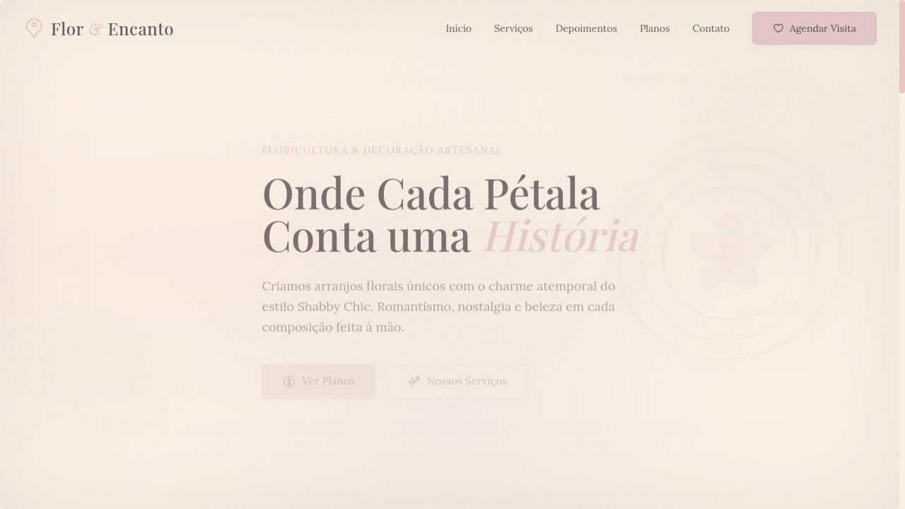
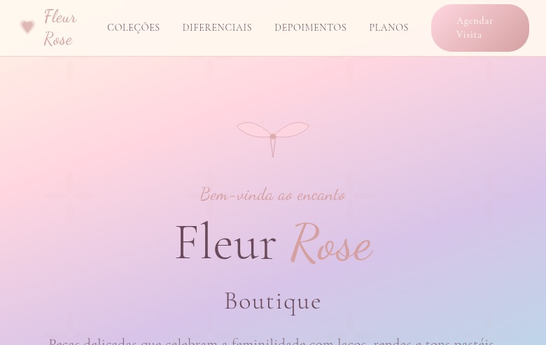
Shabby chic landing page with faded pastel tones and vintage romance. Ideal for convites de casamento, embalagens acolhedoras, marcas nostálgicas, decoração de interiores. AI-ready template.
Use case: Wedding invitations, Cozy packaging, Nostalgic brands, Interior decoration
Historical Context
Shabby Chic emerged in the late 1980s through Rachel Ashwell's Los Angeles storefronts, where she sold slipcover sofas and flea-market furniture repainted in chalky whites. The aesthetic drew heavily from English country houses — not the polished ones, but the ones where generations of use had softened every edge. Faded chintz, peeling paint, and sun-bleached linen weren't flaws; they were the entire point. The style hit mainstream retail hard in the late 1990s and early 2000s, spawning an entire cottage industry of intentionally distressed furniture and muted floral textiles. What made it stick — beyond the obvious Pinterest appeal — was its rejection of modernist perfection. In a decade obsessed with minimalism and chrome, Shabby Chic said: wear and patina carry more beauty than anything fresh off a factory line. As a design language, it codified something decorators had always known intuitively — that warmth comes from imperfection, and that a room (or a brand) feels most inviting when it looks like it has a history, even a fabricated one.
When to Use
Reach for Shabby Chic when your project needs to feel intimate, handmade, and unapologetically feminine. It works beautifully for wedding stationery, boutique home decor brands, vintage e-commerce, and any context where softness signals trust. Avoid it for anything requiring authority or speed — this aesthetic whispers, it never shouts. If your client sells power tools or fintech, keep walking. But if they sell dried flowers, linen aprons, or hand-poured candles, this is home.
Design Principles
- Palette lives in washed-out pastels — think rose, sage, cream, and lavender that look like they've sat in sunlight for a decade. Never saturated, never crisp.
- Typography favors delicate serifs and hand-lettered scripts with generous tracking. Weight should feel light; nothing bold, nothing condensed.
- Texture is non-negotiable. Layer distressed paper, linen weaves, watercolor washes, and subtle grain. Flat digital surfaces kill the mood instantly.
- Florals should feel vintage-botanical, not graphic. Faded roses, peonies, and wildflowers rendered as if printed on old fabric — never vector-sharp, never symmetrical.
- Whitespace operates as breathing room, not minimalism. Generous margins evoke the unhurried pace of a countryside morning, not a tech startup's landing page.
DESIGN.md
---
version: "alpha"
name: "Shabby Chic"
description: "Shabby chic landing page with faded pastel tones and vintage romance. Ideal for convites de casamento, embalagens acolhedoras, marcas nostálgicas, decoração de interiores. AI-ready template."
colors:
  primary: "#E8C4C4"
  secondary: "#FAF0E6"
  tertiary: "#C5D5C5"
  neutral: "#A4B8C4"
  surface: "#D8D0E0"
  accent: "#F0E6D6"
typography:
  h1:
    fontFamily: Lora
    fontSize: 2.5rem
    fontWeight: 700
  body-md:
    fontFamily: Lora
    fontSize: 1rem
    fontWeight: 400
rounded:
  sm: 6px
  md: 12px
  lg: 18px
components:
  button-primary:
    backgroundColor: "{colors.primary}"
    textColor: "{colors.neutral}"
    rounded: "{rounded.sm}"
    padding: 12px
---

## Overview

Shabby chic landing page with faded pastel tones and vintage romance. Ideal for convites de casamento, embalagens acolhedoras, marcas nostálgicas, decoração de interiores. AI-ready template. Shabby Chic emerged in the late 1980s through Rachel Ashwell's Los Angeles storefronts, where she sold slipcover sofas and flea-market furniture repainted in chalky whites. The aesthetic drew heavily from English country houses — not the polished ones, but the ones where generations of use had softened every edge. Faded chintz, peeling paint, and sun-bleached linen weren't flaws; they were the entire point.

The style hit mainstream retail hard in the late 1990s and early 2000s, spawning an entire cottage industry of intentionally distressed furniture and muted floral textiles. What made it stick — beyond the obvious Pinterest appeal — was its rejection of modernist perfection. In a decade obsessed with minimalism and chrome, Shabby Chic said: wear and patina carry more beauty than anything fresh off a factory line.

As a design language, it codified something decorators had always known intuitively — that warmth comes from imperfection, and that a room (or a brand) feels most inviting when it looks like it has a history, even a fabricated one.

- Density: 5/10 — Balanced
- Variance: 7/10 — Dynamic
- Motion: 4/10 — Subtle

- **Style:** Pastel, Faded, Vintage, Romantic
- **Keywords:** Shabby chic, pastel tones, faded florals, distressed, vintage romance, rustic, repurposed, nostalgic, cozy, cottage
- **Era:** 1980s-90s English Cottage Revival
- **Light/Dark:** ✓ Full / ✗ Not Recommended

## Colors

- **Faded Rose** (#E8C4C4) — Primary surface or dominant color
- **Antique White** (#FAF0E6) — Light surface, card backgrounds
- **Soft Sage** (#C5D5C5) — Supporting palette color
- **Dusty Blue** (#A4B8C4) — Accent highlight, links and focus states
- **Lavender Mist** (#D8D0E0) — Extended palette, decorative use
- **Warm Linen** (#F0E6D6) — Extended palette, decorative use
- **Blush Pink** (#F5D5D5) — Primary text color
- **Weathered Wood** (#B8A898) — Error states, destructive actions


## Typography

- **Display / Hero:** Lora — Weight 700, tight tracking, used for headline impact
- **Body:** Lora — Weight 400, 16px/1.6 line-height, max 72ch per line
- **UI Labels / Captions:** Lora — 0.875rem, weight 500, slight letter-spacing
- **Monospace:** JetBrains Mono — Used for code, metadata, and technical values

Scale:
- Hero: clamp(2.5rem, 5vw, 4rem)
- H1: 2.25rem
- H2: 1.5rem
- Body: 1rem / 1.6
- Small: 0.875rem


## Layout

- **Grid:** CSS Grid primary. Max-width containment: 1280px centered with 1.5rem side padding.
- **Spacing rhythm:** Balanced. Base unit: 0.5rem (8px).
- **Section vertical gaps:** clamp(4rem, 8vw, 8rem).
- **Hero layout:** Asymmetric composition.
- **Feature sections:** Asymmetric grid with varied card sizes. No 3-equal-columns.
- **Mobile collapse:** All multi-column layouts collapse below 768px. No horizontal overflow.
- **z-index contract:** base (0) / sticky-nav (100) / overlay (200) / modal (300) / toast (500).


## Elevation & Depth

Faded/washed-out color overlays (opacity 0.7), distressed texture backgrounds, soft floral pattern overlays via CSS, vintage vignette borders, gentle blur on background images (3px), delicate thin borders with rounded corners (6px)

- **Physics:** Ease-out curves, 200-300ms duration. Smooth and predictable.
- **Entry animations:** Fade + translate-Y (16px → 0) over 420ms ease-out. Staggered cascades for lists: 80ms between items.
- **Hover states:** Subtle color shift + shadow adjustment over 200ms.
- **Page transitions:** Fade only (200ms).
- **Performance:** Only transform and opacity animated. No layout-triggering properties.


## Shapes

Base corner radius: 6px. See rounded tokens in front matter for the full scale.


## Components

- **Primary Button:** Rounded (6px) shape. Accent color fill. Hover: 8% darken + subtle lift shadow. Active: -1px translate tactile press. Font weight 600. No outer glows.
- **Secondary / Ghost Button:** Outline variant. 1.5px border in muted color. Text in primary color. Hover: subtle background fill.
- **Cards:** Rounded (6px) corners. Surface background. Subtle shadow (0 2px 12px rgba(0,0,0,0.06)). 1px border stroke.
- **Inputs:** Label above input. 1px border stroke. Focus ring: 2px accent color offset 2px. Error text below in semantic red. No floating labels.
- **Navigation:** Primary surface background. Active item: accent color indicator. Font weight 500 when active.
- **Skeletons:** Shimmer animation matching component dimensions. No circular spinners.
- **Empty States:** Icon-based composition with descriptive text and action button.


## Do's and Don'ts

- No emojis in UI — use icon system only (Lucide, Heroicons)
- No pure black (#000000) — use off-black or charcoal variants
- No oversaturated accent colors (saturation cap: 80%)
- No 3-column equal-width feature layouts — use zig-zag or asymmetric grid
- No `h-screen` — use `min-h-[100dvh]`
- No AI copywriting clichés: "Elevate", "Seamless", "Unleash", "Next-Gen"
- No broken external image links — use picsum.photos or inline SVG
- No generic lorem ipsum in demos

- Do Faded pastel color palette
- Do Distressed texture backgrounds
- Do Floral pattern overlays
- Do Vintage vignette borders
- Do Thin elegant serif typography
- Do Washed-out/faded visual effects
- Do Cozy nostalgic atmosphere
- Do Responsive with maintained romance


## Use Case

Wedding invitations, Cozy packaging, Nostalgic brands, Interior decoration
Technical Specs
CSS
font-family: 'Lora', serif, font-weight: 300-400, background: #FAF0E6, color: #6A5A5A, border: 1px solid rgba(200,180,180,0.4), border-radius: 6px, box-shadow: 0 2px 10px rgba(0,0,0,0.05), filter: saturate(0.8) for faded effect, opacity: 0.9 on decorative elements
Variables
--color-rose: #E8C4C4, --color-white: #FAF0E6, --color-sage: #C5D5C5, --color-blue: #A4B8C4, --font-primary: 'Lora', --font-weight: 300, --border-radius: 6px, --shadow-soft: 0 2px 10px rgba(0,0,0,0.05), --saturation: 0.8
Checklist
☐ Faded pastel color palette, ☐ Distressed texture backgrounds, ☐ Floral pattern overlays, ☐ Vintage vignette borders, ☐ Thin elegant serif typography, ☐ Washed-out/faded visual effects, ☐ Cozy nostalgic atmosphere, ☐ Responsive with maintained romance
Colors
Primary
Secondary
Effects
Faded/washed-out color overlays (opacity 0.7), distressed texture backgrounds, soft floral pattern overlays via CSS, vintage vignette borders, gentle blur on background images (3px), delicate thin borders with rounded corners (6px)
Light/Dark
✓ Full / ✗ Not Recommended
AI Prompt
Act as a Senior Frontend Engineer and Expert UI Designer.
Your task is to code a complete Landing Page on the first attempt.
- Landing Page Theme: <INSERT THEME>
- Sections to add: <INSERT SECTIONS>

Generate the final code immediately following these definitions:

## Style

- **Name:** Shabby Chic
- **Type:** Pastel, Faded, Vintage, Romantic
- **Keywords:** Shabby chic, pastel tones, faded florals, distressed, vintage romance, rustic, repurposed, nostalgic, cozy, cottage
- **Era:** 1980s-90s English Cottage Revival
- **Light/Dark:** ✓ Full / ✗ Not Recommended

## Color Palette

- **Primary:** Faded Rose #E8C4C4, Antique White #FAF0E6, Soft Sage #C5D5C5, Dusty Blue #A4B8C4
- **Secondary:** Lavender Mist #D8D0E0, Warm Linen #F0E6D6, Blush Pink #F5D5D5, Weathered Wood #B8A898

## Visual Effects

Faded/washed-out color overlays (opacity 0.7), distressed texture backgrounds, soft floral pattern overlays via CSS, vintage vignette borders, gentle blur on background images (3px), delicate thin borders with rounded corners (6px)

## AI Visual Direction

Design a shabby chic landing page with faded pastel tones and vintage romance. Use faded rose, antique white, soft sage, dusty blue. Apply distressed texture backgrounds, faded floral overlays, vintage vignette borders, washed-out color effects. Typography should be elegant serif with thin weights. Cozy, nostalgic, cottage-like atmosphere.

## CSS Technical

```css
font-family: 'Lora', serif, font-weight: 300-400, background: #FAF0E6, color: #6A5A5A, border: 1px solid rgba(200,180,180,0.4), border-radius: 6px, box-shadow: 0 2px 10px rgba(0,0,0,0.05), filter: saturate(0.8) for faded effect, opacity: 0.9 on decorative elements
```

## Design System Variables

```css
--color-rose: #E8C4C4, --color-white: #FAF0E6, --color-sage: #C5D5C5, --color-blue: #A4B8C4, --font-primary: 'Lora', --font-weight: 300, --border-radius: 6px, --shadow-soft: 0 2px 10px rgba(0,0,0,0.05), --saturation: 0.8
```

## Implementation Checklist

- ☐ Faded pastel color palette
- ☐ Distressed texture backgrounds
- ☐ Floral pattern overlays
- ☐ Vintage vignette borders
- ☐ Thin elegant serif typography
- ☐ Washed-out/faded visual effects
- ☐ Cozy nostalgic atmosphere
- ☐ Responsive with maintained romance

## Execution Rules

1. Strictly follow the defined visual style.
2. Use high-quality inline SVG icons (Heroicons or Lucide style) — NEVER use emojis as icons.
3. Add `cursor-pointer` and smooth `hover` states (transition-all) on all interactive elements.
4. Required Page Structure:
   - Navbar (Logo + Links + CTA)
   - Hero Section (Impactful Headline + Subtitle + 2 buttons + 3D/Abstract visual element via CSS)
   - Features (3 cards with icons)
   - Testimonials (3 cards)
   - Pricing (3 tiers, highlight the middle one)
   - Final CTA
   - Full Footer with social links, privacy policy, terms of use, contact and SEO links.
5. All text content must be in English.
6. The visual must be CLEARLY distinct — do not create a "default Bootstrap" design. Force the use of the provided design system variables.
7. Use `<style>` tags in the head for custom classes (especially for complex backdrop-filter effects and animations) that Tailwind CDN doesn't cover.
8. Full Responsiveness: Layout must adapt perfectly to Mobile, Tablet and Desktop (vertical stack on mobile).
9. Include basic SEO, Viewport and Open Graph meta tags in `<head>`.
10. Footer must contain: Copyright 2026, Secondary navigation links and Social media icons.
11. Make the creative decisions needed to deliver the complete, functional result now.
Related
Last synced: 4/1/2026