Resume Journey Oregon Trail
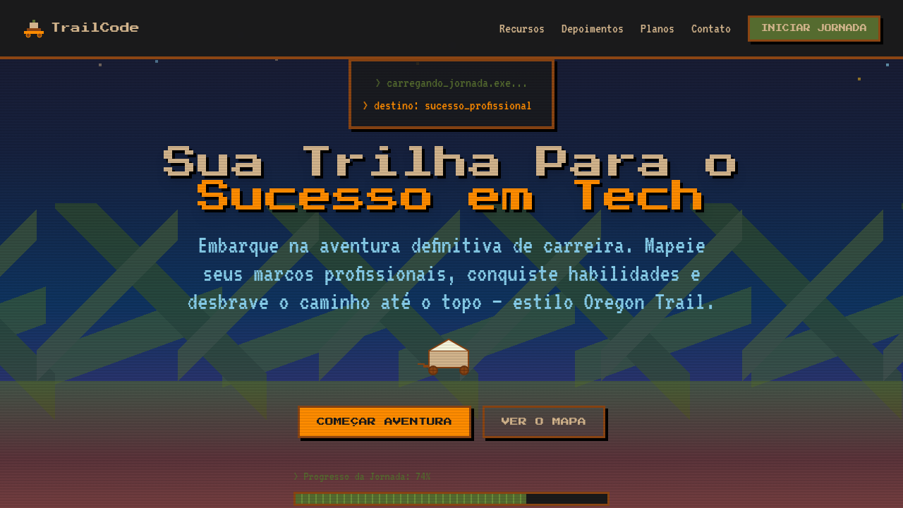
Career resume landing page in Oregon Trail retro game style. Ideal for currículos criativos, portfólios de desenvolvedores, páginas pessoais, apresentações de carreira. AI-ready template.
Use case: Creative resumes, Developer portfolios, Personal pages, Career presentations
Historical Context
Oregon Trail isn't just a game — it's a shared cultural memory for an entire generation of computer users. Released in 1971 and popularized through school computer labs in the 80s and 90s, it became the first video game most Americans ever played. The green-and-black pixel art, the brutal decision-making, the infamous dysentery — these aren't just nostalgia triggers, they're a universal language. What makes the Oregon Trail metaphor work so well for resumes and portfolios is that it reframes a career as a journey with real stakes. You forded rivers (pivoted careers), lost oxen (failed projects), and somehow made it to Oregon (landed the role). The trail format gives narrative structure to what's usually a flat, lifeless document. It turns a list of jobs into a story of survival and progress. Gamers-turned-developers immediately get it. Recruiters who grew up with it get it too. That's rare overlap, and it's worth exploiting.
When to Use
Best deployed by developers and creatives who want their resume to be remembered, not skimmed. Works beautifully for portfolio sites where the journey matters as much as the destination — career changers, bootcamp grads, indie devs with non-linear paths. Also strong for gamified onboarding experiences or interactive timelines. Skip it if your audience is strictly corporate finance. Lean into it if you're applying somewhere that values personality over polish.
Design Principles
- Commit to the bit — use authentic 4-color palettes and bitmap fonts, not 'retro-inspired' gradients that betray the theme
- Pixel art demands pixel-perfect alignment; sub-pixel rendering is the enemy, so snap everything to a grid and disable anti-aliasing on key assets
- Pace the journey with meaningful checkpoints — each career milestone should feel like reaching a fort, not just another bullet point
- Contrast the lo-fi aesthetic with modern interaction patterns; the visuals are 1985 but the UX should be 2025 — smooth scrolling, responsive breakpoints, accessible contrast ratios
- Leave room for humor and personality in microcopy — 'You have mass-applied to 47 jobs. Your motivation has dysentery' hits harder than any skills matrix
DESIGN.md
---
version: "alpha"
name: "Resume Journey Oregon Trail"
description: "Career resume landing page in Oregon Trail retro game style. Ideal for currículos criativos, portfólios de desenvolvedores, páginas pessoais, apresentações de carreira. AI-ready template."
colors:
  primary: "#8B4513"
  secondary: "#556B2F"
  tertiary: "#87CEEB"
  neutral: "#D2B48C"
  surface: "#FF8C00"
  accent: "#4682B4"
typography:
  h1:
    fontFamily: Press Start 2P
    fontSize: 2.5rem
    fontWeight: 700
  body-md:
    fontFamily: Press Start 2P
    fontSize: 1rem
    fontWeight: 400
components:
  button-primary:
    backgroundColor: "{colors.primary}"
    textColor: "{colors.neutral}"
    padding: 12px
---

## Overview

Career resume landing page in Oregon Trail retro game style. Ideal for currículos criativos, portfólios de desenvolvedores, páginas pessoais, apresentações de carreira. AI-ready template. Oregon Trail isn't just a game — it's a shared cultural memory for an entire generation of computer users. Released in 1971 and popularized through school computer labs in the 80s and 90s, it became the first video game most Americans ever played. The green-and-black pixel art, the brutal decision-making, the infamous dysentery — these aren't just nostalgia triggers, they're a universal language.

What makes the Oregon Trail metaphor work so well for resumes and portfolios is that it reframes a career as a journey with real stakes. You forded rivers (pivoted careers), lost oxen (failed projects), and somehow made it to Oregon (landed the role). The trail format gives narrative structure to what's usually a flat, lifeless document. It turns a list of jobs into a story of survival and progress.

Gamers-turned-developers immediately get it. Recruiters who grew up with it get it too. That's rare overlap, and it's worth exploiting.

- Density: 5/10 — Balanced
- Variance: 7/10 — Dynamic
- Motion: 8/10 — Cinematic

- **Style:** Retro Game, Pixel Art, Timeline, Career Path
- **Keywords:** Oregon Trail, retro game, pixel art, career journey, timeline, milestones, 8-bit, adventure, resume, path
- **Era:** 1980s-1990s Educational Games
- **Light/Dark:** ✓ Full / ✓ Full

## Colors

- **Trail Brown** (#8B4513) — Primary surface or dominant color
- **Prairie Green** (#556B2F) — Secondary surface or text color
- **Sky Blue** (#87CEEB) — Accent highlight, links and focus states
- **Wagon Tan** (#D2B48C) — Supporting palette color
- **Campfire Orange** (#FF8C00) — Warm accent, call-to-action secondary
- **River Blue** (#4682B4) — Secondary accent
- **Dust Yellow** (#DAA520) — Warning states, attention indicators
- **Night Black** (#1A1A1A) — Deep contrast surface


## Typography

- **Display / Hero:** Press Start 2P' or 'VT323' monospace — Weight 700, tight tracking, used for headline impact
- **Body:** Press Start 2P' or 'VT323' monospace — Weight 400, 16px/1.6 line-height, max 72ch per line
- **UI Labels / Captions:** Press Start 2P' or 'VT323' monospace — 0.875rem, weight 500, slight letter-spacing
- **Monospace:** Press Start 2P' or 'VT323' monospace — Used for code, metadata, and technical values

Scale:
- Hero: clamp(2.5rem, 5vw, 4rem)
- H1: 2.25rem
- H2: 1.5rem
- Body: 1rem / 1.6
- Small: 0.875rem


## Layout

- **Grid:** CSS Grid primary. Max-width containment: 1280px centered with 1.5rem side padding.
- **Spacing rhythm:** Balanced. Base unit: 0.5rem (8px).
- **Section vertical gaps:** clamp(4rem, 8vw, 8rem).
- **Hero layout:** Asymmetric composition.
- **Feature sections:** Asymmetric grid with varied card sizes. No 3-equal-columns.
- **Mobile collapse:** All multi-column layouts collapse below 768px. No horizontal overflow.
- **z-index contract:** base (0) / sticky-nav (100) / overlay (200) / modal (300) / toast (500).


## Elevation & Depth

Pixel art rendering (image-rendering: pixelated), scrolling trail/path animation connecting milestones, retro terminal-style typography, milestone markers as pixel waypoints, parallax landscape layers, 8-bit style progress bars for skills

- **Physics:** Spring — stiffness 120, damping 20. Confident, weighted transitions.
- **Entry animations:** Fade + translate-Y (16px → 0) over 540ms ease-out. Staggered cascades for lists: 120ms between items.
- **Hover states:** Scale(1.03) + shadow lift over 200ms.
- **Page transitions:** Fade + slide (300ms).
- **Performance:** Only transform and opacity animated. No layout-triggering properties.


## Shapes

Base corner radius: 8px. See rounded tokens in front matter for the full scale.


## Components

- **Primary Button:** Subtly rounded (0.5rem) shape. Accent color fill. Hover: 8% darken + subtle lift shadow. Active: -1px translate tactile press. Font weight 600. No outer glows.
- **Secondary / Ghost Button:** Outline variant. 1.5px border in muted color. Text in primary color. Hover: subtle background fill.
- **Cards:** Subtly rounded (0.5rem) corners. Surface background. Subtle shadow (0 2px 12px rgba(0,0,0,0.06)). 1px border stroke.
- **Inputs:** Label above input. 1px border stroke. Focus ring: 2px accent color offset 2px. Error text below in semantic red. No floating labels.
- **Navigation:** Primary surface background. Active item: accent color indicator. Font weight 500 when active.
- **Skeletons:** Shimmer animation matching component dimensions. No circular spinners.
- **Empty States:** Icon-based composition with descriptive text and action button.


## Do's and Don'ts

- No emojis in UI — use icon system only (Lucide, Heroicons)
- No pure black (#000000) — use off-black or charcoal variants
- No oversaturated accent colors (saturation cap: 80%)
- No 3-column equal-width feature layouts — use zig-zag or asymmetric grid
- No `h-screen` — use `min-h-[100dvh]`
- No AI copywriting clichés: "Elevate", "Seamless", "Unleash", "Next-Gen"
- No broken external image links — use picsum.photos or inline SVG
- No generic lorem ipsum in demos

- Do Pixel art aesthetic throughout
- Do Winding trail/path connecting milestones
- Do Retro terminal typography
- Do Earth-tone color palette
- Do Career milestones as trail stops
- Do 8-bit progress bars for skills
- Do Parallax landscape background


## Use Case

Creative resumes, Developer portfolios, Personal pages, Career presentations
Technical Specs
CSS
image-rendering: pixelated, font-family: 'Press Start 2P' or 'VT323' monospace, background: layered parallax with earth tones, border: 3px solid #8B4513 for retro frames, clip-path or SVG path for winding trail, animation: scroll-trail for path movement, box-shadow: 4px 4px 0 #000 for pixel depth
Variables
--pixel-size: 4px, --trail-color: #8B4513, --prairie-green: #556B2F, --font-retro: 'Press Start 2P', --path-width: 8px, --milestone-size: 48px, --parallax-layers: 3, --pixel-shadow: 4px 4px 0 #000
Checklist
☐ Pixel art aesthetic throughout, ☐ Winding trail/path connecting milestones, ☐ Retro terminal typography, ☐ Earth-tone color palette, ☐ Career milestones as trail stops, ☐ 8-bit progress bars for skills, ☐ Parallax landscape background
Colors
Primary
Secondary
Effects
Pixel art rendering (image-rendering: pixelated), scrolling trail/path animation connecting milestones, retro terminal-style typography, milestone markers as pixel waypoints, parallax landscape layers, 8-bit style progress bars for skills
Light/Dark
✓ Full / ✓ Full
AI Prompt
Act as a Senior Frontend Engineer and Expert UI Designer.
Your task is to code a complete Landing Page on the first attempt.
- Landing Page Theme: <INSERT THEME>
- Sections to add: <INSERT SECTIONS>

Generate the final code immediately following these definitions:

## Style

- **Name:** Resume Journey Oregon Trail
- **Type:** Retro Game, Pixel Art, Timeline, Career Path
- **Keywords:** Oregon Trail, retro game, pixel art, career journey, timeline, milestones, 8-bit, adventure, resume, path
- **Era:** 1980s-1990s Educational Games
- **Light/Dark:** ✓ Full / ✓ Full

## Color Palette

- **Primary:** Trail Brown #8B4513, Prairie Green #556B2F, Sky Blue #87CEEB, Wagon Tan #D2B48C
- **Secondary:** Campfire Orange #FF8C00, River Blue #4682B4, Dust Yellow #DAA520, Night Black #1A1A1A

## Visual Effects

Pixel art rendering (image-rendering: pixelated), scrolling trail/path animation connecting milestones, retro terminal-style typography, milestone markers as pixel waypoints, parallax landscape layers, 8-bit style progress bars for skills

## AI Visual Direction

Design a career resume landing page in Oregon Trail retro game style. Show career milestones as stops along a trail/path that scrolls horizontally or vertically. Use pixel art aesthetic, earth-tone colors (brown, green, tan), retro terminal typography. Include a winding trail connecting career milestones, pixel wagon/character, 8-bit progress bars for skills, and retro game UI elements like health bars and inventory slots for achievements. Each career milestone should look like a trail stop with date and description.

## CSS Technical

```css
image-rendering: pixelated, font-family: 'Press Start 2P' or 'VT323' monospace, background: layered parallax with earth tones, border: 3px solid #8B4513 for retro frames, clip-path or SVG path for winding trail, animation: scroll-trail for path movement, box-shadow: 4px 4px 0 #000 for pixel depth
```

## Design System Variables

```css
--pixel-size: 4px, --trail-color: #8B4513, --prairie-green: #556B2F, --font-retro: 'Press Start 2P', --path-width: 8px, --milestone-size: 48px, --parallax-layers: 3, --pixel-shadow: 4px 4px 0 #000
```

## Implementation Checklist

- ☐ Pixel art aesthetic throughout
- ☐ Winding trail/path connecting milestones
- ☐ Retro terminal typography
- ☐ Earth-tone color palette
- ☐ Career milestones as trail stops
- ☐ 8-bit progress bars for skills
- ☐ Parallax landscape background

## Execution Rules

1. Strictly follow the defined visual style.
2. Use high-quality inline SVG icons (Heroicons or Lucide style) — NEVER use emojis as icons.
3. Add `cursor-pointer` and smooth `hover` states (transition-all) on all interactive elements.
4. Required Page Structure:
   - Navbar (Logo + Links + CTA)
   - Hero Section (Impactful Headline + Subtitle + 2 buttons + 3D/Abstract visual element via CSS)
   - Features (3 cards with icons)
   - Testimonials (3 cards)
   - Pricing (3 tiers, highlight the middle one)
   - Final CTA
   - Full Footer with social links, privacy policy, terms of use, contact and SEO links.
5. All text content must be in English.
6. The visual must be CLEARLY distinct — do not create a "default Bootstrap" design. Force the use of the provided design system variables.
7. Use `<style>` tags in the head for custom classes (especially for complex backdrop-filter effects and animations) that Tailwind CDN doesn't cover.
8. Full Responsiveness: Layout must adapt perfectly to Mobile, Tablet and Desktop (vertical stack on mobile).
9. Include basic SEO, Viewport and Open Graph meta tags in `<head>`.
10. Footer must contain: Copyright 2026, Secondary navigation links and Social media icons.
11. Make the creative decisions needed to deliver the complete, functional result now.
Related


Last synced: 4/1/2026