Neoclassical Art
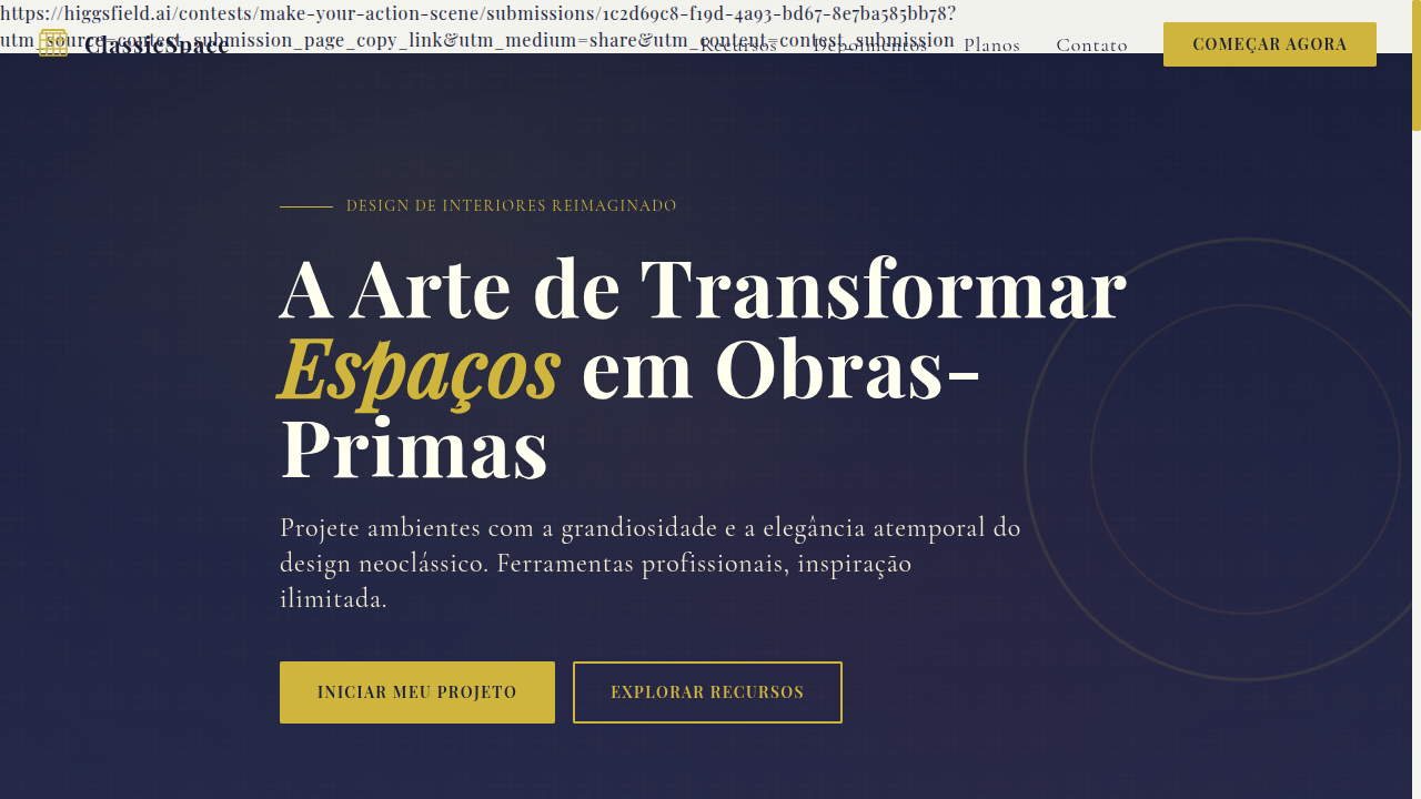
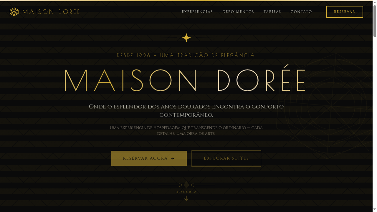
Neoclassical landing page inspired by ancient Greek and Roman art. Ideal for marcas de luxo, interior design, art galleries, projetos formais e institucionais. AI-ready template.
Use case: Luxury brands, Interior design, Art galleries, Formal and institutional projects
Historical Context
Neoclassical art emerged in the mid-18th century as a direct rebellion against the excess of Rococo. Architects, painters, and sculptors looked back to ancient Greece and Rome—not out of nostalgia, but out of intellectual conviction. The excavations at Pompeii and Herculaneum gave artists primary sources they'd never had before. Winckelmann wrote that Greek art achieved "noble simplicity and quiet grandeur," and an entire generation took that as gospel. David, Canova, Ingres—they weren't decorating. They were making moral arguments in marble and oil. What makes Neoclassical relevant to design today isn't the columns or the togas. It's the underlying philosophy: that restraint communicates authority, that symmetry creates trust, that referencing shared cultural memory gives your work weight it couldn't earn on its own. Every courthouse with a pediment, every university seal with a laurel wreath—that's Neoclassical thinking still doing its job two centuries later. The style carries an implicit promise: we are serious, we are permanent, we will outlast trends. That's not a small thing to communicate visually.
When to Use
Reach for Neoclassical when your client needs to project institutional permanence. Law firms, government bodies, museums, and universities all benefit from this visual language because their authority depends on perceived stability. It works when you need gravitas without stuffiness—when the brief says "trustworthy" and "established" but the audience still expects contemporary craft. Avoid it for startups chasing disruption narratives or brands targeting youth culture. This aesthetic earns its power precisely because it refuses to be trendy.
Design Principles
- Symmetry as authority — Center-axis compositions and mirrored layouts signal institutional confidence. Break symmetry only with intention.
- Restrained palette, maximum contrast — Think warm stone against deep navy or black. Let negative space do the heavy lifting instead of color variety.
- Classical proportion over arbitrary spacing — Use golden ratio or column-based grids. The math should feel inevitable, not decorative.
- Typography carries the weight — Serif faces with high contrast strokes and generous tracking. The letterforms themselves should echo chiseled inscriptions.
- Ornament must be earned — Every decorative element needs structural justification. A border, a rule, a flourish—each one should reinforce hierarchy, never compete with content.
DESIGN.md
---
version: "alpha"
name: "Neoclassical Art"
description: "Neoclassical landing page inspired by ancient Greek and Roman art. Ideal for marcas de luxo, interior design, art galleries, projetos formais e institucionais. AI-ready template."
colors:
  primary: "#FFFFF0"
  secondary: "#CFB53B"
  tertiary: "#F5F5F0"
  neutral: "#1B1F3B"
  surface: "#800020"
  accent: "#556B2F"
typography:
  h1:
    fontFamily: Playfair Display
    fontSize: 2.25rem
    fontWeight: 700
  body-md:
    fontFamily: Playfair Display
    fontSize: 1rem
    fontWeight: 400
  label-caps:
    fontFamily: Playfair Display
    fontSize: 0.75rem
    fontWeight: 500
rounded:
  sm: 2px
  md: 4px
  lg: 8px
spacing:
  sm: 2.5rem
  md: 5.0rem
  lg: 10.0rem
components:
  button-primary:
    backgroundColor: "{colors.primary}"
    textColor: "{colors.neutral}"
    rounded: "{rounded.sm}"
    padding: 12px
---

## Overview

Neoclassical landing page inspired by ancient Greek and Roman art. Ideal for marcas de luxo, interior design, art galleries, projetos formais e institucionais. AI-ready template. Neoclassical art emerged in the mid-18th century as a direct rebellion against the excess of Rococo. Architects, painters, and sculptors looked back to ancient Greece and Rome—not out of nostalgia, but out of intellectual conviction. The excavations at Pompeii and Herculaneum gave artists primary sources they'd never had before. Winckelmann wrote that Greek art achieved "noble simplicity and quiet grandeur," and an entire generation took that as gospel. David, Canova, Ingres—they weren't decorating. They were making moral arguments in marble and oil.

What makes Neoclassical relevant to design today isn't the columns or the togas. It's the underlying philosophy: that restraint communicates authority, that symmetry creates trust, that referencing shared cultural memory gives your work weight it couldn't earn on its own. Every courthouse with a pediment, every university seal with a laurel wreath—that's Neoclassical thinking still doing its job two centuries later.

The style carries an implicit promise: we are serious, we are permanent, we will outlast trends. That's not a small thing to communicate visually.

- Density: 5/10 — Balanced
- Variance: 2/10 — Structured
- Motion: 4/10 — Subtle

- **Style:** Classical, Timeless, Grand, Antiquity-Inspired
- **Keywords:** Neoclassical, ancient Greece, timeless, grand, columns, marble, classical antiquity, oil painting, formal, heritage
- **Era:** 18th Century Neoclassicism
- **Light/Dark:** ✓ Full / ◐ Partial

## Colors

- **Ivory** (#FFFFF0) — Light surface, card backgrounds
- **Gold** (#CFB53B) — Premium accent, decorative highlights
- **Marble White** (#F5F5F0) — Light surface, card backgrounds
- **Deep Navy** (#1B1F3B) — Supporting palette color
- **Burgundy** (#800020) — Extended palette, decorative use
- **Olive Green** (#556B2F) — Success states, positive indicators
- **Bronze** (#CD7F32) — Metallic accent, decorative detail
- **Parchment** (#F1E9D2) — Extended palette, decorative use


## Typography

- **Display / Hero:** Playfair Display — Weight 700, tight tracking, used for headline impact
- **Body:** Playfair Display — Weight 400, 16px/1.6 line-height, max 72ch per line
- **UI Labels / Captions:** Playfair Display — 0.875rem, weight 500, slight letter-spacing
- **Monospace:** JetBrains Mono — Used for code, metadata, and technical values

Scale:
- Hero: clamp(2.5rem, 5vw, 4rem)
- H1: 2.25rem
- H2: 1.5rem
- Body: 1rem / 1.6
- Small: 0.875rem


## Layout

- **Grid:** CSS Grid primary. Max-width containment: 1280px centered with 1.5rem side padding.
- **Spacing rhythm:** Balanced. Base unit: 0.5rem (8px).
- **Section vertical gaps:** clamp(4rem, 8vw, 8rem).
- **Hero layout:** Split-screen (text left, visual right).
- **Feature sections:** Zig-zag alternating text+image rows. No 3-equal-columns.
- **Mobile collapse:** All multi-column layouts collapse below 768px. No horizontal overflow.
- **z-index contract:** base (0) / sticky-nav (100) / overlay (200) / modal (300) / toast (500).


## Elevation & Depth

Subtle gold borders, classical column dividers, serif typography with elegant spacing, marble texture backgrounds, soft vignette overlays, smooth fade-in transitions (400ms)

- **Physics:** Ease-out curves, 200-300ms duration. Smooth and predictable.
- **Entry animations:** Fade + translate-Y (16px → 0) over 420ms ease-out. Staggered cascades for lists: 80ms between items.
- **Hover states:** Subtle color shift + shadow adjustment over 200ms.
- **Page transitions:** Fade only (200ms).
- **Performance:** Only transform and opacity animated. No layout-triggering properties.


## Shapes

Base corner radius: 2px. See rounded tokens in front matter for the full scale.


## Components

- **Primary Button:** Rounded (2px font-family: 'Playfair Display') shape. Accent color fill. Hover: 8% darken + subtle lift shadow. Active: -1px translate tactile press. Font weight 600. No outer glows.
- **Secondary / Ghost Button:** Outline variant. 1.5px border in muted color. Text in primary color. Hover: subtle background fill.
- **Cards:** Rounded (2px font-family: 'Playfair Display') corners. Surface background. Subtle shadow (0 2px 12px rgba(0,0,0,0.06)). 1px border stroke.
- **Inputs:** Label above input. 1px border stroke. Focus ring: 2px accent color offset 2px. Error text below in semantic red. No floating labels.
- **Navigation:** Primary surface background. Active item: accent color indicator. Font weight 500 when active.
- **Skeletons:** Shimmer animation matching component dimensions. No circular spinners.
- **Empty States:** Icon-based composition with descriptive text and action button.


## Do's and Don'ts

- No emojis in UI — use icon system only (Lucide, Heroicons)
- No pure black (#000000) — use off-black or charcoal variants
- No oversaturated accent colors (saturation cap: 80%)
- No 3-column equal-width feature layouts — use zig-zag or asymmetric grid
- No `h-screen` — use `min-h-[100dvh]`
- No AI copywriting clichés: "Elevate", "Seamless", "Unleash", "Next-Gen"
- No broken external image links — use picsum.photos or inline SVG
- No generic lorem ipsum in demos

- Do Serif typography with classical hierarchy
- Do Gold accent borders and dividers
- Do Marble or ivory backgrounds
- Do Column-inspired layout dividers
- Do Formal and grand visual tone
- Do Mobile responsive with stacked columns


## Use Case

Luxury brands, Interior design, Art galleries, Formal and institutional projects
Technical Specs
CSS
font-family: 'Playfair Display', serif, background: marble texture or #F5F5F0, border: 2px solid #CFB53B, color: #1B1F3B, letter-spacing: 0.05em, text-transform: uppercase for headings, box-shadow: 0 4px 20px rgba(0,0,0,0.1)
Variables
--font-primary: 'Playfair Display', --color-gold: #CFB53B, --color-ivory: #FFFFF0, --color-navy: #1B1F3B, --border-accent: 2px solid #CFB53B, --spacing: 2.5rem, --border-radius: 2px
Checklist
☐ Serif typography with classical hierarchy, ☐ Gold accent borders and dividers, ☐ Marble or ivory backgrounds, ☐ Column-inspired layout dividers, ☐ Formal and grand visual tone, ☐ Mobile responsive with stacked columns
Colors
Primary
Secondary
Effects
Subtle gold borders, classical column dividers, serif typography with elegant spacing, marble texture backgrounds, soft vignette overlays, smooth fade-in transitions (400ms)
Light/Dark
✓ Full / ◐ Partial
AI Prompt
Act as a Senior Frontend Engineer and Expert UI Designer.
Your task is to code a complete Landing Page on the first attempt.
- Landing Page Theme: <INSERT THEME>
- Sections to add: <INSERT SECTIONS>

Generate the final code immediately following these definitions:

## Style

- **Name:** Neoclassical Art
- **Type:** Classical, Timeless, Grand, Antiquity-Inspired
- **Keywords:** Neoclassical, ancient Greece, timeless, grand, columns, marble, classical antiquity, oil painting, formal, heritage
- **Era:** 18th Century Neoclassicism
- **Light/Dark:** ✓ Full / ◐ Partial

## Color Palette

- **Primary:** Ivory #FFFFF0, Gold #CFB53B, Marble White #F5F5F0, Deep Navy #1B1F3B
- **Secondary:** Burgundy #800020, Olive Green #556B2F, Bronze #CD7F32, Parchment #F1E9D2

## Visual Effects

Subtle gold borders, classical column dividers, serif typography with elegant spacing, marble texture backgrounds, soft vignette overlays, smooth fade-in transitions (400ms)

## AI Visual Direction

Design a neoclassical landing page inspired by ancient Greek and Roman art. Use marble textures, gold accents, classical columns as dividers, serif typography (like Playfair Display or Cormorant), ivory and deep navy palette. Evoke grandeur, timelessness and formal elegance. Include subtle oil-painting-style background elements.

## CSS Technical

```css
font-family: 'Playfair Display', serif, background: marble texture or #F5F5F0, border: 2px solid #CFB53B, color: #1B1F3B, letter-spacing: 0.05em, text-transform: uppercase for headings, box-shadow: 0 4px 20px rgba(0,0,0,0.1)
```

## Design System Variables

```css
--font-primary: 'Playfair Display', --color-gold: #CFB53B, --color-ivory: #FFFFF0, --color-navy: #1B1F3B, --border-accent: 2px solid #CFB53B, --spacing: 2.5rem, --border-radius: 2px
```

## Implementation Checklist

- ☐ Serif typography with classical hierarchy
- ☐ Gold accent borders and dividers
- ☐ Marble or ivory backgrounds
- ☐ Column-inspired layout dividers
- ☐ Formal and grand visual tone
- ☐ Mobile responsive with stacked columns

## Execution Rules

1. Strictly follow the defined visual style.
2. Use high-quality inline SVG icons (Heroicons or Lucide style) — NEVER use emojis as icons.
3. Add `cursor-pointer` and smooth `hover` states (transition-all) on all interactive elements.
4. Required Page Structure:
   - Navbar (Logo + Links + CTA)
   - Hero Section (Impactful Headline + Subtitle + 2 buttons + 3D/Abstract visual element via CSS)
   - Features (3 cards with icons)
   - Testimonials (3 cards)
   - Pricing (3 tiers, highlight the middle one)
   - Final CTA
   - Full Footer with social links, privacy policy, terms of use, contact and SEO links.
5. All text content must be in English.
6. The visual must be CLEARLY distinct — do not create a "default Bootstrap" design. Force the use of the provided design system variables.
7. Use `<style>` tags in the head for custom classes (especially for complex backdrop-filter effects and animations) that Tailwind CDN doesn't cover.
8. Full Responsiveness: Layout must adapt perfectly to Mobile, Tablet and Desktop (vertical stack on mobile).
9. Include basic SEO, Viewport and Open Graph meta tags in `<head>`.
10. Footer must contain: Copyright 2026, Secondary navigation links and Social media icons.
11. Make the creative decisions needed to deliver the complete, functional result now.
Related
Last synced: 4/1/2026