Mystical Western
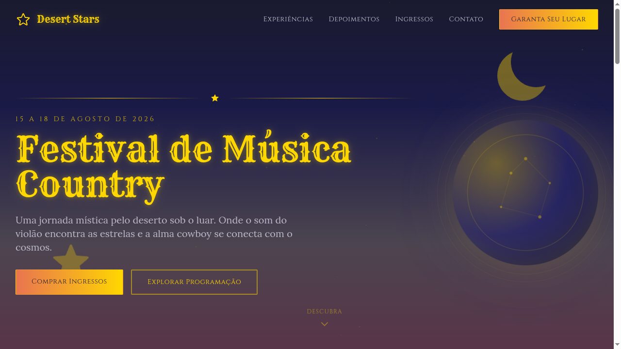
Mystical western landing page blending classic cowboy desert aesthetics with cosmic spiritual vibes. Ideal for pôsteres de festivais de música, marcas de vestuário indie, branding espiritual, eventos temáticos. AI-ready template.
Use case: Music festival posters, Indie clothing brands, Spiritual branding, Themed events
Historical Context
The mystical western sits at a crossroads that's been brewing since the 1960s, when Jodorowsky dragged the cowboy archetype through psychedelic ritual in El Topo. But the visual language goes deeper — back to frontier-era broadsheets printed with crude woodcuts of snake oil salesmen and traveling fortune tellers. The American West was always occult territory. Prospectors carried talismans. Saloon walls displayed astrological charts next to wanted posters. The desert itself became a symbol of spiritual transformation long before Georgia O'Keeffe painted bleached skulls against infinite sky. What we're seeing now is a deliberate collision of two visual traditions: the gritty, sun-bleached typography and worn leather textures of western Americana with the symbolic density of tarot illustration and alchemical diagrams. Think aged parchment meeting celestial maps. Rattlesnakes coiling into ouroboros. Cacti rendered with the reverence of sacred geometry. This isn't costume — it's recognition that the frontier myth was always a spiritual narrative dressed in dust and gunpowder. The style gained serious traction through independent tarot deck designers and desert festival culture, then bled into brand identity work for mezcal labels, desert retreats, and roots music. It works because it refuses to separate the sacred from the rugged.
When to Use
Deploy this when your project needs to feel ancient and earned — not precious. It's ideal for brands operating in spiritual commerce that reject the clean-crystal-on-marble aesthetic. Mezcal and whiskey labels. Desert wellness retreats that aren't afraid of darkness. Roots musicians who read cards between sets. Americana brands that want depth beyond nostalgia. Use it when your audience distrusts polish but craves meaning, when the brief says 'spiritual but not soft,' or when you need illustration that carries weight without feeling heavy-handed.
Design Principles
- Embrace material honesty — textures should reference real substrates: cracked leather, sun-faded broadsheets, hand-pressed ink on rough stock. Never simulate wear digitally when you can reference it authentically.
- Maintain symbolic density without clutter. Every element should carry meaning: a star is a navigation tool AND a celestial body AND a tarot reference. Layer intention, not decoration.
- Let negative space function as landscape. The desert teaches restraint — vast emptiness makes focal elements sacred. Resist the urge to fill. Silence is part of the composition.
- Color palettes must feel extracted, not selected. Burnt sienna from canyon walls. Bone white from bleached skulls. Indigo from desert night sky. If a color couldn't exist in the physical landscape, it doesn't belong.
- Typography should show evidence of the hand and of time. Favor letterforms that reference wood type, engraved plates, or hand-painted signage — but never pristine reproductions. The imperfection IS the authenticity.
DESIGN.md
---
version: "alpha"
name: "Mystical Western"
description: "Mystical western landing page blending classic cowboy desert aesthetics with cosmic spiritual vibes. Ideal for pôsteres de festivais de música, marcas de vestuário indie, branding espiritual, eventos temáticos. AI-ready template."
colors:
  primary: "#C2A878"
  secondary: "#191970"
  tertiary: "#E97451"
  neutral: "#FFD700"
  surface: "#5F7A4A"
  accent: "#C4C4D4"
typography:
  h1:
    fontFamily: Rye
    fontSize: 2.5rem
    fontWeight: 700
  body-md:
    fontFamily: Rye
    fontSize: 1rem
    fontWeight: 400
rounded:
  sm: 2px
  md: 4px
  lg: 8px
spacing:
  sm: 2.0rem
  md: 4.0rem
  lg: 8.0rem
components:
  button-primary:
    backgroundColor: "{colors.primary}"
    textColor: "{colors.neutral}"
    rounded: "{rounded.sm}"
    padding: 12px
---

## Overview

Mystical western landing page blending classic cowboy desert aesthetics with cosmic spiritual vibes. Ideal for pôsteres de festivais de música, marcas de vestuário indie, branding espiritual, eventos temáticos. AI-ready template. The mystical western sits at a crossroads that's been brewing since the 1960s, when Jodorowsky dragged the cowboy archetype through psychedelic ritual in El Topo. But the visual language goes deeper — back to frontier-era broadsheets printed with crude woodcuts of snake oil salesmen and traveling fortune tellers. The American West was always occult territory. Prospectors carried talismans. Saloon walls displayed astrological charts next to wanted posters. The desert itself became a symbol of spiritual transformation long before Georgia O'Keeffe painted bleached skulls against infinite sky.

What we're seeing now is a deliberate collision of two visual traditions: the gritty, sun-bleached typography and worn leather textures of western Americana with the symbolic density of tarot illustration and alchemical diagrams. Think aged parchment meeting celestial maps. Rattlesnakes coiling into ouroboros. Cacti rendered with the reverence of sacred geometry. This isn't costume — it's recognition that the frontier myth was always a spiritual narrative dressed in dust and gunpowder.

The style gained serious traction through independent tarot deck designers and desert festival culture, then bled into brand identity work for mezcal labels, desert retreats, and roots music. It works because it refuses to separate the sacred from the rugged.

- Density: 5/10 — Balanced
- Variance: 4/10 — Moderate
- Motion: 8/10 — Cinematic

- **Style:** Desert, Cosmic, Spiritual, Cowboy-Celestial
- **Keywords:** Mystical western, cowboy, desert, cosmic, spiritual, moonlight, celestial symbols, tarot, stars, indie, boho-western
- **Era:** Modern Indie Western Fusion
- **Light/Dark:** ◐ Partial / ✓ Full

## Colors

- **Desert Tan** (#C2A878) — Primary surface or dominant color
- **Midnight Blue** (#191970) — Dark surface, primary background
- **Burnt Sienna** (#E97451) — Supporting palette color
- **Starlight Gold** (#FFD700) — Premium accent, decorative highlights
- **Cactus Green** (#5F7A4A) — Success states, positive indicators
- **Moonstone Silver** (#C4C4D4) — Extended palette, decorative use
- **Dusty Purple** (#7B6B8A) — Accent color, emphasis elements
- **Warm Black** (#1A1A2E) — Deep contrast surface


## Typography

- **Display / Hero:** Rye — Weight 700, tight tracking, used for headline impact
- **Accent:** Cinzel — Used for decorative or emphasis text
- **Body:** Rye — Weight 400, 16px/1.6 line-height, max 72ch per line
- **UI Labels / Captions:** Rye — 0.875rem, weight 500, slight letter-spacing
- **Monospace:** JetBrains Mono — Used for code, metadata, and technical values

Scale:
- Hero: clamp(2.5rem, 5vw, 4rem)
- H1: 2.25rem
- H2: 1.5rem
- Body: 1rem / 1.6
- Small: 0.875rem


## Layout

- **Grid:** CSS Grid primary. Max-width containment: 1280px centered with 1.5rem side padding.
- **Spacing rhythm:** Balanced. Base unit: 0.5rem (8px).
- **Section vertical gaps:** clamp(4rem, 8vw, 8rem).
- **Hero layout:** Split-screen (text left, visual right).
- **Feature sections:** Zig-zag alternating text+image rows. No 3-equal-columns.
- **Mobile collapse:** All multi-column layouts collapse below 768px. No horizontal overflow.
- **z-index contract:** base (0) / sticky-nav (100) / overlay (200) / modal (300) / toast (500).


## Elevation & Depth

Starfield background animation (CSS particles), celestial symbol SVG decorations (moons, stars), desert gradient horizons, tarot-card-style bordered sections, moonlight glow effects on hover, subtle parallax on celestial elements

- **Physics:** Spring — stiffness 120, damping 20. Confident, weighted transitions.
- **Entry animations:** Fade + translate-Y (16px → 0) over 540ms ease-out. Staggered cascades for lists: 120ms between items.
- **Hover states:** Scale(1.03) + shadow lift over 200ms.
- **Page transitions:** Fade + slide (300ms).
- **Performance:** Only transform and opacity animated. No layout-triggering properties.


## Shapes

Base corner radius: 2px. See rounded tokens in front matter for the full scale.


## Components

- **Primary Button:** Rounded (2px font-family: 'Rye') shape. Accent color fill. Hover: 8% darken + subtle lift shadow. Active: -1px translate tactile press. Font weight 600. No outer glows.
- **Secondary / Ghost Button:** Outline variant. 1.5px border in muted color. Text in primary color. Hover: subtle background fill.
- **Cards:** Rounded (2px font-family: 'Rye') corners. Surface background. Subtle shadow (0 2px 12px rgba(0,0,0,0.06)). 1px border stroke.
- **Inputs:** Label above input. 1px border stroke. Focus ring: 2px accent color offset 2px. Error text below in semantic red. No floating labels.
- **Navigation:** Primary surface background. Active item: accent color indicator. Font weight 500 when active.
- **Skeletons:** Shimmer animation matching component dimensions. No circular spinners.
- **Empty States:** Icon-based composition with descriptive text and action button.


## Do's and Don'ts

- No emojis in UI — use icon system only (Lucide, Heroicons)
- No pure black (#000000) — use off-black or charcoal variants
- No oversaturated accent colors (saturation cap: 80%)
- No 3-column equal-width feature layouts — use zig-zag or asymmetric grid
- No `h-screen` — use `min-h-[100dvh]`
- No AI copywriting clichés: "Elevate", "Seamless", "Unleash", "Next-Gen"
- No broken external image links — use picsum.photos or inline SVG
- No generic lorem ipsum in demos

- Do Desert + cosmic color palette
- Do Starfield background animation
- Do Celestial SVG symbols
- Do Desert gradient horizons
- Do Tarot-card-style section borders
- Do Western + mystical typography mix
- Do Moonlight glow effects
- Do Responsive with maintained atmosphere


## Use Case

Music festival posters, Indie clothing brands, Spiritual branding, Themed events
Technical Specs
CSS
font-family: 'Rye', serif mixed with 'Cinzel', background: linear-gradient(to bottom, #1A1A2E, #191970, #C2A878), color: #FFD700 or #C2A878, border: 2px solid #FFD700, border-radius: 2px, box-shadow: 0 0 30px rgba(255,215,0,0.15), text-shadow: 0 0 10px rgba(255,215,0,0.3)
Variables
--color-tan: #C2A878, --color-midnight: #191970, --color-sienna: #E97451, --color-gold: #FFD700, --font-western: 'Rye', --font-mystical: 'Cinzel', --glow-gold: rgba(255,215,0,0.15), --spacing: 2rem, --border-radius: 2px
Checklist
☐ Desert + cosmic color palette, ☐ Starfield background animation, ☐ Celestial SVG symbols, ☐ Desert gradient horizons, ☐ Tarot-card-style section borders, ☐ Western + mystical typography mix, ☐ Moonlight glow effects, ☐ Responsive with maintained atmosphere
Colors
Primary
Secondary
Effects
Starfield background animation (CSS particles), celestial symbol SVG decorations (moons, stars), desert gradient horizons, tarot-card-style bordered sections, moonlight glow effects on hover, subtle parallax on celestial elements
Light/Dark
◐ Partial / ✓ Full
AI Prompt
Act as a Senior Frontend Engineer and Expert UI Designer.
Your task is to code a complete Landing Page on the first attempt.
- Landing Page Theme: <INSERT THEME>
- Sections to add: <INSERT SECTIONS>

Generate the final code immediately following these definitions:

## Style

- **Name:** Mystical Western
- **Type:** Desert, Cosmic, Spiritual, Cowboy-Celestial
- **Keywords:** Mystical western, cowboy, desert, cosmic, spiritual, moonlight, celestial symbols, tarot, stars, indie, boho-western
- **Era:** Modern Indie Western Fusion
- **Light/Dark:** ◐ Partial / ✓ Full

## Color Palette

- **Primary:** Desert Tan #C2A878, Midnight Blue #191970, Burnt Sienna #E97451, Starlight Gold #FFD700
- **Secondary:** Cactus Green #5F7A4A, Moonstone Silver #C4C4D4, Dusty Purple #7B6B8A, Warm Black #1A1A2E

## Visual Effects

Starfield background animation (CSS particles), celestial symbol SVG decorations (moons, stars), desert gradient horizons, tarot-card-style bordered sections, moonlight glow effects on hover, subtle parallax on celestial elements

## AI Visual Direction

Design a mystical western landing page blending classic cowboy desert aesthetics with cosmic spiritual vibes. Use desert tan, midnight blue, burnt sienna, starlight gold. Apply starfield backgrounds, celestial SVG symbols (moons, stars, constellations), desert gradient horizons, tarot-card-style section borders. Typography should mix western slab-serif with mystical script. Moonlit, spiritual, indie atmosphere.

## CSS Technical

```css
font-family: 'Rye', serif mixed with 'Cinzel', background: linear-gradient(to bottom, #1A1A2E, #191970, #C2A878), color: #FFD700 or #C2A878, border: 2px solid #FFD700, border-radius: 2px, box-shadow: 0 0 30px rgba(255,215,0,0.15), text-shadow: 0 0 10px rgba(255,215,0,0.3)
```

## Design System Variables

```css
--color-tan: #C2A878, --color-midnight: #191970, --color-sienna: #E97451, --color-gold: #FFD700, --font-western: 'Rye', --font-mystical: 'Cinzel', --glow-gold: rgba(255,215,0,0.15), --spacing: 2rem, --border-radius: 2px
```

## Implementation Checklist

- ☐ Desert + cosmic color palette
- ☐ Starfield background animation
- ☐ Celestial SVG symbols
- ☐ Desert gradient horizons
- ☐ Tarot-card-style section borders
- ☐ Western + mystical typography mix
- ☐ Moonlight glow effects
- ☐ Responsive with maintained atmosphere

## Execution Rules

1. Strictly follow the defined visual style.
2. Use high-quality inline SVG icons (Heroicons or Lucide style) — NEVER use emojis as icons.
3. Add `cursor-pointer` and smooth `hover` states (transition-all) on all interactive elements.
4. Required Page Structure:
   - Navbar (Logo + Links + CTA)
   - Hero Section (Impactful Headline + Subtitle + 2 buttons + 3D/Abstract visual element via CSS)
   - Features (3 cards with icons)
   - Testimonials (3 cards)
   - Pricing (3 tiers, highlight the middle one)
   - Final CTA
   - Full Footer with social links, privacy policy, terms of use, contact and SEO links.
5. All text content must be in English.
6. The visual must be CLEARLY distinct — do not create a "default Bootstrap" design. Force the use of the provided design system variables.
7. Use `<style>` tags in the head for custom classes (especially for complex backdrop-filter effects and animations) that Tailwind CDN doesn't cover.
8. Full Responsiveness: Layout must adapt perfectly to Mobile, Tablet and Desktop (vertical stack on mobile).
9. Include basic SEO, Viewport and Open Graph meta tags in `<head>`.
10. Footer must contain: Copyright 2026, Secondary navigation links and Social media icons.
11. Make the creative decisions needed to deliver the complete, functional result now.
Related
Last synced: 4/1/2026