Mintlify Green Docs
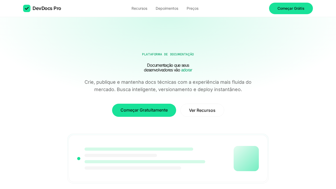
Mintlify-inspired documentation landing page. Ideal for documentação, developer portals, plataformas de docs, knowledge bases. AI-ready template.
Use case: Documentation, Developer portals, Docs platforms, Knowledge bases
Historical Context
Mintlify didn't invent the green-on-dark documentation aesthetic, but they codified it into something repeatable. Before their templates gained traction, developer docs lived in two camps: the sterile white voids of GitBook clones, or the overly branded chaos of marketing teams who couldn't resist adding gradients to API references. Mintlify's contribution was restraint — a single accent color (that now-iconic emerald green), generous whitespace, and typography that actually respects the hierarchy of technical content. The Swiss influence here is undeniable but never heavy-handed. You see it in the grid discipline, the consistent vertical rhythm, the way navigation never competes with content. What makes this system interesting is how it borrows from mid-century print rationalism while solving a distinctly modern problem: making dense technical writing feel approachable without dumbing it down. The green accent does real work. It's not decorative — it signals interactivity, marks navigation state, and creates a visual throughline across pages that might otherwise feel like disconnected walls of monospace text. That single color choice carries the entire personality of the system.
When to Use
Reach for this when your content is the product. API references, SDK guides, developer portals, open-source documentation — anywhere readers arrive with intent and need to find answers fast. The minimalism isn't aesthetic indulgence; it's functional. Dense technical content demands a system that gets out of the way. Skip this if your docs are light on substance or if you need heavy branding presence. This system rewards depth — it makes 200-page documentation sets feel navigable, not overwhelming.
Design Principles
- Single accent, maximum impact — one green carries all interactive and navigational meaning, eliminating color decision fatigue across the entire system
- Content-first hierarchy — typography scale and spacing exist to serve information architecture, never to decorate empty space
- Swiss grid discipline without rigidity — consistent vertical rhythm and column structure that flexes for code blocks, tables, and callouts without breaking
- Darkness as negative space — the dark background isn't a theme toggle; it reduces eye strain during long reading sessions and pushes content forward
- Progressive disclosure through navigation — sidebar, breadcrumbs, and in-page anchors work as a coordinated wayfinding system, not independent components
DESIGN.md
---
version: "alpha"
name: "Mintlify Green Docs"
description: "Mintlify-inspired documentation landing page. Ideal for documentação, developer portals, plataformas de docs, knowledge bases. AI-ready template."
colors:
  primary: "#0d0d0d"
  secondary: "#ffffff"
  tertiary: "#18E299"
  neutral: "#d4fae8"
  surface: "#333333"
  accent: "#666666"
typography:
  h1:
    fontFamily: Inter
    fontSize: 2.5rem
    fontWeight: 700
  body-md:
    fontFamily: Inter
    fontSize: 1rem
    fontWeight: 400
rounded:
  sm: 9999px
  md: 19998px
  lg: 29997px
components:
  button-primary:
    backgroundColor: "{colors.primary}"
    textColor: "{colors.neutral}"
    rounded: "{rounded.sm}"
    padding: 12px
---

## Overview

Mintlify-inspired documentation landing page. Ideal for documentação, developer portals, plataformas de docs, knowledge bases. AI-ready template. Mintlify didn't invent the green-on-dark documentation aesthetic, but they codified it into something repeatable. Before their templates gained traction, developer docs lived in two camps: the sterile white voids of GitBook clones, or the overly branded chaos of marketing teams who couldn't resist adding gradients to API references. Mintlify's contribution was restraint — a single accent color (that now-iconic emerald green), generous whitespace, and typography that actually respects the hierarchy of technical content.

The Swiss influence here is undeniable but never heavy-handed. You see it in the grid discipline, the consistent vertical rhythm, the way navigation never competes with content. What makes this system interesting is how it borrows from mid-century print rationalism while solving a distinctly modern problem: making dense technical writing feel approachable without dumbing it down.

The green accent does real work. It's not decorative — it signals interactivity, marks navigation state, and creates a visual throughline across pages that might otherwise feel like disconnected walls of monospace text. That single color choice carries the entire personality of the system.

- Density: 3/10 — Airy
- Variance: 2/10 — Structured
- Motion: 4/10 — Subtle

- **Style:** Documentation, Green Accent, Inter, Atmospheric Hero, Ultra-Round Corners
- **Keywords:** mintlify, documentation, green accent, Inter, atmospheric gradient, ultra-round, Geist Mono, developer docs
- **Era:** 2024-2026 Developer Documentation
- **Light/Dark:** ✓ Full / ✗ Not Recommended

## Colors

- **Quase Preto** (#0d0d0d) — Dark surface, primary background
- **Branco** (#ffffff) — Light surface, card backgrounds
- **Verde Brand** (#18E299) — Primary accent, CTAs and interactive elements
- **Verde Claro** (#d4fae8) — Supporting palette color
- **Cinza 700** (#333333) — Secondary text, borders, muted elements
- **Cinza 500** (#666666) — Secondary text, borders, muted elements
- **Cinza 200** (#e5e5e5) — Secondary text, borders, muted elements
- **Verde Deep** (#0fa76e) — Success states, positive indicators


## Typography

- **Display / Hero:** Inter — Weight 700, tight tracking, used for headline impact
- **Body:** Inter — Weight 400, 16px/1.6 line-height, max 72ch per line
- **UI Labels / Captions:** Inter — 0.875rem, weight 500, slight letter-spacing
- **Monospace:** JetBrains Mono — Used for code, metadata, and technical values

Scale:
- Hero: clamp(2.5rem, 5vw, 4rem)
- H1: 2.25rem
- H2: 1.5rem
- Body: 1rem / 1.6
- Small: 0.875rem


## Layout

- **Grid:** CSS Grid primary. Max-width containment: 1280px centered with 1.5rem side padding.
- **Spacing rhythm:** Balanced. Base unit: 0.5rem (8px).
- **Section vertical gaps:** clamp(4rem, 8vw, 8rem).
- **Hero layout:** Split-screen (text left, visual right).
- **Feature sections:** Zig-zag alternating text+image rows. No 3-equal-columns.
- **Mobile collapse:** All multi-column layouts collapse below 768px. No horizontal overflow.
- **z-index contract:** base (0) / sticky-nav (100) / overlay (200) / modal (300) / toast (500).


## Elevation & Depth

Canvas branco com acento verde (#18E299) para CTAs, hover e focus. Hero com gradiente atmosférico verde-branco como nuvem. Cantos ultra-arredondados: 16px containers, 24px featured, 9999px botões. Bordas 5% opacity (rgba(0,0,0,0.05)). Inter com tracking negativo em display (-0.8px a -1.28px). Geist Mono uppercase para labels técnicos. Três pesos: 400 body, 500 UI, 600 headings.

- **Physics:** Ease-out curves, 200-300ms duration. Smooth and predictable.
- **Entry animations:** Fade + translate-Y (16px → 0) over 420ms ease-out. Staggered cascades for lists: 80ms between items.
- **Hover states:** Subtle color shift + shadow adjustment over 200ms.
- **Page transitions:** Fade only (200ms).
- **Performance:** Only transform and opacity animated. No layout-triggering properties.


## Shapes

Base corner radius: 9999px. See rounded tokens in front matter for the full scale.


## Components

- **Primary Button:** Pill-shaped (9999px) shape. Accent color fill. Hover: 8% darken + subtle lift shadow. Active: -1px translate tactile press. Font weight 600. No outer glows.
- **Secondary / Ghost Button:** Outline variant. 1.5px border in muted color. Text in primary color. Hover: subtle background fill.
- **Cards:** Pill-shaped (9999px) corners. Surface background. Subtle shadow (0 2px 12px rgba(0,0,0,0.06)). 1px border stroke.
- **Inputs:** Label above input. 1px border stroke. Focus ring: 2px accent color offset 2px. Error text below in semantic red. No floating labels.
- **Navigation:** Primary surface background. Active item: accent color indicator. Font weight 500 when active.
- **Skeletons:** Shimmer animation matching component dimensions. No circular spinners.
- **Empty States:** Icon-based composition with descriptive text and action button.


## Do's and Don'ts

- No emojis in UI — use icon system only (Lucide, Heroicons)
- No pure black (#000000) — use off-black or charcoal variants
- No oversaturated accent colors (saturation cap: 80%)
- No 3-column equal-width feature layouts — use zig-zag or asymmetric grid
- No `h-screen` — use `min-h-[100dvh]`
- No AI copywriting clichés: "Elevate", "Seamless", "Unleash", "Next-Gen"
- No broken external image links — use picsum.photos or inline SVG
- No generic lorem ipsum in demos

- Do Canvas branco com verde #18E299
- Do Hero gradiente atmosférico
- Do Ultra-round corners
- Do Bordas 5% opacity
- Do Inter tracking negativo
- Do Geist Mono labels
- Do Responsivo


## Use Case

Documentation, Developer portals, Docs platforms, Knowledge bases
Technical Specs
CSS
background:#ffffff;color:#0d0d0d;accent:#18E299;border:1px solid rgba(0,0,0,0.05);border-radius:9999px buttons,16px containers,24px featured;font-family:Inter,sans-serif;letter-spacing:-1.28px at 64px
Variables
--bg:#ffffff;--text:#0d0d0d;--accent:#18E299;--accent-light:#d4fae8;--accent-deep:#0fa76e;--gray-700:#333333;--gray-500:#666666;--border:rgba(0,0,0,0.05);--radius-pill:9999px;--radius-container:16px
Checklist
☐ Canvas branco com verde #18E299, ☐ Hero gradiente atmosférico, ☐ Ultra-round corners, ☐ Bordas 5% opacity, ☐ Inter tracking negativo, ☐ Geist Mono labels, ☐ Responsivo
Colors
Primary
Secondary
Effects
Canvas branco com acento verde (#18E299) para CTAs, hover e focus. Hero com gradiente atmosférico verde-branco como nuvem. Cantos ultra-arredondados: 16px containers, 24px featured, 9999px botões. Bordas 5% opacity (rgba(0,0,0,0.05)). Inter com tracking negativo em display (-0.8px a -1.28px). Geist Mono uppercase para labels técnicos. Três pesos: 400 body, 500 UI, 600 headings.
Light/Dark
✓ Full / ✗ Not Recommended
AI Prompt
Act as a Senior Frontend Engineer and Expert UI Designer.
Your task is to code a complete Landing Page on the first attempt.
- Landing Page Theme: <INSERT THEME>
- Sections to add: <INSERT SECTIONS>

Generate the final code immediately following these definitions:

## Style

- **Name:** Mintlify Green Docs
- **Type:** Documentation, Green Accent, Inter, Atmospheric Hero, Ultra-Round Corners
- **Keywords:** mintlify, documentation, green accent, Inter, atmospheric gradient, ultra-round, Geist Mono, developer docs
- **Era:** 2024-2026 Developer Documentation
- **Light/Dark:** ✓ Full / ✗ Not Recommended

## Color Palette

- **Primary:** Quase Preto #0d0d0d, Branco #ffffff, Verde Brand #18E299, Verde Claro #d4fae8
- **Secondary:** Cinza 700 #333333, Cinza 500 #666666, Cinza 200 #e5e5e5, Verde Deep #0fa76e

## Visual Effects

Canvas branco com acento verde (#18E299) para CTAs, hover e focus. Hero com gradiente atmosférico verde-branco como nuvem. Cantos ultra-arredondados: 16px containers, 24px featured, 9999px botões. Bordas 5% opacity (rgba(0,0,0,0.05)). Inter com tracking negativo em display (-0.8px a -1.28px). Geist Mono uppercase para labels técnicos. Três pesos: 400 body, 500 UI, 600 headings.

## AI Visual Direction

Design a Mintlify-inspired documentation landing page. White canvas with Brand Green (#18E299) accent for CTAs and hover states. Atmospheric green-white gradient hero. Ultra-round corners: 16px containers, 24px featured, 9999px buttons. Subtle 5% opacity borders. Inter at 64px weight 600 with -1.28px letter-spacing. Geist Mono uppercase labels with 0.6px letter-spacing. Three weights: 400 body, 500 UI, 600 headings.

## CSS Technical

```css
background:#ffffff;color:#0d0d0d;accent:#18E299;border:1px solid rgba(0,0,0,0.05);border-radius:9999px buttons,16px containers,24px featured;font-family:Inter,sans-serif;letter-spacing:-1.28px at 64px
```

## Design System Variables

```css
--bg:#ffffff;--text:#0d0d0d;--accent:#18E299;--accent-light:#d4fae8;--accent-deep:#0fa76e;--gray-700:#333333;--gray-500:#666666;--border:rgba(0,0,0,0.05);--radius-pill:9999px;--radius-container:16px
```

## Implementation Checklist

- ☐ Canvas branco com verde #18E299
- ☐ Hero gradiente atmosférico
- ☐ Ultra-round corners
- ☐ Bordas 5% opacity
- ☐ Inter tracking negativo
- ☐ Geist Mono labels
- ☐ Responsivo

## Execution Rules

1. Strictly follow the defined visual style.
2. Use high-quality inline SVG icons (Heroicons or Lucide style) — NEVER use emojis as icons.
3. Add `cursor-pointer` and smooth `hover` states (transition-all) on all interactive elements.
4. Required Page Structure:
   - Navbar (Logo + Links + CTA)
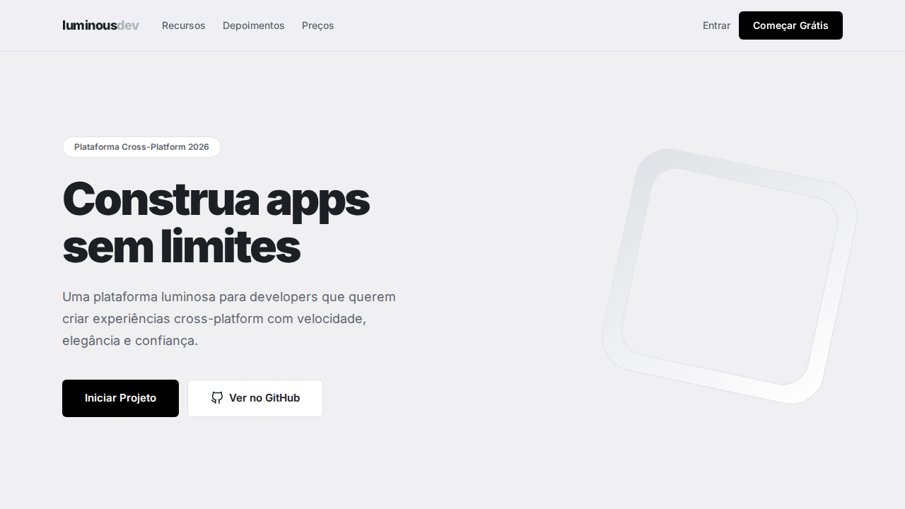
   - Hero Section (Impactful Headline + Subtitle + 2 buttons + 3D/Abstract visual element via CSS)
   - Features (3 cards with icons)
   - Testimonials (3 cards)
   - Pricing (3 tiers, highlight the middle one)
   - Final CTA
   - Full Footer with social links, privacy policy, terms of use, contact and SEO links.
5. All text content must be in English.
6. The visual must be CLEARLY distinct — do not create a "default Bootstrap" design. Force the use of the provided design system variables.
7. Use `<style>` tags in the head for custom classes (especially for complex backdrop-filter effects and animations) that Tailwind CDN doesn't cover.
8. Full Responsiveness: Layout must adapt perfectly to Mobile, Tablet and Desktop (vertical stack on mobile).
9. Include basic SEO, Viewport and Open Graph meta tags in `<head>`.
10. Footer must contain: Copyright 2026, Secondary navigation links and Social media icons.
11. Make the creative decisions needed to deliver the complete, functional result now.
Related
Last synced: 4/1/2026