Minimalismo Funcional B2B
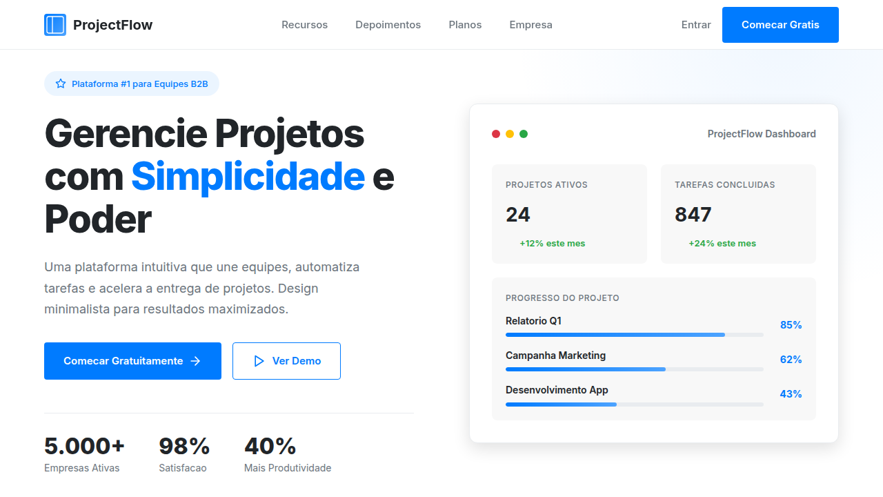
Clean and professional minimalist landing page for a B2B project management platform. Ideal for landing pages, modern websites. AI-ready template.
Use case: Landing pages, Modern websites
Historical Context
Before Linear shipped in 2019, B2B software looked like it hated you. Dense tables, chrome-heavy toolbars, that particular shade of enterprise blue nobody asked for. Basecamp had planted a flag for simplicity years earlier, but it was Linear that proved you could build project management tooling with the restraint of a Swiss poster — monospace type, generous negative space, keyboard-first interaction. Suddenly the bar moved. Notion took a different route to the same destination. A blank page. Almost nothing on screen until you needed it. Progressive disclosure as aesthetic philosophy. Asana followed with its 2021 redesign, stripping decades of accumulated UI cruft. The pattern was clear: productive software should feel like a well-organized desk, not a cockpit. What emerged wasn't minimalism for minimalism's sake. It was functional reduction — every pixel earning its place through utility. Color became semantic rather than decorative. Typography carried hierarchy alone. The tools that won weren't prettier; they were quieter. They got out of the way.
When to Use
When your users live inside your product eight hours a day. When cognitive load is the enemy, not engagement. This system works for project management tools, internal dashboards, developer platforms, and any B2B SaaS where the interface should disappear behind the work. It fails spectacularly for consumer products that need emotional pull, onboarding-heavy flows, or anything where delight matters more than efficiency. If your users would describe the ideal UI as "I barely notice it" — you're in the right place.
Design Principles
- Content density over decoration — information is the interface, chrome is debt
- Semantic color only — every hue signals state (active, warning, destructive), never mood
- Typography as architecture — weight and size do all the hierarchy work that borders and boxes used to do
- Keyboard-first, mouse-tolerant — power users set the interaction baseline, casual users get affordances as progressive enhancement
- Silence as default — empty states, muted palettes, and restrained motion until the system has something worth saying
DESIGN.md
---
version: "alpha"
name: "Minimalismo Funcional B2B"
description: "Clean and professional minimalist landing page for a B2B project management platform. Ideal for landing pages, modern websites. AI-ready template."
colors:
  primary: "#FFFFFF"
  secondary: "#F8F8F8"
  tertiary: "#007BFF"
  neutral: "#212529"
  surface: "#28A745"
  accent: "#FFC107"
typography:
  h1:
    fontFamily: Inter
    fontSize: 2.5rem
    fontWeight: 700
  body-md:
    fontFamily: Inter
    fontSize: 1rem
    fontWeight: 400
rounded:
  sm: 4px
  md: 8px
  lg: 12px
components:
  button-primary:
    backgroundColor: "{colors.primary}"
    textColor: "{colors.neutral}"
    rounded: "{rounded.sm}"
    padding: 12px
---

## Overview

Clean and professional minimalist landing page for a B2B project management platform. Ideal for landing pages, modern websites. AI-ready template. Before Linear shipped in 2019, B2B software looked like it hated you. Dense tables, chrome-heavy toolbars, that particular shade of enterprise blue nobody asked for. Basecamp had planted a flag for simplicity years earlier, but it was Linear that proved you could build project management tooling with the restraint of a Swiss poster — monospace type, generous negative space, keyboard-first interaction. Suddenly the bar moved.

Notion took a different route to the same destination. A blank page. Almost nothing on screen until you needed it. Progressive disclosure as aesthetic philosophy. Asana followed with its 2021 redesign, stripping decades of accumulated UI cruft. The pattern was clear: productive software should feel like a well-organized desk, not a cockpit.

What emerged wasn't minimalism for minimalism's sake. It was functional reduction — every pixel earning its place through utility. Color became semantic rather than decorative. Typography carried hierarchy alone. The tools that won weren't prettier; they were quieter. They got out of the way.

- Density: 3/10 — Airy
- Variance: 2/10 — Structured
- Motion: 4/10 — Subtle

- **Style:** Clean, Professional, Minimalist
- **Keywords:** B2B, software, project management, clean, minimalist, efficient, professional, intuitive, data-driven, modern
- **Era:** 2026+ Produtividade Digital
- **Light/Dark:** ✓ Full / ✗ No

## Colors

- **Branco** (#FFFFFF) — Light surface, card backgrounds
- **Cinza Claro** (#F8F8F8) — Secondary text, borders, muted elements
- **Azul Corporativo** (#007BFF) — Accent highlight, links and focus states
- **Preto** (#212529) — Dark surface, primary background
- **Verde Suave** (#28A745) — Success states, positive indicators
- **Amarelo Mostarda** (#FFC107) — Warning states, attention indicators
- **Vermelho Suave** (#DC3545) — Error states, destructive actions
- **Cinza Médio** (#6C757D) — Secondary text, borders, muted elements


## Typography

- **Display / Hero:** Inter — Weight 700, tight tracking, used for headline impact
- **Body:** Inter — Weight 400, 16px/1.6 line-height, max 72ch per line
- **UI Labels / Captions:** Inter — 0.875rem, weight 500, slight letter-spacing
- **Monospace:** JetBrains Mono — Used for code, metadata, and technical values

Scale:
- Hero: clamp(2.5rem, 5vw, 4rem)
- H1: 2.25rem
- H2: 1.5rem
- Body: 1rem / 1.6
- Small: 0.875rem


## Layout

- **Grid:** CSS Grid primary. Max-width containment: 1280px centered with 1.5rem side padding.
- **Spacing rhythm:** Balanced. Base unit: 0.5rem (8px).
- **Section vertical gaps:** clamp(4rem, 8vw, 8rem).
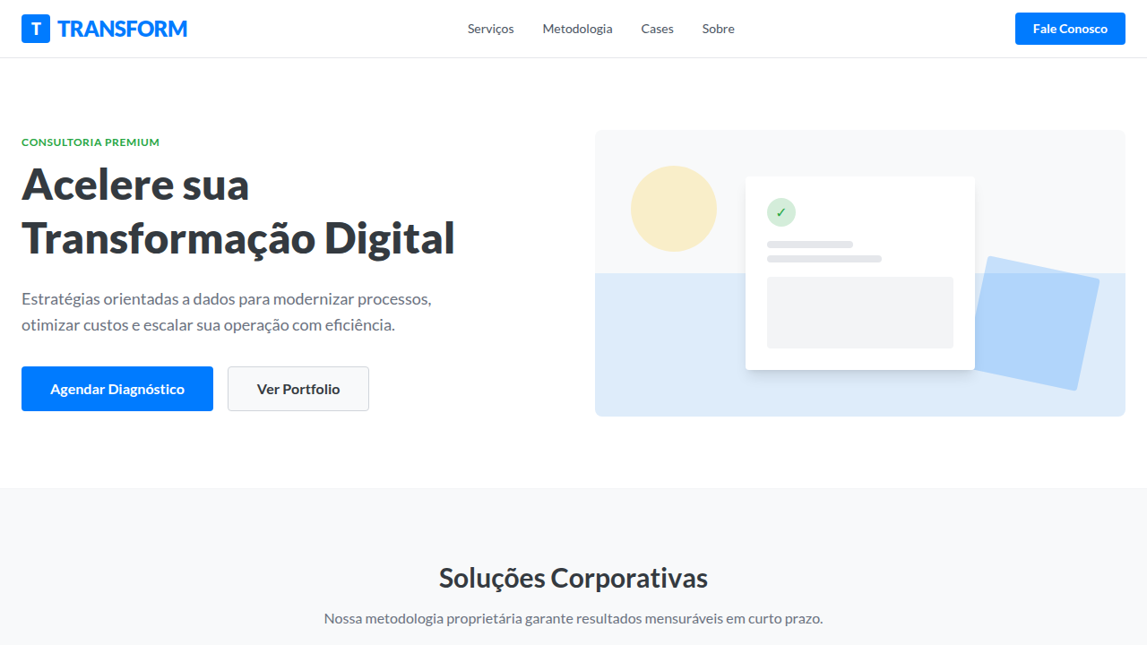
- **Hero layout:** Split-screen (text left, visual right).
- **Feature sections:** Zig-zag alternating text+image rows. No 3-equal-columns.
- **Mobile collapse:** All multi-column layouts collapse below 768px. No horizontal overflow.
- **z-index contract:** base (0) / sticky-nav (100) / overlay (200) / modal (300) / toast (500).


## Elevation & Depth

Espaço em branco abundante, tipografia sans-serif limpa, ícones minimalistas, micro-interações sutis, sombras suaves, transições fluidas, foco na legibilidade e clareza.

- **Physics:** Ease-out curves, 200-300ms duration. Smooth and predictable.
- **Entry animations:** Fade + translate-Y (16px → 0) over 420ms ease-out. Staggered cascades for lists: 80ms between items.
- **Hover states:** Subtle color shift + shadow adjustment over 200ms.
- **Page transitions:** Fade only (200ms).
- **Performance:** Only transform and opacity animated. No layout-triggering properties.


## Shapes

Base corner radius: 4px. See rounded tokens in front matter for the full scale.


## Components

- **Primary Button:** Rounded (4px) shape. Accent color fill. Hover: 8% darken + subtle lift shadow. Active: -1px translate tactile press. Font weight 600. No outer glows.
- **Secondary / Ghost Button:** Outline variant. 1.5px border in muted color. Text in primary color. Hover: subtle background fill.
- **Cards:** Rounded (4px) corners. Surface background. Subtle shadow (0 2px 12px rgba(0,0,0,0.06)). 1px border stroke.
- **Inputs:** Label above input. 1px border stroke. Focus ring: 2px accent color offset 2px. Error text below in semantic red. No floating labels.
- **Navigation:** Primary surface background. Active item: accent color indicator. Font weight 500 when active.
- **Skeletons:** Shimmer animation matching component dimensions. No circular spinners.
- **Empty States:** Icon-based composition with descriptive text and action button.


## Do's and Don'ts

- No emojis in UI — use icon system only (Lucide, Heroicons)
- No decorative gradients — flat color only
- No shadows heavier than 0 2px 8px rgba(0,0,0,0.08)
- No pure black (#000000) — use off-black or charcoal variants
- No oversaturated accent colors (saturation cap: 80%)
- No 3-column equal-width feature layouts — use zig-zag or asymmetric grid
- No `h-screen` — use `min-h-[100dvh]`
- No AI copywriting clichés: "Elevate", "Seamless", "Unleash", "Next-Gen"
- No broken external image links — use picsum.photos or inline SVG
- No generic lorem ipsum in demos

- Do Espaço em branco abundante
- Do Tipografia sans-serif limpa
- Do Ícones minimalistas
- Do Micro-interações sutis
- Do Sombras suaves
- Do Foco na legibilidade.


## Use Case

Landing pages, Modern websites
Technical Specs
CSS
background: #FFFFFF, color: #212529, box-shadow: 0 2px 4px rgba(0,0,0,0.05), border-radius: 4px, font-family: "Inter, sans-serif", transition: all 0.3s ease-in-out, .section-spacing, .icon-minimal, .card-shadow.
Variables
--white-bg: #FFFFFF, --light-grey-bg: #F8F8F8, --corporate-blue: #007BFF, --dark-text: #212529, --border-radius-sm: 4px, --font-main: "Inter, sans-serif", --shadow-subtle: 0 2px 4px rgba(0,0,0,0.05).
Checklist
☐ Espaço em branco abundante, ☐ Tipografia sans-serif limpa, ☐ Ícones minimalistas, ☐ Micro-interações sutis, ☐ Sombras suaves, ☐ Foco na legibilidade.
Colors
Primary
Secondary
Effects
Espaço em branco abundante, tipografia sans-serif limpa, ícones minimalistas, micro-interações sutis, sombras suaves, transições fluidas, foco na legibilidade e clareza.
Light/Dark
✓ Full / ✗ No
AI Prompt
Act as a Senior Frontend Engineer and Expert UI Designer.
Your task is to code a complete Landing Page on the first attempt.
- Landing Page Theme: <INSERT THEME>
- Sections to add: <INSERT SECTIONS>

Generate the final code immediately following these definitions:

## Style

- **Name:** Minimalismo Funcional B2B
- **Type:** Clean, Professional, Minimalist
- **Keywords:** B2B, software, project management, clean, minimalist, efficient, professional, intuitive, data-driven, modern
- **Era:** 2026+ Produtividade Digital
- **Light/Dark:** ✓ Full / ✗ No

## Color Palette

- **Primary:** Branco #FFFFFF, Cinza Claro #F8F8F8, Azul Corporativo #007BFF, Preto #212529
- **Secondary:** Verde Suave #28A745, Amarelo Mostarda #FFC107, Vermelho Suave #DC3545, Cinza Médio #6C757D

## Visual Effects

Espaço em branco abundante, tipografia sans-serif limpa, ícones minimalistas, micro-interações sutis, sombras suaves, transições fluidas, foco na legibilidade e clareza.

## AI Visual Direction

Design a clean and professional minimalist landing page for a B2B project management platform. Use: abundant white space, clean sans-serif typography, minimalist icons, subtle micro-interactions, soft shadows, fluid transitions, corporate blue accents, focus on readability and clarity.

## CSS Technical

```css
background: #FFFFFF, color: #212529, box-shadow: 0 2px 4px rgba(0,0,0,0.05), border-radius: 4px, font-family: "Inter, sans-serif", transition: all 0.3s ease-in-out, .section-spacing, .icon-minimal, .card-shadow.
```

## Design System Variables

```css
--white-bg: #FFFFFF, --light-grey-bg: #F8F8F8, --corporate-blue: #007BFF, --dark-text: #212529, --border-radius-sm: 4px, --font-main: "Inter, sans-serif", --shadow-subtle: 0 2px 4px rgba(0,0,0,0.05).
```

## Implementation Checklist

- ☐ Espaço em branco abundante
- ☐ Tipografia sans-serif limpa
- ☐ Ícones minimalistas
- ☐ Micro-interações sutis
- ☐ Sombras suaves
- ☐ Foco na legibilidade.

## Execution Rules

1. Strictly follow the defined visual style.
2. Use high-quality inline SVG icons (Heroicons or Lucide style) — NEVER use emojis as icons.
3. Add `cursor-pointer` and smooth `hover` states (transition-all) on all interactive elements.
4. Required Page Structure:
   - Navbar (Logo + Links + CTA)
   - Hero Section (Impactful Headline + Subtitle + 2 buttons + 3D/Abstract visual element via CSS)
   - Features (3 cards with icons)
   - Testimonials (3 cards)
   - Pricing (3 tiers, highlight the middle one)
   - Final CTA
   - Full Footer with social links, privacy policy, terms of use, contact and SEO links.
5. All text content must be in English.
6. The visual must be CLEARLY distinct — do not create a "default Bootstrap" design. Force the use of the provided design system variables.
7. Use `<style>` tags in the head for custom classes (especially for complex backdrop-filter effects and animations) that Tailwind CDN doesn't cover.
8. Full Responsiveness: Layout must adapt perfectly to Mobile, Tablet and Desktop (vertical stack on mobile).
9. Include basic SEO, Viewport and Open Graph meta tags in `<head>`.
10. Footer must contain: Copyright 2026, Secondary navigation links and Social media icons.
11. Make the creative decisions needed to deliver the complete, functional result now.
Related
Last synced: 4/1/2026