Merriweather Typography
Render a 2D isolated text on a solid background. Ideal for blogs, news sites, long-form reading, and editorial platforms.. AI-ready template.
Use case: Blogs, news sites, long-form reading, and editorial platforms.
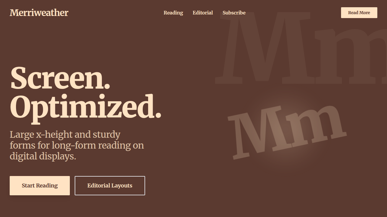
Historical Context
Before Merriweather, serifs on screen were a compromise. You either accepted blurry letterforms at body sizes or abandoned the genre entirely for sans-serifs. Eben Sorkin refused both options. Released in 2011 through Google Fonts, Merriweather was drawn specifically for the constraints of backlit displays. The key insight was structural: an unusually large x-height paired with open counters and sturdy stroke contrast. Where traditional serifs like Georgia relied on hinting tricks to survive pixel grids, Sorkin designed the proportions themselves to remain legible. The serifs are slightly bracketed — thick enough to render cleanly at 16px but refined enough to not feel clunky at display sizes. What made Merriweather genuinely important was timing. It arrived exactly when responsive design was forcing designers to serve the same type across wildly different screens. A serif that could hold its own at 14px on a Kindle and 18px on a Retina display wasn't just nice to have — it was infrastructure. The typeface proved that screen-first didn't have to mean sans-serif-only, and that readability and typographic warmth weren't mutually exclusive.
When to Use
Merriweather belongs wherever sustained reading matters. Long-form editorial, academic papers, documentation that people actually need to absorb — not skim. It pairs naturally with Source Sans Pro or Open Sans for UI elements while carrying the content layer. Avoid it for short punchy marketing copy or interfaces where space is tight; that large x-height eats vertical real estate. Best deployed at 18–21px for body text with generous line-height (1.6–1.8). It's the workhorse serif for projects that respect their readers' time.
Design Principles
- Screen-first proportions: The large x-height and open counters aren't decorative choices — they're engineering decisions that ensure every glyph survives subpixel rendering without losing its serif identity.
- Controlled stroke contrast: Merriweather avoids the hairline-to-thick extremes of Didone serifs. The moderate contrast keeps strokes visible at small sizes while preserving enough variation to feel like a proper serif, not a slab.
- Generous spacing by default: Letter-spacing and word-spacing are tuned for continuous reading. You rarely need to adjust tracking — a sign the designer already solved the rhythm problem.
- Weight range as a system: From Light to Black (300–900), each weight maintains the same optical proportions. The heavier weights work for headlines without needing a separate display cut, giving you a complete typographic hierarchy from one family.
- Bracketed serifs as compromise: Neither fully bracketed like Garamond nor blunt like a slab, Merriweather's serifs split the difference — enough structure to aid horizontal reading flow, enough softness to feel approachable on screen.
DESIGN.md
---
version: "alpha"
name: "Merriweather Typography"
description: "Render a 2D isolated text on a solid background. Ideal for blogs, news sites, long-form reading, and editorial platforms.. AI-ready template."
colors:
  primary: "#FFE3C3"
  secondary: "#5B3A30"
typography:
  h1:
    fontFamily: Merriweather
    fontSize: 2.5rem
    fontWeight: 700
  body-md:
    fontFamily: Merriweather
    fontSize: 1rem
    fontWeight: 400
components:
  button-primary:
    backgroundColor: "{colors.primary}"
    padding: 12px
---

## Overview

Render a 2D isolated text on a solid background. Ideal for blogs, news sites, long-form reading, and editorial platforms.. AI-ready template. Before Merriweather, serifs on screen were a compromise. You either accepted blurry letterforms at body sizes or abandoned the genre entirely for sans-serifs. Eben Sorkin refused both options.

Released in 2011 through Google Fonts, Merriweather was drawn specifically for the constraints of backlit displays. The key insight was structural: an unusually large x-height paired with open counters and sturdy stroke contrast. Where traditional serifs like Georgia relied on hinting tricks to survive pixel grids, Sorkin designed the proportions themselves to remain legible. The serifs are slightly bracketed — thick enough to render cleanly at 16px but refined enough to not feel clunky at display sizes.

What made Merriweather genuinely important was timing. It arrived exactly when responsive design was forcing designers to serve the same type across wildly different screens. A serif that could hold its own at 14px on a Kindle and 18px on a Retina display wasn't just nice to have — it was infrastructure. The typeface proved that screen-first didn't have to mean sans-serif-only, and that readability and typographic warmth weren't mutually exclusive.

- Density: 5/10 — Balanced
- Variance: 4/10 — Moderate
- Motion: 4/10 — Subtle

- **Style:** Screen‑optimized classic serif
- **Keywords:** Merriweather, classic serif, large x-height, readable, screen-optimized, editorial
- **Era:** Contemporary Web
- **Light/Dark:** ✗ No / ✓ Full

## Colors

- **#FFE3C3** (#FFE3C3) — Primary surface or dominant color
- **#5B3A30** (#5B3A30) — Extended palette, decorative use


## Typography

- **Display / Hero:** Merriweather — Weight 700, tight tracking, used for headline impact
- **Body:** Merriweather — Weight 400, 16px/1.6 line-height, max 72ch per line
- **UI Labels / Captions:** Merriweather — 0.875rem, weight 500, slight letter-spacing
- **Monospace:** JetBrains Mono — Used for code, metadata, and technical values

Scale:
- Hero: clamp(2.5rem, 5vw, 4rem)
- H1: 2.25rem
- H2: 1.5rem
- Body: 1rem / 1.6
- Small: 0.875rem


## Layout

- **Grid:** CSS Grid primary. Max-width containment: 1280px centered with 1.5rem side padding.
- **Spacing rhythm:** Balanced. Base unit: 0.5rem (8px).
- **Section vertical gaps:** clamp(4rem, 8vw, 8rem).
- **Hero layout:** Split-screen (text left, visual right).
- **Feature sections:** Zig-zag alternating text+image rows. No 3-equal-columns.
- **Mobile collapse:** All multi-column layouts collapse below 768px. No horizontal overflow.
- **z-index contract:** base (0) / sticky-nav (100) / overlay (200) / modal (300) / toast (500).


## Elevation & Depth

Tight tracking (-3%), 90% leading

- **Physics:** Ease-out curves, 200-300ms duration. Smooth and predictable.
- **Entry animations:** Fade + translate-Y (16px → 0) over 420ms ease-out. Staggered cascades for lists: 80ms between items.
- **Hover states:** Subtle color shift + shadow adjustment over 200ms.
- **Page transitions:** Fade only (200ms).
- **Performance:** Only transform and opacity animated. No layout-triggering properties.


## Shapes

Base corner radius: 8px. See rounded tokens in front matter for the full scale.


## Components

- **Primary Button:** Subtly rounded (0.5rem) shape. Accent color fill. Hover: 8% darken + subtle lift shadow. Active: -1px translate tactile press. Font weight 600. No outer glows.
- **Secondary / Ghost Button:** Outline variant. 1.5px border in muted color. Text in primary color. Hover: subtle background fill.
- **Cards:** Subtly rounded (0.5rem) corners. Surface background. Subtle shadow (0 2px 12px rgba(0,0,0,0.06)). 1px border stroke.
- **Inputs:** Label above input. 1px border stroke. Focus ring: 2px accent color offset 2px. Error text below in semantic red. No floating labels.
- **Navigation:** Primary surface background. Active item: accent color indicator. Font weight 500 when active.
- **Skeletons:** Shimmer animation matching component dimensions. No circular spinners.
- **Empty States:** Icon-based composition with descriptive text and action button.


## Do's and Don'ts

- No emojis in UI — use icon system only (Lucide, Heroicons)
- No pure black (#000000) — use off-black or charcoal variants
- No oversaturated accent colors (saturation cap: 80%)
- No 3-column equal-width feature layouts — use zig-zag or asymmetric grid
- No `h-screen` — use `min-h-[100dvh]`
- No AI copywriting clichés: "Elevate", "Seamless", "Unleash", "Next-Gen"
- No broken external image links — use picsum.photos or inline SVG
- No generic lorem ipsum in demos

- Do Merriweather Font
- Do Color: #FFE3C3
- Do Tracking -3%
- Do Background #5B3A30


## Use Case

Blogs, news sites, long-form reading, and editorial platforms.
Technical Specs
CSS
font-family: 'Merriweather', serif; color: #FFE3C3; letter-spacing: -0.03em; line-height: 0.9;
Variables
--font-family: 'Merriweather', --text-color: #FFE3C3, --bg-color: #5B3A30
Checklist
☐ Merriweather Font, ☐ Color: #FFE3C3, ☐ Tracking -3%, ☐ Background #5B3A30
Colors
Primary
Secondary
Effects
Tight tracking (-3%), 90% leading
Light/Dark
✗ No / ✓ Full
AI Prompt
Act as a Senior Frontend Engineer and Expert UI Designer.
Your task is to code a complete Landing Page on the first attempt.
- Landing Page Theme: <INSERT THEME>
- Sections to add: <INSERT SECTIONS>

Generate the final code immediately following these definitions:

## Style

- **Name:** Merriweather Typography
- **Type:** Screen‑optimized classic serif
- **Keywords:** Merriweather, classic serif, large x-height, readable, screen-optimized, editorial
- **Era:** Contemporary Web
- **Light/Dark:** ✗ No / ✓ Full

## Color Palette

- **Primary:** #FFE3C3
- **Secondary:** #5B3A30

## Visual Effects

Tight tracking (-3%), 90% leading

## AI Visual Direction

Render a 2D isolated text on a solid background. Font Family: @Merriweather Font, Color: Hex #FFE3C3, Background: #5B3A30, Tracking: Tight (-3%), Leading: 90%, Alignment: Strictly Left Aligned, Position: Center, Scale: 50%.

## CSS Technical

```css
font-family: 'Merriweather', serif; color: #FFE3C3; letter-spacing: -0.03em; line-height: 0.9;
```

## Design System Variables

```css
--font-family: 'Merriweather', --text-color: #FFE3C3, --bg-color: #5B3A30
```

## Implementation Checklist

- ☐ Merriweather Font
- ☐ Color: #FFE3C3
- ☐ Tracking -3%
- ☐ Background #5B3A30

## Execution Rules

1. Strictly follow the defined visual style.
2. Use high-quality inline SVG icons (Heroicons or Lucide style) — NEVER use emojis as icons.
3. Add `cursor-pointer` and smooth `hover` states (transition-all) on all interactive elements.
4. Required Page Structure:
   - Navbar (Logo + Links + CTA)
   - Hero Section (Impactful Headline + Subtitle + 2 buttons + 3D/Abstract visual element via CSS)
   - Features (3 cards with icons)
   - Testimonials (3 cards)
   - Pricing (3 tiers, highlight the middle one)
   - Final CTA
   - Full Footer with social links, privacy policy, terms of use, contact and SEO links.
5. All text content must be in English.
6. The visual must be CLEARLY distinct — do not create a "default Bootstrap" design. Force the use of the provided design system variables.
7. Use `<style>` tags in the head for custom classes (especially for complex backdrop-filter effects and animations) that Tailwind CDN doesn't cover.
8. Full Responsiveness: Layout must adapt perfectly to Mobile, Tablet and Desktop (vertical stack on mobile).
9. Include basic SEO, Viewport and Open Graph meta tags in `<head>`.
10. Footer must contain: Copyright 2026, Secondary navigation links and Social media icons.
11. Make the creative decisions needed to deliver the complete, functional result now.
Last synced: 4/1/2026