Inter Typography
Render a 2D isolated text on a solid background. Ideal for apps, dashboards, documentation, digital product needing maximum clarity.. AI-ready template.
Use case: Apps, Dashboards, documentation, digital product needing maximum clarity.
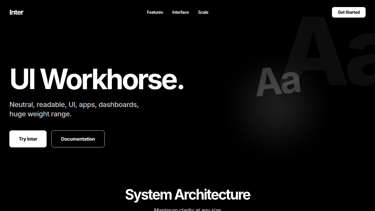
Historical Context
Inter started as a side project by Rasmus Andersson while he was at Figma — a typeface designed explicitly for computer screens. Not print adapted for digital. Not a geometric exercise. A workhorse built from pixel-level constraints upward. The tall x-height, open apertures, and tabular number sets weren't aesthetic choices — they were functional ones. Every decision optimized for legibility at small sizes on low-density displays. Then something happened. Figma shipped Inter as its default. Vercel adopted it. Next.js made it a one-line import. Suddenly Inter wasn't just a good UI font — it was THE UI font. The new Helvetica of interfaces. You see it on every SaaS landing page, every developer tool, every startup that hasn't thought about typography yet. Is that a problem? Honestly, not really. Inter is genuinely excellent at what it does. The issue isn't the typeface — it's the laziness of reaching for it without considering alternatives. When everything looks the same, nothing has personality. Inter gives you a perfect neutral baseline. Whether you stay there is a design decision, not a default.
When to Use
Inter earns its place in product UI where readability at 13-16px matters more than brand expression. Dense data tables, documentation sites, developer tools, admin panels — anywhere text is consumed rather than admired. It's the right call when you need a type system that disappears, letting content do the work. Skip it when your product needs typographic personality to differentiate. A marketing site in Inter says nothing about who you are.
Design Principles
- Set font-feature-settings with 'cv01', 'cv02' enabled — Inter's alternates exist for a reason, use them to avoid the generic look
- Pair with a monospace that matches its x-height (JetBrains Mono, Fira Code) for developer-facing products — mismatched metrics break visual rhythm
- Use Inter Display for headings above 20px — the standard optical size loses crispness when scaled up, Display cuts tighter and reads sharper
- Stick to medium (500) and semibold (600) for hierarchy — Inter's bold is heavier than you think and muddies dense interfaces
- Let the tracking breathe at small sizes (0.01-0.02em below 14px) but tighten at display sizes — Inter's default spacing optimizes for body, not headlines
DESIGN.md
---
version: "alpha"
name: "Inter Typography"
description: "Render a 2D isolated text on a solid background. Ideal for apps, dashboards, documentation, digital product needing maximum clarity.. AI-ready template."
colors:
  primary: "#FFFFFF"
  secondary: "#000000"
typography:
  h1:
    fontFamily: Inter
    fontSize: 2.5rem
    fontWeight: 700
  body-md:
    fontFamily: Inter
    fontSize: 1rem
    fontWeight: 400
components:
  button-primary:
    backgroundColor: "{colors.primary}"
    padding: 12px
---

## Overview

Render a 2D isolated text on a solid background. Ideal for apps, dashboards, documentation, digital product needing maximum clarity.. AI-ready template. Inter started as a side project by Rasmus Andersson while he was at Figma — a typeface designed explicitly for computer screens. Not print adapted for digital. Not a geometric exercise. A workhorse built from pixel-level constraints upward. The tall x-height, open apertures, and tabular number sets weren't aesthetic choices — they were functional ones. Every decision optimized for legibility at small sizes on low-density displays.

Then something happened. Figma shipped Inter as its default. Vercel adopted it. Next.js made it a one-line import. Suddenly Inter wasn't just a good UI font — it was THE UI font. The new Helvetica of interfaces. You see it on every SaaS landing page, every developer tool, every startup that hasn't thought about typography yet.

Is that a problem? Honestly, not really. Inter is genuinely excellent at what it does. The issue isn't the typeface — it's the laziness of reaching for it without considering alternatives. When everything looks the same, nothing has personality. Inter gives you a perfect neutral baseline. Whether you stay there is a design decision, not a default.

- Density: 8/10 — Dense
- Variance: 4/10 — Moderate
- Motion: 4/10 — Subtle

- **Style:** System, product and UI workhorse
- **Keywords:** Inter, neutral, readable, UI, apps, dashboards, huge weight range
- **Era:** Contemporary Web
- **Light/Dark:** ✗ No / ✓ Full

## Colors

- **#FFFFFF** (#FFFFFF) — Primary surface or dominant color
- **#000000** (#000000) — Extended palette, decorative use


## Typography

- **Display / Hero:** Inter — Weight 700, tight tracking, used for headline impact
- **Body:** Inter — Weight 400, 16px/1.6 line-height, max 72ch per line
- **UI Labels / Captions:** Inter — 0.875rem, weight 500, slight letter-spacing
- **Monospace:** JetBrains Mono — Used for code, metadata, and technical values

Scale:
- Hero: clamp(2.5rem, 5vw, 4rem)
- H1: 2.25rem
- H2: 1.5rem
- Body: 1rem / 1.6
- Small: 0.875rem


## Layout

- **Grid:** CSS Grid primary. Max-width containment: 1280px centered with 1.5rem side padding.
- **Spacing rhythm:** Balanced. Base unit: 0.5rem (8px).
- **Section vertical gaps:** clamp(4rem, 8vw, 8rem).
- **Hero layout:** Split-screen (text left, visual right).
- **Feature sections:** Zig-zag alternating text+image rows. No 3-equal-columns.
- **Mobile collapse:** All multi-column layouts collapse below 768px. No horizontal overflow.
- **z-index contract:** base (0) / sticky-nav (100) / overlay (200) / modal (300) / toast (500).


## Elevation & Depth

Tight tracking (-6%), 90% leading

- **Physics:** Ease-out curves, 200-300ms duration. Smooth and predictable.
- **Entry animations:** Fade + translate-Y (16px → 0) over 420ms ease-out. Staggered cascades for lists: 80ms between items.
- **Hover states:** Subtle color shift + shadow adjustment over 200ms.
- **Page transitions:** Fade only (200ms).
- **Performance:** Only transform and opacity animated. No layout-triggering properties.


## Shapes

Base corner radius: 8px. See rounded tokens in front matter for the full scale.


## Components

- **Primary Button:** Subtly rounded (0.5rem) shape. Accent color fill. Hover: 8% darken + subtle lift shadow. Active: -1px translate tactile press. Font weight 600. No outer glows.
- **Secondary / Ghost Button:** Outline variant. 1.5px border in muted color. Text in primary color. Hover: subtle background fill.
- **Cards:** Subtly rounded (0.5rem) corners. Surface background. Subtle shadow (0 2px 12px rgba(0,0,0,0.06)). 1px border stroke.
- **Inputs:** Label above input. 1px border stroke. Focus ring: 2px accent color offset 2px. Error text below in semantic red. No floating labels.
- **Navigation:** Primary surface background. Active item: accent color indicator. Font weight 500 when active.
- **Skeletons:** Shimmer animation matching component dimensions. No circular spinners.
- **Empty States:** Icon-based composition with descriptive text and action button.


## Do's and Don'ts

- No emojis in UI — use icon system only (Lucide, Heroicons)
- No pure black (#000000) — use off-black or charcoal variants
- No oversaturated accent colors (saturation cap: 80%)
- No 3-column equal-width feature layouts — use zig-zag or asymmetric grid
- No `h-screen` — use `min-h-[100dvh]`
- No AI copywriting clichés: "Elevate", "Seamless", "Unleash", "Next-Gen"
- No broken external image links — use picsum.photos or inline SVG
- No generic lorem ipsum in demos

- Do Inter Font
- Do Color: #FFFFFF
- Do Tracking -6%
- Do Background #000000


## Use Case

Apps, Dashboards, documentation, digital product needing maximum clarity.
Technical Specs
CSS
font-family: 'Inter', sans-serif; color: #FFFFFF; letter-spacing: -0.06em; line-height: 0.9;
Variables
--font-family: 'Inter', --text-color: #FFFFFF, --bg-color: #000000
Checklist
☐ Inter Font, ☐ Color: #FFFFFF, ☐ Tracking -6%, ☐ Background #000000
Colors
Primary
Secondary
Effects
Tight tracking (-6%), 90% leading
Light/Dark
✗ No / ✓ Full
AI Prompt
Act as a Senior Frontend Engineer and Expert UI Designer.
Your task is to code a complete Landing Page on the first attempt.
- Landing Page Theme: <INSERT THEME>
- Sections to add: <INSERT SECTIONS>

Generate the final code immediately following these definitions:

## Style

- **Name:** Inter Typography
- **Type:** System, product and UI workhorse
- **Keywords:** Inter, neutral, readable, UI, apps, dashboards, huge weight range
- **Era:** Contemporary Web
- **Light/Dark:** ✗ No / ✓ Full

## Color Palette

- **Primary:** #FFFFFF
- **Secondary:** #000000

## Visual Effects

Tight tracking (-6%), 90% leading

## AI Visual Direction

Render a 2D isolated text on a solid background. Font Family: @Inter Font, Color: Hex #FFFFFF, Background: #000000, Tracking: Tight (-6%), Leading: 90%, Alignment: Strictly Left Aligned, Position: Center, Scale: 50%.

## CSS Technical

```css
font-family: 'Inter', sans-serif; color: #FFFFFF; letter-spacing: -0.06em; line-height: 0.9;
```

## Design System Variables

```css
--font-family: 'Inter', --text-color: #FFFFFF, --bg-color: #000000
```

## Implementation Checklist

- ☐ Inter Font
- ☐ Color: #FFFFFF
- ☐ Tracking -6%
- ☐ Background #000000

## Execution Rules

1. Strictly follow the defined visual style.
2. Use high-quality inline SVG icons (Heroicons or Lucide style) — NEVER use emojis as icons.
3. Add `cursor-pointer` and smooth `hover` states (transition-all) on all interactive elements.
4. Required Page Structure:
   - Navbar (Logo + Links + CTA)
   - Hero Section (Impactful Headline + Subtitle + 2 buttons + 3D/Abstract visual element via CSS)
   - Features (3 cards with icons)
   - Testimonials (3 cards)
   - Pricing (3 tiers, highlight the middle one)
   - Final CTA
   - Full Footer with social links, privacy policy, terms of use, contact and SEO links.
5. All text content must be in English.
6. The visual must be CLEARLY distinct — do not create a "default Bootstrap" design. Force the use of the provided design system variables.
7. Use `<style>` tags in the head for custom classes (especially for complex backdrop-filter effects and animations) that Tailwind CDN doesn't cover.
8. Full Responsiveness: Layout must adapt perfectly to Mobile, Tablet and Desktop (vertical stack on mobile).
9. Include basic SEO, Viewport and Open Graph meta tags in `<head>`.
10. Footer must contain: Copyright 2026, Secondary navigation links and Social media icons.
11. Make the creative decisions needed to deliver the complete, functional result now.
Last synced: 4/1/2026