Gothic
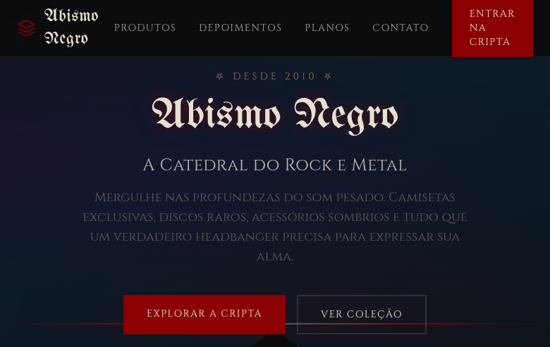
Gothic landing page with dark, mysterious, cathedral-inspired aesthetics. Ideal for merchandising de bandas, logótipos provocadores, branding vintage dark, moda gótica. AI-ready template.
Use case: Merchandising de bandas, Logótipos provocadores, Branding vintage dark, Moda gótica
Historical Context
Gothic architecture wasn't decoration — it was engineering in service of awe. The pointed arch solved a structural problem (distributing weight more efficiently than Roman rounds), but the result was something far more powerful: verticality as ideology. Every element pulled your eye upward. Ribbed vaults, flying buttresses, impossibly thin walls replaced with stained glass — these buildings were designed to make you feel small and transcendent simultaneously. The aesthetic survived because it taps into something primal. Victorian Gothic Revival proved it could work outside cathedrals. German Expressionist cinema proved it could work in two dimensions. Every generation rediscovers Gothic because the core proposition never gets old: darkness as beauty, complexity as ornament, structure as drama. In digital contexts, Gothic translates surprisingly well. The pointed arch is a natural UI frame. Stained glass patterns create rich color stories within dark palettes. The obsessive geometric repetition of tracery is basically a grid system with personality. You're not cosplaying medieval — you're using a visual language that's been refined over eight centuries.
When to Use
When your brand lives in darkness and owns it. Gothic works for gaming studios building dark fantasy worlds, metal and rock brands that need visual weight without cliché, alternative culture platforms where mainstream minimalism feels dishonest. It's the right call when your audience already self-selects into intensity — they'll read ornament as craft, not clutter. Avoid it for anything that needs to feel approachable or casual. Gothic demands commitment.
Design Principles
- Verticality drives hierarchy — stack elements tall and narrow, let pointed shapes create natural visual flow upward through the layout
- Dark palettes are non-negotiable, but stained-glass accents provide controlled bursts of saturated color against deep backgrounds
- Ornament is structural, not decorative — tracery patterns, ribbed borders, and geometric repetition should reinforce grid and containment, never float freely
- Typography carries weight through high contrast between thick display faces (blackletter-inspired or angular serifs) and clean readable body text
- Negative space is shadow — treat empty areas as atmospheric darkness rather than minimalist breathing room, maintaining density without sacrificing legibility
DESIGN.md
---
version: "alpha"
name: "Gothic"
description: "Gothic landing page with dark, mysterious, cathedral-inspired aesthetics. Ideal for merchandising de bandas, logótipos provocadores, branding vintage dark, moda gótica. AI-ready template."
colors:
  primary: "#0B0B0B"
  secondary: "#8B0000"
  tertiary: "#5A5A5A"
  neutral: "#E8E0D0"
  surface: "#2D0A3E"
  accent: "#0D1B2A"
typography:
  h1:
    fontFamily: UnifrakturMaguntia
    fontSize: 2.5rem
    fontWeight: 700
  body-md:
    fontFamily: UnifrakturMaguntia
    fontSize: 1rem
    fontWeight: 400
spacing:
  sm: 2.0rem
  md: 4.0rem
  lg: 8.0rem
components:
  button-primary:
    backgroundColor: "{colors.primary}"
    textColor: "{colors.neutral}"
    padding: 12px
---

## Overview

Gothic landing page with dark, mysterious, cathedral-inspired aesthetics. Ideal for merchandising de bandas, logótipos provocadores, branding vintage dark, moda gótica. AI-ready template. Gothic architecture wasn't decoration — it was engineering in service of awe. The pointed arch solved a structural problem (distributing weight more efficiently than Roman rounds), but the result was something far more powerful: verticality as ideology. Every element pulled your eye upward. Ribbed vaults, flying buttresses, impossibly thin walls replaced with stained glass — these buildings were designed to make you feel small and transcendent simultaneously.

The aesthetic survived because it taps into something primal. Victorian Gothic Revival proved it could work outside cathedrals. German Expressionist cinema proved it could work in two dimensions. Every generation rediscovers Gothic because the core proposition never gets old: darkness as beauty, complexity as ornament, structure as drama.

In digital contexts, Gothic translates surprisingly well. The pointed arch is a natural UI frame. Stained glass patterns create rich color stories within dark palettes. The obsessive geometric repetition of tracery is basically a grid system with personality. You're not cosplaying medieval — you're using a visual language that's been refined over eight centuries.

- Density: 5/10 — Balanced
- Variance: 4/10 — Moderate
- Motion: 4/10 — Subtle

- **Style:** Dark, Pointed Arches, Intricate, Mysterious
- **Keywords:** Gothic, dark, pointed arches, intricate carvings, mysterious, dramatic, grandeur, scary, medieval, cathedral, gargoyle
- **Era:** 12th-16th Century Gothic to Modern Gothic Revival
- **Light/Dark:** ✗ Not Recommended / ✓ Full

## Colors

- **Obsidian Black** (#0B0B0B) — Dark surface, primary background
- **Blood Red** (#8B0000) — Error states, destructive actions
- **Stone Grey** (#5A5A5A) — Secondary text, borders, muted elements
- **Bone White** (#E8E0D0) — Light surface, card backgrounds
- **Deep Purple** (#2D0A3E) — Accent color, emphasis elements
- **Midnight Blue** (#0D1B2A) — Deep contrast surface
- **Tarnished Gold** (#8B7355) — Premium accent, decorative highlights
- **Moss Green** (#4A5A3A) — Success states, positive indicators


## Typography

- **Display / Hero:** UnifrakturMaguntia — Weight 700, tight tracking, used for headline impact
- **Accent:** Cinzel — Used for decorative or emphasis text
- **Body:** UnifrakturMaguntia — Weight 400, 16px/1.6 line-height, max 72ch per line
- **UI Labels / Captions:** UnifrakturMaguntia — 0.875rem, weight 500, slight letter-spacing
- **Monospace:** JetBrains Mono — Used for code, metadata, and technical values

Scale:
- Hero: clamp(2.5rem, 5vw, 4rem)
- H1: 2.25rem
- H2: 1.5rem
- Body: 1rem / 1.6
- Small: 0.875rem


## Layout

- **Grid:** CSS Grid primary. Max-width containment: 1280px centered with 1.5rem side padding.
- **Spacing rhythm:** Balanced. Base unit: 0.5rem (8px).
- **Section vertical gaps:** clamp(4rem, 8vw, 8rem).
- **Hero layout:** Split-screen (text left, visual right).
- **Feature sections:** Zig-zag alternating text+image rows. No 3-equal-columns.
- **Mobile collapse:** All multi-column layouts collapse below 768px. No horizontal overflow.
- **z-index contract:** base (0) / sticky-nav (100) / overlay (200) / modal (300) / toast (500).


## Elevation & Depth

Pointed arch shapes via clip-path, intricate SVG tracery patterns, cathedral window-inspired section frames, dark gradient backgrounds with fog effect, gargoyle/ornament SVG decorations, eerie glow effects on hover, slow dramatic transitions (600ms)

- **Physics:** Ease-out curves, 200-300ms duration. Smooth and predictable.
- **Entry animations:** Fade + translate-Y (16px → 0) over 420ms ease-out. Staggered cascades for lists: 80ms between items.
- **Hover states:** Subtle color shift + shadow adjustment over 200ms.
- **Page transitions:** Fade only (200ms).
- **Performance:** Only transform and opacity animated. No layout-triggering properties.


## Shapes

Base corner radius: 8px. See rounded tokens in front matter for the full scale.


## Components

- **Primary Button:** Subtly rounded (0.5rem) shape. Accent color fill. Hover: 8% darken + subtle lift shadow. Active: -1px translate tactile press. Font weight 600. No outer glows.
- **Secondary / Ghost Button:** Outline variant. 1.5px border in muted color. Text in primary color. Hover: subtle background fill.
- **Cards:** Subtly rounded (0.5rem) corners. Surface background. Subtle shadow (0 2px 12px rgba(0,0,0,0.06)). 1px border stroke.
- **Inputs:** Label above input. 1px border stroke. Focus ring: 2px accent color offset 2px. Error text below in semantic red. No floating labels.
- **Navigation:** Primary surface background. Active item: accent color indicator. Font weight 500 when active.
- **Skeletons:** Shimmer animation matching component dimensions. No circular spinners.
- **Empty States:** Icon-based composition with descriptive text and action button.


## Do's and Don'ts

- No emojis in UI — use icon system only (Lucide, Heroicons)
- No pure white (#FFFFFF) backgrounds — use off-white or dark surfaces
- No oversaturated accent colors (saturation cap: 80%)
- No 3-column equal-width feature layouts — use zig-zag or asymmetric grid
- No `h-screen` — use `min-h-[100dvh]`
- No AI copywriting clichés: "Elevate", "Seamless", "Unleash", "Next-Gen"
- No broken external image links — use picsum.photos or inline SVG
- No generic lorem ipsum in demos

- Do Dark mysterious color palette
- Do Pointed arch shapes
- Do Intricate SVG tracery patterns
- Do Cathedral window-inspired frames
- Do Gothic/blackletter typography
- Do Eerie glow effects
- Do Dark fog gradient backgrounds
- Do Responsive with maintained mystery


## Use Case

Merchandising de bandas, Logótipos provocadores, Branding vintage dark, Moda gótica
Technical Specs
CSS
font-family: 'UnifrakturMaguntia', 'Cinzel', serif, background: linear-gradient(to bottom, #0B0B0B, #1A0A1A), color: #E8E0D0, border: 2px solid #5A5A5A, clip-path: polygon() for pointed arches, box-shadow: 0 0 30px rgba(139,0,0,0.2), text-shadow: 0 0 10px rgba(139,0,0,0.3), transition: all 600ms ease
Variables
--color-black: #0B0B0B, --color-red: #8B0000, --color-grey: #5A5A5A, --color-bone: #E8E0D0, --font-gothic: 'UnifrakturMaguntia', --font-serif: 'Cinzel', --glow-red: rgba(139,0,0,0.2), --border: 2px solid #5A5A5A, --spacing: 2rem, --transition: 600ms
Checklist
☐ Dark mysterious color palette, ☐ Pointed arch shapes, ☐ Intricate SVG tracery patterns, ☐ Cathedral window-inspired frames, ☐ Gothic/blackletter typography, ☐ Eerie glow effects, ☐ Dark fog gradient backgrounds, ☐ Responsive with maintained mystery
Colors
Primary
Secondary
Effects
Pointed arch shapes via clip-path, intricate SVG tracery patterns, cathedral window-inspired section frames, dark gradient backgrounds with fog effect, gargoyle/ornament SVG decorations, eerie glow effects on hover, slow dramatic transitions (600ms)
Light/Dark
✗ Not Recommended / ✓ Full
AI Prompt
Act as a Senior Frontend Engineer and Expert UI Designer.
Your task is to code a complete Landing Page on the first attempt.
- Landing Page Theme: <INSERT THEME>
- Sections to add: <INSERT SECTIONS>

Generate the final code immediately following these definitions:

## Style

- **Name:** Gothic
- **Type:** Dark, Pointed Arches, Intricate, Mysterious
- **Keywords:** Gothic, dark, pointed arches, intricate carvings, mysterious, dramatic, grandeur, scary, medieval, cathedral, gargoyle
- **Era:** 12th-16th Century Gothic to Modern Gothic Revival
- **Light/Dark:** ✗ Not Recommended / ✓ Full

## Color Palette

- **Primary:** Obsidian Black #0B0B0B, Blood Red #8B0000, Stone Grey #5A5A5A, Bone White #E8E0D0
- **Secondary:** Deep Purple #2D0A3E, Midnight Blue #0D1B2A, Tarnished Gold #8B7355, Moss Green #4A5A3A

## Visual Effects

Pointed arch shapes via clip-path, intricate SVG tracery patterns, cathedral window-inspired section frames, dark gradient backgrounds with fog effect, gargoyle/ornament SVG decorations, eerie glow effects on hover, slow dramatic transitions (600ms)

## AI Visual Direction

Design a gothic landing page with dark, mysterious, cathedral-inspired aesthetics. Use obsidian black, blood red, stone grey, bone white. Apply pointed arch clip-path shapes, intricate SVG tracery patterns, cathedral window frames, dark fog gradient backgrounds, gargoyle SVG decorations, eerie glow effects. Typography should be blackletter or gothic serif. Dramatic, mysterious, grandeur atmosphere.

## CSS Technical

```css
font-family: 'UnifrakturMaguntia', 'Cinzel', serif, background: linear-gradient(to bottom, #0B0B0B, #1A0A1A), color: #E8E0D0, border: 2px solid #5A5A5A, clip-path: polygon() for pointed arches, box-shadow: 0 0 30px rgba(139,0,0,0.2), text-shadow: 0 0 10px rgba(139,0,0,0.3), transition: all 600ms ease
```

## Design System Variables

```css
--color-black: #0B0B0B, --color-red: #8B0000, --color-grey: #5A5A5A, --color-bone: #E8E0D0, --font-gothic: 'UnifrakturMaguntia', --font-serif: 'Cinzel', --glow-red: rgba(139,0,0,0.2), --border: 2px solid #5A5A5A, --spacing: 2rem, --transition: 600ms
```

## Implementation Checklist

- ☐ Dark mysterious color palette
- ☐ Pointed arch shapes
- ☐ Intricate SVG tracery patterns
- ☐ Cathedral window-inspired frames
- ☐ Gothic/blackletter typography
- ☐ Eerie glow effects
- ☐ Dark fog gradient backgrounds
- ☐ Responsive with maintained mystery

## Execution Rules

1. Strictly follow the defined visual style.
2. Use high-quality inline SVG icons (Heroicons or Lucide style) — NEVER use emojis as icons.
3. Add `cursor-pointer` and smooth `hover` states (transition-all) on all interactive elements.
4. Required Page Structure:
   - Navbar (Logo + Links + CTA)
   - Hero Section (Impactful Headline + Subtitle + 2 buttons + 3D/Abstract visual element via CSS)
   - Features (3 cards with icons)
   - Testimonials (3 cards)
   - Pricing (3 tiers, highlight the middle one)
   - Final CTA
   - Full Footer with social links, privacy policy, terms of use, contact and SEO links.
5. All text content must be in English.
6. The visual must be CLEARLY distinct — do not create a "default Bootstrap" design. Force the use of the provided design system variables.
7. Use `<style>` tags in the head for custom classes (especially for complex backdrop-filter effects and animations) that Tailwind CDN doesn't cover.
8. Full Responsiveness: Layout must adapt perfectly to Mobile, Tablet and Desktop (vertical stack on mobile).
9. Include basic SEO, Viewport and Open Graph meta tags in `<head>`.
10. Footer must contain: Copyright 2026, Secondary navigation links and Social media icons.
11. Make the creative decisions needed to deliver the complete, functional result now.
Related
Last synced: 4/1/2026