Flat Design Produtivo
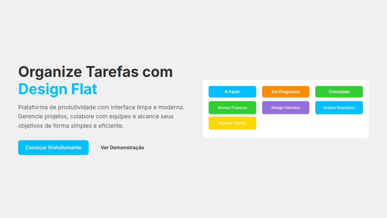
Simple and efficient flat design landing page for a task management app. Ideal for landing pages, modern websites. AI-ready template.
Use case: Landing pages, Modern websites
Historical Context
Flat design found its most natural home in productivity software. Not because it was trendy—though it was—but because task management demands visual silence. Every shadow, every gradient, every decorative flourish competes with the one thing that matters: your next action. Todoist understood this early. Strip the interface to colored dots and clean type. Let priority speak through hue alone. Things took it further—nearly monochrome, obsessively minimal, treating whitespace as a functional element rather than empty real estate. TickTick landed somewhere between: flat foundations with subtle depth cues where hierarchy demanded it. Three apps, three interpretations, one shared conviction that decoration is debt in a tool you open forty times a day. The productivity-flat lineage runs through Clear, Wunderlist, and into today's Linear and Notion. What connects them isn't aesthetic dogma. It's the recognition that cognitive load is the enemy of getting things done, and every pixel that doesn't serve the task is a pixel working against the user.
When to Use
When your interface is a daily-driver tool, not a destination. Todo apps, project boards, habit trackers—anything where users arrive with intent and need to leave fast. Flat productive UI works when the content IS the interface: tasks, dates, labels, progress. If users interact more than they browse, if speed-to-action matters more than first-impression delight, flatten ruthlessly. Skip this for marketing sites or portfolio pieces where you need emotional punch.
Design Principles
- Hierarchy through typography weight and size, never through elevation or shadow—let bold text do what drop shadows pretend to do
- Color as metadata: priority red, category blue, completion green. Decorative color is banned. Every hue must encode meaning a user can learn and recall
- Generous touch targets with invisible boundaries—tap areas extend beyond visible elements, because productivity means speed means not missing the checkbox
- Single-depth interfaces: no modals inside modals, no drawers hiding drawers. One level of context at a time. The user's mental stack should never exceed one
- Motion only for state confirmation—a task completing, a list reordering. Never animate for entrance. Things that exist should simply exist.
DESIGN.md
---
version: "alpha"
name: "Flat Design Produtivo"
description: "Simple and efficient flat design landing page for a task management app. Ideal for landing pages, modern websites. AI-ready template."
colors:
  primary: "#00BFFF"
  secondary: "#32CD32"
  tertiary: "#FFFFFF"
  neutral: "#F0F0F0"
  surface: "#FF8C00"
  accent: "#9370DB"
typography:
  h1:
    fontFamily: Open Sans
    fontSize: 2.5rem
    fontWeight: 700
  body-md:
    fontFamily: Open Sans
    fontSize: 1rem
    fontWeight: 400
components:
  button-primary:
    backgroundColor: "{colors.primary}"
    textColor: "{colors.neutral}"
    padding: 12px
---

## Overview

Simple and efficient flat design landing page for a task management app. Ideal for landing pages, modern websites. AI-ready template. Flat design found its most natural home in productivity software. Not because it was trendy—though it was—but because task management demands visual silence. Every shadow, every gradient, every decorative flourish competes with the one thing that matters: your next action.

Todoist understood this early. Strip the interface to colored dots and clean type. Let priority speak through hue alone. Things took it further—nearly monochrome, obsessively minimal, treating whitespace as a functional element rather than empty real estate. TickTick landed somewhere between: flat foundations with subtle depth cues where hierarchy demanded it. Three apps, three interpretations, one shared conviction that decoration is debt in a tool you open forty times a day.

The productivity-flat lineage runs through Clear, Wunderlist, and into today's Linear and Notion. What connects them isn't aesthetic dogma. It's the recognition that cognitive load is the enemy of getting things done, and every pixel that doesn't serve the task is a pixel working against the user.

- Density: 3/10 — Airy
- Variance: 3/10 — Restrained
- Motion: 4/10 — Subtle

- **Style:** Simple, Efficient, Modern
- **Keywords:** task management, productivity, flat design, simple, efficient, clean, intuitive, modern, vibrant, focused
- **Era:** 2026+ Produtividade Digital
- **Light/Dark:** ✓ Full / ✗ No

## Colors

- **Azul Celeste** (#00BFFF) — Accent highlight, links and focus states
- **Verde Limão** (#32CD32) — Secondary surface or text color
- **Branco** (#FFFFFF) — Light surface, card backgrounds
- **Cinza Claro** (#F0F0F0) — Secondary text, borders, muted elements
- **Laranja Vibrante** (#FF8C00) — Warm accent, call-to-action secondary
- **Roxo Suave** (#9370DB) — Accent color, emphasis elements
- **Amarelo Sol** (#FFD700) — Warning states, attention indicators
- **Preto** (#333333) — Deep contrast surface


## Typography

- **Display / Hero:** Open Sans — Weight 700, tight tracking, used for headline impact
- **Body:** Open Sans — Weight 400, 16px/1.6 line-height, max 72ch per line
- **UI Labels / Captions:** Open Sans — 0.875rem, weight 500, slight letter-spacing
- **Monospace:** JetBrains Mono — Used for code, metadata, and technical values

Scale:
- Hero: clamp(2.5rem, 5vw, 4rem)
- H1: 2.25rem
- H2: 1.5rem
- Body: 1rem / 1.6
- Small: 0.875rem


## Layout

- **Grid:** CSS Grid primary. Max-width containment: 1280px centered with 1.5rem side padding.
- **Spacing rhythm:** Balanced. Base unit: 0.5rem (8px).
- **Section vertical gaps:** clamp(4rem, 8vw, 8rem).
- **Hero layout:** Split-screen (text left, visual right).
- **Feature sections:** Zig-zag alternating text+image rows. No 3-equal-columns.
- **Mobile collapse:** All multi-column layouts collapse below 768px. No horizontal overflow.
- **z-index contract:** base (0) / sticky-nav (100) / overlay (200) / modal (300) / toast (500).


## Elevation & Depth

Elementos de interface planos sem sombras ou gradientes, cores vibrantes e sólidas, tipografia sans-serif limpa e moderna, ícones vetoriais simples, micro-interações de clique com feedback de cor, transições de elementos rápidas e diretas.

- **Physics:** Ease-out curves, 200-300ms duration. Smooth and predictable.
- **Entry animations:** Fade + translate-Y (16px → 0) over 420ms ease-out. Staggered cascades for lists: 80ms between items.
- **Hover states:** Subtle color shift + shadow adjustment over 200ms.
- **Page transitions:** Fade only (200ms).
- **Performance:** Only transform and opacity animated. No layout-triggering properties.


## Shapes

Base corner radius: 8px. See rounded tokens in front matter for the full scale.


## Components

- **Primary Button:** Subtly rounded (0.5rem) shape. Accent color fill. Hover: 8% darken + subtle lift shadow. Active: -1px translate tactile press. Font weight 600. No outer glows.
- **Secondary / Ghost Button:** Outline variant. 1.5px border in muted color. Text in primary color. Hover: subtle background fill.
- **Cards:** Subtly rounded (0.5rem) corners. Surface background. Subtle shadow (0 2px 12px rgba(0,0,0,0.06)). 1px border stroke.
- **Inputs:** Label above input. 1px border stroke. Focus ring: 2px accent color offset 2px. Error text below in semantic red. No floating labels.
- **Navigation:** Primary surface background. Active item: accent color indicator. Font weight 500 when active.
- **Skeletons:** Shimmer animation matching component dimensions. No circular spinners.
- **Empty States:** Icon-based composition with descriptive text and action button.


## Do's and Don'ts

- No emojis in UI — use icon system only (Lucide, Heroicons)
- No pure black (#000000) — use off-black or charcoal variants
- No oversaturated accent colors (saturation cap: 80%)
- No 3-column equal-width feature layouts — use zig-zag or asymmetric grid
- No `h-screen` — use `min-h-[100dvh]`
- No AI copywriting clichés: "Elevate", "Seamless", "Unleash", "Next-Gen"
- No broken external image links — use picsum.photos or inline SVG
- No generic lorem ipsum in demos

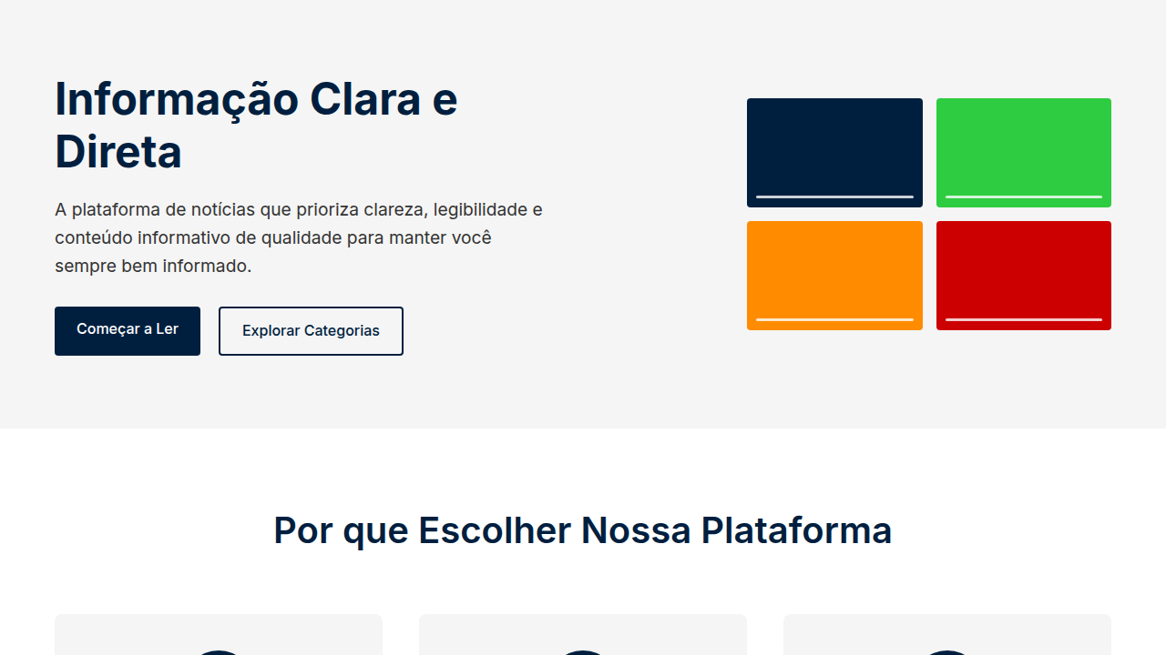
- Do Elementos planos
- Do Cores vibrantes/sólidas
- Do Tipografia sans-serif limpa
- Do Ícones vetoriais simples
- Do Micro-interações de feedback de cor
- Do Transições rápidas.


## Use Case

Landing pages, Modern websites
Technical Specs
CSS
background: #FFFFFF, color: #333333, border: none, box-shadow: none, font-family: "Open Sans, sans-serif", transition: all 0.2s ease-in-out, .flat-button, .vibrant-card, .simple-icon.
Variables
--sky-blue: #00BFFF, --lime-green: #32CD32, --white-bg: #FFFFFF, --light-grey-bg: #F0F0F0, --font-main: "Open Sans, sans-serif", --vibrant-orange: #FF8C00, --shadow-none: none.
Checklist
☐ Elementos planos, ☐ Cores vibrantes/sólidas, ☐ Tipografia sans-serif limpa, ☐ Ícones vetoriais simples, ☐ Micro-interações de feedback de cor, ☐ Transições rápidas.
Colors
Primary
Secondary
Effects
Elementos de interface planos sem sombras ou gradientes, cores vibrantes e sólidas, tipografia sans-serif limpa e moderna, ícones vetoriais simples, micro-interações de clique com feedback de cor, transições de elementos rápidas e diretas.
Light/Dark
✓ Full / ✗ No
AI Prompt
Act as a Senior Frontend Engineer and Expert UI Designer.
Your task is to code a complete Landing Page on the first attempt.
- Landing Page Theme: <INSERT THEME>
- Sections to add: <INSERT SECTIONS>

Generate the final code immediately following these definitions:

## Style

- **Name:** Flat Design Produtivo
- **Type:** Simple, Efficient, Modern
- **Keywords:** task management, productivity, flat design, simple, efficient, clean, intuitive, modern, vibrant, focused
- **Era:** 2026+ Produtividade Digital
- **Light/Dark:** ✓ Full / ✗ No

## Color Palette

- **Primary:** Azul Celeste #00BFFF, Verde Limão #32CD32, Branco #FFFFFF, Cinza Claro #F0F0F0
- **Secondary:** Laranja Vibrante #FF8C00, Roxo Suave #9370DB, Amarelo Sol #FFD700, Preto #333333

## Visual Effects

Elementos de interface planos sem sombras ou gradientes, cores vibrantes e sólidas, tipografia sans-serif limpa e moderna, ícones vetoriais simples, micro-interações de clique com feedback de cor, transições de elementos rápidas e diretas.

## AI Visual Direction

Design a simple and efficient flat design landing page for a task management app. Use: flat UI elements without shadows/gradients, vibrant solid colors, clean modern sans-serif typography, simple vector icons, color feedback click micro-interactions, fast direct element transitions, sky blue and lime green accents, intuitive and focused feel.

## CSS Technical

```css
background: #FFFFFF, color: #333333, border: none, box-shadow: none, font-family: "Open Sans, sans-serif", transition: all 0.2s ease-in-out, .flat-button, .vibrant-card, .simple-icon.
```

## Design System Variables

```css
--sky-blue: #00BFFF, --lime-green: #32CD32, --white-bg: #FFFFFF, --light-grey-bg: #F0F0F0, --font-main: "Open Sans, sans-serif", --vibrant-orange: #FF8C00, --shadow-none: none.
```

## Implementation Checklist

- ☐ Elementos planos
- ☐ Cores vibrantes/sólidas
- ☐ Tipografia sans-serif limpa
- ☐ Ícones vetoriais simples
- ☐ Micro-interações de feedback de cor
- ☐ Transições rápidas.

## Execution Rules

1. Strictly follow the defined visual style.
2. Use high-quality inline SVG icons (Heroicons or Lucide style) — NEVER use emojis as icons.
3. Add `cursor-pointer` and smooth `hover` states (transition-all) on all interactive elements.
4. Required Page Structure:
   - Navbar (Logo + Links + CTA)
   - Hero Section (Impactful Headline + Subtitle + 2 buttons + 3D/Abstract visual element via CSS)
   - Features (3 cards with icons)
   - Testimonials (3 cards)
   - Pricing (3 tiers, highlight the middle one)
   - Final CTA
   - Full Footer with social links, privacy policy, terms of use, contact and SEO links.
5. All text content must be in English.
6. The visual must be CLEARLY distinct — do not create a "default Bootstrap" design. Force the use of the provided design system variables.
7. Use `<style>` tags in the head for custom classes (especially for complex backdrop-filter effects and animations) that Tailwind CDN doesn't cover.
8. Full Responsiveness: Layout must adapt perfectly to Mobile, Tablet and Desktop (vertical stack on mobile).
9. Include basic SEO, Viewport and Open Graph meta tags in `<head>`.
10. Footer must contain: Copyright 2026, Secondary navigation links and Social media icons.
11. Make the creative decisions needed to deliver the complete, functional result now.
Related
Last synced: 4/1/2026