Farmhouse / Cottage Core
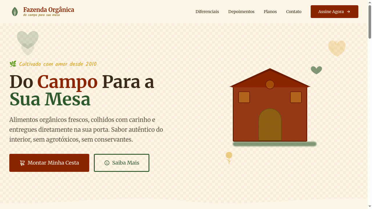
Farmhouse/cottage core landing page with rustic countryside charm. Ideal for decoração de interiores, marcas de vestuário boutique, capas de livros, produtos artesanais. AI-ready template.
Use case: Interior decoration, Boutique clothing brands, Book covers, Artisan products
Historical Context
Farmhouse and cottage core illustration didn't emerge from design studios — it crawled out of William Morris's wallpaper workshops, Victorian botanical plates, and the honest roughness of woodcut almanacs. The Arts & Crafts movement rejected industrial perfection in favor of the handmade mark, and that DNA runs straight through every sprig of lavender and wobbly hand-lettered label you see on a jar of artisan honey today. The modern revival owes less to nostalgia than to fatigue. After a decade of flat vectors and geometric minimalism, audiences craved texture, warmth, and visual evidence of a human hand. Cottage core illustration filled that gap — not by being technically primitive, but by choosing imperfection as a deliberate stance. Grain, bleed, uneven ink coverage — these aren't flaws, they're the vocabulary. What separates good farmhouse illustration from Pinterest kitsch is restraint. The best work references pastoral tradition without cosplaying it. It borrows the palette of dried wildflowers and aged linen, the compositional logic of seed packet art, but applies contemporary spacing and hierarchy. It's romantic without being sentimental.
When to Use
Reach for this style when your brand needs to feel rooted, unhurried, and genuinely crafted — not manufactured. It works when the product story involves provenance: where something was grown, who made it, how it got to your table. Home goods, small-batch food brands, rural hospitality, herbalists, ceramicists, farm-to-table restaurants. It falls apart instantly when applied to anything that moves fast or lives purely digital. Don't force pastoral warmth onto a SaaS dashboard. The style demands physical context — packaging, editorial, environmental signage — where texture can breathe.
Design Principles
- Embrace visible process — show the grain, the plate mark, the ink bleed. Perfection kills the entire premise.
- Limit your palette to what you'd find in a kitchen garden or a faded quilt. Earthy ochres, muted greens, dusty roses, aged cream. Never saturated, never neon.
- Compose like a botanist, not a graphic designer. Asymmetric arrangements, specimens floating with intentional white space, labels that feel catalogued rather than marketed.
- Let typography be humble — hand-lettered or serif workhorses with optical weight, never display fonts screaming for attention. The illustration leads, type supports.
- Honor negative space as breathing room. Cottage core is about slowness; cramming every corner with vines and roosters turns pastoral into claustrophobic.
DESIGN.md
---
version: "alpha"
name: "Farmhouse / Cottage Core"
description: "Farmhouse/cottage core landing page with rustic countryside charm. Ideal for decoração de interiores, marcas de vestuário boutique, capas de livros, produtos artesanais. AI-ready template."
colors:
  primary: "#8B2500"
  secondary: "#FDF5E6"
  tertiary: "#8B6914"
  neutral: "#2E5A2E"
  surface: "#DAA520"
  accent: "#8E8E82"
typography:
  h1:
    fontFamily: Merriweather
    fontSize: 2.5rem
    fontWeight: 700
  body-md:
    fontFamily: Merriweather
    fontSize: 1rem
    fontWeight: 400
rounded:
  sm: 4px
  md: 8px
  lg: 12px
spacing:
  sm: 2.0rem
  md: 4.0rem
  lg: 8.0rem
components:
  button-primary:
    backgroundColor: "{colors.primary}"
    textColor: "{colors.neutral}"
    rounded: "{rounded.sm}"
    padding: 12px
---

## Overview

Farmhouse/cottage core landing page with rustic countryside charm. Ideal for decoração de interiores, marcas de vestuário boutique, capas de livros, produtos artesanais. AI-ready template. Farmhouse and cottage core illustration didn't emerge from design studios — it crawled out of William Morris's wallpaper workshops, Victorian botanical plates, and the honest roughness of woodcut almanacs. The Arts & Crafts movement rejected industrial perfection in favor of the handmade mark, and that DNA runs straight through every sprig of lavender and wobbly hand-lettered label you see on a jar of artisan honey today.

The modern revival owes less to nostalgia than to fatigue. After a decade of flat vectors and geometric minimalism, audiences craved texture, warmth, and visual evidence of a human hand. Cottage core illustration filled that gap — not by being technically primitive, but by choosing imperfection as a deliberate stance. Grain, bleed, uneven ink coverage — these aren't flaws, they're the vocabulary.

What separates good farmhouse illustration from Pinterest kitsch is restraint. The best work references pastoral tradition without cosplaying it. It borrows the palette of dried wildflowers and aged linen, the compositional logic of seed packet art, but applies contemporary spacing and hierarchy. It's romantic without being sentimental.

- Density: 5/10 — Balanced
- Variance: 4/10 — Moderate
- Motion: 6/10 — Expressive

- **Style:** Rustic, Natural, Charming, Rural
- **Keywords:** Farmhouse, cottage core, rustic simplicity, natural fabrics, countryside, rural, charming, handmade, pastoral, cozy
- **Era:** Rural Americana & English Countryside
- **Light/Dark:** ✓ Full / ◐ Partial

## Colors

- **Barn Red** (#8B2500) — Error states, destructive actions
- **Cream White** (#FDF5E6) — Light surface, card backgrounds
- **Natural Wood** (#8B6914) — Supporting palette color
- **Forest Green** (#2E5A2E) — Supporting palette color
- **Wheat Gold** (#DAA520) — Premium accent, decorative highlights
- **Stone Grey** (#8E8E82) — Secondary text, borders, muted elements
- **Lavender** (#9B8EC4) — Extended palette, decorative use
- **Sky Blue** (#87CEEB) — Secondary accent


## Typography

- **Display / Hero:** Merriweather — Weight 700, tight tracking, used for headline impact
- **Accent:** Kalam — Used for decorative or emphasis text
- **Body:** Merriweather — Weight 400, 16px/1.6 line-height, max 72ch per line
- **UI Labels / Captions:** Merriweather — 0.875rem, weight 500, slight letter-spacing
- **Monospace:** JetBrains Mono — Used for code, metadata, and technical values

Scale:
- Hero: clamp(2.5rem, 5vw, 4rem)
- H1: 2.25rem
- H2: 1.5rem
- Body: 1rem / 1.6
- Small: 0.875rem


## Layout

- **Grid:** CSS Grid primary. Max-width containment: 1280px centered with 1.5rem side padding.
- **Spacing rhythm:** Balanced. Base unit: 0.5rem (8px).
- **Section vertical gaps:** clamp(4rem, 8vw, 8rem).
- **Hero layout:** Split-screen (text left, visual right).
- **Feature sections:** Zig-zag alternating text+image rows. No 3-equal-columns.
- **Mobile collapse:** All multi-column layouts collapse below 768px. No horizontal overflow.
- **z-index contract:** base (0) / sticky-nav (100) / overlay (200) / modal (300) / toast (500).


## Elevation & Depth

Wood grain texture backgrounds, gingham/plaid CSS patterns, hand-drawn botanical SVG decorations, rustic thick borders (3px), warm sepia-toned overlays, gentle sway animations on botanical elements

- **Physics:** Spring — stiffness 120, damping 20. Confident, weighted transitions.
- **Entry animations:** Fade + translate-Y (16px → 0) over 480ms ease-out. Staggered cascades for lists: 100ms between items.
- **Hover states:** Scale(1.03) + shadow lift over 200ms.
- **Page transitions:** Fade + slide (300ms).
- **Performance:** Only transform and opacity animated. No layout-triggering properties.


## Shapes

Base corner radius: 4px. See rounded tokens in front matter for the full scale.


## Components

- **Primary Button:** Rounded (4px) shape. Accent color fill. Hover: 8% darken + subtle lift shadow. Active: -1px translate tactile press. Font weight 600. No outer glows.
- **Secondary / Ghost Button:** Outline variant. 1.5px border in muted color. Text in primary color. Hover: subtle background fill.
- **Cards:** Rounded (4px) corners. Surface background. Subtle shadow (0 2px 12px rgba(0,0,0,0.06)). 1px border stroke.
- **Inputs:** Label above input. 1px border stroke. Focus ring: 2px accent color offset 2px. Error text below in semantic red. No floating labels.
- **Navigation:** Primary surface background. Active item: accent color indicator. Font weight 500 when active.
- **Skeletons:** Shimmer animation matching component dimensions. No circular spinners.
- **Empty States:** Icon-based composition with descriptive text and action button.


## Do's and Don'ts

- No emojis in UI — use icon system only (Lucide, Heroicons)
- No pure black (#000000) — use off-black or charcoal variants
- No oversaturated accent colors (saturation cap: 80%)
- No 3-column equal-width feature layouts — use zig-zag or asymmetric grid
- No `h-screen` — use `min-h-[100dvh]`
- No AI copywriting clichés: "Elevate", "Seamless", "Unleash", "Next-Gen"
- No broken external image links — use picsum.photos or inline SVG
- No generic lorem ipsum in demos

- Do Rustic earthy color palette
- Do Wood grain texture backgrounds
- Do Gingham/plaid patterns
- Do Botanical SVG decorations
- Do Warm serif + handwritten typography
- Do Pastoral cozy atmosphere
- Do Responsive with maintained charm


## Use Case

Interior decoration, Boutique clothing brands, Book covers, Artisan products
Technical Specs
CSS
font-family: 'Merriweather', serif mixed with 'Kalam', cursive, background: #FDF5E6 with CSS gingham pattern, color: #3A2A1A, border: 3px solid #8B2500, border-radius: 4px, box-shadow: 2px 2px 0 rgba(139,37,0,0.1), line-height: 1.7
Variables
--color-barn-red: #8B2500, --color-cream: #FDF5E6, --color-wood: #8B6914, --color-forest: #2E5A2E, --font-serif: 'Merriweather', --font-handwritten: 'Kalam', --border: 3px solid #8B2500, --border-radius: 4px, --spacing: 2rem
Checklist
☐ Rustic earthy color palette, ☐ Wood grain texture backgrounds, ☐ Gingham/plaid patterns, ☐ Botanical SVG decorations, ☐ Warm serif + handwritten typography, ☐ Pastoral cozy atmosphere, ☐ Responsive with maintained charm
Colors
Primary
Secondary
Effects
Wood grain texture backgrounds, gingham/plaid CSS patterns, hand-drawn botanical SVG decorations, rustic thick borders (3px), warm sepia-toned overlays, gentle sway animations on botanical elements
Light/Dark
✓ Full / ◐ Partial
AI Prompt
Act as a Senior Frontend Engineer and Expert UI Designer.
Your task is to code a complete Landing Page on the first attempt.
- Landing Page Theme: <INSERT THEME>
- Sections to add: <INSERT SECTIONS>

Generate the final code immediately following these definitions:

## Style

- **Name:** Farmhouse / Cottage Core
- **Type:** Rustic, Natural, Charming, Rural
- **Keywords:** Farmhouse, cottage core, rustic simplicity, natural fabrics, countryside, rural, charming, handmade, pastoral, cozy
- **Era:** Rural Americana & English Countryside
- **Light/Dark:** ✓ Full / ◐ Partial

## Color Palette

- **Primary:** Barn Red #8B2500, Cream White #FDF5E6, Natural Wood #8B6914, Forest Green #2E5A2E
- **Secondary:** Wheat Gold #DAA520, Stone Grey #8E8E82, Lavender #9B8EC4, Sky Blue #87CEEB

## Visual Effects

Wood grain texture backgrounds, gingham/plaid CSS patterns, hand-drawn botanical SVG decorations, rustic thick borders (3px), warm sepia-toned overlays, gentle sway animations on botanical elements

## AI Visual Direction

Design a farmhouse/cottage core landing page with rustic countryside charm. Use barn red, cream white, natural wood, forest green. Apply wood grain textures, gingham patterns, hand-drawn botanical SVG decorations, rustic thick borders. Typography should be warm serif mixed with handwritten accents. Pastoral, cozy, handmade atmosphere rooted in rural simplicity.

## CSS Technical

```css
font-family: 'Merriweather', serif mixed with 'Kalam', cursive, background: #FDF5E6 with CSS gingham pattern, color: #3A2A1A, border: 3px solid #8B2500, border-radius: 4px, box-shadow: 2px 2px 0 rgba(139,37,0,0.1), line-height: 1.7
```

## Design System Variables

```css
--color-barn-red: #8B2500, --color-cream: #FDF5E6, --color-wood: #8B6914, --color-forest: #2E5A2E, --font-serif: 'Merriweather', --font-handwritten: 'Kalam', --border: 3px solid #8B2500, --border-radius: 4px, --spacing: 2rem
```

## Implementation Checklist

- ☐ Rustic earthy color palette
- ☐ Wood grain texture backgrounds
- ☐ Gingham/plaid patterns
- ☐ Botanical SVG decorations
- ☐ Warm serif + handwritten typography
- ☐ Pastoral cozy atmosphere
- ☐ Responsive with maintained charm

## Execution Rules

1. Strictly follow the defined visual style.
2. Use high-quality inline SVG icons (Heroicons or Lucide style) — NEVER use emojis as icons.
3. Add `cursor-pointer` and smooth `hover` states (transition-all) on all interactive elements.
4. Required Page Structure:
   - Navbar (Logo + Links + CTA)
   - Hero Section (Impactful Headline + Subtitle + 2 buttons + 3D/Abstract visual element via CSS)
   - Features (3 cards with icons)
   - Testimonials (3 cards)
   - Pricing (3 tiers, highlight the middle one)
   - Final CTA
   - Full Footer with social links, privacy policy, terms of use, contact and SEO links.
5. All text content must be in English.
6. The visual must be CLEARLY distinct — do not create a "default Bootstrap" design. Force the use of the provided design system variables.
7. Use `<style>` tags in the head for custom classes (especially for complex backdrop-filter effects and animations) that Tailwind CDN doesn't cover.
8. Full Responsiveness: Layout must adapt perfectly to Mobile, Tablet and Desktop (vertical stack on mobile).
9. Include basic SEO, Viewport and Open Graph meta tags in `<head>`.
10. Footer must contain: Copyright 2026, Secondary navigation links and Social media icons.
11. Make the creative decisions needed to deliver the complete, functional result now.
Related
Last synced: 4/1/2026