Engineering Blueprint Schematic
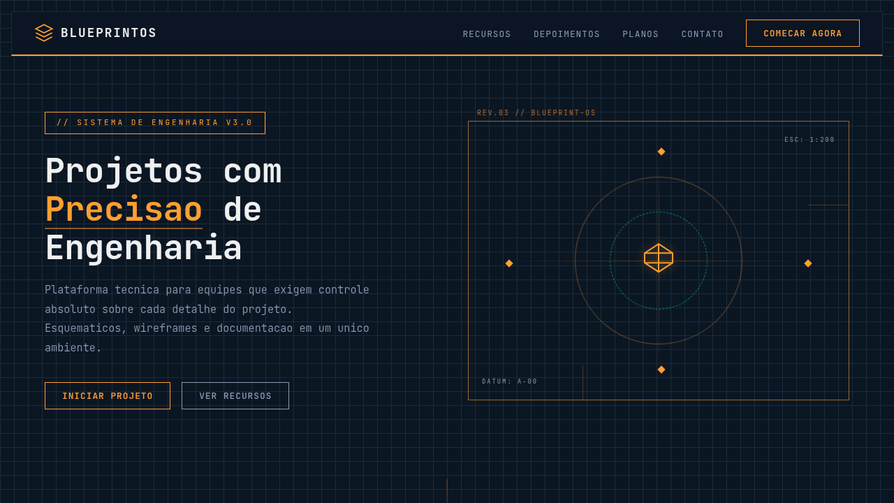
Engineering landing page, blueprint style, schematic design, technical precision, dark blue background, cyan lines, industrial aesthetic, wireframe graphics. Ideal for landing pages, modern websites. AI-ready template.
Use case: Landing pages, Modern websites
Historical Context
Blueprint aesthetics carry a specific weight in digital design that few other visual languages can match. The original cyanotype process — white lines on deep blue — was never meant to be beautiful. It was functional. Engineers needed cheap, reproducible copies of technical drawings. But somewhere between the drafting table and the screen, that stark precision became a signifier of competence itself. Digital designers started borrowing the language in the early 2010s, mostly in tech branding and startup landing pages. The appeal was obvious: show the wireframe, show the grid, show the construction lines — and suddenly your product feels engineered rather than decorated. Process-visible design tells the viewer you sweat the details before the paint dries. What makes schematic aesthetics endure is their honesty. There's no ornamentation pretending to be structure. Every line serves a purpose, every annotation explains a decision. In an era of glossy gradients and AI-generated fluff, a well-executed blueprint layout feels almost radical in its restraint. It says: we build things, and we're not afraid to show you how.
When to Use
Reach for blueprint schematic design when your brand needs to communicate technical authority without resorting to corporate sterility. Engineering firms, hardware startups, maker brands, technical documentation — anywhere the audience respects precision over polish. It works beautifully for product breakdowns, spec sheets, onboarding flows that explain complex systems, or any context where showing construction builds trust. Avoid it for warm, consumer-facing contexts. This aesthetic is cold by nature. Lean into that.
Design Principles
- Every line must justify its existence — decorative strokes break the illusion of engineering rigor instantly.
- Use monospaced or technical typefaces exclusively; humanist fonts contradict the entire premise.
- Maintain a strict grid with visible construction lines — the grid IS the design, not a hidden scaffold.
- Limit your palette to two or three colors maximum; blueprints derive power from constraint, not variety.
- Annotations and callouts should feel functional, not styled — think dimension lines, not marketing badges.
DESIGN.md
---
version: "alpha"
name: "Engineering Blueprint Schematic"
description: "Engineering landing page, blueprint style, schematic design, technical precision, dark blue background, cyan lines, industrial aesthetic, wireframe graphics. Ideal for landing pages, modern websites. AI-ready template."
colors:
  primary: "#0b1623"
  secondary: "#f0f0f0"
  tertiary: "#ff9f30"
  neutral: "#1c2b3a"
  surface: "#8b9bb4"
  accent: "#00ff9d"
typography:
  h1:
    fontFamily: JetBrains Mono
    fontSize: 2.5rem
    fontWeight: 700
  body-md:
    fontFamily: JetBrains Mono
    fontSize: 1rem
    fontWeight: 400
components:
  button-primary:
    backgroundColor: "{colors.primary}"
    textColor: "{colors.neutral}"
    padding: 12px
---

## Overview

Engineering landing page, blueprint style, schematic design, technical precision, dark blue background, cyan lines, industrial aesthetic, wireframe graphics. Ideal for landing pages, modern websites. AI-ready template. Blueprint aesthetics carry a specific weight in digital design that few other visual languages can match. The original cyanotype process — white lines on deep blue — was never meant to be beautiful. It was functional. Engineers needed cheap, reproducible copies of technical drawings. But somewhere between the drafting table and the screen, that stark precision became a signifier of competence itself.

Digital designers started borrowing the language in the early 2010s, mostly in tech branding and startup landing pages. The appeal was obvious: show the wireframe, show the grid, show the construction lines — and suddenly your product feels engineered rather than decorated. Process-visible design tells the viewer you sweat the details before the paint dries.

What makes schematic aesthetics endure is their honesty. There's no ornamentation pretending to be structure. Every line serves a purpose, every annotation explains a decision. In an era of glossy gradients and AI-generated fluff, a well-executed blueprint layout feels almost radical in its restraint. It says: we build things, and we're not afraid to show you how.

- Density: 7/10 — Compact
- Variance: 2/10 — Structured
- Motion: 1/10 — Static

- **Style:** Technical, Precision, Engineered
- **Keywords:** blueprint, schematic, engineering, technical, grid, angular, wireframe, cyan, dark blue
- **Era:** Modern Industrial
- **Light/Dark:** ✗ No / ✓ Full

## Colors

- **Background** (#0b1623) — Primary background surface
- **Text** (#f0f0f0) — Primary text color
- **Accent** (#ff9f30) — Primary accent, CTAs and interactive elements
- **Grid Lines** (#1c2b3a) — Extended palette, decorative use
- **Dim Text** (#8b9bb4) — Primary text color
- **Success** (#00ff9d) — Success states, positive indicators
- **Warning** (#ff9f30) — Warning states, attention indicators


## Typography

- **Display / Hero:** JetBrains Mono — Weight 700, tight tracking, used for headline impact
- **Body:** JetBrains Mono — Weight 400, 16px/1.6 line-height, max 72ch per line
- **UI Labels / Captions:** JetBrains Mono — 0.875rem, weight 500, slight letter-spacing
- **Monospace:** JetBrains Mono — Used for code, metadata, and technical values

Scale:
- Hero: clamp(2.5rem, 5vw, 4rem)
- H1: 2.25rem
- H2: 1.5rem
- Body: 1rem / 1.6
- Small: 0.875rem


## Layout

- **Grid:** CSS Grid primary. Max-width containment: 1280px centered with 1.5rem side padding.
- **Spacing rhythm:** Balanced. Base unit: 0.5rem (8px).
- **Section vertical gaps:** clamp(4rem, 8vw, 8rem).
- **Hero layout:** Split-screen (text left, visual right).
- **Feature sections:** Zig-zag alternating text+image rows. No 3-equal-columns.
- **Mobile collapse:** All multi-column layouts collapse below 768px. No horizontal overflow.
- **z-index contract:** base (0) / sticky-nav (100) / overlay (200) / modal (300) / toast (500).


## Elevation & Depth

Exploded view wireframes, angular leader lines, drafting grid background, technical iconography, neon-like line visibility.

- Minimal motion design. Hover states use color transitions only (150ms).
- No entry animations. No page transitions. Instant, utilitarian feedback.
- Performance: No animation overhead. Static-first approach.


## Shapes

Base corner radius: 0px. See rounded tokens in front matter for the full scale.


## Components

- **Primary Button:** Sharp edges (0px) shape. Accent color fill. Hover: 8% darken + subtle lift shadow. Active: -1px translate tactile press. Font weight 600. No outer glows.
- **Secondary / Ghost Button:** Outline variant. 1.5px border in muted color. Text in primary color. Hover: subtle background fill.
- **Cards:** Sharp edges (0px) corners. Surface background. Subtle shadow (0 2px 12px rgba(0,0,0,0.06)). 1px border stroke.
- **Inputs:** Label above input. 1px border stroke. Focus ring: 2px accent color offset 2px. Error text below in semantic red. No floating labels.
- **Navigation:** Primary surface background. Active item: accent color indicator. Font weight 500 when active.
- **Skeletons:** Shimmer animation matching component dimensions. No circular spinners.
- **Empty States:** Icon-based composition with descriptive text and action button.


## Do's and Don'ts

- No emojis in UI — use icon system only (Lucide, Heroicons)
- No pure white (#FFFFFF) backgrounds — use off-white or dark surfaces
- No oversaturated accent colors (saturation cap: 80%)
- No 3-column equal-width feature layouts — use zig-zag or asymmetric grid
- No `h-screen` — use `min-h-[100dvh]`
- No AI copywriting clichés: "Elevate", "Seamless", "Unleash", "Next-Gen"
- No broken external image links — use picsum.photos or inline SVG
- No generic lorem ipsum in demos

- Do Grid background visible
- Do Monospace typography
- Do High contrast schematic lines
- Do Technical icons (cogs
- Do rulers)
- Do Angular connectors between elements


## Use Case

Landing pages, Modern websites
Technical Specs
CSS
background-color: #0b1623; color: #f0f0f0; font-family: 'JetBrains Mono', monospace; background-image: linear-gradient(#1c2b3a 1px, transparent 1px), linear-gradient(90deg, #1c2b3a 1px, transparent 1px); background-size: 20px 20px; border: 1px solid #ff9f30;
Variables
--bg-color: #0b1623, --text-color: #f0f0f0, --accent-color: #ff9f30, --grid-color: #1c2b3a, --font-tech: 'JetBrains Mono', monospace
Checklist
☐ Grid background visible, ☐ Monospace typography, ☐ High contrast schematic lines, ☐ Technical icons (cogs, rulers), ☐ Angular connectors between elements
Colors
Primary
Secondary
Effects
Exploded view wireframes, angular leader lines, drafting grid background, technical iconography, neon-like line visibility.
Light/Dark
✗ No / ✓ Full
AI Prompt
Act as a Senior Frontend Engineer and Expert UI Designer.
Your task is to code a complete Landing Page on the first attempt.
- Landing Page Theme: <INSERT THEME>
- Sections to add: <INSERT SECTIONS>

Generate the final code immediately following these definitions:

## Style

- **Name:** Engineering Blueprint Schematic
- **Type:** Technical, Precision, Engineered
- **Keywords:** blueprint, schematic, engineering, technical, grid, angular, wireframe, cyan, dark blue
- **Era:** Modern Industrial
- **Light/Dark:** ✗ No / ✓ Full

## Color Palette

- **Primary:** Background #0b1623, Text #f0f0f0, Accent #ff9f30
- **Secondary:** Grid Lines #1c2b3a, Dim Text #8b9bb4, Success #00ff9d, Warning #ff9f30

## Visual Effects

Exploded view wireframes, angular leader lines, drafting grid background, technical iconography, neon-like line visibility.

## AI Visual Direction

engineering landing page, blueprint style, schematic design, technical precision, dark blue background, cyan lines, industrial aesthetic, wireframe graphics.

## CSS Technical

```css
background-color: #0b1623; color: #f0f0f0; font-family: 'JetBrains Mono', monospace; background-image: linear-gradient(#1c2b3a 1px, transparent 1px), linear-gradient(90deg, #1c2b3a 1px, transparent 1px); background-size: 20px 20px; border: 1px solid #ff9f30;
```

## Design System Variables

```css
--bg-color: #0b1623, --text-color: #f0f0f0, --accent-color: #ff9f30, --grid-color: #1c2b3a, --font-tech: 'JetBrains Mono', monospace
```

## Implementation Checklist

- ☐ Grid background visible
- ☐ Monospace typography
- ☐ High contrast schematic lines
- ☐ Technical icons (cogs
- rulers)
- ☐ Angular connectors between elements

## Execution Rules

1. Strictly follow the defined visual style.
2. Use high-quality inline SVG icons (Heroicons or Lucide style) — NEVER use emojis as icons.
3. Add `cursor-pointer` and smooth `hover` states (transition-all) on all interactive elements.
4. Required Page Structure:
   - Navbar (Logo + Links + CTA)
   - Hero Section (Impactful Headline + Subtitle + 2 buttons + 3D/Abstract visual element via CSS)
   - Features (3 cards with icons)
   - Testimonials (3 cards)
   - Pricing (3 tiers, highlight the middle one)
   - Final CTA
   - Full Footer with social links, privacy policy, terms of use, contact and SEO links.
5. All text content must be in English.
6. The visual must be CLEARLY distinct — do not create a "default Bootstrap" design. Force the use of the provided design system variables.
7. Use `<style>` tags in the head for custom classes (especially for complex backdrop-filter effects and animations) that Tailwind CDN doesn't cover.
8. Full Responsiveness: Layout must adapt perfectly to Mobile, Tablet and Desktop (vertical stack on mobile).
9. Include basic SEO, Viewport and Open Graph meta tags in `<head>`.
10. Footer must contain: Copyright 2026, Secondary navigation links and Social media icons.
11. Make the creative decisions needed to deliver the complete, functional result now.
Related
Last synced: 4/1/2026