EdTech Plataforma de Cursos
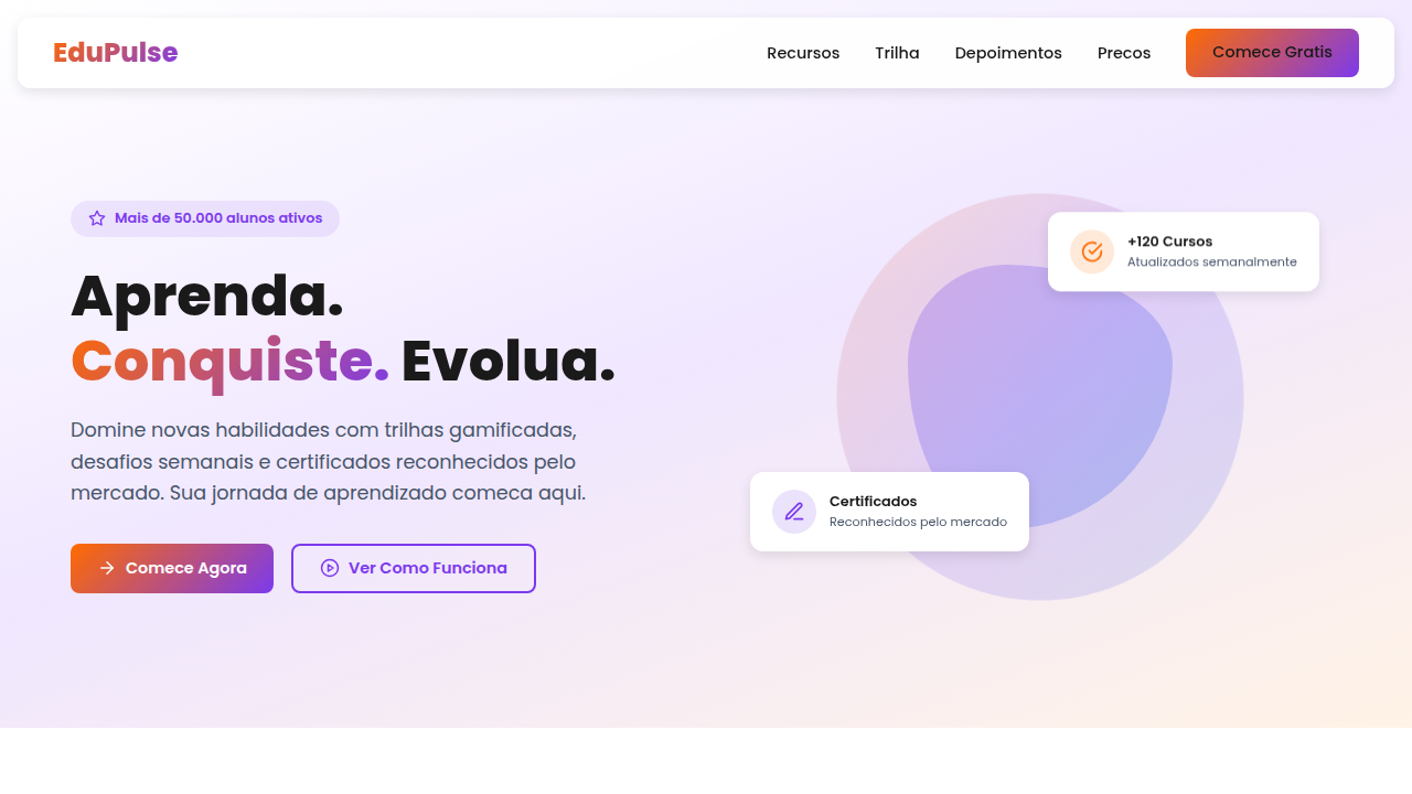
Edtech landing, online courses, gamification, progress badges, vibrant colors, students, learning path, challenges, modern UI. Ideal for landing pages, modern websites. AI-ready template.
Use case: Landing pages, Modern websites
Historical Context
Early edtech interfaces were glorified PDF viewers. Coursera launched in 2012 with a layout that basically said "here's a video, good luck" — and honestly, it worked for a while. The content carried the experience. Then Duolingo showed up and rewrote the rules. Streaks, XP bars, heart systems. Suddenly learning platforms had to feel like games or nobody would come back. Khan Academy took a quieter path — mastery-based progression, skill trees, that satisfying blue-to-green color shift when you leveled up a concept. No confetti explosions, just clear visual feedback that you were getting somewhere. The progress bar became the hero component of an entire industry. Here's the tension nobody resolved cleanly: engagement mechanics and actual learning outcomes don't always align. Duolingo's streak counter keeps you opening the app daily, but does it make you fluent? The best edtech UI today walks this line carefully — gamification that serves comprehension, not just retention metrics. Progress visualization that reflects real mastery, not just time spent clicking.
When to Use
Reach for this when you're building course catalogs, lesson interfaces, student dashboards, or anything where someone needs to track their learning journey. Works for full LMS platforms, standalone course landing pages, onboarding flows for educational apps, and progress-heavy experiences where users need constant orientation — where am I, what's next, how far have I come. Also solid for certification programs, cohort-based courses, and skill assessment tools.
Design Principles
- Progress is the product — every screen should answer 'where am I?' without the user having to ask
- Reward comprehension, not completion — gamification should celebrate understanding, not just clicking 'next'
- Reduce cognitive load between lessons — navigation chrome disappears when learning begins
- Design for the return visit — assume users left mid-lesson and need graceful re-entry
- Accessibility isn't optional in education — if your progress indicator only works with color, you've failed the assignment
DESIGN.md
---
version: "alpha"
name: "EdTech Plataforma de Cursos"
description: "Edtech landing, online courses, gamification, progress badges, vibrant colors, students, learning path, challenges, modern UI. Ideal for landing pages, modern websites. AI-ready template."
colors:
  primary: "#FF6B00"
  secondary: "#7C3AED"
  tertiary: "#2563EB"
  neutral: "#FFFFFF"
  surface: "#F8FAFC"
  accent: "#FFC107"
typography:
  h1:
    fontFamily: Poppins
    fontSize: 2.5rem
    fontWeight: 700
  body-md:
    fontFamily: Poppins
    fontSize: 1rem
    fontWeight: 400
rounded:
  sm: 12px
  md: 24px
  lg: 36px
components:
  button-primary:
    backgroundColor: "{colors.primary}"
    textColor: "{colors.neutral}"
    rounded: "{rounded.sm}"
    padding: 12px
---

## Overview

Edtech landing, online courses, gamification, progress badges, vibrant colors, students, learning path, challenges, modern UI. Ideal for landing pages, modern websites. AI-ready template. Early edtech interfaces were glorified PDF viewers. Coursera launched in 2012 with a layout that basically said "here's a video, good luck" — and honestly, it worked for a while. The content carried the experience. Then Duolingo showed up and rewrote the rules. Streaks, XP bars, heart systems. Suddenly learning platforms had to feel like games or nobody would come back.

Khan Academy took a quieter path — mastery-based progression, skill trees, that satisfying blue-to-green color shift when you leveled up a concept. No confetti explosions, just clear visual feedback that you were getting somewhere. The progress bar became the hero component of an entire industry.

Here's the tension nobody resolved cleanly: engagement mechanics and actual learning outcomes don't always align. Duolingo's streak counter keeps you opening the app daily, but does it make you fluent? The best edtech UI today walks this line carefully — gamification that serves comprehension, not just retention metrics. Progress visualization that reflects real mastery, not just time spent clicking.

- Density: 5/10 — Balanced
- Variance: 4/10 — Moderate
- Motion: 4/10 — Subtle

- **Style:** Vibrant, Gamified, Motivational
- **Keywords:** edtech landing, online courses, gamification, progress badges, vibrant colors, students, learning path, challenges, modern UI
- **Era:** 2020s EdTech
- **Light/Dark:** ✓ Full / ✗ No

## Colors

- **Orange** (#FF6B00) — Warm accent, call-to-action secondary
- **Purple** (#7C3AED) — Accent color, emphasis elements
- **Blue** (#2563EB) — Accent highlight, links and focus states
- **White** (#FFFFFF) — Secondary surface
- **Light Grey** (#F8FAFC) — Secondary text, borders, muted elements
- **Yellow** (#FFC107) — Warning states, attention indicators


## Typography

- **Display / Hero:** Poppins — Weight 700, tight tracking, used for headline impact
- **Body:** Poppins — Weight 400, 16px/1.6 line-height, max 72ch per line
- **UI Labels / Captions:** Poppins — 0.875rem, weight 500, slight letter-spacing
- **Monospace:** JetBrains Mono — Used for code, metadata, and technical values

Scale:
- Hero: clamp(2.5rem, 5vw, 4rem)
- H1: 2.25rem
- H2: 1.5rem
- Body: 1rem / 1.6
- Small: 0.875rem


## Layout

- **Grid:** CSS Grid primary. Max-width containment: 1280px centered with 1.5rem side padding.
- **Spacing rhythm:** Balanced. Base unit: 0.5rem (8px).
- **Section vertical gaps:** clamp(4rem, 8vw, 8rem).
- **Hero layout:** Split-screen (text left, visual right).
- **Feature sections:** Zig-zag alternating text+image rows. No 3-equal-columns.
- **Mobile collapse:** All multi-column layouts collapse below 768px. No horizontal overflow.
- **z-index contract:** base (0) / sticky-nav (100) / overlay (200) / modal (300) / toast (500).


## Elevation & Depth

Badges de progresso em cards, gradientes em headers e CTAs, hover elevando cards, seção de trilha de aprendizado com passos conectados, animações de entrada.

- **Physics:** Ease-out curves, 200-300ms duration. Smooth and predictable.
- **Entry animations:** Fade + translate-Y (16px → 0) over 420ms ease-out. Staggered cascades for lists: 80ms between items.
- **Hover states:** Subtle color shift + shadow adjustment over 200ms.
- **Page transitions:** Fade only (200ms).
- **Performance:** Only transform and opacity animated. No layout-triggering properties.


## Shapes

Base corner radius: 12px. See rounded tokens in front matter for the full scale.


## Components

- **Primary Button:** Rounded (12px) shape. Accent color fill. Hover: 8% darken + subtle lift shadow. Active: -1px translate tactile press. Font weight 600. No outer glows.
- **Secondary / Ghost Button:** Outline variant. 1.5px border in muted color. Text in primary color. Hover: subtle background fill.
- **Cards:** Rounded (12px) corners. Surface background. Subtle shadow (0 2px 12px rgba(0,0,0,0.06)). 1px border stroke.
- **Inputs:** Label above input. 1px border stroke. Focus ring: 2px accent color offset 2px. Error text below in semantic red. No floating labels.
- **Navigation:** Primary surface background. Active item: accent color indicator. Font weight 500 when active.
- **Skeletons:** Shimmer animation matching component dimensions. No circular spinners.
- **Empty States:** Icon-based composition with descriptive text and action button.


## Do's and Don'ts

- No emojis in UI — use icon system only (Lucide, Heroicons)
- No pure black (#000000) — use off-black or charcoal variants
- No oversaturated accent colors (saturation cap: 80%)
- No 3-column equal-width feature layouts — use zig-zag or asymmetric grid
- No `h-screen` — use `min-h-[100dvh]`
- No AI copywriting clichés: "Elevate", "Seamless", "Unleash", "Next-Gen"
- No broken external image links — use picsum.photos or inline SVG
- No generic lorem ipsum in demos

- Do Navbar + Hero
- Do Catálogo de Cursos (cards)
- Do Trilha de Aprendizado
- Do Depoimentos + Planos
- Do CTA Final
- Do Meta tags SEO
- Do Badges de progresso
- Do Linguagem motivadora PT-BR
- Do Microinterações em botões/cards.


## Use Case

Landing pages, Modern websites
Technical Specs
CSS
background: #FFFFFF, color: #1A1A1A, border-radius: 12px, box-shadow: 0 4px 12px rgba(0,0,0,0.1), font-family: 'Poppins, sans-serif', gradient CTAs, badge pseudo-elements, learning path connected steps.
Variables
--orange: #FF6B00, --purple: #7C3AED, --blue: #2563EB, --white: #FFFFFF, --radius-card: 12px, --font-edtech: 'Poppins, sans-serif'.
Checklist
☐ Navbar + Hero, ☐ Catálogo de Cursos (cards), ☐ Trilha de Aprendizado, ☐ Depoimentos + Planos, ☐ CTA Final, ☐ Meta tags SEO, ☐ Badges de progresso, ☐ Linguagem motivadora PT-BR, ☐ Microinterações em botões/cards.
Colors
Primary
Secondary
Effects
Badges de progresso em cards, gradientes em headers e CTAs, hover elevando cards, seção de trilha de aprendizado com passos conectados, animações de entrada.
Light/Dark
✓ Full / ✗ No
AI Prompt
Act as a Senior Frontend Engineer and Expert UI Designer.
Your task is to code a complete Landing Page on the first attempt.
- Landing Page Theme: <INSERT THEME>
- Sections to add: <INSERT SECTIONS>

Generate the final code immediately following these definitions:

## Style

- **Name:** EdTech Plataforma de Cursos
- **Type:** Vibrant, Gamified, Motivational
- **Keywords:** edtech landing, online courses, gamification, progress badges, vibrant colors, students, learning path, challenges, modern UI
- **Era:** 2020s EdTech
- **Light/Dark:** ✓ Full / ✗ No

## Color Palette

- **Primary:** Orange #FF6B00, Purple #7C3AED, Blue #2563EB
- **Secondary:** White #FFFFFF, Light Grey #F8FAFC, Yellow #FFC107

## Visual Effects

Badges de progresso em cards, gradientes em headers e CTAs, hover elevando cards, seção de trilha de aprendizado com passos conectados, animações de entrada.

## AI Visual Direction

edtech landing, online courses, gamification, progress badges, vibrant colors, students, learning path, challenges, modern UI.

## CSS Technical

```css
background: #FFFFFF, color: #1A1A1A, border-radius: 12px, box-shadow: 0 4px 12px rgba(0,0,0,0.1), font-family: 'Poppins, sans-serif', gradient CTAs, badge pseudo-elements, learning path connected steps.
```

## Design System Variables

```css
--orange: #FF6B00, --purple: #7C3AED, --blue: #2563EB, --white: #FFFFFF, --radius-card: 12px, --font-edtech: 'Poppins, sans-serif'.
```

## Implementation Checklist

- ☐ Navbar + Hero
- ☐ Catálogo de Cursos (cards)
- ☐ Trilha de Aprendizado
- ☐ Depoimentos + Planos
- ☐ CTA Final
- ☐ Meta tags SEO
- ☐ Badges de progresso
- ☐ Linguagem motivadora PT-BR
- ☐ Microinterações em botões/cards.

## Execution Rules

1. Strictly follow the defined visual style.
2. Use high-quality inline SVG icons (Heroicons or Lucide style) — NEVER use emojis as icons.
3. Add `cursor-pointer` and smooth `hover` states (transition-all) on all interactive elements.
4. Required Page Structure:
   - Navbar (Logo + Links + CTA)
   - Hero Section (Impactful Headline + Subtitle + 2 buttons + 3D/Abstract visual element via CSS)
   - Features (3 cards with icons)
   - Testimonials (3 cards)
   - Pricing (3 tiers, highlight the middle one)
   - Final CTA
   - Full Footer with social links, privacy policy, terms of use, contact and SEO links.
5. All text content must be in English.
6. The visual must be CLEARLY distinct — do not create a "default Bootstrap" design. Force the use of the provided design system variables.
7. Use `<style>` tags in the head for custom classes (especially for complex backdrop-filter effects and animations) that Tailwind CDN doesn't cover.
8. Full Responsiveness: Layout must adapt perfectly to Mobile, Tablet and Desktop (vertical stack on mobile).
9. Include basic SEO, Viewport and Open Graph meta tags in `<head>`.
10. Footer must contain: Copyright 2026, Secondary navigation links and Social media icons.
11. Make the creative decisions needed to deliver the complete, functional result now.
Related
Last synced: 4/1/2026