Drill-Down Analytics
Drill-down analytics dashboard. Ideal for landing pages, modern websites. AI-ready template.
Use case: Landing pages, Modern websites
Historical Context
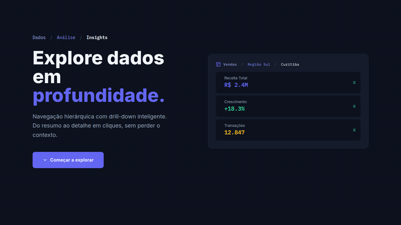
Before drill-down became a UX pattern, it was a database concept. OLAP cubes in the 90s let analysts slice multidimensional data — revenue by region, then by quarter, then by product line. The interaction was powerful but buried in enterprise tooling nobody outside of IT ever touched. The genius of modern drill-down is that it took that same hierarchical traversal and made it feel like browsing. Tableau changed the game around 2013 by making this exploration visual and immediate. Click a bar, the chart redraws. Click again, deeper. Power BI followed suit. Suddenly, progressive disclosure wasn't just a UI trick for hiding complexity — it became the primary navigation model for data itself. The hierarchy IS the interface. What we're designing now inherits all of that. Expandable rows, nested charts, breadcrumb trails back to the top level. The pattern works because it respects attention: show the summary first, let curiosity drive the depth. Not every user needs the granular view. Most don't. But the ones who do should never hit a wall.
When to Use
Reach for drill-down when your data has natural parent-child relationships and users arrive with different depth needs. Dashboards where executives want the headline number but analysts need the transaction-level detail. Reporting tools where a single flat table would be overwhelming. Anywhere you'd otherwise build five separate views that are really just zoom levels of the same dataset. Skip it if your hierarchy is shallow or artificial — two levels deep isn't drill-down, it's an accordion.
Design Principles
- Show the forest first — summary views should be genuinely useful on their own, not just a loading state for the real data
- Make depth reversible and obvious — breadcrumbs, back arrows, or animated transitions that preserve spatial memory of where you came from
- Maintain context during traversal — the parent metric should stay visible or accessible so users never lose the 'compared to what' frame
- Limit depth to what's meaningful — three to four levels max before you're just building a file explorer with extra steps
- Signal drillability affordances clearly — if something is expandable, it needs to look expandable before hover, not after
DESIGN.md
---
version: "alpha"
name: "Drill-Down Analytics"
description: "Drill-down analytics dashboard. Ideal for landing pages, modern websites. AI-ready template."
colors:
  primary: "#1A1A1A"
  secondary: "#4A4A4A"
  tertiary: "#0066FF"
  neutral: "#FFFFFF"
typography:
  h1:
    fontFamily: System UI stack
    fontSize: 2.25rem
    fontWeight: 700
  body-md:
    fontFamily: System UI stack
    fontSize: 1rem
    fontWeight: 400
  label-caps:
    fontFamily: System UI stack
    fontSize: 0.75rem
    fontWeight: 500
---

## Overview

Drill-down analytics dashboard. Ideal for landing pages, modern websites. AI-ready template. Before drill-down became a UX pattern, it was a database concept. OLAP cubes in the 90s let analysts slice multidimensional data — revenue by region, then by quarter, then by product line. The interaction was powerful but buried in enterprise tooling nobody outside of IT ever touched. The genius of modern drill-down is that it took that same hierarchical traversal and made it feel like browsing.

Tableau changed the game around 2013 by making this exploration visual and immediate. Click a bar, the chart redraws. Click again, deeper. Power BI followed suit. Suddenly, progressive disclosure wasn't just a UI trick for hiding complexity — it became the primary navigation model for data itself. The hierarchy IS the interface.

What we're designing now inherits all of that. Expandable rows, nested charts, breadcrumb trails back to the top level. The pattern works because it respects attention: show the summary first, let curiosity drive the depth. Not every user needs the granular view. Most don't. But the ones who do should never hit a wall.

- Density: 8/10 — Dense
- Variance: 4/10 — Moderate
- Motion: 6/10 — Expressive

- **Style:** BI/Analytics
- **Keywords:** Hierarchical data exploration, expandable sections, interactive drill-down paths, summary-to-detail flow, context preservation
- **Era:** 2020s Modern
- **Light/Dark:** ✓ Full / ✓ Full

## Colors

- Palette derived from style keywords and era context


## Typography

- **Display / Hero:** System UI stack (-apple-system, sans-serif) — Weight 700, tight tracking, used for headline impact
- **Body:** System UI stack (-apple-system, sans-serif) — Weight 400, 16px/1.6 line-height, max 72ch per line
- **UI Labels / Captions:** System UI stack (-apple-system, sans-serif) — 0.875rem, weight 500, slight letter-spacing
- **Monospace:** JetBrains Mono — Used for code, metadata, and technical values

Scale:
- Hero: clamp(2.5rem, 5vw, 4rem)
- H1: 2.25rem
- H2: 1.5rem
- Body: 1rem / 1.6
- Small: 0.875rem


## Layout

- **Grid:** CSS Grid primary. Max-width containment: 1280px centered with 1.5rem side padding.
- **Spacing rhythm:** Balanced. Base unit: 0.5rem (8px).
- **Section vertical gaps:** clamp(4rem, 8vw, 8rem).
- **Hero layout:** Split-screen (text left, visual right).
- **Feature sections:** Zig-zag alternating text+image rows. No 3-equal-columns.
- **Mobile collapse:** All multi-column layouts collapse below 768px. No horizontal overflow.
- **z-index contract:** base (0) / sticky-nav (100) / overlay (200) / modal (300) / toast (500).


## Elevation & Depth

Drill-down expand animations, breadcrumb click transitions, smooth detail reveal, level change smooth, data reload animation

- **Physics:** Spring — stiffness 120, damping 20. Confident, weighted transitions.
- **Entry animations:** Fade + translate-Y (16px → 0) over 480ms ease-out. Staggered cascades for lists: 100ms between items.
- **Hover states:** Scale(1.03) + shadow lift over 200ms.
- **Page transitions:** Fade + slide (300ms).
- **Performance:** Only transform and opacity animated. No layout-triggering properties.


## Shapes

Base corner radius: 24px. See rounded tokens in front matter for the full scale.


## Components

- **Primary Button:** Generously rounded (1.5rem) shape. Accent color fill. Hover: 8% darken + subtle lift shadow. Active: -1px translate tactile press. Font weight 600. No outer glows.
- **Secondary / Ghost Button:** Outline variant. 1.5px border in muted color. Text in primary color. Hover: subtle background fill.
- **Cards:** Generously rounded (1.5rem) corners. Surface background. Subtle shadow (0 2px 12px rgba(0,0,0,0.06)). 1px border stroke.
- **Inputs:** Label above input. 1px border stroke. Focus ring: 2px accent color offset 2px. Error text below in semantic red. No floating labels.
- **Navigation:** Primary surface background. Active item: accent color indicator. Font weight 500 when active.
- **Skeletons:** Shimmer animation matching component dimensions. No circular spinners.
- **Empty States:** Icon-based composition with descriptive text and action button.


## Do's and Don'ts

- No emojis in UI — use icon system only (Lucide, Heroicons)
- No pure black (#000000) — use off-black or charcoal variants
- No oversaturated accent colors (saturation cap: 80%)
- No 3-column equal-width feature layouts — use zig-zag or asymmetric grid
- No `h-screen` — use `min-h-[100dvh]`
- No AI copywriting clichés: "Elevate", "Seamless", "Unleash", "Next-Gen"
- No broken external image links — use picsum.photos or inline SVG
- No generic lorem ipsum in demos

- Do Breadcrumbs clear
- Do Back navigation easy
- Do Expand animation smooth
- Do Context preserved
- Do Mobile drill works
- Do Deep links supported


## Use Case

Landing pages, Modern websites
Technical Specs
CSS
breadcrumb nav with separators, details/summary for expand, transition for drill animation, position: sticky breadcrumb, nested grid layouts, smooth scroll to detail
Variables
--breadcrumb-separator: /, --expand-duration: 300ms, --level-indent: 24px, --back-button-size: 40px, --context-bar-height: 48px, --drill-transition: 300ms ease
Checklist
☐ Breadcrumbs clear, ☐ Back navigation easy, ☐ Expand animation smooth, ☐ Context preserved, ☐ Mobile drill works, ☐ Deep links supported
Colors
Effects
Drill-down expand animations, breadcrumb click transitions, smooth detail reveal, level change smooth, data reload animation
Light/Dark
✓ Full / ✓ Full
AI Prompt
Act as a Senior Frontend Engineer and Expert UI Designer.
Your task is to code a complete Landing Page on the first attempt.
- Landing Page Theme: <INSERT THEME>
- Sections to add: <INSERT SECTIONS>

Generate the final code immediately following these definitions:

## Style

- **Name:** Drill-Down Analytics
- **Type:** BI/Analytics
- **Keywords:** Hierarchical data exploration, expandable sections, interactive drill-down paths, summary-to-detail flow, context preservation
- **Era:** 2020s Modern
- **Light/Dark:** ✓ Full / ✓ Full

## Color Palette

- **Primary:** Primary brand, breadcrumb colors, drill-level indicator colors, hierarchy depth colors
- **Secondary:** Drill-down path indicator colors, level-specific colors, highlight colors for selected level, transition colors

## Visual Effects

Drill-down expand animations, breadcrumb click transitions, smooth detail reveal, level change smooth, data reload animation

## AI Visual Direction

Design a drill-down analytics dashboard. Use: breadcrumb navigation, expandable sections, summary-to-detail flow, back button prominent, level indicators, context preservation, hierarchical data display.

## CSS Technical

```css
breadcrumb nav with separators, details/summary for expand, transition for drill animation, position: sticky breadcrumb, nested grid layouts, smooth scroll to detail
```

## Design System Variables

```css
--breadcrumb-separator: /, --expand-duration: 300ms, --level-indent: 24px, --back-button-size: 40px, --context-bar-height: 48px, --drill-transition: 300ms ease
```

## Implementation Checklist

- ☐ Breadcrumbs clear
- ☐ Back navigation easy
- ☐ Expand animation smooth
- ☐ Context preserved
- ☐ Mobile drill works
- ☐ Deep links supported

## Execution Rules

1. Strictly follow the defined visual style.
2. Use high-quality inline SVG icons (Heroicons or Lucide style) — NEVER use emojis as icons.
3. Add `cursor-pointer` and smooth `hover` states (transition-all) on all interactive elements.
4. Required Page Structure:
   - Navbar (Logo + Links + CTA)
   - Hero Section (Impactful Headline + Subtitle + 2 buttons + 3D/Abstract visual element via CSS)
   - Features (3 cards with icons)
   - Testimonials (3 cards)
   - Pricing (3 tiers, highlight the middle one)
   - Final CTA
   - Full Footer with social links, privacy policy, terms of use, contact and SEO links.
5. All text content must be in English.
6. The visual must be CLEARLY distinct — do not create a "default Bootstrap" design. Force the use of the provided design system variables.
7. Use `<style>` tags in the head for custom classes (especially for complex backdrop-filter effects and animations) that Tailwind CDN doesn't cover.
8. Full Responsiveness: Layout must adapt perfectly to Mobile, Tablet and Desktop (vertical stack on mobile).
9. Include basic SEO, Viewport and Open Graph meta tags in `<head>`.
10. Footer must contain: Copyright 2026, Secondary navigation links and Social media icons.
11. Make the creative decisions needed to deliver the complete, functional result now.
Related
Last synced: 4/1/2026