Design Autoral Robusto
Design an authentic and robust landing page for an online store of authorial Brazilian design products, inspired by Sérgio Rodrigues. Ideal for landing pages, saas. AI-ready template.
Use case: Landing pages, SaaS
Historical Context
Brazilian authorial design didn't emerge from European modernism's clean-room logic. It grew from sawdust and sweat — from marceneiros in São Paulo workshops who understood that jacarandá has a temper, that freijó bends differently in humidity. Zanini de Zanine built his early reputation literally from demolition debris, turning reclaimed peroba rosa into furniture that felt both ancient and confrontational. That's the lineage. Jader Almeida took a different path but arrived somewhere adjacent. His work is precision-obsessed — CNC-milled curves that reference organic forms without mimicking them. There's a tension in his pieces between industrial capability and handcraft sensibility that feels uniquely Brazilian. Not Italian minimalism, not Scandinavian restraint. Something warmer, denser, more tactile. This tradition produces objects that refuse neutrality. The Campana brothers pushed it toward chaos; designers like Guilherme Wentz and Aristeu Pires pull it back toward discipline. But the through-line remains: material honesty, volumetric confidence, and an unapologetic rejection of the disposable.
When to Use
When the brand needs weight. Not heaviness — weight. The kind of visual authority that comes from craft conviction rather than trend-chasing. Deploy this system for studios positioning themselves as authors rather than service providers, for product brands where the making process is the story, for any context where 'premium' means substance over surface. Particularly effective when the audience understands that real luxury is slow, considered, and slightly imperfect.
Design Principles
- Material truth over decorative finish — let textures speak, let joints show, let weight be felt in the layout itself
- Volumetric presence — components occupy space with intention, generous padding, decisive proportions that reject timidity
- Warm density — dark woods, aged metals, deep neutrals; color palettes drawn from Brazilian hardwoods and oxidized bronze, never from trend forecasts
- Crafted asymmetry — grids that breathe unevenly, deliberate imbalance that signals human decision-making over algorithmic placement
- Slow reveal — progressive disclosure as design philosophy; information earns its entrance through scroll, interaction, or patience
DESIGN.md
---
version: "alpha"
name: "Design Autoral Robusto"
description: "Design an authentic and robust landing page for an online store of authorial Brazilian design products, inspired by Sérgio Rodrigues. Ideal for landing pages, saas. AI-ready template."
colors:
primary: "#4A2C2A"
secondary: "#F5F5DC"
tertiary: "#B8860B"
neutral: "#000000"
surface: "#006400"
accent: "#000080"
typography:
h1:
fontFamily: Lora
fontSize: 2.5rem
fontWeight: 700
body-md:
fontFamily: Lora
fontSize: 1rem
fontWeight: 400
rounded:
sm: 5px
md: 10px
lg: 15px
components:
button-primary:
backgroundColor: "{colors.primary}"
textColor: "{colors.neutral}"
rounded: "{rounded.sm}"
padding: 12px
---
## Overview
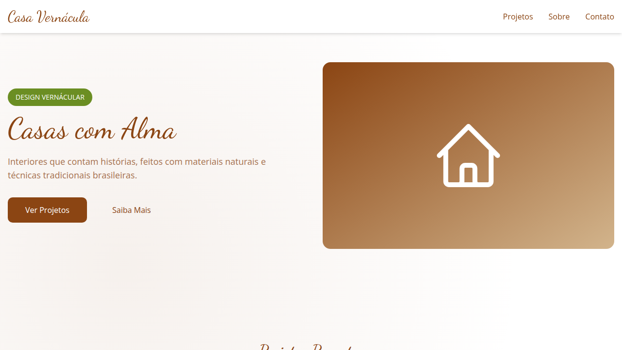
Design an authentic and robust landing page for an online store of authorial Brazilian design products, inspired by Sérgio Rodrigues. Ideal for landing pages, saas. AI-ready template. Brazilian authorial design didn't emerge from European modernism's clean-room logic. It grew from sawdust and sweat — from marceneiros in São Paulo workshops who understood that jacarandá has a temper, that freijó bends differently in humidity. Zanini de Zanine built his early reputation literally from demolition debris, turning reclaimed peroba rosa into furniture that felt both ancient and confrontational. That's the lineage.
Jader Almeida took a different path but arrived somewhere adjacent. His work is precision-obsessed — CNC-milled curves that reference organic forms without mimicking them. There's a tension in his pieces between industrial capability and handcraft sensibility that feels uniquely Brazilian. Not Italian minimalism, not Scandinavian restraint. Something warmer, denser, more tactile.
This tradition produces objects that refuse neutrality. The Campana brothers pushed it toward chaos; designers like Guilherme Wentz and Aristeu Pires pull it back toward discipline. But the through-line remains: material honesty, volumetric confidence, and an unapologetic rejection of the disposable.
- Density: 5/10 — Balanced
- Variance: 8/10 — Expressive
- Motion: 4/10 — Subtle
- **Style:** Authentic, Curated, Crafted, Unique
- **Keywords:** authorial design, Brazilian, crafted, unique, authentic, robust, natural materials, artistic, exclusive, curated
- **Era:** 2026+ Valor do Artesanato
- **Light/Dark:** ✓ Full / ✗ No
## Colors
- **Marrom Escuro** (#4A2C2A) — Dark surface, primary background
- **Bege** (#F5F5DC) — Secondary surface or text color
- **Dourado Envelhecido** (#B8860B) — Premium accent, decorative highlights
- **Preto** (#000000) — Dark surface, primary background
- **Verde Garrafa** (#006400) — Success states, positive indicators
- **Azul Marinho** (#000080) — Secondary accent
- **Cinza Chumbo** (#36454F) — Secondary text, borders, muted elements
- **Branco** (#FFFFFF) — Secondary surface
## Typography
- **Display / Hero:** Lora — Weight 700, tight tracking, used for headline impact
- **Body:** Lora — Weight 400, 16px/1.6 line-height, max 72ch per line
- **UI Labels / Captions:** Lora — 0.875rem, weight 500, slight letter-spacing
- **Monospace:** JetBrains Mono — Used for code, metadata, and technical values
Scale:
- Hero: clamp(2.5rem, 5vw, 4rem)
- H1: 2.25rem
- H2: 1.5rem
- Body: 1rem / 1.6
- Small: 0.875rem
## Layout
- **Grid:** CSS Grid primary. Max-width containment: 1280px centered with 1.5rem side padding.
- **Spacing rhythm:** Balanced. Base unit: 0.5rem (8px).
- **Section vertical gaps:** clamp(4rem, 8vw, 8rem).
- **Hero layout:** Asymmetric composition.
- **Feature sections:** Asymmetric grid with varied card sizes. No 3-equal-columns.
- **Mobile collapse:** All multi-column layouts collapse below 768px. No horizontal overflow.
- **z-index contract:** base (0) / sticky-nav (100) / overlay (200) / modal (300) / toast (500).
## Elevation & Depth
Texturas de madeira maciça e couro em elementos de UI, tipografia serifada clássica e sans-serif limpa, fotografias de produtos com foco em detalhes e acabamento, micro-interações de hover com efeito de "zoom" em detalhes do produto, transições de seção suaves e com efeito de "revelação" de camadas.
- **Physics:** Ease-out curves, 200-300ms duration. Smooth and predictable.
- **Entry animations:** Fade + translate-Y (16px → 0) over 420ms ease-out. Staggered cascades for lists: 80ms between items.
- **Hover states:** Subtle color shift + shadow adjustment over 200ms.
- **Page transitions:** Fade only (200ms).
- **Performance:** Only transform and opacity animated. No layout-triggering properties.
## Shapes
Base corner radius: 5px. See rounded tokens in front matter for the full scale.
## Components
- **Primary Button:** Rounded (5px) shape. Accent color fill. Hover: 8% darken + subtle lift shadow. Active: -1px translate tactile press. Font weight 600. No outer glows.
- **Secondary / Ghost Button:** Outline variant. 1.5px border in muted color. Text in primary color. Hover: subtle background fill.
- **Cards:** Rounded (5px) corners. Surface background. Subtle shadow (0 2px 12px rgba(0,0,0,0.06)). 1px border stroke.
- **Inputs:** Label above input. 1px border stroke. Focus ring: 2px accent color offset 2px. Error text below in semantic red. No floating labels.
- **Navigation:** Primary surface background. Active item: accent color indicator. Font weight 500 when active.
- **Skeletons:** Shimmer animation matching component dimensions. No circular spinners.
- **Empty States:** Icon-based composition with descriptive text and action button.
## Do's and Don'ts
- No emojis in UI — use icon system only (Lucide, Heroicons)
- No pure black (#000000) — use off-black or charcoal variants
- No oversaturated accent colors (saturation cap: 80%)
- No 3-column equal-width feature layouts — use zig-zag or asymmetric grid
- No `h-screen` — use `min-h-[100dvh]`
- No AI copywriting clichés: "Elevate", "Seamless", "Unleash", "Next-Gen"
- No broken external image links — use picsum.photos or inline SVG
- No generic lorem ipsum in demos
- Do Paleta de cores brasileira verificada
- Do Elementos orgânicos/naturais presentes
- Do Autenticidade cultural brasileira verificada
- Do Texturas artesanais/rústicas aplicadas
- Do Tipografia hierárquica clara
- Do Responsividade mobile verificada
- Do Contraste WCAG AA verificado
- Do Conteúdo em PT-BR verificado
## Use Case
Landing pages, SaaS
Technical Specs
CSS
background: #FFFFFF, color: #4A2C2A, border: 2px solid #B8860B, border-radius: 5px, font-family: "Lora, serif", transition: all 0.6s ease-in-out, .solid-wood-texture, .leather-detail, .product-zoom-hover.
Variables
--dark-brown: #4A2C2A, --beige-bg: #F5F5DC, --aged-gold: #B8860B, --black-text: #000000, --border-crafted: 2px solid #B8860B, --font-serif-classic: "Lora, serif", --font-sans-clean: "Inter, sans-serif", --layer-reveal-duration: 0.6s.
Checklist
☐ Paleta de cores brasileira verificada, ☐ Elementos orgânicos/naturais presentes, ☐ Autenticidade cultural brasileira verificada, ☐ Texturas artesanais/rústicas aplicadas, ☐ Tipografia hierárquica clara, ☐ Responsividade mobile verificada, ☐ Contraste WCAG AA verificado, ☐ Conteúdo em PT-BR verificado
Colors
Primary
Secondary
Effects
Texturas de madeira maciça e couro em elementos de UI, tipografia serifada clássica e sans-serif limpa, fotografias de produtos com foco em detalhes e acabamento, micro-interações de hover com efeito de "zoom" em detalhes do produto, transições de seção suaves e com efeito de "revelação" de camadas.
Light/Dark
✓ Full / ✗ No
AI Prompt
Act as a Senior Frontend Engineer and Expert UI Designer.
Your task is to code a complete Landing Page on the first attempt.
- Landing Page Theme: <INSERT THEME>
- Sections to add: <INSERT SECTIONS>

Generate the final code immediately following these definitions:

## Style

- **Name:** Design Autoral Robusto
- **Type:** Authentic, Curated, Crafted, Unique
- **Keywords:** authorial design, Brazilian, crafted, unique, authentic, robust, natural materials, artistic, exclusive, curated
- **Era:** 2026+ Valor do Artesanato
- **Light/Dark:** ✓ Full / ✗ No

## Color Palette

- **Primary:** Marrom Escuro #4A2C2A, Bege #F5F5DC, Dourado Envelhecido #B8860B, Preto #000000
- **Secondary:** Verde Garrafa #006400, Azul Marinho #000080, Cinza Chumbo #36454F, Branco #FFFFFF

## Visual Effects

Texturas de madeira maciça e couro em elementos de UI, tipografia serifada clássica e sans-serif limpa, fotografias de produtos com foco em detalhes e acabamento, micro-interações de hover com efeito de "zoom" em detalhes do produto, transições de seção suaves e com efeito de "revelação" de camadas.

## AI Visual Direction

Design an authentic and robust landing page for an online store of authorial Brazilian design products, inspired by Sérgio Rodrigues. Use: solid wood and leather textures in UI elements, classic serif and clean sans-serif typography, product photographs focusing on details and finish, product detail "zoom" hover micro-interactions, smooth "layer reveal" section transitions, dark brown and aged gold accents, crafted and exclusive feel.

## CSS Technical

```css
background: #FFFFFF, color: #4A2C2A, border: 2px solid #B8860B, border-radius: 5px, font-family: "Lora, serif", transition: all 0.6s ease-in-out, .solid-wood-texture, .leather-detail, .product-zoom-hover.
```

## Design System Variables

```css
--dark-brown: #4A2C2A, --beige-bg: #F5F5DC, --aged-gold: #B8860B, --black-text: #000000, --border-crafted: 2px solid #B8860B, --font-serif-classic: "Lora, serif", --font-sans-clean: "Inter, sans-serif", --layer-reveal-duration: 0.6s.
```

## Implementation Checklist

- ☐ Paleta de cores brasileira verificada
- ☐ Elementos orgânicos/naturais presentes
- ☐ Autenticidade cultural brasileira verificada
- ☐ Texturas artesanais/rústicas aplicadas
- ☐ Tipografia hierárquica clara
- ☐ Responsividade mobile verificada
- ☐ Contraste WCAG AA verificado
- ☐ Conteúdo em PT-BR verificado

## Execution Rules

1. Strictly follow the defined visual style.
2. Use high-quality inline SVG icons (Heroicons or Lucide style) — NEVER use emojis as icons.
3. Add `cursor-pointer` and smooth `hover` states (transition-all) on all interactive elements.
4. Required Page Structure:
   - Navbar (Logo + Links + CTA)
   - Hero Section (Impactful Headline + Subtitle + 2 buttons + 3D/Abstract visual element via CSS)
   - Features (3 cards with icons)
   - Testimonials (3 cards)
   - Pricing (3 tiers, highlight the middle one)
   - Final CTA
   - Full Footer with social links, privacy policy, terms of use, contact and SEO links.
5. All text content must be in English.
6. The visual must be CLEARLY distinct — do not create a "default Bootstrap" design. Force the use of the provided design system variables.
7. Use `<style>` tags in the head for custom classes (especially for complex backdrop-filter effects and animations) that Tailwind CDN doesn't cover.
8. Full Responsiveness: Layout must adapt perfectly to Mobile, Tablet and Desktop (vertical stack on mobile).
9. Include basic SEO, Viewport and Open Graph meta tags in `<head>`.
10. Footer must contain: Copyright 2026, Secondary navigation links and Social media icons.
11. Make the creative decisions needed to deliver the complete, functional result now.
Related
Last synced: 4/1/2026