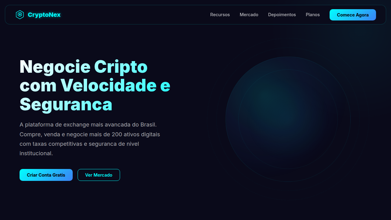
Crypto Exchange Plataforma
Crypto exchange landing, digital assets, charts, neon cyan, dark background, futuristic, security, wallets, trading. Ideal for landing pages, modern websites. AI-ready template.
Use case: Landing pages, Modern websites
Historical Context
Early crypto exchanges looked like Bloomberg terminals had a baby with a spreadsheet — and nobody questioned it. The assumption was: if you're trading crypto, you already know what a candlestick chart means. Binance leaned into this. Dense, information-rich, unapologetically complex. Power users loved it. Then Coinbase flipped the script. Stripped everything back. Made buying Bitcoin feel like buying a book on Amazon. That simplification opened the floodgates — suddenly your uncle was asking about Ethereum at Thanksgiving. The trade-off? Experienced traders felt patronized. There's a reason Coinbase Pro existed as a separate product for years. The real design challenge in crypto isn't the charts or the order books. It's trust. Web3 has a credibility problem — too many rug pulls, too many scammy interfaces with gradient buttons and rocket emojis. The platforms that win long-term are the ones that borrow visual language from traditional finance. Boring is safe. Safe is what people need when their money is on the line.
When to Use
Reach for this when you're building anything that touches digital asset trading — whether that's a full-blown exchange, a DeFi swap interface, a portfolio tracker, or a Web3 product that needs to display market data. Works for both the simplified retail experience and the dense pro-trader dashboard. Particularly useful if you need to communicate financial legitimacy while still feeling modern enough to belong in the crypto space.
Design Principles
- Information density is a feature, not a bug — but layer it progressively. Show the simple view first, let users unlock complexity.
- Borrow trust signals from traditional finance. Serif fonts in headers, muted color palettes, and generous whitespace all say 'we won't disappear with your funds.'
- Real-time data demands real-time feedback. Every price tick, every order fill, every wallet connection state needs immediate, unambiguous visual response.
- Color carries meaning — green up, red down, and never use those colors decoratively elsewhere. Violate this and you'll confuse traders in milliseconds.
- Dark mode isn't optional, it's primary. Traders stare at screens for hours. Light themes exist for marketing pages, not for the actual product.
DESIGN.md
---
version: "alpha"
name: "Crypto Exchange Plataforma"
description: "Crypto exchange landing, digital assets, charts, neon cyan, dark background, futuristic, security, wallets, trading. Ideal for landing pages, modern websites. AI-ready template."
colors:
  primary: "#00FFFF"
  secondary: "#1A0A2E"
  tertiary: "#000000"
  neutral: "#FFFFFF"
  surface: "#3B82F6"
  accent: "#00FF88"
typography:
  h1:
    fontFamily: Inter
    fontSize: 2.5rem
    fontWeight: 700
  body-md:
    fontFamily: Inter
    fontSize: 1rem
    fontWeight: 400
rounded:
  sm: 12px
  md: 24px
  lg: 36px
components:
  button-primary:
    backgroundColor: "{colors.primary}"
    textColor: "{colors.neutral}"
    rounded: "{rounded.sm}"
    padding: 12px
---

## Overview

Crypto exchange landing, digital assets, charts, neon cyan, dark background, futuristic, security, wallets, trading. Ideal for landing pages, modern websites. AI-ready template. Early crypto exchanges looked like Bloomberg terminals had a baby with a spreadsheet — and nobody questioned it. The assumption was: if you're trading crypto, you already know what a candlestick chart means. Binance leaned into this. Dense, information-rich, unapologetically complex. Power users loved it.

Then Coinbase flipped the script. Stripped everything back. Made buying Bitcoin feel like buying a book on Amazon. That simplification opened the floodgates — suddenly your uncle was asking about Ethereum at Thanksgiving. The trade-off? Experienced traders felt patronized. There's a reason Coinbase Pro existed as a separate product for years.

The real design challenge in crypto isn't the charts or the order books. It's trust. Web3 has a credibility problem — too many rug pulls, too many scammy interfaces with gradient buttons and rocket emojis. The platforms that win long-term are the ones that borrow visual language from traditional finance. Boring is safe. Safe is what people need when their money is on the line.

- Density: 5/10 — Balanced
- Variance: 4/10 — Moderate
- Motion: 4/10 — Subtle

- **Style:** Futuristic, Dark, Neon
- **Keywords:** crypto exchange landing, digital assets, charts, neon cyan, dark background, futuristic, security, wallets, trading
- **Era:** 2020s Crypto
- **Light/Dark:** ✗ No / ✓ Full

## Colors

- **Neon Cyan** (#00FFFF) — Accent highlight, links and focus states
- **Dark Purple** (#1A0A2E) — Dark surface, primary background
- **Black** (#000000) — Dark surface, primary background
- **White** (#FFFFFF) — Secondary surface
- **Electric Blue** (#3B82F6) — Secondary accent
- **Neon Green** (#00FF88) — Success states, positive indicators


## Typography

- **Display / Hero:** Inter — Weight 700, tight tracking, used for headline impact
- **Body:** Inter — Weight 400, 16px/1.6 line-height, max 72ch per line
- **UI Labels / Captions:** Inter — 0.875rem, weight 500, slight letter-spacing
- **Monospace:** JetBrains Mono — Used for code, metadata, and technical values

Scale:
- Hero: clamp(2.5rem, 5vw, 4rem)
- H1: 2.25rem
- H2: 1.5rem
- Body: 1rem / 1.6
- Small: 0.875rem


## Layout

- **Grid:** CSS Grid primary. Max-width containment: 1280px centered with 1.5rem side padding.
- **Spacing rhythm:** Balanced. Base unit: 0.5rem (8px).
- **Section vertical gaps:** clamp(4rem, 8vw, 8rem).
- **Hero layout:** Split-screen (text left, visual right).
- **Feature sections:** Zig-zag alternating text+image rows. No 3-equal-columns.
- **Mobile collapse:** All multi-column layouts collapse below 768px. No horizontal overflow.
- **z-index contract:** base (0) / sticky-nav (100) / overlay (200) / modal (300) / toast (500).


## Elevation & Depth

Fundo escuro com detalhes neon em ciano, cards de moedas com preço/variação/botão trade, gráfico line em SVG animado, hover com glow neon em botões, micro animações futuristas.

- **Physics:** Ease-out curves, 200-300ms duration. Smooth and predictable.
- **Entry animations:** Fade + translate-Y (16px → 0) over 420ms ease-out. Staggered cascades for lists: 80ms between items.
- **Hover states:** Subtle color shift + shadow adjustment over 200ms.
- **Page transitions:** Fade only (200ms).
- **Performance:** Only transform and opacity animated. No layout-triggering properties.


## Shapes

Base corner radius: 12px. See rounded tokens in front matter for the full scale.


## Components

- **Primary Button:** Rounded (12px) shape. Accent color fill. Hover: 8% darken + subtle lift shadow. Active: -1px translate tactile press. Font weight 600. No outer glows.
- **Secondary / Ghost Button:** Outline variant. 1.5px border in muted color. Text in primary color. Hover: subtle background fill.
- **Cards:** Rounded (12px) corners. Surface background. Subtle shadow (0 2px 12px rgba(0,0,0,0.06)). 1px border stroke.
- **Inputs:** Label above input. 1px border stroke. Focus ring: 2px accent color offset 2px. Error text below in semantic red. No floating labels.
- **Navigation:** Primary surface background. Active item: accent color indicator. Font weight 500 when active.
- **Skeletons:** Shimmer animation matching component dimensions. No circular spinners.
- **Empty States:** Icon-based composition with descriptive text and action button.


## Do's and Don'ts

- No emojis in UI — use icon system only (Lucide, Heroicons)
- No pure white (#FFFFFF) backgrounds — use off-white or dark surfaces
- No oversaturated accent colors (saturation cap: 80%)
- No 3-column equal-width feature layouts — use zig-zag or asymmetric grid
- No `h-screen` — use `min-h-[100dvh]`
- No AI copywriting clichés: "Elevate", "Seamless", "Unleash", "Next-Gen"
- No broken external image links — use picsum.photos or inline SVG
- No generic lorem ipsum in demos

- Do Navbar + Hero
- Do Lista de Criptos + Gráfico/Estatísticas
- Do Segurança + App/Plataforma
- Do CTA Final
- Do Meta tags SEO
- Do Foco em segurança e facilidade PT-BR
- Do Ícones SVG (moedas
- Do cadeados
- Do carteiras)
- Do Contraste forte texto/fundo
- Do Estética futurista coerente.


## Use Case

Landing pages, Modern websites
Technical Specs
CSS
background: #0A0A1A, color: #FFFFFF, text-shadow: 0 0 10px rgba(0,255,255,0.5), box-shadow: 0 0 20px rgba(0,255,255,0.15), border-radius: 12px, font-family: 'Inter, sans-serif', SVG animated line chart, neon glow hover effects.
Variables
--neon-cyan: #00FFFF, --dark-purple: #1A0A2E, --black: #000000, --white: #FFFFFF, --glow-cyan: rgba(0,255,255,0.15), --font-crypto: 'Inter, sans-serif'.
Checklist
☐ Navbar + Hero, ☐ Lista de Criptos + Gráfico/Estatísticas, ☐ Segurança + App/Plataforma, ☐ CTA Final, ☐ Meta tags SEO, ☐ Foco em segurança e facilidade PT-BR, ☐ Ícones SVG (moedas, cadeados, carteiras), ☐ Contraste forte texto/fundo, ☐ Estética futurista coerente.
Colors
Primary
Secondary
Effects
Fundo escuro com detalhes neon em ciano, cards de moedas com preço/variação/botão trade, gráfico line em SVG animado, hover com glow neon em botões, micro animações futuristas.
Light/Dark
✗ No / ✓ Full
AI Prompt
Act as a Senior Frontend Engineer and Expert UI Designer.
Your task is to code a complete Landing Page on the first attempt.
- Landing Page Theme: <INSERT THEME>
- Sections to add: <INSERT SECTIONS>

Generate the final code immediately following these definitions:

## Style

- **Name:** Crypto Exchange Plataforma
- **Type:** Futuristic, Dark, Neon
- **Keywords:** crypto exchange landing, digital assets, charts, neon cyan, dark background, futuristic, security, wallets, trading
- **Era:** 2020s Crypto
- **Light/Dark:** ✗ No / ✓ Full

## Color Palette

- **Primary:** Neon Cyan #00FFFF, Dark Purple #1A0A2E, Black #000000
- **Secondary:** White #FFFFFF, Electric Blue #3B82F6, Neon Green #00FF88

## Visual Effects

Fundo escuro com detalhes neon em ciano, cards de moedas com preço/variação/botão trade, gráfico line em SVG animado, hover com glow neon em botões, micro animações futuristas.

## AI Visual Direction

crypto exchange landing, digital assets, charts, neon cyan, dark background, futuristic, security, wallets, trading.

## CSS Technical

```css
background: #0A0A1A, color: #FFFFFF, text-shadow: 0 0 10px rgba(0,255,255,0.5), box-shadow: 0 0 20px rgba(0,255,255,0.15), border-radius: 12px, font-family: 'Inter, sans-serif', SVG animated line chart, neon glow hover effects.
```

## Design System Variables

```css
--neon-cyan: #00FFFF, --dark-purple: #1A0A2E, --black: #000000, --white: #FFFFFF, --glow-cyan: rgba(0,255,255,0.15), --font-crypto: 'Inter, sans-serif'.
```

## Implementation Checklist

- ☐ Navbar + Hero
- ☐ Lista de Criptos + Gráfico/Estatísticas
- ☐ Segurança + App/Plataforma
- ☐ CTA Final
- ☐ Meta tags SEO
- ☐ Foco em segurança e facilidade PT-BR
- ☐ Ícones SVG (moedas
- cadeados
- carteiras)
- ☐ Contraste forte texto/fundo
- ☐ Estética futurista coerente.

## Execution Rules

1. Strictly follow the defined visual style.
2. Use high-quality inline SVG icons (Heroicons or Lucide style) — NEVER use emojis as icons.
3. Add `cursor-pointer` and smooth `hover` states (transition-all) on all interactive elements.
4. Required Page Structure:
   - Navbar (Logo + Links + CTA)
   - Hero Section (Impactful Headline + Subtitle + 2 buttons + 3D/Abstract visual element via CSS)
   - Features (3 cards with icons)
   - Testimonials (3 cards)
   - Pricing (3 tiers, highlight the middle one)
   - Final CTA
   - Full Footer with social links, privacy policy, terms of use, contact and SEO links.
5. All text content must be in English.
6. The visual must be CLEARLY distinct — do not create a "default Bootstrap" design. Force the use of the provided design system variables.
7. Use `<style>` tags in the head for custom classes (especially for complex backdrop-filter effects and animations) that Tailwind CDN doesn't cover.
8. Full Responsiveness: Layout must adapt perfectly to Mobile, Tablet and Desktop (vertical stack on mobile).
9. Include basic SEO, Viewport and Open Graph meta tags in `<head>`.
10. Footer must contain: Copyright 2026, Secondary navigation links and Social media icons.
11. Make the creative decisions needed to deliver the complete, functional result now.
Related
Last synced: 4/1/2026