Construtivismo de Dados Dinâmicos
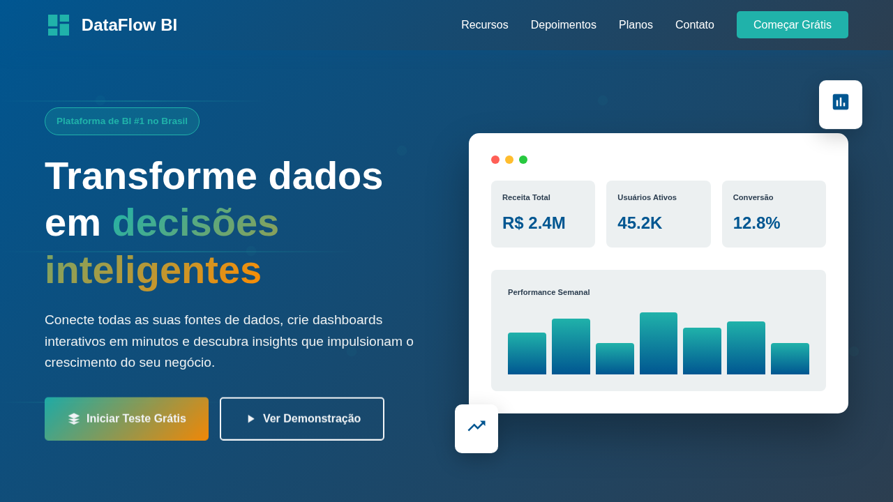
Data-driven and dynamic constructivist landing page for a business intelligence platform. Ideal for landing pages, modern websites. AI-ready template.
Use case: Landing pages, Modern websites
Historical Context
Russian Constructivism wasn't decoration. It was ideology made visible — geometry as argument, color as hierarchy, composition as propaganda machine. When El Lissitzky arranged shapes on a page, every angle carried weight. Every red square meant something. That ruthless clarity is exactly what data visualization needs and rarely gets. The parallel is almost too clean. Constructivists solved the problem of communicating complex political ideas to semi-literate populations through pure visual structure. We're solving the same problem — communicating complex data relationships to time-starved analysts through dashboards they'll glance at for six seconds. Rodchenko's diagonal compositions created immediate visual tension and reading order. A well-built dashboard does identical work: directing the eye, establishing hierarchy, making the important number impossible to miss. What makes this lineage powerful rather than decorative is the underlying discipline. Constructivism rejected ornamentation. Every element justified its existence through function. Apply that same rigor to a BI interface and you strip away the chart junk, the gratuitous gradients, the seven-color legends nobody reads. What remains is data, structured with geometric precision, colored with intention.
When to Use
Reach for this when your dashboard serves power users who live inside data all day. Analytics platforms, BI tools, real-time monitoring — environments where density is a feature, not a bug. The Constructivist approach earns its keep when you need to layer multiple data dimensions without visual collapse. It fails in consumer-facing contexts where warmth matters more than precision. Don't use it for onboarding flows or marketing dashboards. Use it where the audience respects structure and reads hierarchy instinctively.
Design Principles
- Geometric hierarchy over decorative flourish — every shape defines a data relationship, never an aesthetic whim
- Limited, high-contrast palette where each color carries semantic meaning: red alerts, not red accents
- Diagonal tension and asymmetric grids to create natural reading paths through dense information
- Typography as structural element — weight and scale do the work that borders and boxes pretend to do
- Negative space as active composition tool, not leftover emptiness — silence between data points is information too
DESIGN.md
---
version: "alpha"
name: "Construtivismo de Dados Dinâmicos"
description: "Data-driven and dynamic constructivist landing page for a business intelligence platform. Ideal for landing pages, modern websites. AI-ready template."
colors:
  primary: "#005691"
  secondary: "#FFFFFF"
  tertiary: "#2C3E50"
  neutral: "#20B2AA"
  surface: "#FF8C00"
  accent: "#8A2BE2"
typography:
  h1:
    fontFamily: Roboto Mono
    fontSize: 2.5rem
    fontWeight: 700
  body-md:
    fontFamily: Roboto Mono
    fontSize: 1rem
    fontWeight: 400
components:
  button-primary:
    backgroundColor: "{colors.primary}"
    textColor: "{colors.neutral}"
    padding: 12px
---

## Overview

Data-driven and dynamic constructivist landing page for a business intelligence platform. Ideal for landing pages, modern websites. AI-ready template. Russian Constructivism wasn't decoration. It was ideology made visible — geometry as argument, color as hierarchy, composition as propaganda machine. When El Lissitzky arranged shapes on a page, every angle carried weight. Every red square meant something. That ruthless clarity is exactly what data visualization needs and rarely gets.

The parallel is almost too clean. Constructivists solved the problem of communicating complex political ideas to semi-literate populations through pure visual structure. We're solving the same problem — communicating complex data relationships to time-starved analysts through dashboards they'll glance at for six seconds. Rodchenko's diagonal compositions created immediate visual tension and reading order. A well-built dashboard does identical work: directing the eye, establishing hierarchy, making the important number impossible to miss.

What makes this lineage powerful rather than decorative is the underlying discipline. Constructivism rejected ornamentation. Every element justified its existence through function. Apply that same rigor to a BI interface and you strip away the chart junk, the gratuitous gradients, the seven-color legends nobody reads. What remains is data, structured with geometric precision, colored with intention.

- Density: 8/10 — Dense
- Variance: 2/10 — Structured
- Motion: 4/10 — Subtle

- **Style:** Data-Driven, Dynamic, Structured
- **Keywords:** data analysis, business intelligence, dashboard, visualization, structured, dynamic, efficient, precise, modern, analytical
- **Era:** 2026+ Inteligência de Dados
- **Light/Dark:** ✓ Full / ✗ No

## Colors

- **Azul Profundo** (#005691) — Primary background surface
- **Branco** (#FFFFFF) — Light surface, card backgrounds
- **Cinza Escuro** (#2C3E50) — Dark surface, primary background
- **Verde Água** (#20B2AA) — Supporting palette color
- **Laranja** (#FF8C00) — Warm accent, call-to-action secondary
- **Roxo** (#8A2BE2) — Accent color, emphasis elements
- **Amarelo** (#FFD700) — Warning states, attention indicators
- **Cinza Claro** (#ECF0F1) — Secondary text, borders, muted elements


## Typography

- **Display / Hero:** Roboto Mono — Weight 700, tight tracking, used for headline impact
- **Body:** Roboto Mono — Weight 400, 16px/1.6 line-height, max 72ch per line
- **UI Labels / Captions:** Roboto Mono — 0.875rem, weight 500, slight letter-spacing
- **Monospace:** Roboto Mono — Used for code, metadata, and technical values

Scale:
- Hero: clamp(2.5rem, 5vw, 4rem)
- H1: 2.25rem
- H2: 1.5rem
- Body: 1rem / 1.6
- Small: 0.875rem


## Layout

- **Grid:** CSS Grid primary. Max-width containment: 1280px centered with 1.5rem side padding.
- **Spacing rhythm:** Balanced. Base unit: 0.5rem (8px).
- **Section vertical gaps:** clamp(4rem, 8vw, 8rem).
- **Hero layout:** Split-screen (text left, visual right).
- **Feature sections:** Zig-zag alternating text+image rows. No 3-equal-columns.
- **Mobile collapse:** All multi-column layouts collapse below 768px. No horizontal overflow.
- **z-index contract:** base (0) / sticky-nav (100) / overlay (200) / modal (300) / toast (500).


## Elevation & Depth

Gráficos e visualizações de dados geométricas e animadas, layouts assimétricos com foco em fluxo de informação, tipografia sans-serif técnica, micro-interações de filtro e drill-down, transições de dados fluidas e rápidas.

- **Physics:** Ease-out curves, 200-300ms duration. Smooth and predictable.
- **Entry animations:** Fade + translate-Y (16px → 0) over 420ms ease-out. Staggered cascades for lists: 80ms between items.
- **Hover states:** Subtle color shift + shadow adjustment over 200ms.
- **Page transitions:** Fade only (200ms).
- **Performance:** Only transform and opacity animated. No layout-triggering properties.


## Shapes

Base corner radius: 8px. See rounded tokens in front matter for the full scale.


## Components

- **Primary Button:** Subtly rounded (0.5rem) shape. Accent color fill. Hover: 8% darken + subtle lift shadow. Active: -1px translate tactile press. Font weight 600. No outer glows.
- **Secondary / Ghost Button:** Outline variant. 1.5px border in muted color. Text in primary color. Hover: subtle background fill.
- **Cards:** Subtly rounded (0.5rem) corners. Surface background. Subtle shadow (0 2px 12px rgba(0,0,0,0.06)). 1px border stroke.
- **Inputs:** Label above input. 1px border stroke. Focus ring: 2px accent color offset 2px. Error text below in semantic red. No floating labels.
- **Navigation:** Primary surface background. Active item: accent color indicator. Font weight 500 when active.
- **Skeletons:** Shimmer animation matching component dimensions. No circular spinners.
- **Empty States:** Icon-based composition with descriptive text and action button.


## Do's and Don'ts

- No emojis in UI — use icon system only (Lucide, Heroicons)
- No pure black (#000000) — use off-black or charcoal variants
- No oversaturated accent colors (saturation cap: 80%)
- No 3-column equal-width feature layouts — use zig-zag or asymmetric grid
- No `h-screen` — use `min-h-[100dvh]`
- No AI copywriting clichés: "Elevate", "Seamless", "Unleash", "Next-Gen"
- No broken external image links — use picsum.photos or inline SVG
- No generic lorem ipsum in demos

- Do Gráficos geométricos animados
- Do Layouts assimétricos
- Do Tipografia sans-serif técnica
- Do Micro-interações de filtro
- Do Transições de dados fluidas
- Do Foco em fluxo de informação.


## Use Case

Landing pages, Modern websites
Technical Specs
CSS
background: #FFFFFF, color: #2C3E50, border-right: 3px solid #20B2AA, transform: rotate(1deg), font-family: "Roboto Mono, monospace", transition: all 0.3s ease-in-out, .data-chart-animated, .asymmetrical-layout, .filter-interaction.
Variables
--deep-blue: #005691, --white-bg: #FFFFFF, --dark-text: #2C3E50, --teal-accent: #20B2AA, --border-accent: 3px solid #20B2AA, --font-mono: "Roboto Mono, monospace", --rotate-angle: 1deg.
Checklist
☐ Gráficos geométricos animados, ☐ Layouts assimétricos, ☐ Tipografia sans-serif técnica, ☐ Micro-interações de filtro, ☐ Transições de dados fluidas, ☐ Foco em fluxo de informação.
Colors
Primary
Secondary
Effects
Gráficos e visualizações de dados geométricas e animadas, layouts assimétricos com foco em fluxo de informação, tipografia sans-serif técnica, micro-interações de filtro e drill-down, transições de dados fluidas e rápidas.
Light/Dark
✓ Full / ✗ No
AI Prompt
Act as a Senior Frontend Engineer and Expert UI Designer.
Your task is to code a complete Landing Page on the first attempt.
- Landing Page Theme: <INSERT THEME>
- Sections to add: <INSERT SECTIONS>

Generate the final code immediately following these definitions:

## Style

- **Name:** Construtivismo de Dados Dinâmicos
- **Type:** Data-Driven, Dynamic, Structured
- **Keywords:** data analysis, business intelligence, dashboard, visualization, structured, dynamic, efficient, precise, modern, analytical
- **Era:** 2026+ Inteligência de Dados
- **Light/Dark:** ✓ Full / ✗ No

## Color Palette

- **Primary:** Azul Profundo #005691, Branco #FFFFFF, Cinza Escuro #2C3E50, Verde Água #20B2AA
- **Secondary:** Laranja #FF8C00, Roxo #8A2BE2, Amarelo #FFD700, Cinza Claro #ECF0F1

## Visual Effects

Gráficos e visualizações de dados geométricas e animadas, layouts assimétricos com foco em fluxo de informação, tipografia sans-serif técnica, micro-interações de filtro e drill-down, transições de dados fluidas e rápidas.

## AI Visual Direction

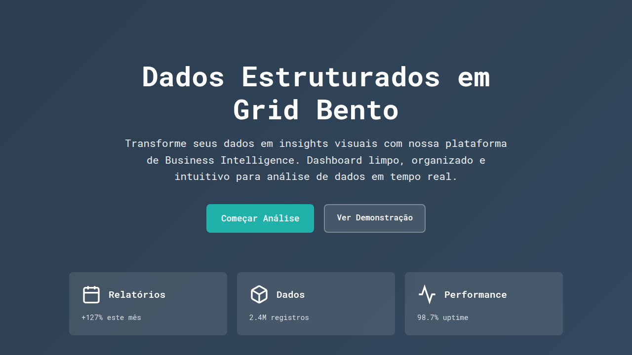
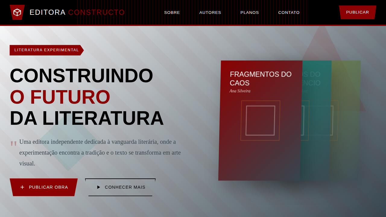
Design a data-driven and dynamic constructivist landing page for a business intelligence platform. Use: animated geometric data visualizations, asymmetrical layouts focusing on information flow, technical sans-serif typography, filter and drill-down micro-interactions, fluid and fast data transitions, deep blue and teal accents, precise and analytical feel.

## CSS Technical

```css
background: #FFFFFF, color: #2C3E50, border-right: 3px solid #20B2AA, transform: rotate(1deg), font-family: "Roboto Mono, monospace", transition: all 0.3s ease-in-out, .data-chart-animated, .asymmetrical-layout, .filter-interaction.
```

## Design System Variables

```css
--deep-blue: #005691, --white-bg: #FFFFFF, --dark-text: #2C3E50, --teal-accent: #20B2AA, --border-accent: 3px solid #20B2AA, --font-mono: "Roboto Mono, monospace", --rotate-angle: 1deg.
```

## Implementation Checklist

- ☐ Gráficos geométricos animados
- ☐ Layouts assimétricos
- ☐ Tipografia sans-serif técnica
- ☐ Micro-interações de filtro
- ☐ Transições de dados fluidas
- ☐ Foco em fluxo de informação.

## Execution Rules

1. Strictly follow the defined visual style.
2. Use high-quality inline SVG icons (Heroicons or Lucide style) — NEVER use emojis as icons.
3. Add `cursor-pointer` and smooth `hover` states (transition-all) on all interactive elements.
4. Required Page Structure:
   - Navbar (Logo + Links + CTA)
   - Hero Section (Impactful Headline + Subtitle + 2 buttons + 3D/Abstract visual element via CSS)
   - Features (3 cards with icons)
   - Testimonials (3 cards)
   - Pricing (3 tiers, highlight the middle one)
   - Final CTA
   - Full Footer with social links, privacy policy, terms of use, contact and SEO links.
5. All text content must be in English.
6. The visual must be CLEARLY distinct — do not create a "default Bootstrap" design. Force the use of the provided design system variables.
7. Use `<style>` tags in the head for custom classes (especially for complex backdrop-filter effects and animations) that Tailwind CDN doesn't cover.
8. Full Responsiveness: Layout must adapt perfectly to Mobile, Tablet and Desktop (vertical stack on mobile).
9. Include basic SEO, Viewport and Open Graph meta tags in `<head>`.
10. Footer must contain: Copyright 2026, Secondary navigation links and Social media icons.
11. Make the creative decisions needed to deliver the complete, functional result now.
Related
Last synced: 4/1/2026