ClearInvoice SaaS Hero
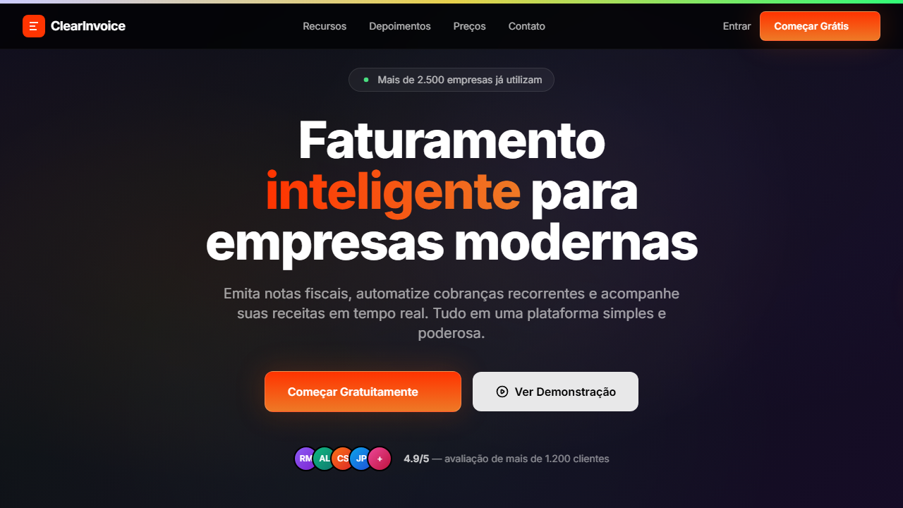
SaaS hero with HLS background video at full opacity no overlay. Ideal for saas de faturamento, plataformas de billing, ferramentas de pagamento, gestão financeira. AI-ready template.
Use case: SaaS de faturamento, Platforms de billing, Tools de pagamento, Gestão financeira
Historical Context
The clean SaaS hero for financial products didn't emerge from aesthetic preference — it emerged from necessity. When Stripe launched their first marketing site, they understood something fundamental: people handing over banking credentials need to feel safe before they feel excited. The entire fintech design language shifted away from the cluttered dashboards and stock-photo-heavy layouts of legacy billing tools toward radical simplicity. This wasn't minimalism for minimalism's sake. Every removed element was a trust signal. White space said 'we have nothing to hide.' A single gradient button said 'there's one thing to do here, and it's safe.' The futuristic tech aesthetic — subtle glows, clean geometry, restrained color palettes — communicated competence without intimidation. Companies like Paddle, Chargebee, and FreshBooks followed this pattern because conversion data backed it up: fewer visual elements meant higher signup rates for money-handling products. The clear invoice hero became a genre unto itself. One headline, one subline, one CTA, maybe a floating UI mockup. It works because financial SaaS lives or dies on perceived reliability, and visual noise is the enemy of perceived reliability.
When to Use
Deploy this pattern when your product touches money and your audience needs confidence before curiosity. Ideal for invoicing platforms, billing tools, payment processors, and subscription management products where the primary conversion barrier is trust, not awareness. Works best when you have a strong single value proposition that doesn't need supporting evidence above the fold. Skip it if your product requires explanation — this hero rewards brands that can say what they do in under eight words.
Design Principles
- One gradient button, one action — financial products convert on clarity, not choice overload
- Generous white space as a trust mechanism — emptiness signals transparency when you're asking for payment details
- Restrained color palette with a single accent gradient — too many colors read as carnival, not bank
- Typography hierarchy does all the heavy lifting — if your headline needs visual support to land, rewrite the headline
- Floating UI elements over clean backgrounds — show the product without cluttering the emotional space around the CTA
DESIGN.md
---
version: "alpha"
name: "ClearInvoice SaaS Hero"
description: "SaaS hero with HLS background video at full opacity no overlay. Ideal for saas de faturamento, plataformas de billing, ferramentas de pagamento, gestão financeira. AI-ready template."
colors:
  primary: "#000000"
  secondary: "#FFFFFF"
  tertiary: "#FF3300"
  neutral: "#EE7926"
  surface: "#EA580C"
  accent: "#e7d04c"
typography:
  h1:
    fontFamily: Switzer
    fontSize: 2.5rem
    fontWeight: 700
  body-md:
    fontFamily: Switzer
    fontSize: 1rem
    fontWeight: 400
components:
  button-primary:
    backgroundColor: "{colors.primary}"
    textColor: "{colors.neutral}"
    padding: 12px
---

## Overview

SaaS hero with HLS background video at full opacity no overlay. Ideal for saas de faturamento, plataformas de billing, ferramentas de pagamento, gestão financeira. AI-ready template. The clean SaaS hero for financial products didn't emerge from aesthetic preference — it emerged from necessity. When Stripe launched their first marketing site, they understood something fundamental: people handing over banking credentials need to feel safe before they feel excited. The entire fintech design language shifted away from the cluttered dashboards and stock-photo-heavy layouts of legacy billing tools toward radical simplicity.

This wasn't minimalism for minimalism's sake. Every removed element was a trust signal. White space said 'we have nothing to hide.' A single gradient button said 'there's one thing to do here, and it's safe.' The futuristic tech aesthetic — subtle glows, clean geometry, restrained color palettes — communicated competence without intimidation. Companies like Paddle, Chargebee, and FreshBooks followed this pattern because conversion data backed it up: fewer visual elements meant higher signup rates for money-handling products.

The clear invoice hero became a genre unto itself. One headline, one subline, one CTA, maybe a floating UI mockup. It works because financial SaaS lives or dies on perceived reliability, and visual noise is the enemy of perceived reliability.

- Density: 5/10 — Balanced
- Variance: 4/10 — Moderate
- Motion: 8/10 — Cinematic

- **Style:** SaaS, Gradient CTA, Video HLS, Social Proof
- **Keywords:** SaaS, faturamento, gradient button, HLS video, social proof, avatars, glow effect, Switzer font, barra gradiente topo, inner stroke
- **Era:** 2024-2026 SaaS Conversion-Focused
- **Light/Dark:** ✗ Not Recommended / ✓ Full

## Colors

- **Preto** (#000000) — Dark surface, primary background
- **Branco** (#FFFFFF) — Light surface, card backgrounds
- **Laranja Gradiente from** (#FF3300) — Warm accent, call-to-action secondary
- **to** (#EE7926) — Supporting palette color
- **** (rgba(255,255,255,0.9)) — Supporting palette color
- **Laranja Glow** (#EA580C) — Warm accent, call-to-action secondary
- **Gradiente Topo from** (#ccf) — Extended palette, decorative use
- **via** (#e7d04c) — Extended palette, decorative use
- **to** (#31fb78) — Extended palette, decorative use
- **Borda Interna** (rgba(255,255,255,0.2)) — Extended palette, decorative use
- **Borda Preta** (rgba(0,0,0,0.05)) — Extended palette, decorative use


## Typography

- **Display / Hero:** Switzer — Weight 700, tight tracking, used for headline impact
- **Accent:** Geist — Used for decorative or emphasis text
- **Body:** Switzer — Weight 400, 16px/1.6 line-height, max 72ch per line
- **UI Labels / Captions:** Switzer — 0.875rem, weight 500, slight letter-spacing
- **Monospace:** JetBrains Mono — Used for code, metadata, and technical values

Scale:
- Hero: clamp(2.5rem, 5vw, 4rem)
- H1: 2.25rem
- H2: 1.5rem
- Body: 1rem / 1.6
- Small: 0.875rem


## Layout

- **Grid:** CSS Grid primary. Max-width containment: 1280px centered with 1.5rem side padding.
- **Spacing rhythm:** Balanced. Base unit: 0.5rem (8px).
- **Section vertical gaps:** clamp(4rem, 8vw, 8rem).
- **Hero layout:** Split-screen (text left, visual right).
- **Feature sections:** Zig-zag alternating text+image rows. No 3-equal-columns.
- **Mobile collapse:** All multi-column layouts collapse below 768px. No horizontal overflow.
- **z-index contract:** base (0) / sticky-nav (100) / overlay (200) / modal (300) / toast (500).


## Elevation & Depth

VÍDEO: Stream HLS de vídeo abstrato com formas fluidas e orgânicas em movimento. Tons escuros com destaques luminosos sutis, criando textura visual dinâmica. Exibido em opacity 100% sem overlay escuro, o vídeo serve como fundo imersivo total. Aspect ratio widescreen (~16:9 baseado no storyboard 284x160px), duração ~14s em loop contínuo. | EFEITOS CSS: Vídeo de fundo HLS (autoplay, loop, muted) com opacity 100% sem overlay, barra gradiente 5px no topo (from #ccf via #e7d04c to #31fb78), botão primário com gradiente laranja e glow (blur-lg opacity-20 atrás), inner stroke 1.5px (border-white/20), hover scale 1.05 com glow opacity-60 e seta deslizante, botão secundário bg-white/90 backdrop-blur, social proof com avatars sobrepostos, animações staggered de entrada

- **Physics:** Spring — stiffness 120, damping 20. Confident, weighted transitions.
- **Entry animations:** Fade + translate-Y (16px → 0) over 540ms ease-out. Staggered cascades for lists: 120ms between items.
- **Hover states:** Scale(1.03) + shadow lift over 200ms.
- **Page transitions:** Fade + slide (300ms).
- **Performance:** Only transform and opacity animated. No layout-triggering properties.


## Shapes

Base corner radius: 8px. See rounded tokens in front matter for the full scale.


## Components

- **Primary Button:** Subtly rounded (0.5rem) shape. Accent color fill. Hover: 8% darken + subtle lift shadow. Active: -1px translate tactile press. Font weight 600. No outer glows.
- **Secondary / Ghost Button:** Outline variant. 1.5px border in muted color. Text in primary color. Hover: subtle background fill.
- **Cards:** Subtly rounded (0.5rem) corners. Surface background. Subtle shadow (0 2px 12px rgba(0,0,0,0.06)). 1px border stroke.
- **Inputs:** Label above input. 1px border stroke. Focus ring: 2px accent color offset 2px. Error text below in semantic red. No floating labels.
- **Navigation:** Primary surface background. Active item: accent color indicator. Font weight 500 when active.
- **Skeletons:** Shimmer animation matching component dimensions. No circular spinners.
- **Empty States:** Icon-based composition with descriptive text and action button.


## Do's and Don'ts

- No emojis in UI — use icon system only (Lucide, Heroicons)
- No pure black (#000000) — use off-black or charcoal variants
- No oversaturated accent colors (saturation cap: 80%)
- No 3-column equal-width feature layouts — use zig-zag or asymmetric grid
- No `h-screen` — use `min-h-[100dvh]`
- No AI copywriting clichés: "Elevate", "Seamless", "Unleash", "Next-Gen"
- No broken external image links — use picsum.photos or inline SVG
- No generic lorem ipsum in demos

- Do Vídeo HLS tela cheia sem overlay
- Do Barra gradiente 5px no topo
- Do Botão gradiente laranja com glow e inner stroke
- Do Hover com scale e seta deslizante
- Do Botão secundário branco backdrop-blur
- Do Social proof com avatars sobrepostos
- Do Animações staggered
- Do Responsivo com mobile hamburger


## Use Case

SaaS de faturamento, Platforms de billing, Tools de pagamento, Gestão financeira
Technical Specs
CSS
font-family: 'Switzer' headings / 'Geist' body, background: #000000, video: HLS autoplay loop muted opacity-100, gradient-bar: 5px, button: linear-gradient(#FF3300, #EE7926) with glow blur-lg, border: 1.5px solid rgba(255,255,255,0.2), transition: transform scale 200ms
Variables
--bg-primary: #000000, --text-primary: #FFFFFF, --gradient-cta: linear-gradient(#FF3300, #EE7926), --glow-color: #EA580C, --inner-stroke: rgba(255,255,255,0.2), --gradient-bar: linear-gradient(to right, #ccf, #e7d04c, #31fb78), --font-heading: 'Switzer', --font-body: 'Geist'
Checklist
☐ Vídeo HLS tela cheia sem overlay, ☐ Barra gradiente 5px no topo, ☐ Botão gradiente laranja com glow e inner stroke, ☐ Hover com scale e seta deslizante, ☐ Botão secundário branco backdrop-blur, ☐ Social proof com avatars sobrepostos, ☐ Animações staggered, ☐ Responsivo com mobile hamburger
Colors
Primary
Secondary
Effects
VÍDEO: Stream HLS de vídeo abstrato com formas fluidas e orgânicas em movimento. Tons escuros com destaques luminosos sutis, criando textura visual dinâmica. Exibido em opacity 100% sem overlay escuro, o vídeo serve como fundo imersivo total. Aspect ratio widescreen (~16:9 baseado no storyboard 284x160px), duração ~14s em loop contínuo. | EFEITOS CSS: Vídeo de fundo HLS (autoplay, loop, muted) com opacity 100% sem overlay, barra gradiente 5px no topo (from #ccf via #e7d04c to #31fb78), botão primário com gradiente laranja e glow (blur-lg opacity-20 atrás), inner stroke 1.5px (border-white/20), hover scale 1.05 com glow opacity-60 e seta deslizante, botão secundário bg-white/90 backdrop-blur, social proof com avatars sobrepostos, animações staggered de entrada
Light/Dark
✗ Not Recommended / ✓ Full
AI Prompt
Act as a Senior Frontend Engineer and Expert UI Designer.
Your task is to code a complete Landing Page on the first attempt.
- Landing Page Theme: <INSERT THEME>
- Sections to add: <INSERT SECTIONS>

Generate the final code immediately following these definitions:

## Style

- **Name:** ClearInvoice SaaS Hero
- **Type:** SaaS, Gradient CTA, Video HLS, Social Proof
- **Keywords:** SaaS, faturamento, gradient button, HLS video, social proof, avatars, glow effect, Switzer font, barra gradiente topo, inner stroke
- **Era:** 2024-2026 SaaS Conversion-Focused
- **Light/Dark:** ✗ Not Recommended / ✓ Full

## Color Palette

- **Primary:** Preto #000000, Branco #FFFFFF, Laranja Gradiente from #FF3300 to #EE7926, Branco 90% rgba(255,255,255,0.9)
- **Secondary:** Laranja Glow #EA580C, Borda Interna rgba(255,255,255,0.2), Borda Preta rgba(0,0,0,0.05), Gradiente Topo from #ccf via #e7d04c to #31fb78

## Visual Effects

VÍDEO: Stream HLS de vídeo abstrato com formas fluidas e orgânicas em movimento. Tons escuros com destaques luminosos sutis, criando textura visual dinâmica. Exibido em opacity 100% sem overlay escuro, o vídeo serve como fundo imersivo total. Aspect ratio widescreen (~16:9 baseado no storyboard 284x160px), duração ~14s em loop contínuo. | EFEITOS CSS: Vídeo de fundo HLS (autoplay, loop, muted) com opacity 100% sem overlay, barra gradiente 5px no topo (from #ccf via #e7d04c to #31fb78), botão primário com gradiente laranja e glow (blur-lg opacity-20 atrás), inner stroke 1.5px (border-white/20), hover scale 1.05 com glow opacity-60 e seta deslizante, botão secundário bg-white/90 backdrop-blur, social proof com avatars sobrepostos, animações staggered de entrada

## AI Visual Direction

Design a SaaS hero with HLS background video at full opacity no overlay. 5px gradient top bar (from #ccf via #e7d04c to #31fb78). Switzer font headings, Geist body. Primary CTA with orange gradient and glow div behind, inner stroke 1.5px, hover scale 1.05 with arrow sliding in. Secondary CTA bg-white/90 backdrop-blur. Social proof with overlapping avatars. Staggered entrance animations.

## CSS Technical

```css
font-family: 'Switzer' headings / 'Geist' body, background: #000000, video: HLS autoplay loop muted opacity-100, gradient-bar: 5px, button: linear-gradient(#FF3300, #EE7926) with glow blur-lg, border: 1.5px solid rgba(255,255,255,0.2), transition: transform scale 200ms
```

## Design System Variables

```css
--bg-primary: #000000, --text-primary: #FFFFFF, --gradient-cta: linear-gradient(#FF3300, #EE7926), --glow-color: #EA580C, --inner-stroke: rgba(255,255,255,0.2), --gradient-bar: linear-gradient(to right, #ccf, #e7d04c, #31fb78), --font-heading: 'Switzer', --font-body: 'Geist'
```

## Implementation Checklist

- ☐ Vídeo HLS tela cheia sem overlay
- ☐ Barra gradiente 5px no topo
- ☐ Botão gradiente laranja com glow e inner stroke
- ☐ Hover com scale e seta deslizante
- ☐ Botão secundário branco backdrop-blur
- ☐ Social proof com avatars sobrepostos
- ☐ Animações staggered
- ☐ Responsivo com mobile hamburger

## Execution Rules

1. Strictly follow the defined visual style.
2. Use high-quality inline SVG icons (Heroicons or Lucide style) — NEVER use emojis as icons.
3. Add `cursor-pointer` and smooth `hover` states (transition-all) on all interactive elements.
4. Required Page Structure:
   - Navbar (Logo + Links + CTA)
   - Hero Section (Impactful Headline + Subtitle + 2 buttons + 3D/Abstract visual element via CSS)
   - Features (3 cards with icons)
   - Testimonials (3 cards)
   - Pricing (3 tiers, highlight the middle one)
   - Final CTA
   - Full Footer with social links, privacy policy, terms of use, contact and SEO links.
5. All text content must be in English.
6. The visual must be CLEARLY distinct — do not create a "default Bootstrap" design. Force the use of the provided design system variables.
7. Use `<style>` tags in the head for custom classes (especially for complex backdrop-filter effects and animations) that Tailwind CDN doesn't cover.
8. Full Responsiveness: Layout must adapt perfectly to Mobile, Tablet and Desktop (vertical stack on mobile).
9. Include basic SEO, Viewport and Open Graph meta tags in `<head>`.
10. Footer must contain: Copyright 2026, Secondary navigation links and Social media icons.
11. Make the creative decisions needed to deliver the complete, functional result now.
Related
Last synced: 4/1/2026