Cerrado Minimalista
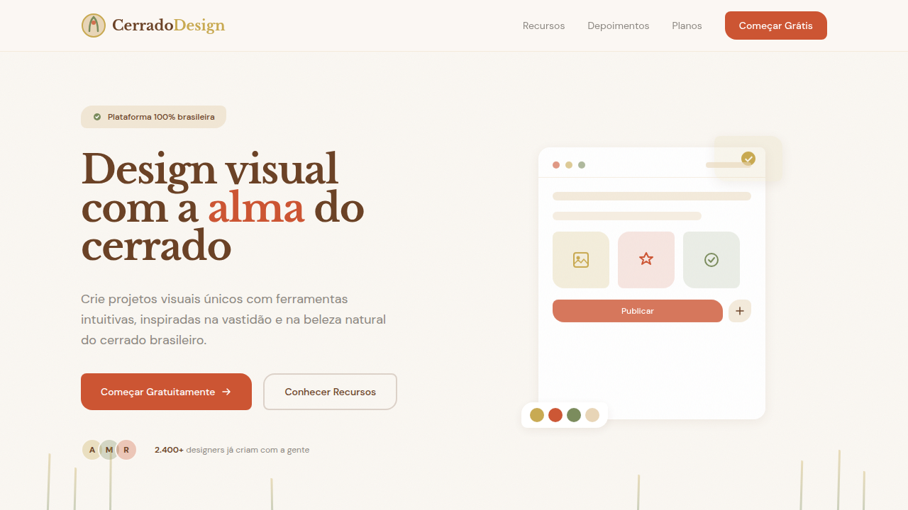
Cerrado (Brazilian savanna) minimalist landing page. Ideal for landing pages sustentáveis, projetos ecológicos, sites minimalistas. AI-ready template.
Use case: Sustainable landing pages, Eco-friendly projects, Minimalist websites
Historical Context
The Cerrado doesn't announce itself. No dramatic waterfalls, no dense canopy blocking the sky. It's Brazil's forgotten biome — a vast savanna stretching across the central plateau, all ochre soil and twisted silhouettes against bleached horizons. The trees grow low and gnarled, bark thick as armor, roots diving deep where water hides. Everything here is about restraint. About surviving with less. Designers have long drawn from tropical Brazil — the riot of carnival, the lushness of Atlantic Forest. But the Cerrado offers something rarer: a native minimalism. Its palette is burnt sienna, dry gold, charcoal bark, and the pale grey-green of drought-resistant leaves. The negative space is enormous. A single tortured tree against red earth carries more visual weight than any maximalist composition. This is minimalism that didn't arrive from Scandinavia or Japan. It grew from laterite soil under relentless sun. It's warm where Nordic minimalism runs cold. Textured where modernist minimalism goes flat. The Cerrado proves that restraint can be deeply, unmistakably Brazilian.
When to Use
Reach for this when the brief says sustainability but the client recoils at cliché green. When you need warmth without clutter. It works for environmental organizations that want gravity instead of guilt, eco-tourism brands selling silence over spectacle, and Brazilian companies tired of being reduced to samba and palm trees. The earth-tone palette grounds luxury without excess. Particularly strong for editorial layouts, packaging with presence, and identity systems that need to breathe.
Design Principles
- Negative space as protagonist — let the layout breathe like open savanna, resist the urge to fill
- Earth-tone palette drawn from laterite soil, dry grass, and charcoal bark — no synthetic greens, no borrowed Scandinavian greys
- Organic asymmetry inspired by twisted Cerrado trees — balance without symmetry, structure without rigidity
- Texture over flatness — subtle grain, raw paper feel, the tactile quality of cracked earth and rough bark
- Typographic restraint with weight — fewer words, bolder presence, like a lone tree commanding a horizon
DESIGN.md
---
version: "alpha"
name: "Cerrado Minimalista"
description: "Cerrado (Brazilian savanna) minimalist landing page. Ideal for landing pages sustentáveis, projetos ecológicos, sites minimalistas. AI-ready template."
colors:
  primary: "#C8A951"
  secondary: "#CC5533"
  tertiary: "#E8D5B7"
  neutral: "#7A8B5C"
  surface: "#6B4226"
  accent: "#8B8680"
typography:
  h1:
    fontFamily: DM Sans
    fontSize: 2.5rem
    fontWeight: 700
  body-md:
    fontFamily: DM Sans
    fontSize: 1rem
    fontWeight: 400
rounded:
  sm: 8px
  md: 16px
  lg: 24px
components:
  button-primary:
    backgroundColor: "{colors.primary}"
    textColor: "{colors.neutral}"
    rounded: "{rounded.sm}"
    padding: 12px
---

## Overview

Cerrado (Brazilian savanna) minimalist landing page. Ideal for landing pages sustentáveis, projetos ecológicos, sites minimalistas. AI-ready template. The Cerrado doesn't announce itself. No dramatic waterfalls, no dense canopy blocking the sky. It's Brazil's forgotten biome — a vast savanna stretching across the central plateau, all ochre soil and twisted silhouettes against bleached horizons. The trees grow low and gnarled, bark thick as armor, roots diving deep where water hides. Everything here is about restraint. About surviving with less.

Designers have long drawn from tropical Brazil — the riot of carnival, the lushness of Atlantic Forest. But the Cerrado offers something rarer: a native minimalism. Its palette is burnt sienna, dry gold, charcoal bark, and the pale grey-green of drought-resistant leaves. The negative space is enormous. A single tortured tree against red earth carries more visual weight than any maximalist composition.

This is minimalism that didn't arrive from Scandinavia or Japan. It grew from laterite soil under relentless sun. It's warm where Nordic minimalism runs cold. Textured where modernist minimalism goes flat. The Cerrado proves that restraint can be deeply, unmistakably Brazilian.

- Density: 3/10 — Airy
- Variance: 8/10 — Expressive
- Motion: 4/10 — Subtle

- **Style:** Organic, Minimal, Warm, Natural
- **Keywords:** cerrado, savanna, minimal, organic, warm, natural, earth tones, Brazilian biome, sustainable, eco, dry landscape, golden grass, red earth, sparse vegetation
- **Era:** Design Sustentável Brasileiro
- **Light/Dark:** ✓ Full / ✗ No

## Colors

- **Dourado Cerrado** (#C8A951) — Premium accent, decorative highlights
- **Terracota** (#CC5533) — Secondary surface or text color
- **Bege Areia** (#E8D5B7) — Supporting palette color
- **Verde Seco** (#7A8B5C) — Supporting palette color
- **Marrom Terra** (#6B4226) — Extended palette, decorative use
- **Cinza Pedra** (#8B8680) — Secondary text, borders, muted elements
- **Branco Algodão** (#FAF7F2) — Secondary surface
- **Azul Céu Seco** (#87CEEB) — Secondary accent


## Typography

- **Display / Hero:** DM Sans — Weight 700, tight tracking, used for headline impact
- **Accent:** Nunito Sans — Used for decorative or emphasis text
- **Body:** DM Sans — Weight 400, 16px/1.6 line-height, max 72ch per line
- **UI Labels / Captions:** DM Sans — 0.875rem, weight 500, slight letter-spacing
- **Monospace:** JetBrains Mono — Used for code, metadata, and technical values

Scale:
- Hero: clamp(2.5rem, 5vw, 4rem)
- H1: 2.25rem
- H2: 1.5rem
- Body: 1rem / 1.6
- Small: 0.875rem


## Layout

- **Grid:** CSS Grid primary. Max-width containment: 1280px centered with 1.5rem side padding.
- **Spacing rhythm:** Balanced. Base unit: 0.5rem (8px).
- **Section vertical gaps:** clamp(4rem, 8vw, 8rem).
- **Hero layout:** Asymmetric composition.
- **Feature sections:** Asymmetric grid with varied card sizes. No 3-equal-columns.
- **Mobile collapse:** All multi-column layouts collapse below 768px. No horizontal overflow.
- **z-index contract:** base (0) / sticky-nav (100) / overlay (200) / modal (300) / toast (500).


## Elevation & Depth

Espaçamento amplo e generoso remetendo à vastidão do cerrado, tipografia limpa e minimalista com toques orgânicos, paleta de cores terrosas e quentes, elementos visuais inspirados em gramíneas secas e texturas de terra, layouts assimétricos sutis que remetem a paisagens naturais, micro-animações suaves como brisa no capim, bordas orgânicas e irregulares, fundos com texturas sutis de papel reciclado.

- **Physics:** Ease-out curves, 200-300ms duration. Smooth and predictable.
- **Entry animations:** Fade + translate-Y (16px → 0) over 420ms ease-out. Staggered cascades for lists: 80ms between items.
- **Hover states:** Subtle color shift + shadow adjustment over 200ms.
- **Page transitions:** Fade only (200ms).
- **Performance:** Only transform and opacity animated. No layout-triggering properties.


## Shapes

Base corner radius: 8px. See rounded tokens in front matter for the full scale.


## Components

- **Primary Button:** Rounded (8px 16px 8px 16px for organic shapes) shape. Accent color fill. Hover: 8% darken + subtle lift shadow. Active: -1px translate tactile press. Font weight 600. No outer glows.
- **Secondary / Ghost Button:** Outline variant. 1.5px border in muted color. Text in primary color. Hover: subtle background fill.
- **Cards:** Rounded (8px 16px 8px 16px for organic shapes) corners. Surface background. Subtle shadow (0 2px 12px rgba(0,0,0,0.06)). 1px border stroke.
- **Inputs:** Label above input. 1px border stroke. Focus ring: 2px accent color offset 2px. Error text below in semantic red. No floating labels.
- **Navigation:** Primary surface background. Active item: accent color indicator. Font weight 500 when active.
- **Skeletons:** Shimmer animation matching component dimensions. No circular spinners.
- **Empty States:** Icon-based composition with descriptive text and action button.


## Do's and Don'ts

- No emojis in UI — use icon system only (Lucide, Heroicons)
- No decorative gradients — flat color only
- No shadows heavier than 0 2px 8px rgba(0,0,0,0.08)
- No pure black (#000000) — use off-black or charcoal variants
- No oversaturated accent colors (saturation cap: 80%)
- No 3-column equal-width feature layouts — use zig-zag or asymmetric grid
- No `h-screen` — use `min-h-[100dvh]`
- No AI copywriting clichés: "Elevate", "Seamless", "Unleash", "Next-Gen"
- No broken external image links — use picsum.photos or inline SVG
- No generic lorem ipsum in demos

- Do Espaçamento amplo do cerrado
- Do Tipografia minimalista orgânica
- Do Paleta terrosa quente
- Do Texturas de gramíneas/terra
- Do Layouts assimétricos naturais
- Do Bordas orgânicas irregulares.


## Use Case

Sustainable landing pages, Eco-friendly projects, Minimalist websites
Technical Specs
CSS
font-family: 'DM Sans', 'Nunito Sans', sans-serif for body, 'Libre Baskerville', serif for accents, background: #FAF7F2 with subtle noise texture, color: #6B4226 for body text, border-radius: 8px 16px 8px 16px for organic shapes, box-shadow: 0 4px 16px rgba(107,66,38,0.08), padding: 5rem 0 for generous spacing, animation: sway 8s ease-in-out infinite for grass-like elements, max-width: 1100px for comfortable reading width.
Variables
--color-cerrado-gold: #C8A951, --color-terracotta: #CC5533, --color-sand: #E8D5B7, --color-dry-green: #7A8B5C, --color-earth-brown: #6B4226, --color-cotton-white: #FAF7F2, --font-body: 'DM Sans', sans-serif, --font-accent: 'Libre Baskerville', serif, --border-organic: 8px 16px 8px 16px, --shadow-subtle: 0 4px 16px rgba(107,66,38,0.08), --spacing-vast: 5rem.
Checklist
☐ Espaçamento amplo do cerrado, ☐ Tipografia minimalista orgânica, ☐ Paleta terrosa quente, ☐ Texturas de gramíneas/terra, ☐ Layouts assimétricos naturais, ☐ Bordas orgânicas irregulares.
Colors
Primary
Secondary
Effects
Espaçamento amplo e generoso remetendo à vastidão do cerrado, tipografia limpa e minimalista com toques orgânicos, paleta de cores terrosas e quentes, elementos visuais inspirados em gramíneas secas e texturas de terra, layouts assimétricos sutis que remetem a paisagens naturais, micro-animações suaves como brisa no capim, bordas orgânicas e irregulares, fundos com texturas sutis de papel reciclado.
Light/Dark
✓ Full / ✗ No
AI Prompt
Act as a Senior Frontend Engineer and Expert UI Designer.
Your task is to code a complete Landing Page on the first attempt.
- Landing Page Theme: <INSERT THEME>
- Sections to add: <INSERT SECTIONS>

Generate the final code immediately following these definitions:

## Style

- **Name:** Cerrado Minimalista
- **Type:** Organic, Minimal, Warm, Natural
- **Keywords:** cerrado, savanna, minimal, organic, warm, natural, earth tones, Brazilian biome, sustainable, eco, dry landscape, golden grass, red earth, sparse vegetation
- **Era:** Design Sustentável Brasileiro
- **Light/Dark:** ✓ Full / ✗ No

## Color Palette

- **Primary:** Dourado Cerrado #C8A951, Terracota #CC5533, Bege Areia #E8D5B7, Verde Seco #7A8B5C
- **Secondary:** Marrom Terra #6B4226, Cinza Pedra #8B8680, Branco Algodão #FAF7F2, Azul Céu Seco #87CEEB

## Visual Effects

Espaçamento amplo e generoso remetendo à vastidão do cerrado, tipografia limpa e minimalista com toques orgânicos, paleta de cores terrosas e quentes, elementos visuais inspirados em gramíneas secas e texturas de terra, layouts assimétricos sutis que remetem a paisagens naturais, micro-animações suaves como brisa no capim, bordas orgânicas e irregulares, fundos com texturas sutis de papel reciclado.

## AI Visual Direction

Design a Cerrado (Brazilian savanna) minimalist landing page. Use: generous wide spacing evoking the vastness of the cerrado, clean minimalist typography with organic touches, earthy warm color palette (golden, terracotta, sand beige, dry green), visual elements inspired by dry grasses and earth textures, subtly asymmetric layouts reminiscent of natural landscapes, gentle breeze-like micro-animations, organic irregular borders, recycled paper subtle texture backgrounds, sustainable eco-friendly aesthetic.

## CSS Technical

```css
font-family: 'DM Sans', 'Nunito Sans', sans-serif for body, 'Libre Baskerville', serif for accents, background: #FAF7F2 with subtle noise texture, color: #6B4226 for body text, border-radius: 8px 16px 8px 16px for organic shapes, box-shadow: 0 4px 16px rgba(107,66,38,0.08), padding: 5rem 0 for generous spacing, animation: sway 8s ease-in-out infinite for grass-like elements, max-width: 1100px for comfortable reading width.
```

## Design System Variables

```css
--color-cerrado-gold: #C8A951, --color-terracotta: #CC5533, --color-sand: #E8D5B7, --color-dry-green: #7A8B5C, --color-earth-brown: #6B4226, --color-cotton-white: #FAF7F2, --font-body: 'DM Sans', sans-serif, --font-accent: 'Libre Baskerville', serif, --border-organic: 8px 16px 8px 16px, --shadow-subtle: 0 4px 16px rgba(107,66,38,0.08), --spacing-vast: 5rem.
```

## Implementation Checklist

- ☐ Espaçamento amplo do cerrado
- ☐ Tipografia minimalista orgânica
- ☐ Paleta terrosa quente
- ☐ Texturas de gramíneas/terra
- ☐ Layouts assimétricos naturais
- ☐ Bordas orgânicas irregulares.

## Execution Rules

1. Strictly follow the defined visual style.
2. Use high-quality inline SVG icons (Heroicons or Lucide style) — NEVER use emojis as icons.
3. Add `cursor-pointer` and smooth `hover` states (transition-all) on all interactive elements.
4. Required Page Structure:
   - Navbar (Logo + Links + CTA)
   - Hero Section (Impactful Headline + Subtitle + 2 buttons + 3D/Abstract visual element via CSS)
   - Features (3 cards with icons)
   - Testimonials (3 cards)
   - Pricing (3 tiers, highlight the middle one)
   - Final CTA
   - Full Footer with social links, privacy policy, terms of use, contact and SEO links.
5. All text content must be in English.
6. The visual must be CLEARLY distinct — do not create a "default Bootstrap" design. Force the use of the provided design system variables.
7. Use `<style>` tags in the head for custom classes (especially for complex backdrop-filter effects and animations) that Tailwind CDN doesn't cover.
8. Full Responsiveness: Layout must adapt perfectly to Mobile, Tablet and Desktop (vertical stack on mobile).
9. Include basic SEO, Viewport and Open Graph meta tags in `<head>`.
10. Footer must contain: Copyright 2026, Secondary navigation links and Social media icons.
11. Make the creative decisions needed to deliver the complete, functional result now.
Related
Last synced: 4/1/2026