Bohemian (Boho)
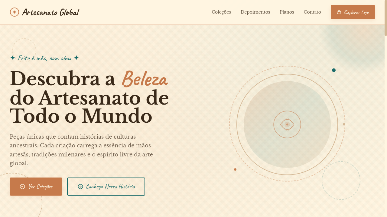
Bohemian landing page with vibrant yet muted earthy tones. Ideal for branding de eventos, linhas de moda, produtos lifestyle, marcas de viagem. AI-ready template.
Use case: Event branding, Fashion lines, Lifestyle products, Travel brands
Historical Context
Bohemian visual language didn't emerge from a design studio — it crawled out of 19th-century Parisian garrets where artists, writers, and Roma travelers rejected bourgeois aesthetics in favor of layered, imperfect beauty. The term itself comes from French society's assumption that Romani people originated in Bohemia, and the artists who lived like them — broke, nomadic, deliberately unkempt — adopted the label as a badge of honor. William Morris and the Arts & Crafts movement formalized some of these instincts into repeating organic patterns, but boho always resisted full systematization. The 1960s and 70s counterculture gave it a second life. Moroccan tiles, Indian block prints, Turkish kilims, Guatemalan textiles — all got flattened into a Western aesthetic vocabulary that prioritized feeling over cultural specificity. This is the tension every designer working in boho must navigate: the style's power comes from its eclecticism, but eclecticism without intention is just appropriation with better typography. Today's boho sits in a more considered place. The best implementations use muted vibrancy — terracotta instead of orange, sage instead of green, dusty rose instead of pink — creating warmth without the visual noise that plagued early-2010s boho Pinterest boards.
When to Use
Reach for bohemian when your brand needs to feel handmade without looking amateur, or spiritual without sliding into new-age kitsch. It works when your audience values authenticity over polish — yoga studios, artisan marketplaces, slow-travel platforms, wellness brands that actually mean it. Boho falls apart instantly when applied to anything requiring trust signals around precision: fintech, healthcare, enterprise SaaS. If your product needs to feel reliable more than it needs to feel soulful, walk away from this palette entirely.
Design Principles
- Layer texture over flatness — linen paper grains, watercolor washes, hand-drawn line weights. Every surface should feel touched by a human hand, never rendered by default.
- Mute your vibrancy. Pure saturated hues read as craft-store, not craft. Pull every color toward earth: add brown to your oranges, grey to your greens, dust to your pinks.
- Embrace asymmetric composition. Boho rejects grid rigidity — offset your elements, let whitespace breathe unevenly, allow illustrations to break containers. Symmetry here reads as corporate cosplay.
- Mix pattern scales deliberately. Pair a large-scale floral with a tight geometric, a loose brushstroke with a precise mandala. Contrast in pattern density creates the eclectic richness that defines the style.
- Typography should feel collected, not designed. Combine a serif with visible personality (irregular stroke weights, soft terminals) alongside a handwritten or brush script — but never more than two decorative faces per layout. Restraint separates boho from chaos.
DESIGN.md
---
version: "alpha"
name: "Bohemian (Boho)"
description: "Bohemian landing page with vibrant yet muted earthy tones. Ideal for branding de eventos, linhas de moda, produtos lifestyle, marcas de viagem. AI-ready template."
colors:
  primary: "#C67A4B"
  secondary: "#D4B896"
  tertiary: "#1A6B6A"
  neutral: "#FFF5E1"
  surface: "#CC5500"
  accent: "#B08B8B"
typography:
  h1:
    fontFamily: Libre Baskerville
    fontSize: 2.5rem
    fontWeight: 700
  body-md:
    fontFamily: Libre Baskerville
    fontSize: 1rem
    fontWeight: 400
rounded:
  sm: 4px
  md: 8px
  lg: 12px
spacing:
  sm: 2.0rem
  md: 4.0rem
  lg: 8.0rem
components:
  button-primary:
    backgroundColor: "{colors.primary}"
    textColor: "{colors.neutral}"
    rounded: "{rounded.sm}"
    padding: 12px
---

## Overview

Bohemian landing page with vibrant yet muted earthy tones. Ideal for branding de eventos, linhas de moda, produtos lifestyle, marcas de viagem. AI-ready template. Bohemian visual language didn't emerge from a design studio — it crawled out of 19th-century Parisian garrets where artists, writers, and Roma travelers rejected bourgeois aesthetics in favor of layered, imperfect beauty. The term itself comes from French society's assumption that Romani people originated in Bohemia, and the artists who lived like them — broke, nomadic, deliberately unkempt — adopted the label as a badge of honor. William Morris and the Arts & Crafts movement formalized some of these instincts into repeating organic patterns, but boho always resisted full systematization.

The 1960s and 70s counterculture gave it a second life. Moroccan tiles, Indian block prints, Turkish kilims, Guatemalan textiles — all got flattened into a Western aesthetic vocabulary that prioritized feeling over cultural specificity. This is the tension every designer working in boho must navigate: the style's power comes from its eclecticism, but eclecticism without intention is just appropriation with better typography.

Today's boho sits in a more considered place. The best implementations use muted vibrancy — terracotta instead of orange, sage instead of green, dusty rose instead of pink — creating warmth without the visual noise that plagued early-2010s boho Pinterest boards.

- Density: 5/10 — Balanced
- Variance: 7/10 — Dynamic
- Motion: 8/10 — Cinematic

- **Style:** Vibrant-Muted, Earthy, Free-Spirit, Global
- **Keywords:** Bohemian, boho, vibrant muted, earthy, free spirit, global influences, layered textures, travel, eclectic, handmade
- **Era:** 1960s-70s Counterculture to Modern Boho
- **Light/Dark:** ✓ Full / ◐ Partial

## Colors

- **Terracotta** (#C67A4B) — Primary surface or dominant color
- **Desert Sand** (#D4B896) — Secondary surface or text color
- **Deep Teal** (#1A6B6A) — Accent highlight, links and focus states
- **Warm Cream** (#FFF5E1) — Light surface, card backgrounds
- **Burnt Orange** (#CC5500) — Warm accent, call-to-action secondary
- **Dusty Mauve** (#B08B8B) — Extended palette, decorative use
- **Olive** (#6B7B3A) — Extended palette, decorative use
- **Indigo** (#3F51B5) — Accent color, emphasis elements


## Typography

- **Display / Hero:** Libre Baskerville — Weight 700, tight tracking, used for headline impact
- **Accent:** Caveat — Used for decorative or emphasis text
- **Body:** Libre Baskerville — Weight 400, 16px/1.6 line-height, max 72ch per line
- **UI Labels / Captions:** Libre Baskerville — 0.875rem, weight 500, slight letter-spacing
- **Monospace:** JetBrains Mono — Used for code, metadata, and technical values

Scale:
- Hero: clamp(2.5rem, 5vw, 4rem)
- H1: 2.25rem
- H2: 1.5rem
- Body: 1rem / 1.6
- Small: 0.875rem


## Layout

- **Grid:** CSS Grid primary. Max-width containment: 1280px centered with 1.5rem side padding.
- **Spacing rhythm:** Balanced. Base unit: 0.5rem (8px).
- **Section vertical gaps:** clamp(4rem, 8vw, 8rem).
- **Hero layout:** Asymmetric composition.
- **Feature sections:** Asymmetric grid with varied card sizes. No 3-equal-columns.
- **Mobile collapse:** All multi-column layouts collapse below 768px. No horizontal overflow.
- **z-index contract:** base (0) / sticky-nav (100) / overlay (200) / modal (300) / toast (500).


## Elevation & Depth

Layered textile-like textures (CSS patterns), hand-drawn style borders, warm gradient overlays, macramé-inspired decorative dividers via SVG, gentle parallax on background textures, earthy shadow tones

- **Physics:** Spring — stiffness 120, damping 20. Confident, weighted transitions.
- **Entry animations:** Fade + translate-Y (16px → 0) over 540ms ease-out. Staggered cascades for lists: 120ms between items.
- **Hover states:** Scale(1.03) + shadow lift over 200ms.
- **Page transitions:** Fade + slide (300ms).
- **Performance:** Only transform and opacity animated. No layout-triggering properties.


## Shapes

Base corner radius: 4px. See rounded tokens in front matter for the full scale.


## Components

- **Primary Button:** Rounded (4px) shape. Accent color fill. Hover: 8% darken + subtle lift shadow. Active: -1px translate tactile press. Font weight 600. No outer glows.
- **Secondary / Ghost Button:** Outline variant. 1.5px border in muted color. Text in primary color. Hover: subtle background fill.
- **Cards:** Rounded (4px) corners. Surface background. Subtle shadow (0 2px 12px rgba(0,0,0,0.06)). 1px border stroke.
- **Inputs:** Label above input. 1px border stroke. Focus ring: 2px accent color offset 2px. Error text below in semantic red. No floating labels.
- **Navigation:** Primary surface background. Active item: accent color indicator. Font weight 500 when active.
- **Skeletons:** Shimmer animation matching component dimensions. No circular spinners.
- **Empty States:** Icon-based composition with descriptive text and action button.


## Do's and Don'ts

- No emojis in UI — use icon system only (Lucide, Heroicons)
- No pure black (#000000) — use off-black or charcoal variants
- No oversaturated accent colors (saturation cap: 80%)
- No 3-column equal-width feature layouts — use zig-zag or asymmetric grid
- No `h-screen` — use `min-h-[100dvh]`
- No AI copywriting clichés: "Elevate", "Seamless", "Unleash", "Next-Gen"
- No broken external image links — use picsum.photos or inline SVG
- No generic lorem ipsum in demos

- Do Earthy muted color palette
- Do Layered textile textures
- Do Hand-drawn style borders
- Do Macramé-inspired dividers
- Do Mixed serif and handwritten typography
- Do Free-spirited eclectic atmosphere
- Do Responsive with maintained warmth


## Use Case

Event branding, Fashion lines, Lifestyle products, Travel brands
Technical Specs
CSS
font-family: 'Libre Baskerville', serif mixed with 'Caveat', cursive, background: #FFF5E1 with CSS textile patterns, color: #3A2A1A, border: 2px solid #C67A4B, border-radius: 4px, box-shadow: 0 4px 12px rgba(198,122,75,0.15), line-height: 1.7
Variables
--color-terracotta: #C67A4B, --color-sand: #D4B896, --color-teal: #1A6B6A, --color-cream: #FFF5E1, --font-serif: 'Libre Baskerville', --font-handwritten: 'Caveat', --border-radius: 4px, --spacing: 2rem
Checklist
☐ Earthy muted color palette, ☐ Layered textile textures, ☐ Hand-drawn style borders, ☐ Macramé-inspired dividers, ☐ Mixed serif and handwritten typography, ☐ Free-spirited eclectic atmosphere, ☐ Responsive with maintained warmth
Colors
Primary
Secondary
Effects
Layered textile-like textures (CSS patterns), hand-drawn style borders, warm gradient overlays, macramé-inspired decorative dividers via SVG, gentle parallax on background textures, earthy shadow tones
Light/Dark
✓ Full / ◐ Partial
AI Prompt
Act as a Senior Frontend Engineer and Expert UI Designer.
Your task is to code a complete Landing Page on the first attempt.
- Landing Page Theme: <INSERT THEME>
- Sections to add: <INSERT SECTIONS>

Generate the final code immediately following these definitions:

## Style

- **Name:** Bohemian (Boho)
- **Type:** Vibrant-Muted, Earthy, Free-Spirit, Global
- **Keywords:** Bohemian, boho, vibrant muted, earthy, free spirit, global influences, layered textures, travel, eclectic, handmade
- **Era:** 1960s-70s Counterculture to Modern Boho
- **Light/Dark:** ✓ Full / ◐ Partial

## Color Palette

- **Primary:** Terracotta #C67A4B, Desert Sand #D4B896, Deep Teal #1A6B6A, Warm Cream #FFF5E1
- **Secondary:** Burnt Orange #CC5500, Dusty Mauve #B08B8B, Olive #6B7B3A, Indigo #3F51B5

## Visual Effects

Layered textile-like textures (CSS patterns), hand-drawn style borders, warm gradient overlays, macramé-inspired decorative dividers via SVG, gentle parallax on background textures, earthy shadow tones

## AI Visual Direction

Design a bohemian landing page with vibrant yet muted earthy tones. Use terracotta, desert sand, deep teal, warm cream. Apply layered textile textures, hand-drawn borders, macramé-inspired SVG dividers, warm gradient overlays. Typography should mix serif and handwritten fonts. Free-spirited, eclectic, globally-inspired atmosphere with handmade feel.

## CSS Technical

```css
font-family: 'Libre Baskerville', serif mixed with 'Caveat', cursive, background: #FFF5E1 with CSS textile patterns, color: #3A2A1A, border: 2px solid #C67A4B, border-radius: 4px, box-shadow: 0 4px 12px rgba(198,122,75,0.15), line-height: 1.7
```

## Design System Variables

```css
--color-terracotta: #C67A4B, --color-sand: #D4B896, --color-teal: #1A6B6A, --color-cream: #FFF5E1, --font-serif: 'Libre Baskerville', --font-handwritten: 'Caveat', --border-radius: 4px, --spacing: 2rem
```

## Implementation Checklist

- ☐ Earthy muted color palette
- ☐ Layered textile textures
- ☐ Hand-drawn style borders
- ☐ Macramé-inspired dividers
- ☐ Mixed serif and handwritten typography
- ☐ Free-spirited eclectic atmosphere
- ☐ Responsive with maintained warmth

## Execution Rules

1. Strictly follow the defined visual style.
2. Use high-quality inline SVG icons (Heroicons or Lucide style) — NEVER use emojis as icons.
3. Add `cursor-pointer` and smooth `hover` states (transition-all) on all interactive elements.
4. Required Page Structure:
   - Navbar (Logo + Links + CTA)
   - Hero Section (Impactful Headline + Subtitle + 2 buttons + 3D/Abstract visual element via CSS)
   - Features (3 cards with icons)
   - Testimonials (3 cards)
   - Pricing (3 tiers, highlight the middle one)
   - Final CTA
   - Full Footer with social links, privacy policy, terms of use, contact and SEO links.
5. All text content must be in English.
6. The visual must be CLEARLY distinct — do not create a "default Bootstrap" design. Force the use of the provided design system variables.
7. Use `<style>` tags in the head for custom classes (especially for complex backdrop-filter effects and animations) that Tailwind CDN doesn't cover.
8. Full Responsiveness: Layout must adapt perfectly to Mobile, Tablet and Desktop (vertical stack on mobile).
9. Include basic SEO, Viewport and Open Graph meta tags in `<head>`.
10. Footer must contain: Copyright 2026, Secondary navigation links and Social media icons.
11. Make the creative decisions needed to deliver the complete, functional result now.
Related
Last synced: 4/1/2026