Azulejaria Digital Moderna
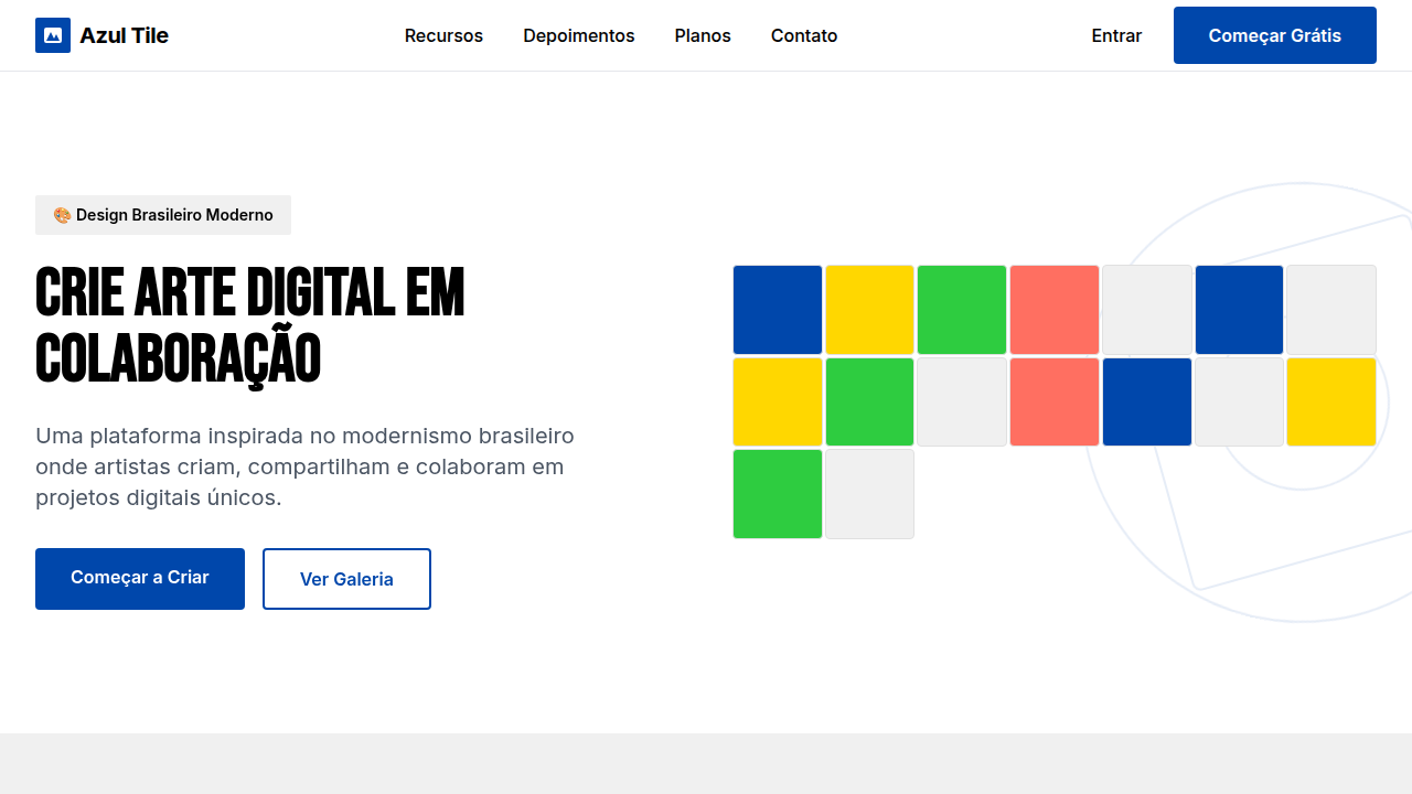
Geometric and modular landing page for a collaborative digital art platform, inspired by Brazilian modernist azulejaria. Ideal for landing pages, saas. AI-ready template.
Use case: Landing pages, SaaS
Historical Context
The azulejo never belonged to museums. It belonged to streets, to kitchens, to the curved walls of colonial churches where light hit glazed surfaces and scattered. Portuguese colonizers brought the tradition to Brazil in the 1600s, and Brazilian artisans immediately broke the rules — bolder colors, looser geometry, narrative panels that told local stories instead of repeating Moorish abstractions. Athos Bulcão shattered the grid entirely in Brasília, proving tiles could be modern, could be architecture itself. Digital azulejaria picks up exactly there. Artists like Gustavo Magalhães and collectives such as Azulejo Coletivo treat the pixel as a tessera, building modular pattern systems that snap together like ceramic but propagate through screens. The key shift: collaboration. Where a single artisan once painted a panel, now dozens of contributors submit individual tile designs to shared repositories. The pattern emerges from the collective, not the individual. This isn't nostalgia rendered in vectors. It's a living practice — generative algorithms producing variations no hand could sustain, open-source tile libraries anyone can fork, public projections turning building facades into participatory mosaics. The modularity that made azulejos scalable across colonial architecture makes them native to digital systems.
When to Use
When your project needs visual identity rooted in Brazilian material culture without falling into folklore pastiche. Strong fit for collaborative platforms where multiple contributors need a unifying visual grammar — each person designs a tile, the system composes the wall. Cultural institutions digitizing collections. Educational platforms teaching geometry through play. Any interface where repetition creates rhythm rather than monotony. Avoid if you need photographic realism or minimal aesthetics — this system is unapologetically decorative.
Design Principles
- Modularity is meaning — every element must function alone as a complete composition and multiply into larger patterns without losing coherence at either scale
- Constraint breeds variation — work within a fixed grid (square, hexagonal, or triangular) but exhaust its combinatorial possibilities before ever expanding the canvas
- Color carries climate — pull palettes from Brazilian built environments: the oxide terracotta of Olinda, the cobalt-and-white of São Luís, the tropical maximalism of Pelourinho facades
- Collaboration over authorship — design systems where individual contributions dissolve into collective pattern, where no single tile dominates but every tile matters
- Imperfection is signal — introduce controlled irregularity (slight rotation, color drift, hand-drawn edges) to resist the sterility of pure digital repetition
DESIGN.md
---
version: "alpha"
name: "Azulejaria Digital Moderna"
description: "Geometric and modular landing page for a collaborative digital art platform, inspired by Brazilian modernist azulejaria. Ideal for landing pages, saas. AI-ready template."
colors:
  primary: "#0047AB"
  secondary: "#FFFFFF"
  tertiary: "#000000"
  neutral: "#F0F0F0"
  surface: "#FFD700"
  accent: "#2ECC40"
typography:
  h1:
    fontFamily: Inter
    fontSize: 2.5rem
    fontWeight: 700
  body-md:
    fontFamily: Inter
    fontSize: 1rem
    fontWeight: 400
rounded:
  sm: 4px
  md: 8px
  lg: 12px
components:
  button-primary:
    backgroundColor: "{colors.primary}"
    textColor: "{colors.neutral}"
    rounded: "{rounded.sm}"
    padding: 12px
---

## Overview

Geometric and modular landing page for a collaborative digital art platform, inspired by Brazilian modernist azulejaria. Ideal for landing pages, saas. AI-ready template. The azulejo never belonged to museums. It belonged to streets, to kitchens, to the curved walls of colonial churches where light hit glazed surfaces and scattered. Portuguese colonizers brought the tradition to Brazil in the 1600s, and Brazilian artisans immediately broke the rules — bolder colors, looser geometry, narrative panels that told local stories instead of repeating Moorish abstractions. Athos Bulcão shattered the grid entirely in Brasília, proving tiles could be modern, could be architecture itself.

Digital azulejaria picks up exactly there. Artists like Gustavo Magalhães and collectives such as Azulejo Coletivo treat the pixel as a tessera, building modular pattern systems that snap together like ceramic but propagate through screens. The key shift: collaboration. Where a single artisan once painted a panel, now dozens of contributors submit individual tile designs to shared repositories. The pattern emerges from the collective, not the individual.

This isn't nostalgia rendered in vectors. It's a living practice — generative algorithms producing variations no hand could sustain, open-source tile libraries anyone can fork, public projections turning building facades into participatory mosaics. The modularity that made azulejos scalable across colonial architecture makes them native to digital systems.

- Density: 5/10 — Balanced
- Variance: 8/10 — Expressive
- Motion: 4/10 — Subtle

- **Style:** Geometric, Modular, Dynamic, Artistic
- **Keywords:** digital art, collaborative, modular, geometric, dynamic, artistic, Brazilian modernism, azulejo, pattern, vibrant
- **Era:** 2026+ Arte e Tecnologia Brasileira
- **Light/Dark:** ✓ Full / ✗ No

## Colors

- **Azul Cobalto** (#0047AB) — Accent highlight, links and focus states
- **Branco** (#FFFFFF) — Light surface, card backgrounds
- **Preto** (#000000) — Dark surface, primary background
- **Cinza Claro** (#F0F0F0) — Secondary text, borders, muted elements
- **Amarelo Sol** (#FFD700) — Warning states, attention indicators
- **Verde Esmeralda** (#2ECC40) — Success states, positive indicators
- **Vermelho Coral** (#FF6F61) — Error states, destructive actions
- **Cinza Médio** (#6C757D) — Secondary text, borders, muted elements


## Typography

- **Display / Hero:** Inter — Weight 700, tight tracking, used for headline impact
- **Body:** Inter — Weight 400, 16px/1.6 line-height, max 72ch per line
- **UI Labels / Captions:** Inter — 0.875rem, weight 500, slight letter-spacing
- **Monospace:** JetBrains Mono — Used for code, metadata, and technical values

Scale:
- Hero: clamp(2.5rem, 5vw, 4rem)
- H1: 2.25rem
- H2: 1.5rem
- Body: 1rem / 1.6
- Small: 0.875rem


## Layout

- **Grid:** CSS Grid primary. Max-width containment: 1280px centered with 1.5rem side padding.
- **Spacing rhythm:** Balanced. Base unit: 0.5rem (8px).
- **Section vertical gaps:** clamp(4rem, 8vw, 8rem).
- **Hero layout:** Asymmetric composition.
- **Feature sections:** Asymmetric grid with varied card sizes. No 3-equal-columns.
- **Mobile collapse:** All multi-column layouts collapse below 768px. No horizontal overflow.
- **z-index contract:** base (0) / sticky-nav (100) / overlay (200) / modal (300) / toast (500).


## Elevation & Depth

Layouts de grid modular inspirados em azulejos, com elementos geométricos que rotacionam e se combinam, tipografia sans-serif limpa e moderna, ícones vetoriais que remetem a formas abstratas, micro-interações de hover com mudança de padrão ou cor do azulejo, transições de seção com efeito de "montagem" de módulos.

- **Physics:** Ease-out curves, 200-300ms duration. Smooth and predictable.
- **Entry animations:** Fade + translate-Y (16px → 0) over 420ms ease-out. Staggered cascades for lists: 80ms between items.
- **Hover states:** Subtle color shift + shadow adjustment over 200ms.
- **Page transitions:** Fade only (200ms).
- **Performance:** Only transform and opacity animated. No layout-triggering properties.


## Shapes

Base corner radius: 4px. See rounded tokens in front matter for the full scale.


## Components

- **Primary Button:** Rounded (4px) shape. Accent color fill. Hover: 8% darken + subtle lift shadow. Active: -1px translate tactile press. Font weight 600. No outer glows.
- **Secondary / Ghost Button:** Outline variant. 1.5px border in muted color. Text in primary color. Hover: subtle background fill.
- **Cards:** Rounded (4px) corners. Surface background. Subtle shadow (0 2px 12px rgba(0,0,0,0.06)). 1px border stroke.
- **Inputs:** Label above input. 1px border stroke. Focus ring: 2px accent color offset 2px. Error text below in semantic red. No floating labels.
- **Navigation:** Primary surface background. Active item: accent color indicator. Font weight 500 when active.
- **Skeletons:** Shimmer animation matching component dimensions. No circular spinners.
- **Empty States:** Icon-based composition with descriptive text and action button.


## Do's and Don'ts

- No emojis in UI — use icon system only (Lucide, Heroicons)
- No pure black (#000000) — use off-black or charcoal variants
- No oversaturated accent colors (saturation cap: 80%)
- No 3-column equal-width feature layouts — use zig-zag or asymmetric grid
- No `h-screen` — use `min-h-[100dvh]`
- No AI copywriting clichés: "Elevate", "Seamless", "Unleash", "Next-Gen"
- No broken external image links — use picsum.photos or inline SVG
- No generic lorem ipsum in demos

- Do Layouts de grid modular (azulejo)
- Do Elementos geométricos rotacionáveis
- Do Tipografia sans-serif limpa
- Do Ícones vetoriais abstratos
- Do Micro-interações de mudança de padrão/cor
- Do Transições de "montagem" de módulos.


## Use Case

Landing pages, SaaS
Technical Specs
CSS
background: #FFFFFF, color: #000000, border: 1px solid #E0E0E0, border-radius: 4px, font-family: "Inter, sans-serif", transition: all 0.3s ease-in-out, .azulejo-grid, .geometric-module, .pattern-rotate-hover.
Variables
--cobalt-blue: #0047AB, --white-bg: #FFFFFF, --black-text: #000000, --light-grey-bg: #F0F0F0, --border-radius-sm: 4px, --font-main: "Inter, sans-serif", --module-transition: all 0.3s ease-in-out.
Checklist
☐ Layouts de grid modular (azulejo), ☐ Elementos geométricos rotacionáveis, ☐ Tipografia sans-serif limpa, ☐ Ícones vetoriais abstratos, ☐ Micro-interações de mudança de padrão/cor, ☐ Transições de "montagem" de módulos.
Colors
Primary
Secondary
Effects
Layouts de grid modular inspirados em azulejos, com elementos geométricos que rotacionam e se combinam, tipografia sans-serif limpa e moderna, ícones vetoriais que remetem a formas abstratas, micro-interações de hover com mudança de padrão ou cor do azulejo, transições de seção com efeito de "montagem" de módulos.
Light/Dark
✓ Full / ✗ No
AI Prompt
Act as a Senior Frontend Engineer and Expert UI Designer.
Your task is to code a complete Landing Page on the first attempt.
- Landing Page Theme: <INSERT THEME>
- Sections to add: <INSERT SECTIONS>

Generate the final code immediately following these definitions:

## Style

- **Name:** Azulejaria Digital Moderna
- **Type:** Geometric, Modular, Dynamic, Artistic
- **Keywords:** digital art, collaborative, modular, geometric, dynamic, artistic, Brazilian modernism, azulejo, pattern, vibrant
- **Era:** 2026+ Arte e Tecnologia Brasileira
- **Light/Dark:** ✓ Full / ✗ No

## Color Palette

- **Primary:** Azul Cobalto #0047AB, Branco #FFFFFF, Preto #000000, Cinza Claro #F0F0F0
- **Secondary:** Amarelo Sol #FFD700, Verde Esmeralda #2ECC40, Vermelho Coral #FF6F61, Cinza Médio #6C757D

## Visual Effects

Layouts de grid modular inspirados em azulejos, com elementos geométricos que rotacionam e se combinam, tipografia sans-serif limpa e moderna, ícones vetoriais que remetem a formas abstratas, micro-interações de hover com mudança de padrão ou cor do azulejo, transições de seção com efeito de "montagem" de módulos.

## AI Visual Direction

Design a geometric and modular landing page for a collaborative digital art platform, inspired by Brazilian modernist azulejaria. Use: modular grid layouts with rotating geometric elements, clean modern sans-serif typography, abstract vector icons, azulejo pattern/color change hover micro-interactions, module "assembly" section transitions, cobalt blue and white palette, dynamic and artistic feel.

## CSS Technical

```css
background: #FFFFFF, color: #000000, border: 1px solid #E0E0E0, border-radius: 4px, font-family: "Inter, sans-serif", transition: all 0.3s ease-in-out, .azulejo-grid, .geometric-module, .pattern-rotate-hover.
```

## Design System Variables

```css
--cobalt-blue: #0047AB, --white-bg: #FFFFFF, --black-text: #000000, --light-grey-bg: #F0F0F0, --border-radius-sm: 4px, --font-main: "Inter, sans-serif", --module-transition: all 0.3s ease-in-out.
```

## Implementation Checklist

- ☐ Layouts de grid modular (azulejo)
- ☐ Elementos geométricos rotacionáveis
- ☐ Tipografia sans-serif limpa
- ☐ Ícones vetoriais abstratos
- ☐ Micro-interações de mudança de padrão/cor
- ☐ Transições de "montagem" de módulos.

## Execution Rules

1. Strictly follow the defined visual style.
2. Use high-quality inline SVG icons (Heroicons or Lucide style) — NEVER use emojis as icons.
3. Add `cursor-pointer` and smooth `hover` states (transition-all) on all interactive elements.
4. Required Page Structure:
   - Navbar (Logo + Links + CTA)
   - Hero Section (Impactful Headline + Subtitle + 2 buttons + 3D/Abstract visual element via CSS)
   - Features (3 cards with icons)
   - Testimonials (3 cards)
   - Pricing (3 tiers, highlight the middle one)
   - Final CTA
   - Full Footer with social links, privacy policy, terms of use, contact and SEO links.
5. All text content must be in English.
6. The visual must be CLEARLY distinct — do not create a "default Bootstrap" design. Force the use of the provided design system variables.
7. Use `<style>` tags in the head for custom classes (especially for complex backdrop-filter effects and animations) that Tailwind CDN doesn't cover.
8. Full Responsiveness: Layout must adapt perfectly to Mobile, Tablet and Desktop (vertical stack on mobile).
9. Include basic SEO, Viewport and Open Graph meta tags in `<head>`.
10. Footer must contain: Copyright 2026, Secondary navigation links and Social media icons.
11. Make the creative decisions needed to deliver the complete, functional result now.
Related
Last synced: 4/1/2026