Art Deco
Design an Art Deco landing page with elegant glamour from the 1920s-30s. Ideal for embalagens de luxo, bares de cocktails, hotéis, interiores com toque great gatsby. AI-ready template.
Use case: Luxury packaging, Cocktail bars, Hotels, Great Gatsby-inspired interiors
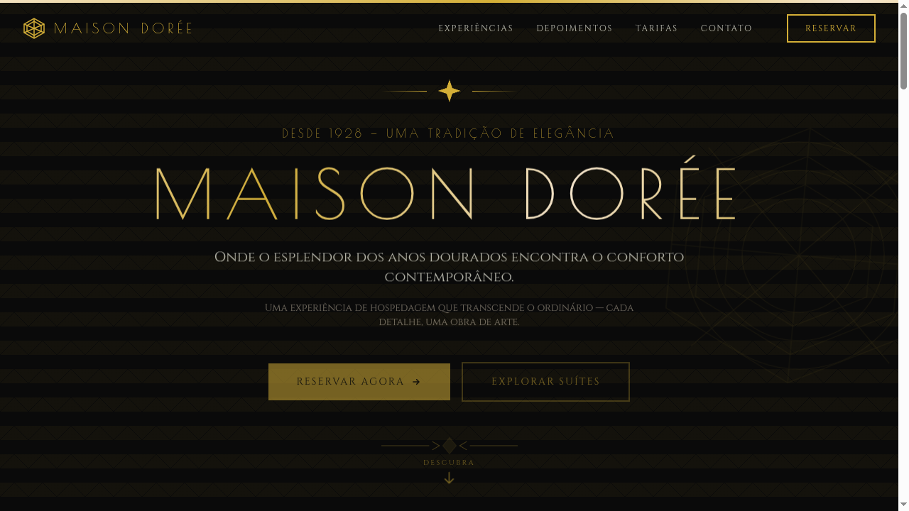
Historical Context
Art Deco didn't ask permission. It exploded out of 1920s Paris as a full rejection of the organic, flowing lines that Art Nouveau had made fashionable. Where Nouveau whispered, Deco shouted — in gold leaf, in chrome, in obsidian marble. It was the aesthetic of a world drunk on industrialization, jazz, and the intoxicating belief that the future would be glamorous. The Chrysler Building wasn't just architecture; it was a manifesto in stainless steel. What makes Deco endure isn't nostalgia — it's the sheer confidence of its geometry. Sunbursts, chevrons, stepped forms, symmetrical compositions that feel inevitable rather than designed. It borrowed from Egyptian tombs, Aztec temples, and Cubist painting without apology. The movement understood something most designers forget: luxury isn't about restraint. It's about precision applied to excess. Deco collapsed under the weight of wartime austerity, but its DNA never left. Every time a hotel lobby uses brass inlays and geometric tile, every time a cocktail menu reaches for that angular serif — that's Deco's ghost, still insisting that elegance and boldness aren't opposites.
When to Use
Art Deco works when you need to communicate premium without being precious about it. Hotels and hospitality brands that want guests to feel they've stepped into something curated. Cocktail bars where the typography on the menu matters as much as the drink list. Luxury events — galas, openings, launches — where the invitation itself is a status signal. Premium brands that refuse the minimalist default and want their identity to feel constructed, deliberate, unapologetically opulent. If your client says "elegant but not boring," this is your answer.
Design Principles
- Symmetry as authority — center your compositions, mirror your elements, let bilateral balance communicate control and intentionality
- Geometric repetition over organic variation — fans, sunbursts, chevrons, and stepped forms create rhythm through mathematical precision, not natural randomness
- Material contrast is non-negotiable — pair matte with metallic, dark with gold, stone with glass; Deco lives in the tension between surfaces
- Typography carries structural weight — letterforms should feel architectural; choose angular serifs or geometric sans with extreme contrast in stroke width
- Ornament is earned through restraint elsewhere — lavish detail in borders and accents only works when surrounded by confident negative space
DESIGN.md
---
version: "alpha"
name: "Art Deco"
description: "Design an Art Deco landing page with elegant glamour from the 1920s-30s. Ideal for embalagens de luxo, bares de cocktails, hotéis, interiores com toque great gatsby. AI-ready template."
colors:
  primary: "#0A0A0A"
  secondary: "#D4AF37"
  tertiary: "#1B2838"
  neutral: "#FFFFF0"
  surface: "#046307"
  accent: "#9B111E"
typography:
  h1:
    fontFamily: Poiret One
    fontSize: 2.5rem
    fontWeight: 700
  body-md:
    fontFamily: Poiret One
    fontSize: 1rem
    fontWeight: 400
spacing:
  sm: 2.0rem
  md: 4.0rem
  lg: 8.0rem
components:
  button-primary:
    backgroundColor: "{colors.primary}"
    textColor: "{colors.neutral}"
    padding: 12px
---

## Overview

Design an Art Deco landing page with elegant glamour from the 1920s-30s. Ideal for embalagens de luxo, bares de cocktails, hotéis, interiores com toque great gatsby. AI-ready template. Art Deco didn't ask permission. It exploded out of 1920s Paris as a full rejection of the organic, flowing lines that Art Nouveau had made fashionable. Where Nouveau whispered, Deco shouted — in gold leaf, in chrome, in obsidian marble. It was the aesthetic of a world drunk on industrialization, jazz, and the intoxicating belief that the future would be glamorous. The Chrysler Building wasn't just architecture; it was a manifesto in stainless steel.

What makes Deco endure isn't nostalgia — it's the sheer confidence of its geometry. Sunbursts, chevrons, stepped forms, symmetrical compositions that feel inevitable rather than designed. It borrowed from Egyptian tombs, Aztec temples, and Cubist painting without apology. The movement understood something most designers forget: luxury isn't about restraint. It's about precision applied to excess.

Deco collapsed under the weight of wartime austerity, but its DNA never left. Every time a hotel lobby uses brass inlays and geometric tile, every time a cocktail menu reaches for that angular serif — that's Deco's ghost, still insisting that elegance and boldness aren't opposites.

- Density: 3/10 — Airy
- Variance: 2/10 — Structured
- Motion: 8/10 — Cinematic

- **Style:** Elegant, Glamorous, Geometric, Metallic
- **Keywords:** Art Deco, elegant, glamorous, symmetric, geometric, metallic accents, 1920s, Great Gatsby, luxury modern, clean patterns
- **Era:** 1920s-1930s Art Deco Movement
- **Light/Dark:** ✓ Full / ✓ Full

## Colors

- **Jet Black** (#0A0A0A) — Dark surface, primary background
- **Gold Metallic** (#D4AF37) — Premium accent, decorative highlights
- **Deep Navy** (#1B2838) — Supporting palette color
- **Ivory** (#FFFFF0) — Light surface, card backgrounds
- **Emerald** (#046307) — Extended palette, decorative use
- **Ruby Red** (#9B111E) — Error states, destructive actions
- **Silver** (#C0C0C0) — Extended palette, decorative use
- **Champagne** (#F7E7CE) — Extended palette, decorative use


## Typography

- **Display / Hero:** Poiret One — Weight 700, tight tracking, used for headline impact
- **Accent:** Cinzel — Used for decorative or emphasis text
- **Body:** Poiret One — Weight 400, 16px/1.6 line-height, max 72ch per line
- **UI Labels / Captions:** Poiret One — 0.875rem, weight 500, slight letter-spacing
- **Monospace:** JetBrains Mono — Used for code, metadata, and technical values

Scale:
- Hero: clamp(2.5rem, 5vw, 4rem)
- H1: 2.25rem
- H2: 1.5rem
- Body: 1rem / 1.6
- Small: 0.875rem


## Layout

- **Grid:** CSS Grid primary. Max-width containment: 1280px centered with 1.5rem side padding.
- **Spacing rhythm:** Balanced. Base unit: 0.5rem (8px).
- **Section vertical gaps:** clamp(4rem, 8vw, 8rem).
- **Hero layout:** Split-screen (text left, visual right).
- **Feature sections:** Zig-zag alternating text+image rows. No 3-equal-columns.
- **Mobile collapse:** All multi-column layouts collapse below 768px. No horizontal overflow.
- **z-index contract:** base (0) / sticky-nav (100) / overlay (200) / modal (300) / toast (500).


## Elevation & Depth

Geometric symmetric patterns via CSS (chevrons, sunbursts, fan shapes), metallic gold borders and accents, clean sharp lines, art deco fan dividers via SVG, subtle shimmer animation on gold elements, elegant fade transitions (400ms)

- **Physics:** Spring — stiffness 120, damping 20. Confident, weighted transitions.
- **Entry animations:** Fade + translate-Y (16px → 0) over 540ms ease-out. Staggered cascades for lists: 120ms between items.
- **Hover states:** Scale(1.03) + shadow lift over 200ms.
- **Page transitions:** Fade + slide (300ms).
- **Performance:** Only transform and opacity animated. No layout-triggering properties.


## Shapes

Base corner radius: 8px. See rounded tokens in front matter for the full scale.


## Components

- **Primary Button:** Subtly rounded (0.5rem) shape. Accent color fill. Hover: 8% darken + subtle lift shadow. Active: -1px translate tactile press. Font weight 600. No outer glows.
- **Secondary / Ghost Button:** Outline variant. 1.5px border in muted color. Text in primary color. Hover: subtle background fill.
- **Cards:** Subtly rounded (0.5rem) corners. Surface background. Subtle shadow (0 2px 12px rgba(0,0,0,0.06)). 1px border stroke.
- **Inputs:** Label above input. 1px border stroke. Focus ring: 2px accent color offset 2px. Error text below in semantic red. No floating labels.
- **Navigation:** Primary surface background. Active item: accent color indicator. Font weight 500 when active.
- **Skeletons:** Shimmer animation matching component dimensions. No circular spinners.
- **Empty States:** Icon-based composition with descriptive text and action button.


## Do's and Don'ts

- No emojis in UI — use icon system only (Lucide, Heroicons)
- No pure black (#000000) — use off-black or charcoal variants
- No oversaturated accent colors (saturation cap: 80%)
- No 3-column equal-width feature layouts — use zig-zag or asymmetric grid
- No `h-screen` — use `min-h-[100dvh]`
- No AI copywriting clichés: "Elevate", "Seamless", "Unleash", "Next-Gen"
- No broken external image links — use picsum.photos or inline SVG
- No generic lorem ipsum in demos

- Do Geometric symmetric patterns
- Do Metallic gold accents throughout
- Do Clean sharp lines and borders
- Do Art deco fan/sunburst dividers
- Do Uppercase geometric typography
- Do Dark + gold color scheme
- Do Responsive with maintained symmetry


## Use Case

Luxury packaging, Cocktail bars, Hotels, Great Gatsby-inspired interiors
Technical Specs
CSS
font-family: 'Poiret One', 'Cinzel', serif, background: #0A0A0A or #1B2838, color: #D4AF37 or #FFFFF0, border: 2px solid #D4AF37, clip-path for geometric shapes, linear-gradient for metallic effects, letter-spacing: 0.15em, text-transform: uppercase
Variables
--color-black: #0A0A0A, --color-gold: #D4AF37, --color-navy: #1B2838, --color-ivory: #FFFFF0, --font-display: 'Poiret One', --font-body: 'Cinzel', --border-gold: 2px solid #D4AF37, --letter-spacing: 0.15em, --spacing: 2rem
Checklist
☐ Geometric symmetric patterns, ☐ Metallic gold accents throughout, ☐ Clean sharp lines and borders, ☐ Art deco fan/sunburst dividers, ☐ Uppercase geometric typography, ☐ Dark + gold color scheme, ☐ Responsive with maintained symmetry
Colors
Primary
Secondary
Effects
Geometric symmetric patterns via CSS (chevrons, sunbursts, fan shapes), metallic gold borders and accents, clean sharp lines, art deco fan dividers via SVG, subtle shimmer animation on gold elements, elegant fade transitions (400ms)
Light/Dark
✓ Full / ✓ Full
AI Prompt
Act as a Senior Frontend Engineer and Expert UI Designer.
Your task is to code a complete Landing Page on the first attempt.
- Landing Page Theme: <INSERT THEME>
- Sections to add: <INSERT SECTIONS>

Generate the final code immediately following these definitions:

## Style

- **Name:** Art Deco
- **Type:** Elegant, Glamorous, Geometric, Metallic
- **Keywords:** Art Deco, elegant, glamorous, symmetric, geometric, metallic accents, 1920s, Great Gatsby, luxury modern, clean patterns
- **Era:** 1920s-1930s Art Deco Movement
- **Light/Dark:** ✓ Full / ✓ Full

## Color Palette

- **Primary:** Jet Black #0A0A0A, Gold Metallic #D4AF37, Deep Navy #1B2838, Ivory #FFFFF0
- **Secondary:** Emerald #046307, Ruby Red #9B111E, Silver #C0C0C0, Champagne #F7E7CE

## Visual Effects

Geometric symmetric patterns via CSS (chevrons, sunbursts, fan shapes), metallic gold borders and accents, clean sharp lines, art deco fan dividers via SVG, subtle shimmer animation on gold elements, elegant fade transitions (400ms)

## AI Visual Direction

Design an Art Deco landing page with elegant glamour from the 1920s-30s. Use jet black, metallic gold, deep navy, ivory. Apply geometric symmetric patterns (chevrons, sunbursts, fan shapes), metallic gold borders, clean sharp lines, art deco fan SVG dividers. Typography should be geometric sans-serif or deco-style serif. Great Gatsby luxury atmosphere.

## CSS Technical

```css
font-family: 'Poiret One', 'Cinzel', serif, background: #0A0A0A or #1B2838, color: #D4AF37 or #FFFFF0, border: 2px solid #D4AF37, clip-path for geometric shapes, linear-gradient for metallic effects, letter-spacing: 0.15em, text-transform: uppercase
```

## Design System Variables

```css
--color-black: #0A0A0A, --color-gold: #D4AF37, --color-navy: #1B2838, --color-ivory: #FFFFF0, --font-display: 'Poiret One', --font-body: 'Cinzel', --border-gold: 2px solid #D4AF37, --letter-spacing: 0.15em, --spacing: 2rem
```

## Implementation Checklist

- ☐ Geometric symmetric patterns
- ☐ Metallic gold accents throughout
- ☐ Clean sharp lines and borders
- ☐ Art deco fan/sunburst dividers
- ☐ Uppercase geometric typography
- ☐ Dark + gold color scheme
- ☐ Responsive with maintained symmetry

## Execution Rules

1. Strictly follow the defined visual style.
2. Use high-quality inline SVG icons (Heroicons or Lucide style) — NEVER use emojis as icons.
3. Add `cursor-pointer` and smooth `hover` states (transition-all) on all interactive elements.
4. Required Page Structure:
   - Navbar (Logo + Links + CTA)
   - Hero Section (Impactful Headline + Subtitle + 2 buttons + 3D/Abstract visual element via CSS)
   - Features (3 cards with icons)
   - Testimonials (3 cards)
   - Pricing (3 tiers, highlight the middle one)
   - Final CTA
   - Full Footer with social links, privacy policy, terms of use, contact and SEO links.
5. All text content must be in English.
6. The visual must be CLEARLY distinct — do not create a "default Bootstrap" design. Force the use of the provided design system variables.
7. Use `<style>` tags in the head for custom classes (especially for complex backdrop-filter effects and animations) that Tailwind CDN doesn't cover.
8. Full Responsiveness: Layout must adapt perfectly to Mobile, Tablet and Desktop (vertical stack on mobile).
9. Include basic SEO, Viewport and Open Graph meta tags in `<head>`.
10. Footer must contain: Copyright 2026, Secondary navigation links and Social media icons.
11. Make the creative decisions needed to deliver the complete, functional result now.
Related
Last synced: 4/1/2026