Acanthus
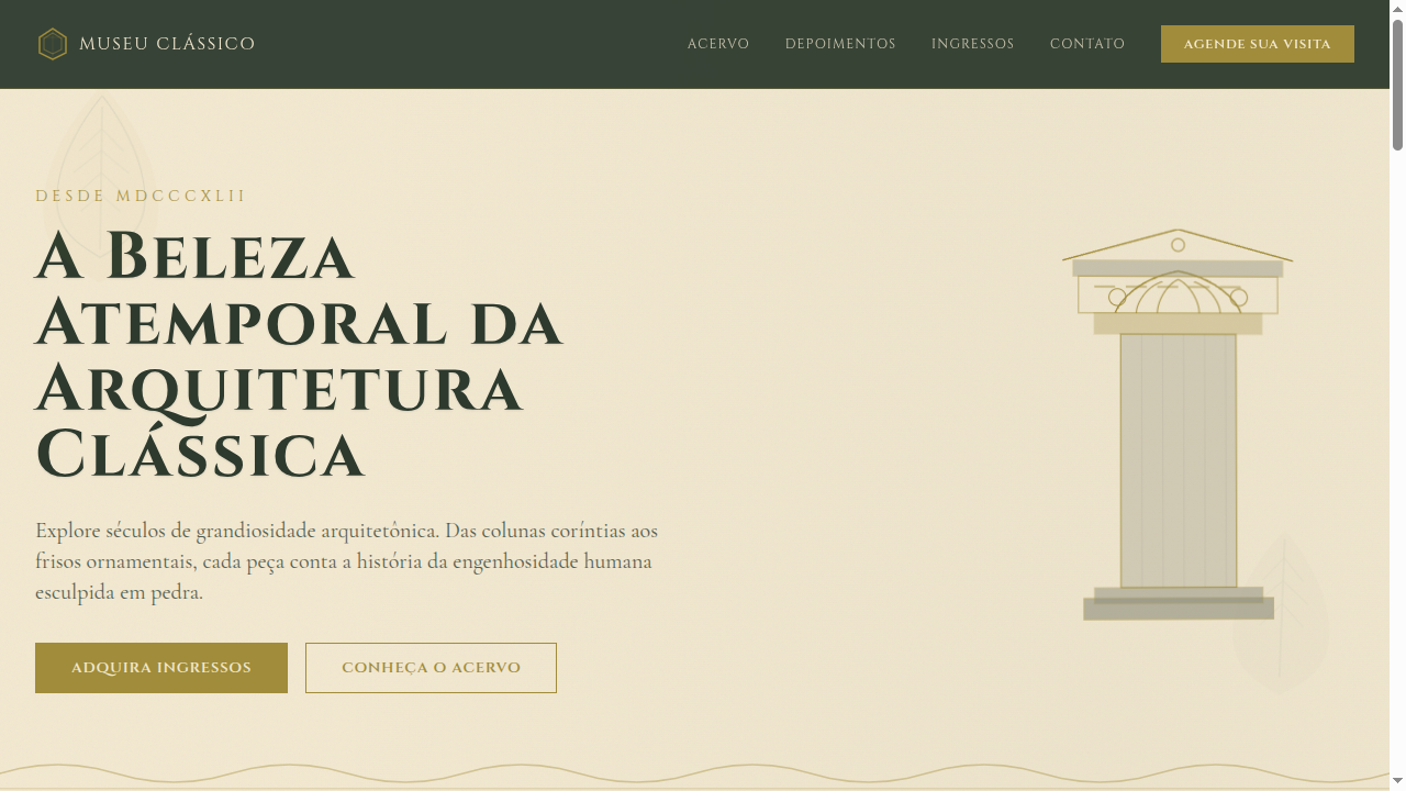
Landing page inspired by acanthus leaf patterns from Greek and Roman architecture. Ideal for detalhes arquitetônicos, tipografia sofisticada, layouts de impressão elegantes, museums. AI-ready template.
Use case: Architectural details, Sophisticated typography, Elegant print layouts, Museums
Historical Context
The acanthus leaf is arguably the most consequential decorative motif in Western design history. It first appeared on the Corinthian capital around 450 BCE — legend credits the sculptor Callimachus, who supposedly spotted acanthus leaves growing around a basket on a young girl's grave. Whether apocryphal or not, the story captures something true: this ornament was born from observing nature under emotional circumstances, not from pure geometric abstraction. What makes acanthus remarkable is its survivability across millennia of stylistic upheaval. Roman architects scaled it up for imperial propaganda. Byzantine craftsmen flattened it into mosaic borders. Renaissance designers rediscovered it through Vitruvius and made it central to the vocabulary of humanist architecture. The Baroque stretched and curled it into near-unrecognizable exuberance. Even Art Nouveau — ostensibly a rejection of classicism — owes its whiplash curves to the same organic logic that drives acanthus scrollwork. The motif endures because it solves a fundamental design problem: how to transition between structural geometry and organic beauty. A column is rigid; an acanthus capital softens that rigidity without undermining it. That tension between discipline and flourish is why it still works.
When to Use
Reach for acanthus when a project demands gravitas without stuffiness. It belongs on heritage brands that need to signal longevity — law firms, auction houses, architectural practices, luxury hospitality. Use it as border detail, capital ornamentation, or repeating frieze pattern. Avoid it in minimalist contexts where it reads as costume. It pairs well with serif typography, muted stone palettes, and generous whitespace. The motif earns its place when the brand genuinely connects to craft, permanence, or classical tradition — never as superficial decoration.
Design Principles
- Maintain the asymmetric naturalism of the leaf — perfectly symmetrical acanthus looks dead and mechanical
- Respect the depth hierarchy: overlapping leaves create shadow and dimension, never flatten them into a single plane
- Scale dictates detail density — large applications can carry deep relief and fine veining; small applications need simplified silhouettes
- Pair with restrained geometry to preserve the structural-organic tension that gives the motif its power
- Leave breathing room — acanthus suffocates when packed edge-to-edge without negative space to frame it
DESIGN.md
---
version: "alpha"
name: "Acanthus"
description: "Landing page inspired by acanthus leaf patterns from Greek and Roman architecture. Ideal for detalhes arquitetônicos, tipografia sofisticada, layouts de impressão elegantes, museums. AI-ready template."
colors:
  primary: "#8C8C7A"
  secondary: "#A08C3A"
  tertiary: "#F2E8D0"
  neutral: "#2D3A2D"
  surface: "#C67A4B"
  accent: "#8B7355"
typography:
  h1:
    fontFamily: Cinzel
    fontSize: 2.5rem
    fontWeight: 700
  body-md:
    fontFamily: Cinzel
    fontSize: 1rem
    fontWeight: 400
rounded:
  sm: 2px
  md: 4px
  lg: 8px
spacing:
  sm: 2.5rem
  md: 5.0rem
  lg: 10.0rem
components:
  button-primary:
    backgroundColor: "{colors.primary}"
    textColor: "{colors.neutral}"
    rounded: "{rounded.sm}"
    padding: 12px
---

## Overview

Landing page inspired by acanthus leaf patterns from Greek and Roman architecture. Ideal for detalhes arquitetônicos, tipografia sofisticada, layouts de impressão elegantes, museums. AI-ready template. The acanthus leaf is arguably the most consequential decorative motif in Western design history. It first appeared on the Corinthian capital around 450 BCE — legend credits the sculptor Callimachus, who supposedly spotted acanthus leaves growing around a basket on a young girl's grave. Whether apocryphal or not, the story captures something true: this ornament was born from observing nature under emotional circumstances, not from pure geometric abstraction.

What makes acanthus remarkable is its survivability across millennia of stylistic upheaval. Roman architects scaled it up for imperial propaganda. Byzantine craftsmen flattened it into mosaic borders. Renaissance designers rediscovered it through Vitruvius and made it central to the vocabulary of humanist architecture. The Baroque stretched and curled it into near-unrecognizable exuberance. Even Art Nouveau — ostensibly a rejection of classicism — owes its whiplash curves to the same organic logic that drives acanthus scrollwork.

The motif endures because it solves a fundamental design problem: how to transition between structural geometry and organic beauty. A column is rigid; an acanthus capital softens that rigidity without undermining it. That tension between discipline and flourish is why it still works.

- Density: 5/10 — Balanced
- Variance: 4/10 — Moderate
- Motion: 8/10 — Cinematic

- **Style:** Classical, Decorative, Architectural, Leaf-Pattern
- **Keywords:** Acanthus, leaf patterns, Greek columns, Roman capitals, decorative borders, typographic flourishes, classical architecture, ornamental, elegant
- **Era:** Ancient Greece & Rome
- **Light/Dark:** ✓ Full / ◐ Partial

## Colors

- **Stone Grey** (#8C8C7A) — Secondary text, borders, muted elements
- **Olive Gold** (#A08C3A) — Premium accent, decorative highlights
- **Parchment** (#F2E8D0) — Supporting palette color
- **Deep Forest** (#2D3A2D) — Supporting palette color
- **Terracotta** (#C67A4B) — Extended palette, decorative use
- **Aged Bronze** (#8B7355) — Metallic accent, decorative detail
- **Sage Green** (#7A8B6A) — Success states, positive indicators
- **Warm Cream** (#F5EDD6) — Secondary surface


## Typography

- **Display / Hero:** Cinzel — Weight 700, tight tracking, used for headline impact
- **Body:** Cinzel — Weight 400, 16px/1.6 line-height, max 72ch per line
- **UI Labels / Captions:** Cinzel — 0.875rem, weight 500, slight letter-spacing
- **Monospace:** JetBrains Mono — Used for code, metadata, and technical values

Scale:
- Hero: clamp(2.5rem, 5vw, 4rem)
- H1: 2.25rem
- H2: 1.5rem
- Body: 1rem / 1.6
- Small: 0.875rem


## Layout

- **Grid:** CSS Grid primary. Max-width containment: 1280px centered with 1.5rem side padding.
- **Spacing rhythm:** Balanced. Base unit: 0.5rem (8px).
- **Section vertical gaps:** clamp(4rem, 8vw, 8rem).
- **Hero layout:** Split-screen (text left, visual right).
- **Feature sections:** Zig-zag alternating text+image rows. No 3-equal-columns.
- **Mobile collapse:** All multi-column layouts collapse below 768px. No horizontal overflow.
- **z-index contract:** base (0) / sticky-nav (100) / overlay (200) / modal (300) / toast (500).


## Elevation & Depth

SVG acanthus leaf border ornaments, classical column-inspired section dividers, subtle emboss effect on headings, warm parchment texture backgrounds, gentle parallax on decorative elements, smooth transitions (350ms)

- **Physics:** Spring — stiffness 120, damping 20. Confident, weighted transitions.
- **Entry animations:** Fade + translate-Y (16px → 0) over 540ms ease-out. Staggered cascades for lists: 120ms between items.
- **Hover states:** Scale(1.03) + shadow lift over 200ms.
- **Page transitions:** Fade + slide (300ms).
- **Performance:** Only transform and opacity animated. No layout-triggering properties.


## Shapes

Base corner radius: 0px. See rounded tokens in front matter for the full scale.


## Components

- **Primary Button:** Sharp edges (0px) shape. Accent color fill. Hover: 8% darken + subtle lift shadow. Active: -1px translate tactile press. Font weight 600. No outer glows.
- **Secondary / Ghost Button:** Outline variant. 1.5px border in muted color. Text in primary color. Hover: subtle background fill.
- **Cards:** Sharp edges (0px) corners. Surface background. Subtle shadow (0 2px 12px rgba(0,0,0,0.06)). 1px border stroke.
- **Inputs:** Label above input. 1px border stroke. Focus ring: 2px accent color offset 2px. Error text below in semantic red. No floating labels.
- **Navigation:** Primary surface background. Active item: accent color indicator. Font weight 500 when active.
- **Skeletons:** Shimmer animation matching component dimensions. No circular spinners.
- **Empty States:** Icon-based composition with descriptive text and action button.


## Do's and Don'ts

- No emojis in UI — use icon system only (Lucide, Heroicons)
- No pure black (#000000) — use off-black or charcoal variants
- No oversaturated accent colors (saturation cap: 80%)
- No 3-column equal-width feature layouts — use zig-zag or asymmetric grid
- No `h-screen` — use `min-h-[100dvh]`
- No AI copywriting clichés: "Elevate", "Seamless", "Unleash", "Next-Gen"
- No broken external image links — use picsum.photos or inline SVG
- No generic lorem ipsum in demos

- Do Acanthus leaf SVG border ornaments
- Do Classical column section dividers
- Do Parchment/stone texture backgrounds
- Do Serif typography with flourishes
- Do Olive gold accent color consistent
- Do Responsive with simplified ornaments on mobile


## Use Case

Architectural details, Sophisticated typography, Elegant print layouts, Museums
Technical Specs
CSS
font-family: 'Cinzel', serif, background: #F2E8D0, color: #2D3A2D, border: 1px solid #A08C3A, border-image with SVG leaf patterns, text-shadow: 0 1px 2px rgba(0,0,0,0.1), box-shadow: 0 4px 16px rgba(0,0,0,0.08), letter-spacing: 0.04em
Variables
--color-stone: #8C8C7A, --color-olive-gold: #A08C3A, --color-parchment: #F2E8D0, --color-forest: #2D3A2D, --font-display: 'Cinzel', --border-classical: 1px solid #A08C3A, --spacing: 2.5rem, --border-radius: 0px
Checklist
☐ Acanthus leaf SVG border ornaments, ☐ Classical column section dividers, ☐ Parchment/stone texture backgrounds, ☐ Serif typography with flourishes, ☐ Olive gold accent color consistent, ☐ Responsive with simplified ornaments on mobile
Colors
Primary
Secondary
Effects
SVG acanthus leaf border ornaments, classical column-inspired section dividers, subtle emboss effect on headings, warm parchment texture backgrounds, gentle parallax on decorative elements, smooth transitions (350ms)
Light/Dark
✓ Full / ◐ Partial
AI Prompt
Act as a Senior Frontend Engineer and Expert UI Designer.
Your task is to code a complete Landing Page on the first attempt.
- Landing Page Theme: <INSERT THEME>
- Sections to add: <INSERT SECTIONS>

Generate the final code immediately following these definitions:

## Style

- **Name:** Acanthus
- **Type:** Classical, Decorative, Architectural, Leaf-Pattern
- **Keywords:** Acanthus, leaf patterns, Greek columns, Roman capitals, decorative borders, typographic flourishes, classical architecture, ornamental, elegant
- **Era:** Ancient Greece & Rome
- **Light/Dark:** ✓ Full / ◐ Partial

## Color Palette

- **Primary:** Stone Grey #8C8C7A, Olive Gold #A08C3A, Parchment #F2E8D0, Deep Forest #2D3A2D
- **Secondary:** Terracotta #C67A4B, Aged Bronze #8B7355, Sage Green #7A8B6A, Warm Cream #F5EDD6

## Visual Effects

SVG acanthus leaf border ornaments, classical column-inspired section dividers, subtle emboss effect on headings, warm parchment texture backgrounds, gentle parallax on decorative elements, smooth transitions (350ms)

## AI Visual Direction

Design a landing page inspired by acanthus leaf patterns from Greek and Roman architecture. Use SVG leaf border ornaments, classical column dividers, stone and parchment textures, olive gold accents. Typography should feature classical serifs with decorative flourishes. Evoke architectural elegance and timeless craftsmanship.

## CSS Technical

```css
font-family: 'Cinzel', serif, background: #F2E8D0, color: #2D3A2D, border: 1px solid #A08C3A, border-image with SVG leaf patterns, text-shadow: 0 1px 2px rgba(0,0,0,0.1), box-shadow: 0 4px 16px rgba(0,0,0,0.08), letter-spacing: 0.04em
```

## Design System Variables

```css
--color-stone: #8C8C7A, --color-olive-gold: #A08C3A, --color-parchment: #F2E8D0, --color-forest: #2D3A2D, --font-display: 'Cinzel', --border-classical: 1px solid #A08C3A, --spacing: 2.5rem, --border-radius: 0px
```

## Implementation Checklist

- ☐ Acanthus leaf SVG border ornaments
- ☐ Classical column section dividers
- ☐ Parchment/stone texture backgrounds
- ☐ Serif typography with flourishes
- ☐ Olive gold accent color consistent
- ☐ Responsive with simplified ornaments on mobile

## Execution Rules

1. Strictly follow the defined visual style.
2. Use high-quality inline SVG icons (Heroicons or Lucide style) — NEVER use emojis as icons.
3. Add `cursor-pointer` and smooth `hover` states (transition-all) on all interactive elements.
4. Required Page Structure:
   - Navbar (Logo + Links + CTA)
   - Hero Section (Impactful Headline + Subtitle + 2 buttons + 3D/Abstract visual element via CSS)
   - Features (3 cards with icons)
   - Testimonials (3 cards)
   - Pricing (3 tiers, highlight the middle one)
   - Final CTA
   - Full Footer with social links, privacy policy, terms of use, contact and SEO links.
5. All text content must be in English.
6. The visual must be CLEARLY distinct — do not create a "default Bootstrap" design. Force the use of the provided design system variables.
7. Use `<style>` tags in the head for custom classes (especially for complex backdrop-filter effects and animations) that Tailwind CDN doesn't cover.
8. Full Responsiveness: Layout must adapt perfectly to Mobile, Tablet and Desktop (vertical stack on mobile).
9. Include basic SEO, Viewport and Open Graph meta tags in `<head>`.
10. Footer must contain: Copyright 2026, Secondary navigation links and Social media icons.
11. Make the creative decisions needed to deliver the complete, functional result now.
Related
Last synced: 4/1/2026