90s Retro Video Game
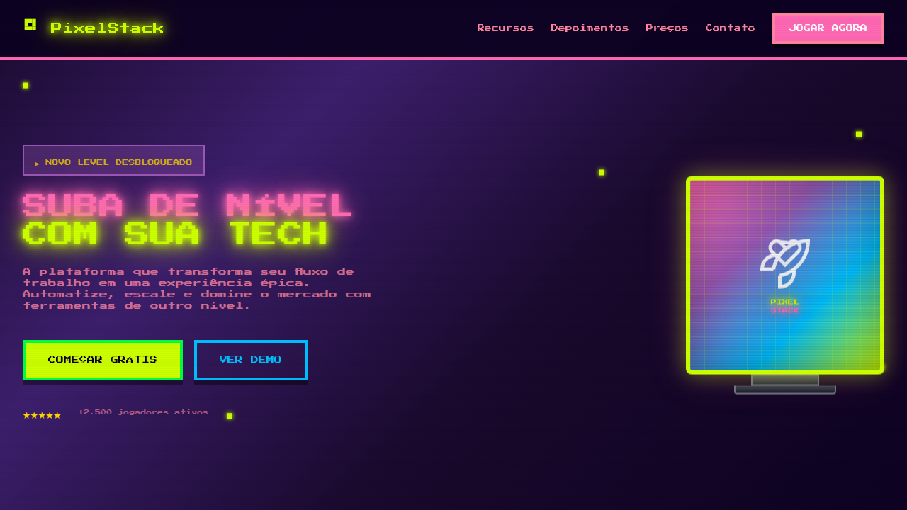
90s/Y2K retro video game style landing page. Ideal for games indie, projetos nostálgicos, marketing y2k, streaming, comunidades gamer. AI-ready template.
Use case: Indie games, Nostalgic projects, Y2K marketing, Streaming, Gaming communities
Historical Context
The 90s video game aesthetic wasn't designed to be nostalgic — it was the bleeding edge. When Sega and Nintendo were locked in their console war, every pixel was a deliberate choice made under brutal technical constraints. The SNES could push 256 colors on screen from a palette of 32,768. The Genesis had a smaller palette but faster processing. These limitations forced artists to become masters of suggestion — a four-frame walk cycle that somehow conveyed personality, backgrounds built from repeating 8x8 tiles that still felt like living worlds. What we now call '16-bit style' was really a collision of Japanese illustration traditions, American comic book energy, and the raw problem-solving of artists working within 64KB of VRAM. The typography was chunky and unapologetic — built for CRT scanlines and living room distances. Color palettes ran hot: saturated blues, electric greens, that specific shade of purple that only existed in Sonic box art. The Y2K crossover period (roughly 1996-2001) added a layer of early 3D experimentation, metallic gradients, and that unmistakable 'future that never happened' optimism. This era's design language sits at the intersection of pixel craft and the first wave of digital maximalism.
When to Use
Reach for this system when you need instant emotional recognition from anyone who grew up with a controller in their hands. It works for indie game studios who want to signal craft over budget, nostalgia brands targeting millennials with disposable income, and any product that benefits from the warmth of imperfection. It's particularly effective for packaging, app interfaces, and brand identities that need to feel playful without being childish. Avoid it for anything requiring corporate trust signals — this aesthetic says 'we remember fun' not 'we'll protect your data.'
Design Principles
- Constraint as style: Honor the grid. Work in multiples of 8px, limit your palette deliberately, and let the restrictions generate personality rather than fighting them.
- Saturated confidence: These palettes don't whisper. Use fully committed, high-saturation colors with hard transitions — no gentle gradients, no safe neutrals as primaries.
- Readable at speed: Typography and UI elements must work like a HUD — instantly parseable, chunky enough to survive scaling, with clear hierarchy achieved through size contrast rather than weight subtlety.
- Motion with purpose: Animation should feel like sprite work — discrete frames, snappy timing, satisfying feedback loops. Every transition earns its frames.
- Textural honesty: Embrace scanlines, dithering patterns, and pixel-level detail as design elements, not filters. The texture should feel structural, not applied as an afterthought.
DESIGN.md
---
version: "alpha"
name: "90s Retro Video Game"
description: "90s/Y2K retro video game style landing page. Ideal for games indie, projetos nostálgicos, marketing y2k, streaming, comunidades gamer. AI-ready template."
colors:
  primary: "#FF69B4"
  secondary: "#CCFF00"
  tertiary: "#9B59B6"
  neutral: "#00BFFF"
  surface: "#FF85A2"
  accent: "#FF6B35"
typography:
  h1:
    fontFamily: Press Start 2P
    fontSize: 2.5rem
    fontWeight: 700
  body-md:
    fontFamily: Press Start 2P
    fontSize: 1rem
    fontWeight: 400
components:
  button-primary:
    backgroundColor: "{colors.primary}"
    textColor: "{colors.neutral}"
    padding: 12px
---

## Overview

90s/Y2K retro video game style landing page. Ideal for games indie, projetos nostálgicos, marketing y2k, streaming, comunidades gamer. AI-ready template. The 90s video game aesthetic wasn't designed to be nostalgic — it was the bleeding edge. When Sega and Nintendo were locked in their console war, every pixel was a deliberate choice made under brutal technical constraints. The SNES could push 256 colors on screen from a palette of 32,768. The Genesis had a smaller palette but faster processing. These limitations forced artists to become masters of suggestion — a four-frame walk cycle that somehow conveyed personality, backgrounds built from repeating 8x8 tiles that still felt like living worlds.

What we now call '16-bit style' was really a collision of Japanese illustration traditions, American comic book energy, and the raw problem-solving of artists working within 64KB of VRAM. The typography was chunky and unapologetic — built for CRT scanlines and living room distances. Color palettes ran hot: saturated blues, electric greens, that specific shade of purple that only existed in Sonic box art.

The Y2K crossover period (roughly 1996-2001) added a layer of early 3D experimentation, metallic gradients, and that unmistakable 'future that never happened' optimism. This era's design language sits at the intersection of pixel craft and the first wave of digital maximalism.

- Density: 5/10 — Balanced
- Variance: 7/10 — Dynamic
- Motion: 8/10 — Cinematic

- **Style:** Pixel Art, Neon, Y2K, Chunky, Nostalgic
- **Keywords:** 90s, Y2K, retro, pixel art, neon, bubblegum, chunky typography, arcade, video game, nostalgic, 8-bit
- **Era:** 1990s / Y2K (1995-2005)
- **Light/Dark:** ✓ Full / ✓ Full

## Colors

- **Hot Pink** (#FF69B4) — Primary text color
- **Electric Lime** (#CCFF00) — Secondary surface or text color
- **Cyber Purple** (#9B59B6) — Accent color, emphasis elements
- **Arcade Blue** (#00BFFF) — Accent highlight, links and focus states
- **Bubblegum** (#FF85A2) — Extended palette, decorative use
- **Neon Orange** (#FF6B35) — Warm accent, call-to-action secondary
- **Pixel Green** (#00FF41) — Success states, positive indicators
- **Chrome Yellow** (#FFD700) — Warning states, attention indicators


## Typography

- **Display / Hero:** Press Start 2P' or monospace — Weight 700, tight tracking, used for headline impact
- **Body:** Press Start 2P' or monospace — Weight 400, 16px/1.6 line-height, max 72ch per line
- **UI Labels / Captions:** Press Start 2P' or monospace — 0.875rem, weight 500, slight letter-spacing
- **Monospace:** Press Start 2P' or monospace — Used for code, metadata, and technical values

Scale:
- Hero: clamp(2.5rem, 5vw, 4rem)
- H1: 2.25rem
- H2: 1.5rem
- Body: 1rem / 1.6
- Small: 0.875rem


## Layout

- **Grid:** CSS Grid primary. Max-width containment: 1280px centered with 1.5rem side padding.
- **Spacing rhythm:** Balanced. Base unit: 0.5rem (8px).
- **Section vertical gaps:** clamp(4rem, 8vw, 8rem).
- **Hero layout:** Asymmetric composition.
- **Feature sections:** Asymmetric grid with varied card sizes. No 3-equal-columns.
- **Mobile collapse:** All multi-column layouts collapse below 768px. No horizontal overflow.
- **z-index contract:** base (0) / sticky-nav (100) / overlay (200) / modal (300) / toast (500).


## Elevation & Depth

Pixel-art style borders (image-rendering: pixelated), neon glow text-shadow, chunky rounded typography (800+ weight), scanline overlay effect, CRT screen curvature, retro gradient backgrounds, blink/flash animations for arcade feel

- **Physics:** Spring — stiffness 120, damping 20. Confident, weighted transitions.
- **Entry animations:** Fade + translate-Y (16px → 0) over 540ms ease-out. Staggered cascades for lists: 120ms between items.
- **Hover states:** Scale(1.03) + shadow lift over 200ms.
- **Page transitions:** Fade + slide (300ms).
- **Performance:** Only transform and opacity animated. No layout-triggering properties.


## Shapes

Base corner radius: 8px. See rounded tokens in front matter for the full scale.


## Components

- **Primary Button:** Subtly rounded (0.5rem) shape. Accent color fill. Hover: 8% darken + subtle lift shadow. Active: -1px translate tactile press. Font weight 600. No outer glows.
- **Secondary / Ghost Button:** Outline variant. 1.5px border in muted color. Text in primary color. Hover: subtle background fill.
- **Cards:** Subtly rounded (0.5rem) corners. Surface background. Subtle shadow (0 2px 12px rgba(0,0,0,0.06)). 1px border stroke.
- **Inputs:** Label above input. 1px border stroke. Focus ring: 2px accent color offset 2px. Error text below in semantic red. No floating labels.
- **Navigation:** Primary surface background. Active item: accent color indicator. Font weight 500 when active.
- **Skeletons:** Shimmer animation matching component dimensions. No circular spinners.
- **Empty States:** Icon-based composition with descriptive text and action button.


## Do's and Don'ts

- No emojis in UI — use icon system only (Lucide, Heroicons)
- No pure white (#FFFFFF) backgrounds — use off-white or dark surfaces
- No oversaturated accent colors (saturation cap: 80%)
- No 3-column equal-width feature layouts — use zig-zag or asymmetric grid
- No `h-screen` — use `min-h-[100dvh]`
- No AI copywriting clichés: "Elevate", "Seamless", "Unleash", "Next-Gen"
- No broken external image links — use picsum.photos or inline SVG
- No generic lorem ipsum in demos

- Do Pixel art style elements
- Do Neon/bubblegum color palette
- Do Chunky bold typography
- Do Scanline or CRT overlay effect
- Do Retro gradient backgrounds
- Do Arcade-style interactive elements


## Use Case

Indie games, Nostalgic projects, Y2K marketing, Streaming, Gaming communities
Technical Specs
CSS
image-rendering: pixelated, font-family: 'Press Start 2P' or monospace, font-weight: 800, text-shadow: 0 0 10px neon-color, 0 0 20px neon-color for glow, border: 4px solid with pixel-step pattern, background: linear-gradient(180deg, #FF69B4, #9B59B6), animation: scanline 8s linear infinite, box-shadow: inset 0 0 100px rgba(0,0,0,0.3) for CRT curve
Variables
--pixel-border: 4px solid, --neon-glow: 0 0 10px, --font-retro: 'Press Start 2P', --scanline-opacity: 0.05, --crt-curve: inset shadow, --color-neon-1: #FF69B4, --color-neon-2: #CCFF00
Checklist
☐ Pixel art style elements, ☐ Neon/bubblegum color palette, ☐ Chunky bold typography, ☐ Scanline or CRT overlay effect, ☐ Retro gradient backgrounds, ☐ Arcade-style interactive elements
Colors
Primary
Secondary
Effects
Pixel-art style borders (image-rendering: pixelated), neon glow text-shadow, chunky rounded typography (800+ weight), scanline overlay effect, CRT screen curvature, retro gradient backgrounds, blink/flash animations for arcade feel
Light/Dark
✓ Full / ✓ Full
AI Prompt
Act as a Senior Frontend Engineer and Expert UI Designer.
Your task is to code a complete Landing Page on the first attempt.
- Landing Page Theme: <INSERT THEME>
- Sections to add: <INSERT SECTIONS>

Generate the final code immediately following these definitions:

## Style

- **Name:** 90s Retro Video Game
- **Type:** Pixel Art, Neon, Y2K, Chunky, Nostalgic
- **Keywords:** 90s, Y2K, retro, pixel art, neon, bubblegum, chunky typography, arcade, video game, nostalgic, 8-bit
- **Era:** 1990s / Y2K (1995-2005)
- **Light/Dark:** ✓ Full / ✓ Full

## Color Palette

- **Primary:** Hot Pink #FF69B4, Electric Lime #CCFF00, Cyber Purple #9B59B6, Arcade Blue #00BFFF
- **Secondary:** Bubblegum #FF85A2, Neon Orange #FF6B35, Pixel Green #00FF41, Chrome Yellow #FFD700

## Visual Effects

Pixel-art style borders (image-rendering: pixelated), neon glow text-shadow, chunky rounded typography (800+ weight), scanline overlay effect, CRT screen curvature, retro gradient backgrounds, blink/flash animations for arcade feel

## AI Visual Direction

Design a 90s/Y2K retro video game style landing page. Use pixel art icons, bright neon and bubblegum colors (hot pink, lime green, electric blue), chunky rounded bold typography. Add scanline overlay effect, CRT screen curvature on cards, retro gradient backgrounds. Include arcade-style buttons with pixel borders, 8-bit inspired decorative elements, and nostalgic gaming references in the layout.

## CSS Technical

```css
image-rendering: pixelated, font-family: 'Press Start 2P' or monospace, font-weight: 800, text-shadow: 0 0 10px neon-color, 0 0 20px neon-color for glow, border: 4px solid with pixel-step pattern, background: linear-gradient(180deg, #FF69B4, #9B59B6), animation: scanline 8s linear infinite, box-shadow: inset 0 0 100px rgba(0,0,0,0.3) for CRT curve
```

## Design System Variables

```css
--pixel-border: 4px solid, --neon-glow: 0 0 10px, --font-retro: 'Press Start 2P', --scanline-opacity: 0.05, --crt-curve: inset shadow, --color-neon-1: #FF69B4, --color-neon-2: #CCFF00
```

## Implementation Checklist

- ☐ Pixel art style elements
- ☐ Neon/bubblegum color palette
- ☐ Chunky bold typography
- ☐ Scanline or CRT overlay effect
- ☐ Retro gradient backgrounds
- ☐ Arcade-style interactive elements

## Execution Rules

1. Strictly follow the defined visual style.
2. Use high-quality inline SVG icons (Heroicons or Lucide style) — NEVER use emojis as icons.
3. Add `cursor-pointer` and smooth `hover` states (transition-all) on all interactive elements.
4. Required Page Structure:
   - Navbar (Logo + Links + CTA)
   - Hero Section (Impactful Headline + Subtitle + 2 buttons + 3D/Abstract visual element via CSS)
   - Features (3 cards with icons)
   - Testimonials (3 cards)
   - Pricing (3 tiers, highlight the middle one)
   - Final CTA
   - Full Footer with social links, privacy policy, terms of use, contact and SEO links.
5. All text content must be in English.
6. The visual must be CLEARLY distinct — do not create a "default Bootstrap" design. Force the use of the provided design system variables.
7. Use `<style>` tags in the head for custom classes (especially for complex backdrop-filter effects and animations) that Tailwind CDN doesn't cover.
8. Full Responsiveness: Layout must adapt perfectly to Mobile, Tablet and Desktop (vertical stack on mobile).
9. Include basic SEO, Viewport and Open Graph meta tags in `<head>`.
10. Footer must contain: Copyright 2026, Secondary navigation links and Social media icons.
11. Make the creative decisions needed to deliver the complete, functional result now.
Related
Last synced: 4/1/2026