Resume Journey Oregon Trail
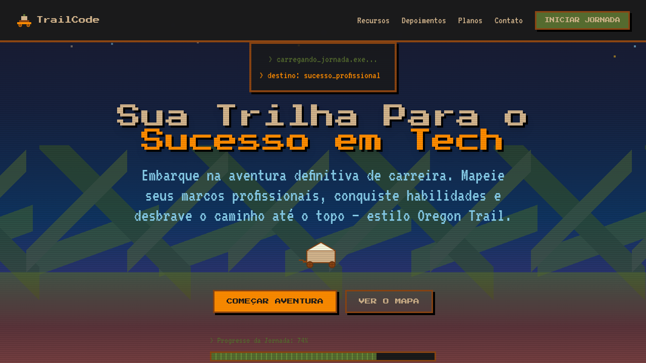
Estilo Oregon Trail retrô mostrando a jornada de carreira como uma trilha com marcos em pixel art. Ideal para currículos criativos e portfólios de desenvolvedores.
Uso: Currículos criativos, Portfólios de desenvolvedores, Páginas pessoais, Apresentações de carreira
Contexto Histórico
Oregon Trail (1971) é um dos jogos educacionais mais icônicos da história. Simula a jornada de pioneiros americanos e se tornou referência cultural de aventura e superação de desafios.
Especificações Técnicas
Cores
Primárias
Secundárias
Efeitos
Pixel art rendering (image-rendering: pixelated), scrolling trail/path animation connecting milestones, retro terminal-style typography, milestone markers as pixel waypoints, parallax landscape layers, 8-bit style progress bars for skills
Light/Dark
✓ Full / ✓ Full
CSS
image-rendering: pixelated, font-family: 'Press Start 2P' or 'VT323' monospace, background: layered parallax with earth tones, border: 3px solid #8B4513 for retro frames, clip-path or SVG path for winding trail, animation: scroll-trail for path movement, box-shadow: 4px 4px 0 #000 for pixel depth
Variáveis
--pixel-size: 4px, --trail-color: #8B4513, --prairie-green: #556B2F, --font-retro: 'Press Start 2P', --path-width: 8px, --milestone-size: 48px, --parallax-layers: 3, --pixel-shadow: 4px 4px 0 #000
Checklist
☐ Pixel art aesthetic throughout, ☐ Winding trail/path connecting milestones, ☐ Retro terminal typography, ☐ Earth-tone color palette, ☐ Career milestones as trail stops, ☐ 8-bit progress bars for skills, ☐ Parallax landscape background
DESIGN.md
Design System: Resume Journey Oregon Trail
1. Visual Theme & Atmosphere
Estilo Oregon Trail retrô mostrando a jornada de carreira como uma trilha com marcos em pixel art. Ideal para currículos criativos e portfólios de desenvolvedores. Oregon Trail (1971) é um dos jogos educacionais mais icônicos da história. Simula a jornada de pioneiros americanos e se tornou referência cultural de aventura e superação de desafios.
- Density: 5/10 — Balanced
- Variance: 7/10 — Dynamic
- Motion: 8/10 — Cinematic
2. Color Palette & Roles
- Trail Brown (#8B4513) — Primary surface or dominant color
- Prairie Green (#556B2F) — Secondary surface or text color
- Sky Blue (#87CEEB) — Accent highlight, links and focus states
- Wagon Tan (#D2B48C) — Supporting palette color
- Campfire Orange (#FF8C00) — Warm accent, call-to-action secondary
- River Blue (#4682B4) — Secondary accent
- Dust Yellow (#DAA520) — Warning states, attention indicators
- Night Black (#1A1A1A) — Deep contrast surface
3. Typography Rules
- Display / Hero: Press Start 2P' or 'VT323' monospace — Weight 700, tight tracking, used for headline impact
- Body: Press Start 2P' or 'VT323' monospace — Weight 400, 16px/1.6 line-height, max 72ch per line
- UI Labels / Captions: Press Start 2P' or 'VT323' monospace — 0.875rem, weight 500, slight letter-spacing
- Monospace: Press Start 2P' or 'VT323' monospace — Used for code, metadata, and technical values
Scale:
- Hero: clamp(2.5rem, 5vw, 4rem)
- H1: 2.25rem
- H2: 1.5rem
- Body: 1rem / 1.6
- Small: 0.875rem
4. Component Stylings
- Primary Button: Subtly rounded (0.5rem) shape. Accent color fill. Hover: 8% darken + subtle lift shadow. Active: -1px translate tactile press. Font weight 600. No outer glows.
- Secondary / Ghost Button: Outline variant. 1.5px border in muted color. Text in primary color. Hover: subtle background fill.
- Cards: Subtly rounded (0.5rem) corners. Surface background. Subtle shadow (0 2px 12px rgba(0,0,0,0.06)). 1px border stroke.
- Inputs: Label above input. 1px border stroke. Focus ring: 2px accent color offset 2px. Error text below in semantic red. No floating labels.
- Navigation: Primary surface background. Active item: accent color indicator. Font weight 500 when active.
- Skeletons: Shimmer animation matching component dimensions. No circular spinners.
- Empty States: Icon-based composition with descriptive text and action button.
5. Layout Principles
- Grid: CSS Grid primary. Max-width containment: 1280px centered with 1.5rem side padding.
- Spacing rhythm: Balanced. Base unit: 0.5rem (8px).
- Section vertical gaps: clamp(4rem, 8vw, 8rem).
- Hero layout: Asymmetric composition.
- Feature sections: Asymmetric grid with varied card sizes. No 3-equal-columns.
- Mobile collapse: All multi-column layouts collapse below 768px. No horizontal overflow.
- z-index contract: base (0) / sticky-nav (100) / overlay (200) / modal (300) / toast (500).
6. Motion & Interaction
- Physics: Spring — stiffness 120, damping 20. Confident, weighted transitions.
- Entry animations: Fade + translate-Y (16px → 0) over 540ms ease-out. Staggered cascades for lists: 120ms between items.
- Hover states: Scale(1.03) + shadow lift over 200ms.
- Page transitions: Fade + slide (300ms).
- Performance: Only transform and opacity animated. No layout-triggering properties.
7. Anti-Patterns (Banned)
- No emojis in UI — use icon system only (Lucide, Heroicons)
- No pure black (#000000) — use off-black or charcoal variants
- No oversaturated accent colors (saturation cap: 80%)
- No 3-column equal-width feature layouts — use zig-zag or asymmetric grid
- No
h-screen— usemin-h-[100dvh] - No AI copywriting clichés: "Elevate", "Seamless", "Unleash", "Next-Gen"
- No broken external image links — use picsum.photos or inline SVG
- No generic lorem ipsum in demos
Prompt para AI
Design a career resume landing page in Oregon Trail retro game style. Show career milestones as stops along a trail/path that scrolls horizontally or vertically. Use pixel art aesthetic, earth-tone colors (brown, green, tan), retro terminal typography. Include a winding trail connecting career milestones, pixel wagon/character, 8-bit progress bars for skills, and retro game UI elements like health bars and inventory slots for achievements. Each career milestone should look like a trail stop with date and description.
Relacionados
Última sincronização: 01/04/2026